
The Evolution of Responsive Architecture
To understand the current friction in adoption, one must examine the chronology of responsive design. In 2010, Ethan Marcotte introduced the concept of Responsive Web Design, which relied on fluid grids, flexible images, and, most importantly, Media Queries. For 15 years, Media Queries served as the primary mechanism for layout adaptation. However, as the industry shifted toward component-based architectures—popularized by frameworks like React, Vue, and Svelte—the limitations of the viewport became apparent.
In 2019, "Container Queries" topped the list of most-requested features in the annual CSS Wishlist survey conducted by CSS-Tricks. Developers argued that the viewport was a "proxy" for the actual space available to a component. The official specification for Container Queries eventually landed in stable browser releases between late 2022 and early 2023, with Chrome 105, Safari 16, and Firefox 110 providing the necessary cross-platform foundation.
Despite this long-awaited arrival, industry leaders note that the transition has been sluggish. At the SmashingConf Amsterdam 2026, technical educator Kevin Powell observed that adoption has been "terrible" compared to the enthusiasm that preceded the launch. The primary hurdle identified is the tendency for developers to treat @container as a drop-in replacement for @media, rather than a shift in layout philosophy.
Technical Distinctions: Macro vs. Micro Layouts
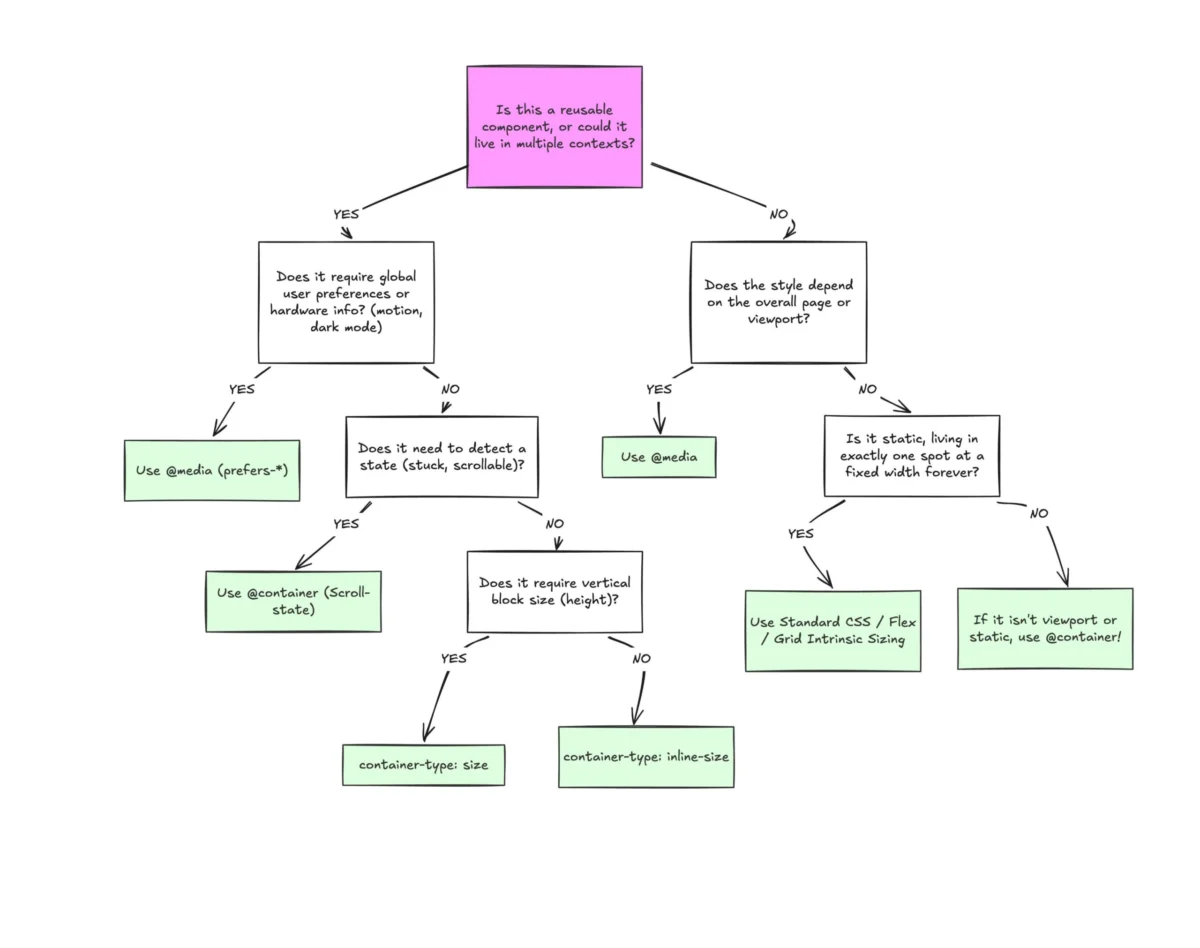
The fundamental difference between these two technologies lies in their point of reference. A Media Query asks the browser for the dimensions of the entire screen or window. This is effective for "macro" layouts—the high-level structure of a page, including global headers, footers, and the primary grid system. However, Media Queries are functionally "blind" to the internal state of a page.
A standard media query, such as @media (min-width: 1024px), will trigger its styles regardless of where a component is placed on the page. If a "card" component is designed to expand when the screen is wide, it will do so even if it is placed inside a narrow 300px sidebar on a 1920px desktop monitor. This often leads to "layout breakage," where elements overlap, text overflows, or proportions become distorted because the component is responding to the wrong environment.
In contrast, Container Queries look inward. They allow an element to respond to the specific dimensions of its parent wrapper. By defining a container using the container-type: inline-size property, developers enable a "micro" layout approach. The component asks: "How much space is available to me in this specific spot?" This allows a single component to exist in multiple states simultaneously on the same page—appearing as a vertical stack in a sidebar and a horizontal row in the main content area—without a single line of viewport-specific code.
Supporting Data on Web Fragmentation
The necessity for this shift is underscored by the increasing fragmentation of web-capable devices. Research into viewport diversity indicates there are now over 2,300 unique viewport sizes active on the modern web. This fragmentation makes it mathematically impossible to account for every edge case using traditional media query breakpoints.
Industry analysts suggest that the "breakpoint" methodology is becoming obsolete in a world of foldable screens, side-by-side multitasking on tablets, and ultra-wide monitors. Container Queries solve this by offloading the logic from the global viewport to the local environment. According to data from the W3C CSS Working Group, moving toward "intrinsic design"—where components define their own boundaries—reduces the complexity of CSS files by minimizing the need for "override" styles that are often required when media queries conflict with nested layouts.
Advanced Implementation: Fluidity and Logic
One of the most powerful applications of Container Queries is the integration of new CSS units. Just as vw (viewport width) and vh (viewport height) revolutionized typography in the 2010s, container-relative units like cqi (inline size) and cqw (width) are doing the same for modular components.

For example, fluid typography using the clamp() function has historically been tied to the viewport. This caused issues when large text was placed in small containers. By using cqi units—where 1cqi equals 1% of the container’s inline size—developers can ensure that font sizes scale proportionally to the component itself. This creates a self-contained unit of UI that maintains its visual integrity regardless of the parent layout.
Furthermore, Container Queries enable a form of "state detection" that was previously only possible through JavaScript and the ResizeObserver API. A notable technique involves detecting when Flexbox items wrap. While CSS cannot natively detect a "wrapped" state via a pseudo-class, a Container Query nested within a flex item can trigger style changes once that item expands to fill a new row. This reduces the reliance on heavy JavaScript libraries for layout management, leading to improved performance and lower "Time to Interactive" (TTI) scores.
Operational Constraints and Side Effects
Despite the advantages, the journalistic record must reflect the technical caveats that have contributed to the slow adoption rate. Container Queries introduce three primary challenges that require a departure from traditional CSS mental models:
1. The Container-Descendant Rule
A container cannot query itself. This is perhaps the most common point of failure for developers new to the specification. To style an element based on its size, that element must be a descendant of the container. This often necessitates an extra "wrapper" div in the HTML markup, which can conflict with "clean code" philosophies or existing CSS grid structures.
2. Layout Collapse and Size Containment
When a developer sets container-type: size, the browser ignores the children of that container when calculating its dimensions to prevent infinite loops. If an explicit height or aspect ratio is not provided, the container will collapse to 0px. This behavior is intentional but often perceived as a "bug" by those accustomed to the auto-sizing nature of standard block elements. Most experts recommend using inline-size (which only monitors width) to avoid this issue in standard document flows.

3. Custom Property Limitations
Currently, Container Queries cannot query against CSS variables (custom properties). A query such as @container (min-width: var(--breakpoint-lg)) will fail. This is due to the complexities of the CSS cascade; if a query changed the value of the variable it was querying, it would create a circular dependency. This forces developers to hard-code values or use pre-processor variables, limiting the dynamism of the system.
Industry Outlook and Strategic Implications
The shift toward Container Queries represents more than just a new syntax; it is a fundamental change in how design systems are built and maintained. Major design tools like Figma have begun introducing "component properties" that mirror this container-based logic, signaling a convergence between design and engineering workflows.
For organizations, the adoption of Container Queries offers a significant return on investment in terms of code maintainability. In traditional responsive design, a change to a global breakpoint could have unforeseen consequences across dozens of pages. With container-based logic, the "scope of impact" is limited to the component and its immediate parent. This modularity is essential for large-scale enterprise applications where multiple teams contribute to a single codebase.
The consensus among CSS experts and browser vendors is that the industry is currently in a "transition period." Much like the shift from Floats to Flexbox, the "old way" of using Media Queries for everything is being replaced by a more nuanced, two-tiered approach. Media Queries will continue to handle the "Macro" (system preferences, dark mode, and page-level grids), while Container Queries will dominate the "Micro" (reusable components and intrinsic layouts).
As browser support continues to climb toward 100% and developer education catches up with the specification, the expectation is that the usage statistics will eventually align with the awareness levels. The future of web design is not one of fixed breakpoints, but of fluid, self-aware components that adapt naturally to any context they inhabit. Organizations that fail to adopt this mindset risk maintaining increasingly fragile and complex CSS architectures in an era of unprecedented device diversity.

