

In the dynamic landscape of e-commerce, the effectiveness of a website’s user interface (UI) can be the decisive factor between a completed sale and a lost customer. Steve Krug, a renowned authority on usability and the author of the seminal work "Don’t Make Me Think," posits that even the slightest hesitation in a shopper’s journey—manifested through questions like "Where do I click?" or "What does this mean?"—can significantly impede the conversion process. This friction not only distracts from the primary goal of finding and purchasing a product but transforms the online shopping experience into a cognitive puzzle, draining the customer’s reservoir of goodwill with each moment spent deciphering the interface.
Krug’s foundational principle highlights a critical truth: every second a shopper spends wrestling with a website’s design is a second they are not actively engaging with the product or progressing towards a purchase. This cumulative effect of uncertainty and confusion erodes customer confidence and, ultimately, their inclination to buy. When this "reservoir of goodwill" is depleted, the likelihood of shoppers abandoning their carts or leaving the site altogether escalates dramatically. While obvious pain points like shipping costs are frequently addressed, subtler visual and textual cues often hold the key to eliminating these pervasive shopper doubts, thereby streamlining the path to purchase.

Decoding Shopper Hesitation: Identifying and Addressing Common Friction Points
The digital marketplace is rife with opportunities for friction that can deter potential customers. These often stem from a lack of clarity regarding product quantities, pricing structures, and the practical implications of purchasing decisions. The following examples illustrate how various e-commerce platforms have strategically addressed these challenges to enhance user experience and boost conversion rates.
Navigating Product Quantities: From Abstract Numbers to Tangible Value
A recurring area of confusion for online shoppers revolves around understanding product quantities and their associated costs, a problem exacerbated when dealing with bulk purchases or subscription models. The way a quantity is presented can either simplify or complicate the decision-making process.
Gush: Framing Quantities by Occasion, Not Just Numbers
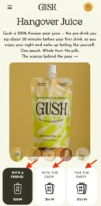
The beverage brand Gush exemplifies an innovative approach to presenting product quantities by shifting the focus from mere numerical counts to relatable consumption scenarios. Instead of solely displaying the number of pouches in a pack, Gush labels its offerings with occasions such as "With a Friend," "With the Crew," and "For the Party." This strategy effectively "does the math" for the consumer. Rather than requiring shoppers to estimate how many individual pouches they might need based on the number of people or the duration of an event, they can directly select a pack size that aligns with their social context. This intuitive framing reduces cognitive load and simplifies the decision-making process, making it easier for customers to envision themselves using the product and thus more likely to commit to a purchase. This approach leverages behavioral economics principles, making the purchase feel more personal and less transactional.
Waju: Crystal-Clear Unit Definitions for Undisputed Clarity
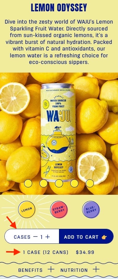
In contrast, Waju tackles the issue of quantity clarity with a direct and unambiguous approach. On its product pages, the brand ensures that shoppers understand that the listed quantity refers to cases, not individual units. This is reinforced by a clear explanatory line detailing the number of cans contained within each case. The visual design further emphasizes this clarity, with the quantity field featuring a prominent white background that draws the eye, ensuring that the explanatory text is not overlooked. This meticulous attention to detail removes any potential ambiguity, preventing the frustration that can arise from misinterpreting order sizes and ensuring that customers can confidently select the quantity they require. This strategy is particularly effective for products commonly purchased in bulk or with varying unit sizes.
Blueland: Describing Outcomes Over Contents for User-Centric Appeal
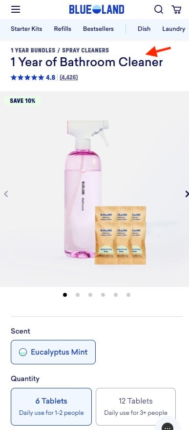
Blueland’s product naming strategy offers a compelling example of how to communicate value by focusing on the end result rather than the physical components. The brand eschews simple translations of tablet quantities into daily usage for a given household size. Instead, product names like "1 Year of Bathroom Cleaner" directly articulate the benefit and longevity of the product. This descriptive approach bypasses the need for consumers to perform calculations related to refills or usage rates. By emphasizing the tangible outcome—a year’s supply of a necessary cleaning product—Blueland taps into the consumer’s desire for convenience and long-term value. This framing shifts the purchase decision from a functional assessment of contents to an aspirational choice based on sustained utility, aligning with a growing consumer preference for products that offer lasting solutions.
The Farmer’s Dog: Visualizing Portions to Simplify Meal Planning
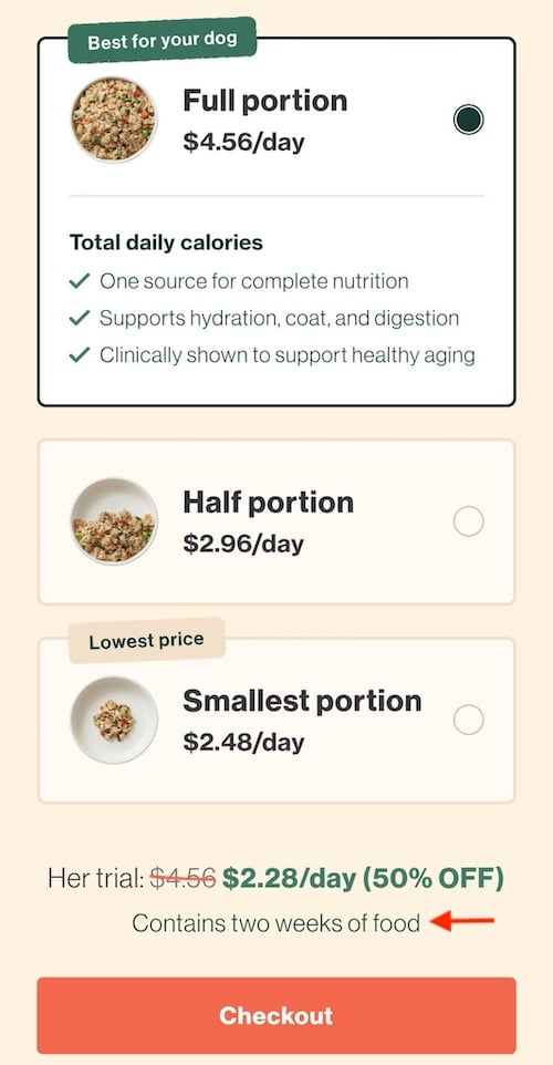
For subscription-based services, particularly in the pet food industry, determining the appropriate quantity can be a significant hurdle. The Farmer’s Dog addresses this challenge by employing a highly visual method to illustrate portion sizes. Their system presents three distinct bowl illustrations, each representing a different quantity of dog food. This visual representation allows pet owners to easily grasp the volume of food they will receive, eliminating the need for complex conversions of grams, boxes, or daily totals. Furthermore, pricing the food on a "per day" basis, rather than per box, aligns with how most pet owners conceptualize their budget and their pet’s dietary needs. A clarifying sentence below the options, stating "Contains two weeks of food," provides an additional layer of context, ensuring that shoppers can make an informed decision without any guesswork. This multi-faceted approach to quantity presentation significantly reduces the perceived complexity of ordering, making the service more accessible and appealing.
The Broader Implications of User Experience in E-commerce
The examples provided by Gush, Waju, Blueland, and The Farmer’s Dog underscore a fundamental shift in e-commerce strategy: prioritizing a frictionless user experience is no longer a secondary consideration but a primary driver of business success. In an increasingly competitive digital marketplace, where consumers have an abundance of choices at their fingertips, even minor points of friction can lead to substantial revenue loss.
The principles articulated by Steve Krug in "Don’t Make Me Think" have become foundational to effective UI/UX design. The cumulative effect of small uncertainties and moments of confusion can lead to a significant decline in customer engagement and conversion rates. Industry data consistently shows a strong correlation between intuitive website design and increased sales. For instance, a study by Forrester Research indicated that a well-designed user interface can increase conversion rates by up to 200%, while a poor one can decrease them by 50%. Similarly, studies by the Nielsen Norman Group have demonstrated that users often abandon websites that are difficult to navigate, with a significant percentage of users leaving after encountering just one usability issue.
The implication for businesses is clear: investing in user experience is not merely an aesthetic choice but a strategic imperative. This involves not only simplifying navigation and visual design but also meticulously crafting product descriptions, pricing information, and quantity selectors to be as clear and intuitive as possible. The adoption of contextual information, visual aids, and benefit-driven language, as seen in the successful strategies of the aforementioned brands, allows businesses to proactively address potential shopper doubts before they arise.
Looking ahead, the evolution of e-commerce UI/UX will likely see further integration of artificial intelligence and personalization to tailor experiences to individual user needs and preferences. However, the core principle will remain unchanged: making the online shopping journey as effortless and intuitive as possible. As consumer expectations continue to rise, brands that fail to prioritize and continuously refine their user experience risk being left behind, unable to compete effectively in the ever-evolving digital economy. The ability to anticipate and remove even the smallest points of friction is paramount to building customer loyalty and achieving sustained commercial success in the online realm.

