
The No Correlation meme, also known as the Scatter Plot Meme, has solidified its position as a cornerstone of digital communication, serving as a visual shorthand for dismissing illogical arguments, non-sequiturs, and irrelevant comparisons. Characterized by a standard statistical scatter plot featuring a random distribution of data points and the caption "No Correlation," the image has transitioned from a dry academic tool into a potent weapon of internet rhetoric. Since its emergence in the mid-2010s, the meme has navigated various platform migrations—from the early days of Twitter and Tumblr to the high-velocity environment of TikTok—proving its enduring utility in an era defined by rapid-fire social media interactions.
The Mathematical Foundation of a Digital Phenomenon
To understand the resonance of the No Correlation meme, one must first examine its origins in the field of statistics. A scatter plot is a fundamental graphical tool used by researchers and analysts to visualize the relationship between two numerical variables. By plotting individual data points along an X-axis and a Y-axis, observers can identify patterns: a "positive correlation" suggests that as one variable increases, so does the other; a "negative correlation" suggests an inverse relationship.
In statistical terms, "no correlation" (often represented by a correlation coefficient, or r-value, near zero) indicates that there is no discernible relationship between the variables being measured. The data points appear scattered randomly across the graph, offering no predictive value. In the context of internet culture, this mathematical concept has been repurposed as a metaphorical "mic drop." When a user posts a comment that lacks logical consistency or attempts to link two unrelated ideas, the No Correlation image is deployed to signal that the premises do not support the conclusion. It is a visual indictment of a logical fallacy, specifically the non-sequitur—Latin for "it does not follow."
Chronology of Emergence and Early Adoption (2015–2017)
The visual assets of the meme are believed to have originated from a generic stock image library, representing the platonic ideal of a disorganized data set. While the exact first instance of its use as a reaction image remains difficult to pinpoint due to the ephemeral nature of social media, digital historians trace its earliest documented appearances to late 2015.
On October 16, 2015, an Imgur user identified as RussianMinority uploaded one of the first known instances of the meme being used to mock social media logic. The post featured a screenshot of a Twitter exchange where a user attempted to praise a man’s appearance by noting his disability: "He’s deaf & YET he’s finer than most guys." The No Correlation scatter plot was appended to the exchange, highlighting the absurdity of suggesting that hearing ability and physical attractiveness are mutually exclusive or related variables.
Following this initial surge, the meme found a fertile breeding ground on Twitter and Tumblr throughout 2016. On Twitter, it became a staple of "Stan Twitter" and "Academic Twitter" alike, used to shut down "hot takes" that lacked evidentiary support. A November 2015 BuzzFeed article documented the chart’s use in responding to bizarre celebrity comparisons and political non-sequiturs, though many of these original posts have since been archived or deleted. By 2017, the meme had crossed over into more niche communities, appearing on platforms like 9GAG. A notable example from August 2017 featured a user mocking the perceived gap between "dank memes" and mainstream 9GAG content, reinforcing the meme’s role as a tool for gatekeeping and cultural commentary.
Institutionalization on Reddit and the Logic of the "Nigerian-Kenyan" Pivot
By 2019, the No Correlation meme had entered its "exploitable" phase, where the template was modified to fit specific narrative structures rather than just serving as a reaction image. On February 9, 2019, Reddit user SuperHelix7 posted a version to the r/memes subreddit that exemplified the meme’s ability to highlight microaggressions and social awkwardness.
The post depicted a conversation: "Me: yea I’m Nigerian. Caucasian lady: Amazing! My colleague went to Kenya for a mission trip 2 years ago." The inclusion of the No Correlation chart served as a sharp, wordless critique of the lady’s assumption that all African nations or experiences are interchangeable. This iteration of the meme received significant engagement, accumulating nearly 2,000 upvotes and demonstrating how the scatter plot could be used to address broader social themes like geography, race, and cultural ignorance.
The TikTok Renaissance and Modern Resurgence (2023–2026)
While many memes fade into obscurity after a few years, the No Correlation scatter plot experienced a massive resurgence in the mid-2020s, driven by the algorithmic power of TikTok. The platform’s "stitch" and "comment photo" features allowed the meme to be integrated into video content in real-time.
On December 19, 2023, TikTok creator @rebmasel utilized the image in a video that dissected a confusing statement from another creator. By overlaying the No Correlation chart onto her analysis, she provided a visual punchline that resonated with millions. The video garnered 3.9 million views and nearly 450,000 likes, introducing the meme to a new generation of users who may not have been active during its 2015 origin.
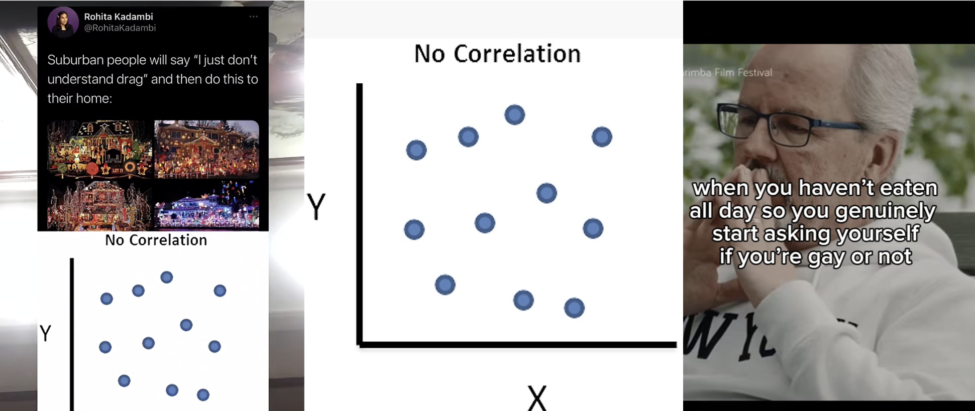
The meme’s evolution continued into late 2025 and early 2026. On September 28, 2025, a video by user @sslimeball_ went viral for its surrealist humor, using the caption: "when you haven’t eaten all day so you genuinely start asking yourself if you’re gay or not." The comment section was immediately flooded with the No Correlation scatter plot, as users used the image to point out the absolute lack of connection between blood sugar levels and sexual orientation. This specific interaction highlights the meme’s current role as a "sanity check" in the increasingly abstract and "brain-rot" influenced landscape of modern internet humor.
Structural Variations: Positive and Negative Correlation
As the meme matured, users began to develop variations to express different shades of logic. While the "No Correlation" version remains the most popular, derivative works have emerged:
- Perfect Positive Correlation: A graph showing a straight diagonal line going upward. This is used ironically or sincerely to show that two things are perfectly aligned (e.g., "The more I stay up late, the more I regret it").
- Negative Correlation: A graph showing a downward trend, used to show that as one thing increases, another decreases (e.g., "The more someone talks about being an ‘alpha,’ the less likely I am to listen").
- "There’s Correlation": A version where the points are slightly organized but still messy, used for "reaching" arguments that might have a shred of truth but are still largely illogical.
These variations have turned a single reaction image into a versatile linguistic system, allowing users to communicate complex assessments of logic through simple statistical templates.
Analytical Implications: The "Academic Aesthetic" in Meme Culture
The enduring success of the No Correlation meme can be attributed to its "academic aesthetic." In an online environment often characterized by emotional hyperbole and "all-caps" shouting, the use of a scientific graph provides a veneer of objective authority. It allows the user to assume the role of a detached observer or a "data scientist of discourse," effectively ending a debate by suggesting that the opponent’s argument is so flawed it cannot even be mapped.
Furthermore, the meme functions as a form of "digital literacy." By using the language of statistics to navigate social interactions, users are indirectly reinforcing the importance of logical consistency. It serves as a humorous but pointed reminder that "correlation does not imply causation"—a mantra of the scientific community that has found a second life in the comment sections of viral videos.
Broader Impact and Conclusion
The No Correlation scatter plot meme represents a unique intersection of mathematics, social commentary, and digital shorthand. Over the past decade, it has evolved from a niche reaction image into a universal symbol for the dismissal of illogicality. Its journey through Imgur, Twitter, Reddit, and TikTok reflects the changing ways in which we consume and critique information.
As of March 2026, the meme shows no signs of waning. Its ability to adapt to new social contexts—whether it is mocking poorly constructed marketing campaigns, debunking "pseudo-science" on social media, or simply pointing out the absurdity of a random TikTok caption—ensures its continued relevance. In a digital world increasingly filled with "noise," the No Correlation meme remains a vital tool for those seeking to signal the absence of "signal." It is a testament to the power of simplicity: sometimes, a collection of random dots says more than a thousand words ever could.