
The landscape of modern web development is currently undergoing a fundamental shift as the browser platform matures to absorb complex user interface patterns that previously required extensive third-party dependencies. For over a decade, developers have relied on JavaScript libraries to manage even the most basic interactive elements, such as tooltips and menus. However, the introduction and widespread adoption of the native Popover API marks a significant turning point, moving these UI components from simulated behaviors into native browser primitives. This transition is not merely a matter of reducing code volume; it represents a comprehensive improvement in accessibility, performance, and the long-term maintainability of web applications.
The Historical Burden of Custom Tooltip Implementations
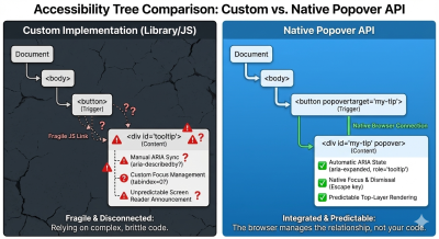
To understand the impact of the Popover API, it is necessary to examine the technical debt associated with traditional tooltip implementations. On the surface, a tooltip appears to be a minor UI element: a small text box that appears upon hover or focus. In practice, however, creating a robust, accessible tooltip using standard HTML, CSS, and JavaScript has historically been one of the most disproportionately complex tasks in front-end development.
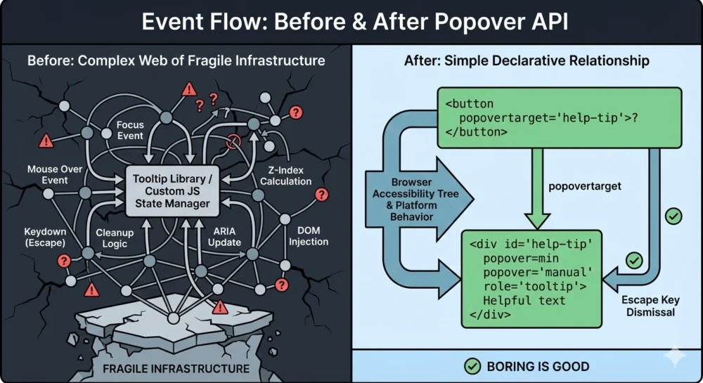
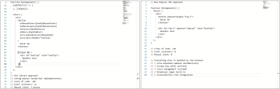
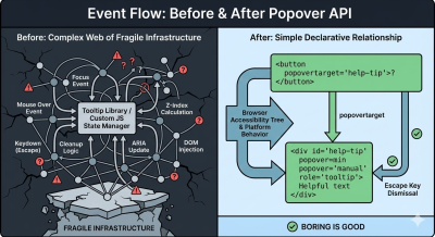
Before the standardization of the Popover API, a developer attempting to build a "correct" tooltip had to account for a wide array of edge cases. These included managing event listeners for both mouse and keyboard interactions, ensuring the tooltip was not clipped by parent containers with overflow: hidden properties, and manually syncing ARIA (Accessible Rich Internet Applications) attributes. A typical custom implementation often required upwards of 60 lines of JavaScript to handle five or more distinct event listeners: mouseenter, mouseleave, focus, blur, and keydown.
The fragility of these custom systems frequently led to significant accessibility failures. Keyboard users often found that tooltips would not trigger during tabbing sequences, or that the Esc key failed to dismiss the overlay as expected. Screen reader users faced even greater inconsistencies, with tooltips being announced twice, not at all, or failing to update their state in the accessibility tree when the visual state changed. This "tangled web" of manual state management created a high risk of regressions whenever small changes were made to the codebase.
Technical Anatomy of the Popover API
The Popover API addresses these systemic issues by providing a declarative mechanism within the HTML specification. By using the popover attribute, developers can instruct the browser to treat an element as a managed overlay. This shifts the responsibility of state management from the developer’s JavaScript to the browser’s internal engine.
The API introduces several key attributes that simplify the developer experience. The popovertarget attribute creates a direct, declarative link between a trigger (such as a button) and the popover element itself. The popover attribute can be set to two primary states: auto or manual. In the auto state, the browser handles "light dismiss" functionality, meaning the popover will automatically close when the user clicks outside of it or presses the Esc key. In the manual state, the developer retains control over the closing logic while still benefiting from the browser’s native rendering optimizations.
One of the most significant technical advantages of the Popover API is its utilization of the "Top Layer." Elements designated as popovers are rendered in a special internal layer of the browser that sits above all other elements in the document. This eliminates the "z-index wars" that have plagued web design for decades, ensuring that a tooltip will never be obscured by a parent container or a competing UI component with a higher z-index value.
The Accessibility Revolution and Automated ARIA Syncing
The move toward native APIs is fundamentally a move toward a more accessible web. Industry data suggests that a large percentage of accessibility violations on modern websites stem from incorrectly implemented custom widgets. The Popover API mitigates this by providing "free" accessibility wins that are built directly into the platform.
When a developer uses the Popover API, the browser automatically manages the aria-expanded state. In traditional implementations, a developer would need to write a script to toggle aria-expanded="true" and aria-expanded="false" every time the tooltip appeared or disappeared. If this script failed or was interrupted by another process, the accessibility state would become "stale," providing misleading information to assistive technology users. With the native API, this state is tied directly to the element’s visibility in the browser’s engine, ensuring 100% accuracy.
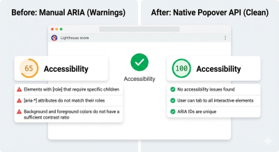
Furthermore, focus management is handled natively. When a popover is dismissed, the browser intelligently understands where focus should be restored, preventing the "lost focus" bug where a user’s cursor disappears into the top of the document after closing a modal or tooltip. Accessibility audits using tools like Lighthouse have shown that migrating from custom libraries to the Popover API often results in immediate improvements in accessibility scores, specifically regarding roles and state management.
Browser Support and the Interop Initiative
The rapid adoption of the Popover API is a direct result of the "Interop" initiative, a collaborative effort between major browser vendors—including Google, Apple, and Mozilla—to ensure that web features work identically across all platforms. As of early 2024, the Popover API enjoys broad support across all "evergreen" browsers.
According to data from Caniuse, the Popover API is supported in Chrome (version 114+), Edge (114+), Safari (17+), and Firefox (125+). This level of cross-browser consensus is rare for new APIs and indicates the industry’s collective desire to standardize UI primitives. For developers, this means that the "baseline" for web development has shifted. While polyfills exist for legacy browsers, the vast majority of global web traffic can now experience native popover behavior without the need for heavy JavaScript polyfills or libraries.
Performance Implications and JavaScript Reduction
The performance benefits of moving to native APIs are quantifiable. Modern web applications are often bogged down by large JavaScript bundles, a significant portion of which is dedicated to UI components. Popular tooltip libraries, while highly optimized, still add several kilobytes to a site’s initial load time and contribute to main-thread execution costs during interaction.
Technical comparisons show that a native popover implementation can reduce the code required for a single tooltip by nearly 80%. In a large-scale application with hundreds of tooltips or menus, this reduction in JavaScript overhead can lead to faster "Time to Interactive" (TTI) and lower memory usage, particularly on mobile devices with limited processing power. By removing the need for five or more event listeners per tooltip, the browser’s event loop is freed up for more critical application logic.
The Remaining Gaps: Hover Intent and Manual Overrides
Despite its strengths, the Popover API is not yet a complete replacement for all third-party libraries in every scenario. One area where the platform is still evolving is "hover intent." In many sophisticated UI designs, tooltips do not appear instantly; rather, they wait for a short delay (e.g., 200ms) to ensure the user actually intended to hover over the item and isn’t just moving their mouse across the screen.
Currently, the Popover API opens and closes elements instantaneously. Developers who require specific timing or delays still need to utilize a small amount of JavaScript to manage the showPopover() and hidePopover() methods. However, the nature of this JavaScript has changed. It is no longer providing the infrastructure for the tooltip; it is merely expressing the developer’s intent for the timing.
Industry observers note that the CSS Working Group is already exploring "interest invokers," a proposed feature that would allow developers to define hover delays directly in CSS. Once this is standardized, the need for JavaScript in basic tooltip interactions may disappear entirely.
Future Outlook: CSS Anchor Positioning
The final piece of the puzzle for native tooltips is CSS Anchor Positioning. While the Popover API handles the "how" of overlays, Anchor Positioning handles the "where." Historically, one of the primary reasons developers used libraries like Floating UI or Popper.js was to ensure that tooltips stayed attached to their trigger elements during scrolling or window resizing.
CSS Anchor Positioning, which is currently being rolled out across browsers, allows an element to be tethered to another element using pure CSS. This feature includes built-in logic for collision detection, allowing a tooltip to automatically flip from the top to the bottom of a button if it nears the edge of the viewport. When combined with the Popover API, Anchor Positioning provides a complete, no-JavaScript solution for the most complex positioning requirements.
Conclusion
The shift toward the Popover API represents a maturation of the web as a software platform. For years, the community accepted that "correct" UI required external libraries because the browser’s native tools were insufficient. Today, that assumption is no longer valid. By moving these interactions into the browser’s core, the web becomes more performant, more accessible, and easier to develop for.
While large-scale design systems with legacy constraints may continue to use libraries in the short term, the "default" choice for new projects has clearly shifted toward native implementation. The Popover API demonstrates that when the platform provides a better primitive, the result is not just fewer lines of code, but a more resilient and inclusive digital experience for all users. The era of simulating tooltips is ending; the era of understanding them has begun.
