
The introduction of the CSS corner-shape property marks a significant milestone in the history of web typography and layout, effectively ending nearly two decades of technical workarounds for non-circular decorative corners. This new property, currently gaining traction in modern browser engines, allows developers to define complex corner geometries—including beveled, scooped, and squircle shapes—directly within the CSS box model. By acting as a companion to the traditional border-radius property, corner-shape addresses long-standing limitations that previously forced engineers to rely on fragile SVG masks or performance-heavy clip-paths.
The Historical Context: From Image Slicing to Border-Radius
To understand the impact of corner-shape, one must examine the arduous evolution of web styling. In the early 2000s, achieving rounded corners required a technique known as "sliding doors," which utilized multiple background images for each corner and edge of a container. This method was not only labor-intensive but also resulted in significant HTTP overhead and brittle layouts that broke whenever content dimensions shifted.
The arrival of the CSS3 border-radius property approximately fifteen years ago was heralded as a revolutionary advancement. It simplified the creation of circular arcs, allowing for consistent, high-performance rounding across the web. However, as digital design matured, the limitations of border-radius became apparent. While it excelled at creating perfect circles and ellipses, it offered no native support for the "squircle" (a superellipse curve popularized by mobile operating systems), the "bevel" (a flat diagonal cut), or the "scoop" (an inward-facing curve).

For years, designers seeking these specific aesthetics were forced to use the CSS clip-path property or SVG masks. While visually effective, these methods presented severe drawbacks: they often cut off box shadows, prevented borders from rendering correctly, and required complex coordinate calculations that were difficult to maintain. The corner-shape property represents a definitive shift toward a more robust, integrated solution.
Technical Specifications and the Superellipse Function
The corner-shape property, defined in the CSS Borders and Box Decorations Module Level 4, operates as a modifier to the existing border-radius. It does not replace the radius but rather dictates how the path between the two points of the radius is drawn. According to the W3C Working Draft, the property accepts several key keywords:

- Round: The standard circular arc (the default behavior).
- Bevel: A straight line connecting the two points of the radius, creating a faceted appearance.
- Scoop: An inward-facing circular arc, often used for ticket-style UI or ornamental cards.
- Notch: A mechanical, sharp inward cut.
- Squircle: A superellipse curve that provides a smoother transition between the straight edges of an element and its corners.
Furthermore, the property introduces the superellipse() function, allowing for fine-grained mathematical control over the corner curvature. By adjusting the numeric parameters within this function, developers can achieve a spectrum of shapes ranging from a perfect diamond (exponent of 1) to a perfect circle (exponent of 2) and beyond to the ultra-smooth squircle (often an exponent between 3 and 5). This level of control is particularly vital for branding, where the "smoothness" of a corner can differentiate a premium interface from a standard one.
A New Framework for Progressive Enhancement
As of early 2026, browser support for corner-shape is led by Chromium-based browsers, including Chrome 139+. While Firefox and Safari have yet to implement full support, the industry is adopting a "progressive enhancement" strategy. This approach involves creating two tiers of design: a "good" baseline that works in all browsers using standard border-radius, and a "better" enhanced version for modern browsers.

Developers are increasingly utilizing CSS Cascade Layers (@layer) and @supports queries to manage this transition. By isolating enhancement styles, teams can ensure that users on older browsers receive a polished, functional experience with rounded corners, while users on cutting-edge browsers enjoy the sophisticated geometries provided by corner-shape. This methodology avoids the "broken" layouts of the past and promotes a graceful evolution of the web’s visual language.
Case Studies: Practical Applications in Modern UI
The practical implications of corner-shape extend across various UI components, offering both aesthetic and functional benefits.

E-commerce and Promotional Badges
In e-commerce design, "New" or "Sale" badges are frequently pinned to product cards. Traditionally, these required complex polygon clip-paths to create ribbon-like points. With corner-shape, a developer can apply corner-shape: round bevel bevel round to a badge. This creates a directional arrow shape that remains perfectly aligned with the parent container’s border and shadow, even if the padding or text length changes.
Component Libraries and Design Systems
Design systems are increasingly using shape as a functional signifier. For instance, primary buttons might utilize a squircle for a premium feel, while "danger" or "alert" tags might use a notch to convey a sense of urgency or mechanical precision. Because corner-shape values can be animated via their superellipse equivalents, these shapes can fluidly transition during hover states, providing a more tactile and responsive user experience.

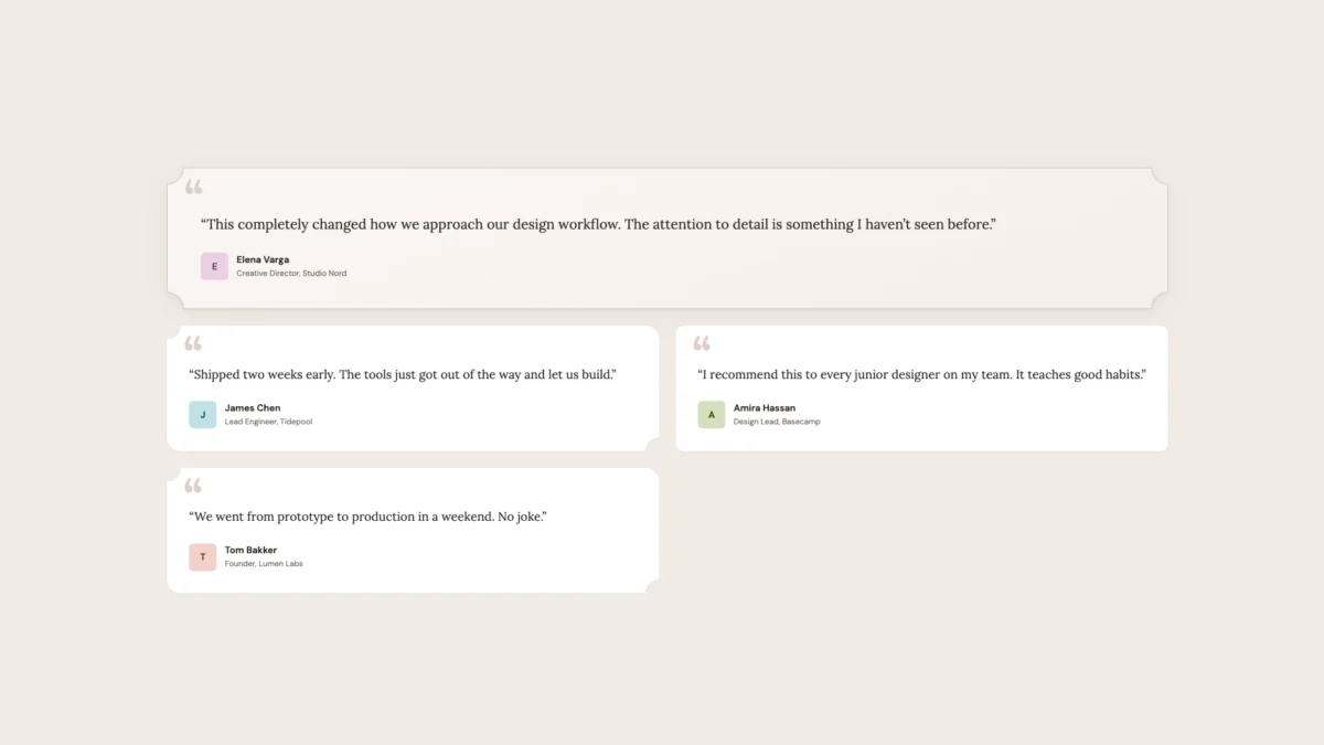
Editorial Design and Testimonial Cards
For content-heavy or editorial sites, the "scoop" value provides an organic, hand-crafted aesthetic that mimics traditional print and calligraphy. By combining scooped corners with serif typography and warm color palettes, designers can achieve a sophisticated "high-end" look that was previously difficult to implement without heavy reliance on external assets or complex SVG code.
SaaS and Pricing Hierarchies
Visual hierarchy is paramount in SaaS pricing pages. The corner-shape property allows developers to distinguish a "featured" plan by using a unique corner geometry, such as a scoop, while surrounding plans use a standard squircle. This creates an immediate visual distinction that guides the user’s eye toward the preferred option without relying solely on color or size.

Industry Impact and Developer Sentiment
Initial reactions from the web development community suggest that corner-shape is one of the most anticipated CSS features in recent years. Technical analysts point to the reduction in "code debt" as a primary advantage. By moving corner logic into a native property, developers can eliminate hundreds of lines of fragile SVG and clip-path code, leading to faster load times and easier maintenance.
From a design perspective, the property bridges the gap between professional design tools (like Figma, which has long supported corner smoothing) and the browser. For years, designers have complained about the "translation loss" that occurs when a squircle-based design is converted to a circular border-radius on the live web. The corner-shape property finally allows for pixel-perfect implementation of these sophisticated design languages.

Broader Implications and Future Outlook
The introduction of corner-shape is part of a broader trend toward more expressive CSS. It follows other advancements like the OKLCH color space and CSS Subgrid, which collectively empower developers to build interfaces that were once the exclusive domain of graphic design software.
Furthermore, the property has implications for web accessibility and performance. Native CSS shapes are inherently more performant than SVG masks or clip-paths, as they are handled more efficiently by the browser’s rendering engine. They also play better with hardware acceleration. From an accessibility standpoint, because the shape is part of the element’s border box, it does not interfere with focus indicators or screen reader interactions in the way that some complex hacks might.

As browser engines like WebKit (Safari) and Gecko (Firefox) move toward implementation, the web will likely see a departure from the "uniform roundness" that has defined the last decade. We are entering an era of geometric diversity, where the shape of a corner can be as much a part of a brand’s identity as its logo or color palette. The shift from five background images to a single line of CSS represents not just a technical improvement, but a maturing of the web as a design medium. Developers are encouraged to begin experimenting with these properties today, using the "good and better" philosophy to lead the way into the next generation of user interface design.
