
The architectural integrity of a digital interface relies heavily on the selection of appropriate User Interface (UI) components, yet the distinction between foundational elements such as comboboxes, multiselects, listboxes, and dual listboxes remains a primary source of friction for designers and developers alike. As digital ecosystems grow in complexity, the efficiency with which a user can navigate and select data points determines the overall success of the user experience (UX). While these components often share a common goal—facilitating user interaction with lists of data—their technical implementations and psychological impacts on the user vary significantly. The choice of a component is not merely an aesthetic preference but a strategic decision dictated by the volume of available options, the necessity of visibility, and the cognitive load imposed on the end user.
The Evolution of List Selection: A Brief Chronology
The history of list selection in digital interfaces traces back to the earliest iterations of Graphical User Interfaces (GUIs) in the 1980s and the subsequent standardization of HTML in the 1990s. Initially, the HTML <select> tag provided a rudimentary way for users to choose from a list of options. However, as the web transitioned from static documents to dynamic applications, the limitations of basic dropdown menus became apparent.

In the early 2000s, the rise of Asynchronous JavaScript and XML (AJAX) allowed for real-time data fetching, giving birth to the "autocomplete" or "type-ahead" functionality. This was the precursor to the modern combobox, which combined a text input with a filtered list. By the 2010s, design systems such as Google’s Material Design and IBM’s Carbon (and subsequently Watson) began to formalize these patterns, introducing "pills" or "chips" for multiselect components to help users manage complex data sets. Today, the focus has shifted toward accessibility and mobile responsiveness, leading to the refinement of listboxes and the re-emergence of the dual listbox as a powerhouse for enterprise-level data management.
Decoding the Core Components: Technical Definitions and Use Cases
To implement these patterns effectively, one must first understand the technical nuances that separate them. According to industry standards established by organizations like the Nielsen Norman Group (NN/g) and the World Wide Web Consortium (W3C), each component serves a distinct functional niche.
The Combobox: The Efficiency Specialist
A combobox is a hybrid component that integrates a text input field with a hidden dropdown list. Its primary utility lies in its "type-to-filter" capability. When a user begins typing, the list is dynamically pruned to show only relevant matches. This is the gold standard for single-selection tasks involving large datasets, such as selecting a country from a list of 195 nations or choosing a specific airport code. The combobox minimizes scrolling and accelerates the selection process for "power users" who know exactly what they are looking for.

The Multiselect: Managing Complexity
The multiselect component expands upon the combobox or dropdown by allowing users to pick more than one item. Modern multiselects often utilize "chips" or "tags" to provide visual feedback on the current selection. This pattern is essential for filtering search results or assigning multiple categories to a single item. However, designers must be cautious; as the number of selected items grows, the input field can become cluttered, potentially obscuring other UI elements.
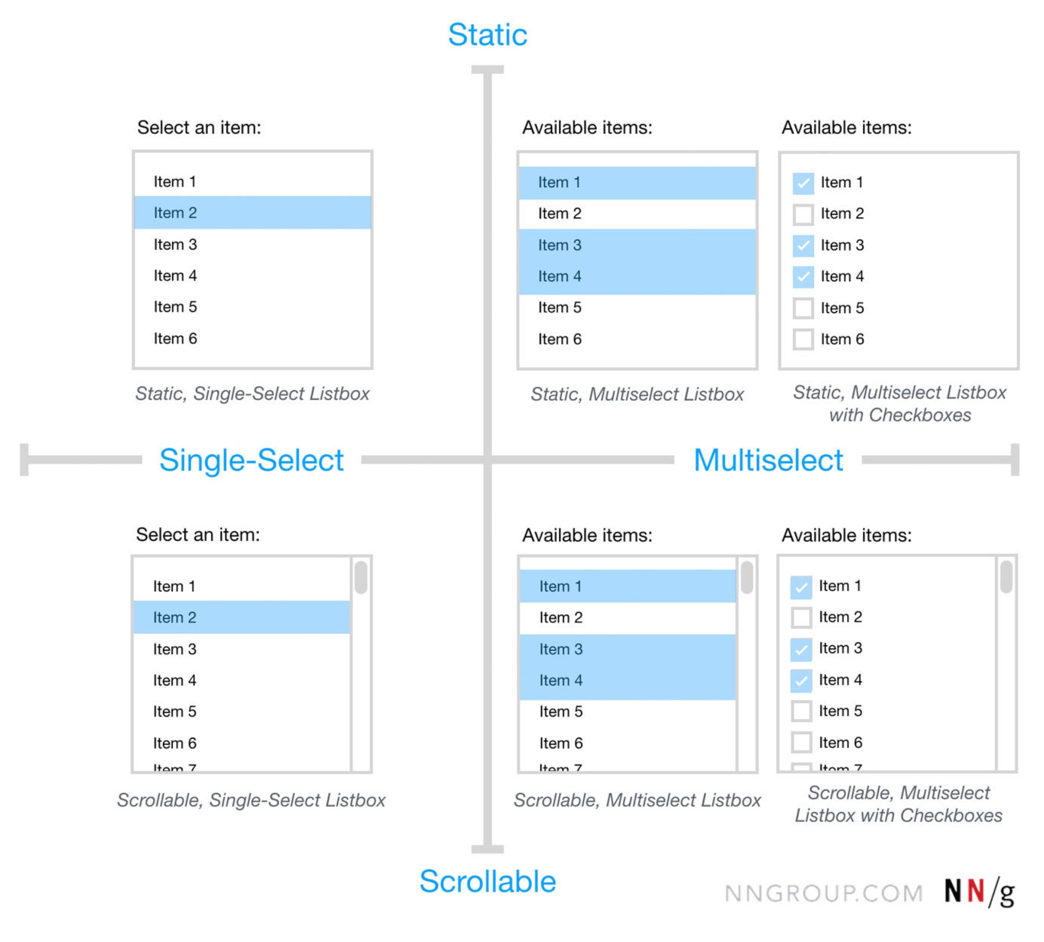
The Listbox: Prioritizing Visibility
Unlike the dropdown-based components, a listbox displays its options in a static container that is visible by default. It may include a scrollbar if the list exceeds the container’s height. Listboxes are preferred when users need to see all available choices immediately without an extra click. This is particularly useful for frequently used filters or when the relationship between options needs to be clear at a glance.
The Dual Listbox: The Enterprise Workhorse
Commonly referred to as a "transfer list," the dual listbox consists of two side-by-side listboxes. Users move items from the "source" list on the left to the "destination" list on the right. This component is unrivaled for bulk selection, role assignment, or permission management. It allows users to review their final selection in its entirety before committing, reducing errors in complex administrative tasks.

Supporting Data: When to Use Which Pattern
Data-driven design suggests that the number of items in a list is the most reliable metric for component selection. User testing has consistently shown that the cognitive load increases as the list grows, necessitating more robust filtering tools.
- Fewer than 5 items: Industry consensus suggests that for lists with five or fewer options, simple radio buttons (for single select) or checkboxes (for multi-select) are superior. These require zero clicks to view and only one click to select, maximizing efficiency.
- 6 to 15 items: A standard dropdown or listbox is typically sufficient. The list is short enough to be scanned quickly without the need for a search filter.
- 15 to 200 items: A combobox with an autocomplete feature becomes necessary. Users can no longer be expected to scan the entire list efficiently, and the ability to type the first few letters of an option significantly reduces "time to task."
- 200+ items: Advanced filtering, categorization, and grouping within a combobox or a dedicated search interface are required to prevent user frustration.
The Golden Rule of UI Visibility
A critical principle emphasized by UX experts, including Vitaly Friedman of Design Patterns for AI Interfaces, is the mandate to never hide frequently used options. If data analytics indicate that 80% of users select the same three options from a list of fifty, those three options should be extracted from the hidden list and presented as immediate actions—such as buttons or chips—at the top of the interface.
Hiding popular choices behind a dropdown click adds unnecessary friction. By exposing these "high-velocity" options, designers can cater to the majority of users while still providing the full list for the minority who need it. This approach, often called "progressive disclosure," balances simplicity with functional depth.

Accessibility and Keyboard Navigation Standards
For a UI component to be considered "production-ready," it must adhere to Web Content Accessibility Guidelines (WCAG). Selection components are notoriously difficult for users who rely on screen readers or keyboard navigation if not implemented correctly.
Official responses from accessibility advocates highlight three non-negotiable requirements:
- Keyboard Support: Users must be able to open the list, navigate options using the up and down arrow keys, and select an item using the "Enter" or "Space" key.
- Focus Management: When a dropdown opens, the focus must move logically into the list, and when it closes, it must return to the trigger element.
- ARIA Attributes: Components must use appropriate ARIA (Accessible Rich Internet Applications) labels, such as
role="combobox",aria-expanded, andaria-haspopup, to communicate their state to assistive technologies.
Industry Analysis: Real-World Implementations
Leading design systems provide a blueprint for how these components should function at scale. The Watson Design System (by Docplanner) utilizes grouping within its comboboxes to help users navigate medical specialties, demonstrating how nesting can manage high-density information. Similarly, the MongoDB Design System employs nested filters and chips to allow developers to navigate complex database configurations without losing context.

The Mantine UI library has gained traction for its implementation of the "Transfer List" (dual listbox), proving that this "old-school" enterprise component is faster and more accessible than modern drag-and-drop interfaces for many users. While drag-and-drop is visually appealing, it often fails on mobile devices and lacks the precision required for selecting dozens of items simultaneously.
Broader Impact and Future Implications
The way we select items in digital interfaces is currently undergoing a paradigm shift driven by Artificial Intelligence. As AI interfaces become more prevalent, the "selection" process is evolving from a manual search to a conversational verification. In an AI-driven UI, a combobox might pre-fill based on predicted user intent, or a listbox might dynamically reorder itself based on the user’s current context.
However, the fundamental need for clear, distinct selection patterns remains. Mislabeling a multiselect as a simple dropdown, or using a listbox when a combobox is required, creates "UI debt"—a cumulative frustration that leads to user churn. By aligning terminology and functionality, designers and engineers ensure that they are speaking the same language as their users.

In conclusion, the distinction between a combobox, multiselect, listbox, and dual listbox is a matter of matching the tool to the task. Whether it is the speed of a combobox, the clarity of a listbox, or the power of a dual listbox, the goal is to reduce the distance between a user’s intent and their action. As interfaces continue to evolve, the adherence to these core usability principles will remain the hallmark of professional software design.