
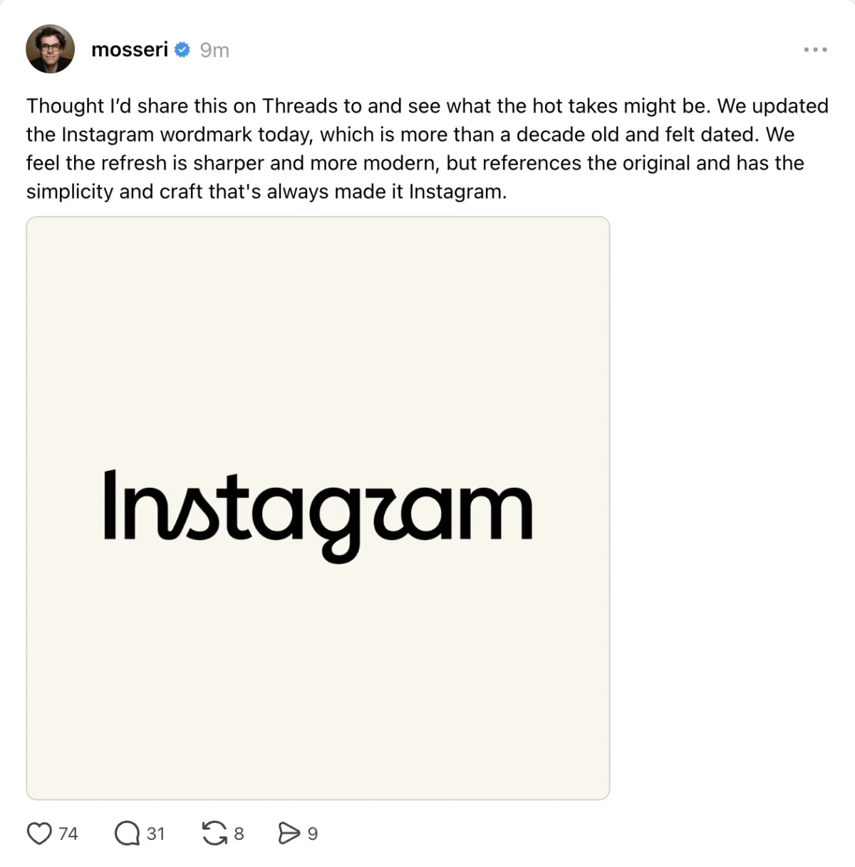
Instagram, the ubiquitous social media platform, on Thursday, August 13, 2026, introduced a significant update to its brand identity, unveiling a new wordmark – its text-only logo that spells out the company’s name. This strategic refresh, announced by Instagram head Adam Mosseri across both Instagram and Threads, marks a conscious effort to modernize the platform’s visual presence, citing that the previous wordmark had begun to feel "dated" after a decade of continuous use. Mosseri described the new logo as "sharper and more modern," emphasizing that it retains a clear reference to the original design while upholding principles of simplicity.
The redesign comes at a pivotal moment for Instagram, a platform that has grown from a niche photo-sharing app into a global multimedia powerhouse boasting over 2.5 billion monthly active users by early 2026. Its enduring influence in the digital landscape necessitates a brand image that reflects its current status as a cultural arbiter, a hub for commerce, and a leader in visual communication. The decision to update the wordmark, rather than its widely recognized gradient camera icon, highlights a focus on the fundamental textual representation of the brand, a subtle yet impactful shift in how Instagram projects its identity to its vast and diverse user base.
A Chronology of Instagram’s Evolving Visual Identity
Instagram’s journey through brand evolution began shortly after its launch in October 2010. The original icon, a skeuomorphic representation of a vintage Polaroid camera, quickly became iconic, embodying the app’s initial focus on retro-filtered photography. This early branding resonated deeply with users seeking a nostalgic yet innovative way to share moments. The accompanying wordmark, often seen in a distinct script font, further cemented this vintage aesthetic.
A significant turning point occurred in May 2016 when Instagram underwent its most dramatic visual overhaul to date. This redesign saw the departure from the classic brown camera icon in favor of the now-familiar vibrant, gradient-colored camera logo. This shift was more than just cosmetic; it symbolized Instagram’s transition from a niche photography app to a broader social media platform, integrating features like Stories and video content. The accompanying app interface also transformed, moving from a blue-and-white theme to a minimalist black-and-white design, intended to put greater emphasis on user-generated content rather than the app’s chrome. At the time, the company explained this change as a reflection of how diverse and full of life the community had become, evolving beyond a simple photo filter app. The wordmark introduced alongside this 2016 update, while modernizing the script, retained a certain elegance that harkened back to the platform’s original artistic aspirations. This wordmark, now deemed "dated," served the brand for eight years, witnessing Instagram’s explosive growth and diversification into Reels, Shopping, and enhanced direct messaging capabilities.
The latest update in August 2026 therefore represents the third major iteration of Instagram’s core visual identity. Unlike the 2016 change which encompassed both the icon and the app interface, this current refresh is specifically focused on the wordmark. This targeted approach suggests a refinement of an already established and recognized visual system, rather than a radical overhaul.
The Rationale Behind the Redesign: Modernity and Relevance
The explicit reasoning provided by Adam Mosseri — that the older wordmark "felt dated after a decade in use" — underscores a common challenge faced by long-standing digital brands. In the rapidly evolving tech landscape, visual identities can quickly become obsolete, failing to convey the dynamism and forward-thinking nature expected by modern consumers. A brand’s visual language needs to continuously adapt to reflect technological advancements, shifts in design trends, and the evolving demographics of its user base.
The 2016 wordmark, while contemporary for its time, likely suffered from an increasing disconnect with current digital aesthetics, which prioritize clean lines, geometric precision, and highly legible typography that performs well across a myriad of screen sizes and resolutions. As Instagram continued to expand its functionalities – from short-form video content with Reels to e-commerce integrations and creator monetization tools – its brand identity needed to project a sense of sophistication and enduring relevance. The term "dated" implies a perception of stagnation, which is antithetical to a platform that thrives on continuous innovation and trendsetting.
Furthermore, within the broader Meta ecosystem, consistency in design language is becoming increasingly crucial. With Threads, Instagram’s text-based companion app, gaining traction, and Meta’s overarching vision for the metaverse, a unified and modern aesthetic across its family of applications helps reinforce corporate identity and user trust. An updated wordmark for Instagram could be seen as aligning its core brand more closely with Meta’s contemporary design principles, ensuring a cohesive user experience across interconnected platforms.
Deconstructing the New Wordmark: Design Choices and Public Reception
The newly introduced wordmark retains the lowercase "instagram" spelling, a deliberate choice that maintains an approachable and user-friendly tone. However, the font itself is the subject of considerable discussion. Mosseri’s description of it as "sharper and more modern" points to a typeface that likely features cleaner lines, potentially a more geometric construction, and improved optical clarity. The visual evidence, as shared by Instagram, confirms a departure from the softer, more calligraphic style of its predecessor.
The new wordmark incorporates artistic flourishes, particularly in letters like ‘s’, ‘r’, and ‘g’, which evoke a sense of cursive writing. For instance, the ‘s’ might feature a distinctive loop or sail-like curve, and the ‘r’ has a unique ascender or descender that alters its traditional form. This choice, while aiming for distinctiveness and a nod to traditional craftsmanship (like a signature), has inadvertently sparked public commentary. A recurring observation among users is that the stylized ‘r’ can, at first glance, appear like a ‘z’, leading to playful remarks about the logo reading "Instagzam."

This phenomenon highlights a classic tension in logo design: the balance between distinctiveness and legibility. While the artistic interpretation adds character and aims to make the wordmark memorable, it risks momentarily confusing a global audience accustomed to standardized letterforms. However, given Instagram’s immense brand recognition, it is highly probable that most users will quickly acclimate and correctly identify the brand, despite initial optical illusions. The psychological principle of "gestalt" suggests that humans perceive entire forms rather than isolated elements, meaning the overall shape of "Instagram" will likely override any momentary misinterpretation of a single letter.
The incorporation of cursive-like elements is also an intriguing design decision, especially considering evolving educational trends. In many modern curricula, cursive writing is no longer taught as extensively as it once was, raising questions about how younger, digitally native generations might perceive or interpret these stylistic choices. For some, it might lend a sophisticated, handcrafted feel; for others, it might appear less immediately decipherable than a more conventional sans-serif typeface. This juxtaposition of traditional script elements with a desire for "modernity" suggests an attempt to bridge generational aesthetics and cultural references, aiming for a timeless quality rather than merely chasing fleeting trends.
User Reception and the Psychology of Brand Change
As with any significant brand redesign, Instagram’s new wordmark has been met with a spectrum of reactions, ranging from enthusiastic approval to vocal criticism. This phenomenon is not unique to Instagram; consumers often develop a deep emotional connection to established brand identities, viewing them as symbols of familiarity, trust, and even personal history. Changes can evoke a sense of loss or discomfort, regardless of the objective merits of the new design.
Positive feedback has largely focused on the "fresher look" and "sharper" aesthetic, with some users praising the specific font choice for its contemporary feel and perceived elegance. These reactions often come from individuals who appreciate design evolution and see the update as a necessary step for a leading tech brand to maintain its relevance. They might perceive the change as an indication of Instagram’s continued innovation and commitment to a modern user experience.
Conversely, the complaints and humorous observations, such as the "Instagzam" meme, reflect the immediate and often visceral reactions to alterations in a deeply ingrained visual cue. Some users might find the new font less appealing, less legible, or simply unnecessary. The aversion to change, particularly concerning beloved brands, is a well-documented psychological phenomenon. Brands like Gap, Tropicana, and even Airbnb have faced significant backlashes for logo redesigns in the past, sometimes leading to a reversion to older designs. The key for Instagram will be to monitor sustained user sentiment and ensure that the new wordmark ultimately enhances, rather than detracts from, the overall brand experience.
Broader Industry Implications and Future Outlook
Instagram’s wordmark update is not an isolated event but rather indicative of broader trends in digital branding and corporate identity. In an increasingly crowded and visually saturated digital landscape, a strong, adaptable, and recognizable brand identity is paramount. Companies regularly invest in rebranding efforts to signify growth, pivot in strategy, appeal to new demographics, or simply refresh their image to remain competitive.
The move towards cleaner, more versatile typography is a hallmark of modern digital design. Typefaces that offer excellent legibility across various screen sizes, from smartwatches to large desktop monitors, and within diverse digital environments (apps, websites, advertisements) are highly valued. The emphasis on "simplicity" in Mosseri’s statement aligns with this trend, suggesting a design that is scalable and functions effectively in an omnichannel context.
This update also carries implications for Instagram’s competitive standing. Platforms like TikTok have leveraged distinct visual and auditory branding to cultivate a strong identity among younger audiences. By modernizing its wordmark, Instagram aims to reinforce its position as a contemporary and forward-thinking platform, capable of competing with newer entrants while retaining its established user base. It signals an ongoing commitment to staying visually current in a market where aesthetics play a crucial role in user engagement and brand loyalty.
While Meta has not yet provided further comment on the redesign or hinted at additional visual changes, such as an updated app icon, it is common for wordmark refreshes to be part of a larger, phased brand evolution. A new wordmark often sets the tone for subsequent updates to user interfaces, marketing materials, and potentially even the app icon itself. The question of whether the vibrant gradient camera icon will eventually align with the new wordmark’s aesthetic remains open, but the current focus on typography suggests a foundational step in a potentially broader brand strategy. This measured approach allows Instagram to introduce change incrementally, mitigating potential user backlash while progressively aligning its visual identity with its long-term strategic goals within the expansive Meta universe. The new wordmark, therefore, is more than just a font change; it is a statement about Instagram’s continued evolution, its commitment to modernity, and its enduring relevance in the ever-shifting landscape of digital communication.

