
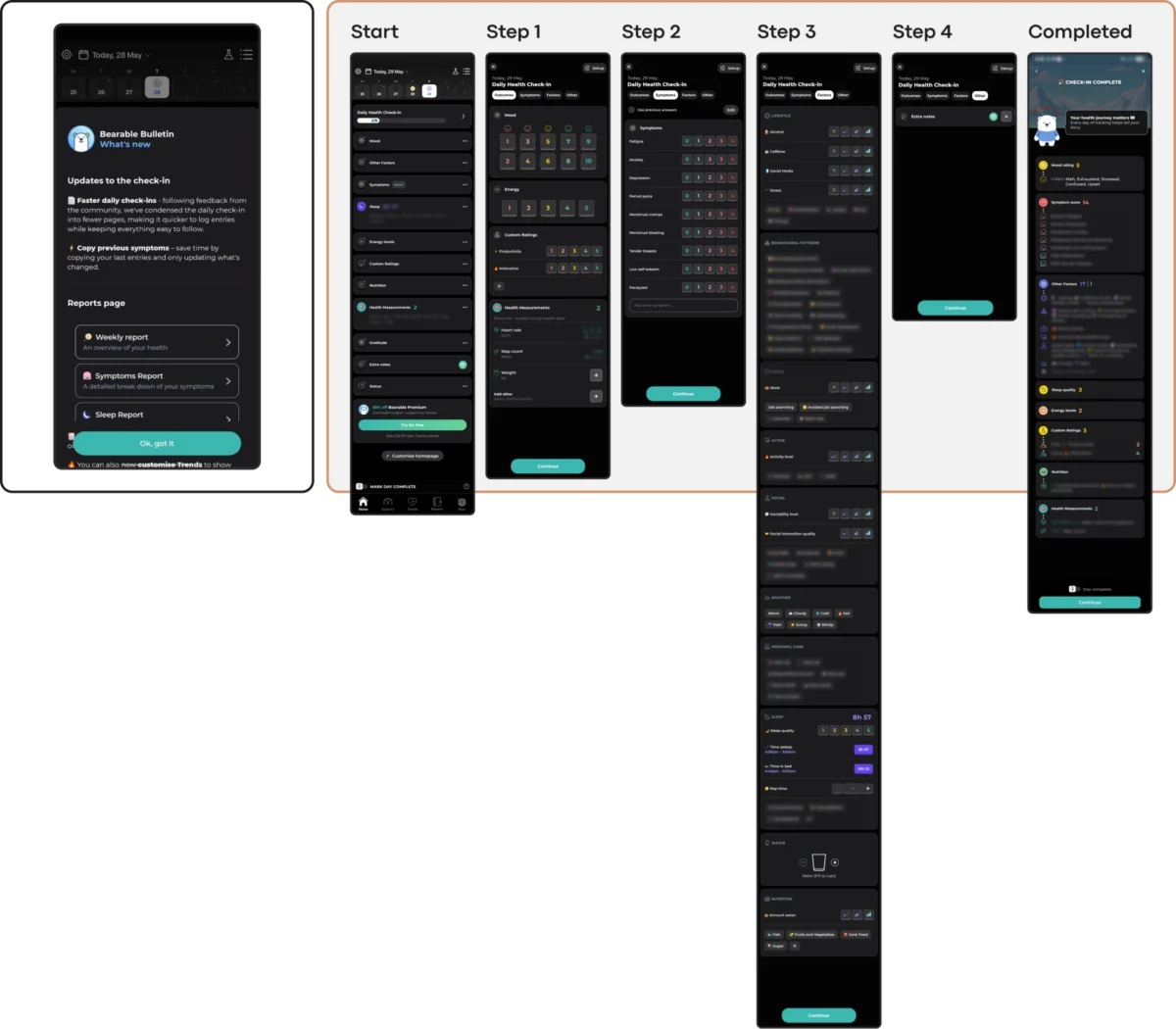
The global mental health technology sector is currently grappling with a measurable retention crisis, as data reveals a staggering disconnect between initial user interest and long-term engagement. Despite the proliferation of wellness applications, research indicates that nearly 95% of users who download a mental health app abandon it within the first 30 days. With a median 30-day retention rate of just 3.3%, even industry leaders in the space lose approximately half of their user base within the first ten days of interaction. While marketing and content play significant roles in these figures, design experts are increasingly pointing toward a fundamental conflict: the friction between modern UI trends and the specific cognitive needs of users in distress.

Kat Homan, a prominent voice in the user experience (UX) design community, has introduced a new evaluation framework aimed at helping developers determine whether visual and interaction patterns support or undermine therapeutic goals. The core of the issue lies in the fact that most contemporary design trends are optimized to capture attention and signal innovation—goals that are often diametrically opposed to the needs of mental health users, which include reducing cognitive strain, fostering trust, and providing a sense of refuge.

The Retention Collapse and the "Leaky Bucket" of mHealth
The data regarding mental health app abandonment is stark and consistent across multiple studies. According to research published in the Journal of Medical Internet Research (JMIR) in 2019, the "leaky bucket" phenomenon in mobile health (mHealth) is more pronounced than in almost any other app category. Users typically approach these tools not out of casual curiosity, but from a state of acute need—often while experiencing stress, anxiety, exhaustion, or overwhelming emotion.

In these high-pressure states, the human brain’s executive function is frequently compromised. What a healthy user might perceive as a "delightful surprise" or a "flashy animation" can, for a distressed user, manifest as a significant cognitive barrier. Research suggests that when an interface requires excessive parsing or unconventional navigation, it adds a layer of effort that users simply cannot afford. This "cognitive tax" is cited as a primary driver for the 50% drop-off seen in even the most recognized mental health "giants" within the first week of use.

The Evolution of UI Trends vs. Clinical Utility
To understand why this conflict exists, one must look at the trajectory of user interface design over the last decade. The industry has moved through various phases, from the realism of skeuomorphism to the starkness of flat design, and more recently, toward "Neo-brutalism" and "Glassmorphism."

- Neo-Brutalism and High Contrast: This trend utilizes bold lines, clashing colors, and stark shadows. While effective for a fashion brand or a creative portfolio, these elements demand significant visual parsing. For an individual in the midst of a panic attack or deep depressive episode, such high-energy visuals can be overstimulating and physically uncomfortable.
- Hidden Navigation and Gesture-Only Controls: Modern UX often favors "clean" screens that hide menus behind non-standard swipes or unlabeled icons. This forces the user to guess rather than recognize. In a mental health context, where predictability is a therapeutic requirement, these "puzzles" lead to immediate frustration.
- Abstract Iconography: Without text labels, abstract icons require users to recall specific meanings. When cognitive load is already high due to internal distress, this reliance on memory over recognition becomes a point of failure.
Emotional Mismatch and the Erosion of Trust
The visual language of an app serves as its "bedside manner." Recent studies investigating the influence of aesthetics on mood in mHealth apps suggest that users in distress show a marked preference for subtlety. There is a documented desire for dark palettes, sleek aesthetics, and uncluttered layouts.

A common pitfall in wellness design is "toxic positivity"—the use of overly bright, cheerful colors and "happy" animations regardless of the user’s input. For someone logging a low mood or a traumatic event, a burst of digital confetti or a bright yellow "Great job!" screen creates a jarring emotional mismatch. This dissonance erodes trust, making the app feel less like a supportive tool and more like a tone-deaf automated system.

Industry analysts point to apps like Calmer as examples where engagement mechanics sometimes conflict with the product’s relaxed tone. Features such as discount wheels or aggressive upsell prompts can disrupt the therapeutic environment, reminding the user they are in a commercial ecosystem rather than a safe space.

Case Studies in Low-Friction Design: Bear Room and Teeni
In response to these design challenges, new applications are beginning to prioritize "state-aware" interactions. The app Bear Room, designed for stress and anxiety reduction, utilizes a "cosy room" metaphor. Instead of a complex dashboard, the app uses familiar objects—a lamp, a window, a chair—as navigation points. This leverages existing mental models of a safe physical space to reduce the effort required to navigate a digital one.

Furthermore, Bear Room incorporates voice-to-text as a primary input method. Recognizing that typing can be overwhelming for those in a high-capacity state, the app allows users to speak their thoughts. This "low-friction" entry point ensures that the barrier to getting help is as low as possible.

Similarly, the app Teeni, which supports parents of teenagers, utilizes a "Quick Relief" button that triggers a "Hot Flow." This specific pathway allows users to vent immediate frustrations through voice input before transitioning into a "Cold Flow" of reflective resources. This chronological approach acknowledges the user’s physiological state, moving from emotional release to cognitive reflection only when the user is ready.

The Coercion Paradox: When Gamification Backfires
One of the most debated trends in mHealth is the use of "persuasion patterns" borrowed from Duolingo or social media. Streaks, badges, and aggressive notifications are designed to maximize screen time. However, in mental health, these can become sources of performance pressure and guilt.

For a user managing depression, a notification that they have "lost their 10-day streak" can be perceived as a personal failure, potentially exacerbating the feelings they are trying to manage. Designers are now advocating for "forgiving streaks." In Bear Room, for example, streaks do not reset if a day is missed; instead, the system focuses on rewarding the return rather than punishing the absence. This shift from "coercive retention" to "supportive presence" is seen as essential for long-term clinical efficacy.

Accessibility as a Foundational Constraint
The population requiring mental health support disproportionately includes individuals with cognitive, visual, or motor accessibility needs. Popular trends often compromise these requirements:

- Minimalist Contrast: Low-contrast text (e.g., light gray on white) fails WCAG 2.2 standards, which require a 4.5:1 ratio for body text.
- Target Size: Trendy, small buttons are difficult for users with unsteady hands or those experiencing the physical tremors sometimes associated with high anxiety.
- Motion Sensitivity: Parallax scrolling and sudden animations can trigger vertigo or sensory overload in neurodivergent users.
Experts argue that accessibility is not a "layer" to be added at the end of development but a constraint that must define the design from day one.

The Homan Five-Point Evaluation Framework
To bridge the gap between design and therapy, Kat Homan proposes a five-point evaluation framework for any new UI element in a mental health app:

- Cognitive Load: Does this element require the user to learn a new pattern, or does it utilize a familiar one?
- Emotional Alignment: Does the visual tone match the user’s likely state of mind during this specific interaction?
- Navigational Reliability: Is the path to support predictable and stable, or does it change based on "novelty"?
- Accessibility Compliance: Does it meet WCAG 2.2 standards for contrast, target size, and motion?
- Non-Coercive Engagement: Does it encourage return through support, or does it use shame and pressure?
Global Implications and the Future of mHealth
The stakes for improving mental health app design are immense. The World Health Organization (WHO) estimates that over one billion people globally live with a mental disorder. In the last decade alone, cases of depression and anxiety have surged by 25%. As traditional healthcare systems remain overextended, digital tools are often the first—and sometimes only—line of support for millions.

The future of the industry likely lies in "quiet design"—interfaces that do not seek to be the center of attention but act as a reliable, invisible helper. The transition from "attention-grabbing" to "refuge-offering" represents a maturation of the mHealth sector. As the focus shifts from winning design awards to achieving clinical outcomes, the industry is beginning to recognize that the best interface is often the one that helps the user feel the most understood, even if it is the least "trendy."

Ultimately, the measure of success for a mental health app is not how many minutes a user spends on the screen, but how much better they feel once they put the phone down. By aligning UI patterns with the psychological realities of distress, developers can finally begin to address the retention crisis and deliver on the promise of digital therapeutics.

