
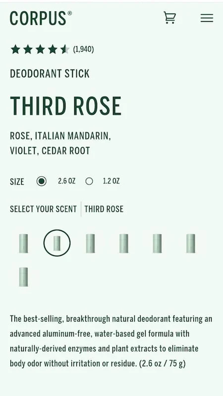
A burgeoning trend in e-commerce design, characterized by the complete inundation of product pages with the color of the item being sold, is proving to be a significant detriment to user experience (UX) and, consequently, conversion rates. This immersive design strategy, while perhaps intended to create a cohesive brand aesthetic, inadvertently introduces critical usability issues that hinder customer navigation and decision-making. Experts in user interface design and consumer psychology are increasingly vocal about the negative implications of this approach, citing its potential to obscure vital information and frustrate potential buyers.
The fundamental principle of effective e-commerce design is to facilitate a seamless and intuitive journey for the customer. Users are driven by a desire for efficiency, seeking to move from discovery to purchase with minimal cognitive load. Any element that introduces friction, forcing users to expend unnecessary mental energy, acts as a "speed bump" on this path. The practice of coloring an entire product page—from background elements and typography to call-to-action buttons and discount indicators—to match the product’s primary hue directly contravenes this principle. This monochromatic approach creates a visual landscape where distinctions blur, and the user’s ability to quickly identify and interact with key information is compromised.
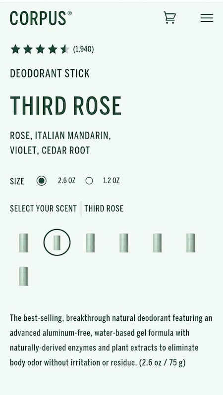
Consider the hypothetical scenario of a consumer drawn to a new natural deodorant brand, attracted by its promise of eco-friendly ingredients and a pleasant scent. Upon arriving at the product page on their mobile device, they are confronted with a screen where every element is rendered in a shade of green, mirroring the product’s packaging. This creates an immediate challenge: how to differentiate between various scent options or understand the nuances of the product offering. Without clear visual cues, the user is left to question if all scents are identical or if they must individually click on each small, indistinct option to glean information. This uncertainty can lead to a perception of technical issues or poor mobile optimization, prompting the user to abandon the current device and attempt to access the page on a larger screen, hoping for better clarity.
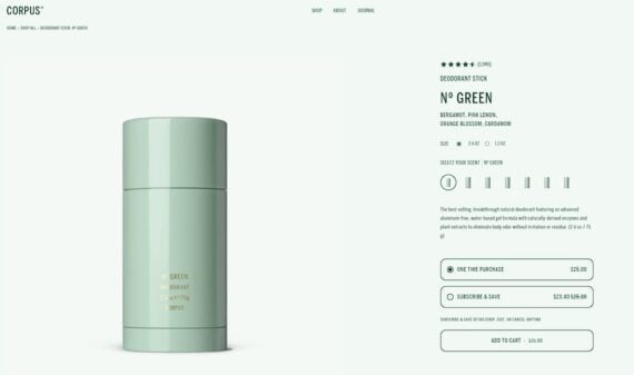
The desktop experience, in many instances, exacerbates the problem. While offering more screen real estate, the monochromatic design persists, often rendering the product page even more visually monotonous. In the case of the natural deodorant brand, the desktop version presents a similarly green-dominated interface. Here, the primary visual elements that might offer some respite are the product name and the product image itself. However, the scent variations, often presented as small swatches or text links, remain indistinguishable from one another. The absence of clear visual indicators for interactive elements becomes a critical flaw. Links, discount tags, and even the crucial "add to cart" button can become visually lost within the pervasive green. The subscription discount, often a key persuasive element, might appear as a struck-through price that blends seamlessly with other page elements, diminishing its impact. The call to action, the button that signifies the culmination of the customer’s journey, fails to stand out, its urgency and importance lost in the sea of green.
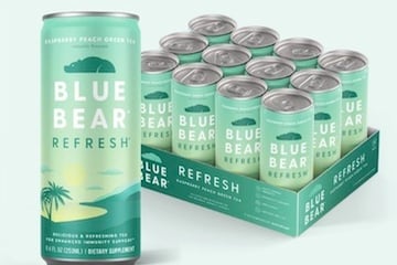
This design philosophy extends beyond personal care products. An examination of an online tea retailer, "Blue Bear," exemplifies an even more extreme application of this trend. Their product pages, dedicated to various herbal infusions, are overwhelmingly green. The product name, benefit tags, icons, subscription savings, and the "add to cart" button are all subjected to this color saturation. The example of a 12-pack offering demonstrates how the dominant green fill of the product description can merge with the "Subscribe & Save" box below it, further obscuring the distinction between informational elements and interactive components.
The analogy of a student highlighting every sentence in a textbook is apt here. When everything is emphasized, nothing is truly highlighted. Similarly, when a single color dominates an entire web page, the visual hierarchy is flattened. The intended purpose of color in design—to convey priority, guide attention, and signal action—is undermined. A core tenet of user interface design is to establish a clear visual hierarchy, guiding the user’s eye through the content, indicating what is most important, what can be explored later, and what action is expected. Color, when used strategically through contrast, is a powerful tool for achieving this. Elements that differ from their surroundings naturally draw the eye. By enveloping the entire page in a single brand color, this inherent contrast is eliminated, rendering all elements visually equal and, therefore, equally insignificant.
The Psychology of Color and User Perception
The effectiveness of color in web design is deeply rooted in psychological principles and established human perception. Colors evoke emotions, convey meaning, and influence behavior. While a brand’s primary color can establish identity and reinforce brand recognition, its pervasive application on a product page can lead to cognitive overload. Users process information more effectively when there are clear points of contrast that allow them to quickly scan and identify key information.
- Contrast and Hierarchy: Research in human-computer interaction consistently demonstrates the importance of contrast in drawing user attention. A study published in the Journal of Usability Studies highlighted how visual contrast is a primary driver of information salience. When all elements share the same color, the ability to discern functional elements like buttons, links, and pricing information is severely hampered. This lack of contrast forces users to engage in a more deliberate and time-consuming process of deciphering the page’s layout.
- Cognitive Load: Excessive visual uniformity can increase cognitive load, the amount of mental effort required to process information. A paper presented at the ACM Conference on Human Factors in Computing Systems (CHI) noted that users prefer interfaces that minimize extraneous cognitive load, allowing them to focus on their task. Monochromatic product pages, by forcing users to hunt for essential details, increase this load, potentially leading to frustration and abandonment.
- Brand Consistency vs. Usability: While brand consistency is crucial for building recognition, it should not come at the expense of fundamental usability. E-commerce platforms are increasingly recognizing this trade-off. Data from Nielsen Norman Group, a leading authority on user experience, indicates that sites with clear visual hierarchy and intuitive navigation consistently outperform those that prioritize aesthetics over functionality. For instance, a report on e-commerce conversion rates found that a 1-second delay in page load time can result in a 7% reduction in conversions. While this refers to load time, the principle extends to perceived load time due to poor usability. If a user spends an inordinate amount of time trying to understand a page, it feels as if it is taking longer to load and interact with.
The Chronology of a Design Trend
The trend of color-matching product pages appears to have gained traction in recent years, possibly driven by a desire for highly curated and aesthetically pleasing brand presentations, particularly on visually-oriented social media platforms and within the "lifestyle" e-commerce sector. Early adopters likely focused on brands with strong, distinctive color identities, aiming to create an immersive brand experience.
- Emergence (Late 2010s – Early 2020s): As brands increasingly invested in sophisticated branding and visual storytelling, the idea of extending brand colors beyond logos and basic assets to the entire user interface began to emerge. This was often seen on mobile-first websites where a strong visual impact was prioritized.
- Peak Popularity (Early 2020s): The trend reached a point where it was observable across various product categories, from beauty and fashion to home goods and even food and beverage. Brands experimenting with vibrant and distinct color palettes were more likely to adopt this approach.
- Growing Criticism and Re-evaluation (Mid-2020s onwards): As more data on user behavior and conversion rates became available, and as UX best practices became more widely understood, the drawbacks of this extreme monochromatic approach began to surface. Industry publications and UX professionals started to highlight the negative impacts on usability.
While specific data on the prevalence of this exact trend is difficult to quantify without large-scale audits, anecdotal evidence and observation of e-commerce sites reveal its persistent presence. The companies cited, Corpus and Blue Bear, represent examples of brands that have implemented this design choice, leading to the critical analysis presented.
Implications for E-commerce Businesses
The adoption of a monochromatic design strategy on product pages carries significant implications for e-commerce businesses:
- Reduced Conversion Rates: The most direct consequence is a potential decline in conversion rates. When customers struggle to navigate a page, find information, or locate the "add to cart" button, they are more likely to abandon their purchase. This directly impacts revenue and profitability.
- Increased Bounce Rates: Frustrated users are likely to leave the site quickly, increasing bounce rates. High bounce rates signal to search engines that a website may not be providing valuable content or a good user experience, potentially affecting search engine rankings.
- Damaged Brand Perception: While intended to enhance brand identity, a poorly designed user experience can inadvertently create a negative perception of the brand. Customers may associate the brand with being difficult to interact with or unconcerned with customer ease.
- Accessibility Concerns: Beyond general usability, monochromatic designs can pose significant accessibility challenges for users with visual impairments, such as color blindness. Adequate contrast is a fundamental requirement for web accessibility standards like WCAG (Web Content Accessibility Guidelines).
Expert Perspectives and Industry Standards
Leading figures in UX design and e-commerce strategy consistently advocate for clarity and contrast in digital interfaces.
"The core of good UX is to remove friction," states a senior UX consultant who preferred to remain anonymous to speak freely. "When a design decision, however aesthetically driven, creates obstacles for the user, it’s a failed design. Color should be a tool to guide, not to overwhelm. We see this trend where brands are so focused on their visual identity that they forget the primary purpose of a product page: to sell a product by making it easy for the customer to understand and buy it."
Industry best practices, as outlined by organizations like the Interaction Design Foundation and the Nielsen Norman Group, emphasize the importance of:
- Clear Visual Hierarchy: Using size, color, contrast, and spacing to indicate the relative importance of different elements.
- Distinct Calls to Action: Ensuring that buttons and links are easily identifiable and stand out from surrounding content.
- Readability: Employing sufficient contrast between text and background colors for comfortable reading.
- Consistency: Maintaining a consistent design language across the website, but allowing for variations that enhance usability.
Moving Forward: Balancing Aesthetics and Functionality
The allure of a fully immersive brand experience is understandable, but it must be tempered with a deep understanding of user behavior and cognitive psychology. E-commerce designers and marketers should strive for a balance where brand aesthetics enhance, rather than detract from, the user’s journey.
- Strategic Use of Color: Employing brand colors as accents, for key interactive elements, or for specific informational highlights can be highly effective without sacrificing clarity.
- Contrast as a Tool: Utilizing contrast to draw attention to crucial elements like pricing, discounts, and add-to-cart buttons is essential for driving conversions.
- A/B Testing: Implementing A/B testing on product page designs can provide invaluable data on how different visual approaches impact conversion rates and user engagement. This data-driven approach can help identify optimal design strategies.
- Prioritizing Accessibility: Ensuring that all design choices adhere to accessibility standards will broaden the appeal of the product and demonstrate a commitment to inclusive design.
Ultimately, the goal of e-commerce design is to facilitate a positive and efficient customer experience that leads to successful transactions. While monochromatic product pages may offer a striking visual statement, their detrimental impact on usability suggests that a more nuanced and contrast-driven approach is necessary for long-term e-commerce success. The trend, while visually bold, represents a misstep in prioritizing brand immersion over fundamental user needs.

