
The landscape of front-end web development is currently undergoing one of its most significant structural shifts since the introduction of responsive web design in 2010. While media queries have served as the industry standard for over a decade, a newer specification known as CSS Container Queries has reached a critical mass of browser support, currently sitting at approximately 94% across all major engines. Despite this near-universal compatibility, recent industry data suggests a significant disconnect between developer awareness and actual implementation. This technical evolution marks a transition from "macro-layout" thinking, which relies on the browser viewport as a proxy for layout logic, to "micro-layout" architecture, where individual components possess the intrinsic intelligence to adapt to their immediate surroundings.
The State of Adoption: Awareness vs. Implementation
According to the latest State of CSS survey, a comprehensive annual report tracking the habits and preferences of thousands of global developers, approximately 86% of the workforce is aware of the existence of container queries. However, the data reveals a stark contrast in practical application, with only 41.4% of respondents reporting that they actually use the feature in production environments. This gap has become a focal point of discussion within the web standards community.
Industry experts, including prominent CSS educator Kevin Powell, have noted that the adoption of container queries has been unexpectedly slow. Speaking at SmashingConf Amsterdam, Powell characterized the adoption rate as "terrible," a sentiment that appears contradictory to the historical demand for the feature. For years, the ability for components to respond to their container’s size—rather than the entire screen’s width—was at the top of developer "wishlists" and feature requests for the W3C (World Wide Web Consortium).
The slow uptake is attributed to several factors, primarily the deep-seated muscle memory associated with media queries. For many developers, the viewport-based approach has become synonymous with "responsiveness," leading to a misunderstanding of how container queries differ in both syntax and fundamental philosophy.
Historical Context: From Viewports to Containers
To understand the current shift, one must look at the chronology of responsive design. In May 2010, Ethan Marcotte coined the term "Responsive Web Design," proposing a system of fluid grids, flexible images, and media queries. At that time, the primary challenge was the emergence of smartphones; the goal was to make a single website look acceptable on both a desktop and a mobile device.
In this era, the browser viewport was a reliable proxy. If a screen was 480 pixels wide, the developer could safely assume the user was on a mobile device and adjust the entire page accordingly. However, as web applications grew in complexity and the industry moved toward component-based frameworks like React, Vue, and Svelte, the limitations of the viewport-based model became apparent.
Modern web architecture relies on reusable components. A "card" component might appear in a wide hero section on the homepage, a narrow sidebar on a blog post, or a medium-sized grid cell on a search results page. Using traditional media queries, that card cannot know its own width; it only knows the width of the entire browser. If the browser is 1920 pixels wide, the media query will trigger "desktop" styles, even if the card itself is squeezed into a 300-pixel sidebar, leading to broken layouts, overlapping text, and poor user experiences.
Technical Analysis: Macro-Layout vs. Micro-Layout
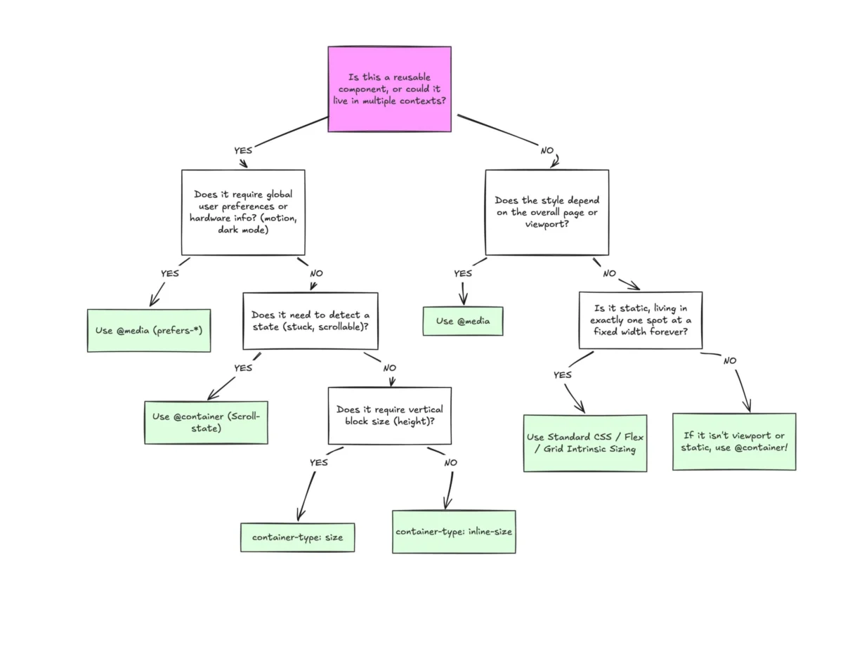
The distinction between @media and @container queries is best categorized as a separation of layout concerns. Professional architectural standards now suggest a bifurcated approach:
Macro-Layouts (Media Queries)
Media queries remain the optimal tool for "macro" layout decisions. These are global concerns that affect the entire page structure, including:

- Primary grid systems (e.g., changing from a 12-column layout to a 1-column stack).
- Global navigation headers and footers.
- System-level preferences such as
prefers-color-scheme(dark mode) orprefers-reduced-motion. - Device-specific capabilities like touch-screen detection or print styles.
Micro-Layouts (Container Queries)
Container queries are designed for "micro" layouts, focusing on the internal logic of a component. This includes:
- Individual widgets, cards, and form elements.
- Internal typography scaling.
- Dynamic adjustment of flexbox or grid properties within a component.
- Contextual styling where a component must change its appearance based on whether it is placed in a sidebar, a modal, or a main content area.
The technical implementation of a container query requires a two-step process: defining a container and then querying it. By setting a container-type (usually inline-size), a developer instructs the browser to track the dimensions of that specific element. This allows the children of that element to use the @container rule to adjust their styles based on the space available to them, independent of the viewport.
Impact on Fluid Typography and Layout Logic
One of the most immediate benefits of container queries is the introduction of new CSS units: cqi (container query inline-size), cqw (container query width), and cqb (container query block-size). These units allow for "fluid typography" that is truly contextual.
In traditional responsive design, developers often use viewport units (vw) to scale text. However, text tied to the viewport can become illegibly large on ultra-wide monitors or remain too small in a narrow sidebar on a large screen. By using cqi units in conjunction with the CSS clamp() function, developers can ensure that a headline scales relative to the container it lives in. This ensures visual harmony regardless of where the component is placed in the DOM (Document Object Model).
Furthermore, container queries provide a CSS-native solution for detecting "flex-wrap" states. While Flexbox is excellent at wrapping content to a new line, CSS has historically lacked a mechanism to change an element’s style because it wrapped. By nesting container queries within flex items, developers can now trigger style changes—such as changing background colors or alignment—exactly when a component’s width crosses a specific threshold, a task that previously required JavaScript-based ResizeObserver implementations.

Industry Challenges and Technical Limitations
Despite the advantages, the transition to container queries is not without friction. There are several technical caveats that developers must navigate:
- The Parent-Child Constraint: A fundamental rule of the specification is that a container cannot query itself. This is a preventative measure against infinite loops (e.g., a container shrinking because its width changed, which then triggers a style that makes it grow). This requires developers to add extra "wrapper" elements to their HTML structure, which some argue adds unnecessary bloat.
- Layout Collapse: When a developer sets an element to
container-type: size, the browser ignores the size of its children when calculating the initial layout. Without an explicit height or aspect ratio, the container may collapse to zero pixels, a common pitfall for those transitioning from media queries. - Custom Property Limitations: Currently, container queries cannot query against CSS custom properties (variables). This limits the ability to create dynamic, variable-driven breakpoints, although discussions within the W3C are ongoing to address this in future levels of the specification.
Broader Implications for the Modern Web
The shift toward container queries represents a maturation of the web as a platform. With over 2,300 unique viewport sizes identified in modern web traffic, the strategy of designing for specific "device breakpoints" (such as 768px for tablets) is increasingly viewed as an exercise in futility.
The move toward container-based logic aligns with the broader industry trend of "Design Systems." Large organizations like Google, Adobe, and Shopify rely on design systems where components must be "context-agnostic." A button or a data table must function perfectly whether it is in a full-screen dashboard or a small pop-over.
In conclusion, while media queries are not obsolete, their role is being redefined. The emergence of container queries allows developers to build components that are truly modular and self-aware. As the industry moves past the initial learning curve, the expectation is that container queries will become the primary tool for component styling, leaving media queries to handle the global orchestration of the page. This transition marks the end of the "proxy era" and the beginning of a more robust, content-centric approach to digital design.

