
The Nielsen Norman Group (NN/g), a leading authority in user experience research, has released a comprehensive analysis regarding the effectiveness of accordion icons and the structural integrity of navigation menus. This research addresses a long-standing debate within the web design community: how to best signal to a user that a content area can be expanded or collapsed without causing cognitive friction or navigational errors. The findings suggest that while various symbols such as chevrons, arrows, and plus signs are common, the "caret" icon remains the most reliable choice for ensuring user clarity. Furthermore, the study issues a stern warning against the use of "split menus," a design pattern where a text label and its accompanying icon perform two different functions, often leading to significant user frustration and abandoned tasks.
The Evolution of the Accordion Component in Digital Interfaces
The accordion—a graphical control element that allows users to expand and collapse sections of content—has its roots in the early days of desktop computing, originally popularized by file directory trees. However, its importance surged with the advent of the "mobile-first" design era. As screen real estate became a premium commodity on smartphones, the accordion became the primary tool for Progressive Disclosure, a technique used to maintain a clean interface by hiding complex information until it is specifically requested by the user.
Over the last decade, the implementation of accordions has transitioned from simple text-based toggles to highly stylized interactive elements. This evolution brought about a proliferation of iconography intended to guide the user. Designers began experimenting with different visual metaphors to indicate hidden content. Yet, as the recent NN/g research highlights, this experimentation has often come at the cost of usability. The chronology of this design shift shows a move from standardized system icons to custom, brand-specific graphics that frequently fail to communicate their intended function.
Analyzing the Efficacy of Standard Iconography
The core of the recent UX study focused on how users interpret four primary icon types: the caret, the arrow, the plus sign, and the triangle. Each carries a different level of "information scent"—the degree to which a user can predict the outcome of an interaction based on visual cues.
The Caret: The Gold Standard for Containment
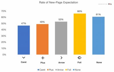
The research identifies the caret (a V-shape or circumflex) as the safest and most intuitive choice for accordions. When pointing downward, it signals that content is contained below; when pointing upward, it indicates that the content can be tucked away. Unlike other symbols, the caret is rarely associated with "moving to a new page." Its visual weight is sufficient to be noticed but light enough to not be mistaken for a call-to-action (CTA) button.

The Arrow: A Source of Navigational Ambiguity
The right-facing arrow is one of the most misused icons in modern UI design. While many designers use it to indicate an expandable menu, users overwhelmingly associate arrows with "linear progression"—the act of leaving the current page to visit a new URL. The NN/g study found that when an arrow is used in a menu, users are often surprised when the page does not change, leading to a momentary lapse in the user’s mental model of the site.
The Plus and Minus Symbols: Overloaded Metaphors
The plus (+) and minus (-) symbols are effective in signaling the addition or removal of content. However, they suffer from "icon overload." In various contexts, a plus sign can mean "add to cart," "zoom in," "create new," or "follow." In multi-level navigation systems, having multiple plus signs visible simultaneously can create a cluttered visual field that makes it difficult for users to determine the hierarchy of information.
The Quantitative Case Against Split Menus
Perhaps the most significant finding in recent UX audits is the detrimental impact of split menus. A split menu occurs when a single navigation item is divided into two distinct hit areas: the text label (which usually links to a category landing page) and an icon (which opens an accordion to show sub-categories).
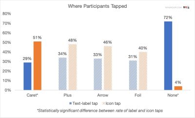
Data from usability testing indicates that users do not perceive these as two separate buttons. Instead, they view the entire row as a single interactive element. When a user intends to see sub-options but accidentally clicks the text, they are forcefully navigated away from their current context. This "accidental navigation" is a primary driver of high bounce rates on mobile e-commerce sites.
The NN/g research found that for most icons, users tap on the label and the icon with roughly equal frequency. The only exception was the caret, where users showed a slightly higher tendency to tap the icon itself. This suggests that the caret has a stronger "affordance" for interaction than other symbols, but even then, it does not justify the use of a split-action pattern.
Industry Case Studies: DHL and Lens.org
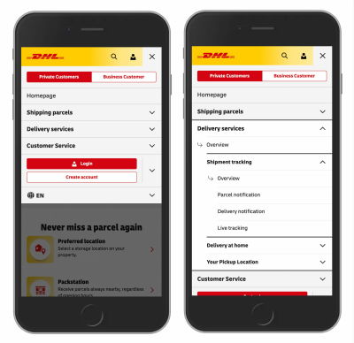
To understand these principles in a real-world context, analysts often point to major logistics and academic platforms. DHL, the global shipping giant, utilizes a navigation model that avoids the pitfalls of split menus. In their mobile interface, clicking a main category simply opens the accordion. To ensure users can still access the "Category Overview" page, DHL includes a dedicated link titled "Overview" or "All Services" inside the expanded menu. This design ensures that the user’s intent to browse sub-options is never interrupted by an unwanted page load.

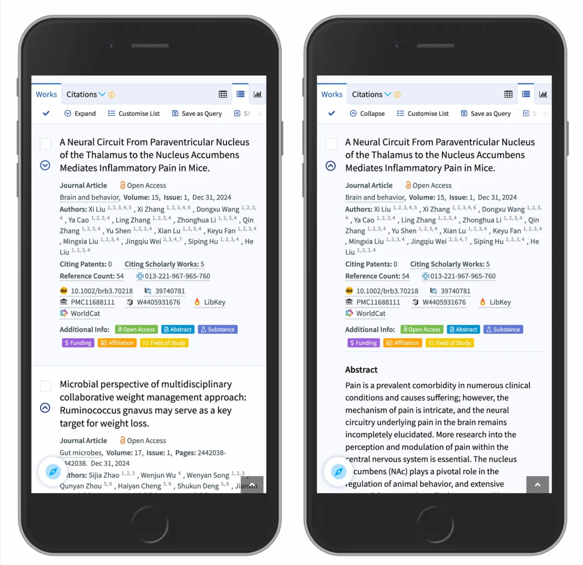
Similarly, the scholarly search engine Lens.org demonstrates the effective use of carets in search result filtering. By using a downward-pointing caret to indicate expandable abstracts, the platform maintains a high "signal-to-noise" ratio. Users can quickly scan titles and only expand the details they find relevant. This implementation respects the user’s cognitive load by keeping the interface predictable and stable.
The Psychological Impact of Visual Cues
The effectiveness of accordion icons is deeply rooted in the psychological principle of "Recognition over Recall." A well-designed interface should not require the user to remember what a specific custom icon does; the icon should leverage existing mental models.
When designers remove icons entirely, as seen in some "minimalist" designs, the results are predictably poor. Without an icon, users assume that a text label is a standard hyperlink. If that label opens an accordion instead of a new page, it violates the "Principle of Least Astonishment." The NN/g findings reinforce the idea that if an element is a link, it should be underlined or styled as a button. If it is a toggle, it must have a directional indicator like a caret.
Broader Implications for Accessibility and SEO
The choice of accordion icons and structures also has significant implications for web accessibility (A11y) and Search Engine Optimization (SEO). From a technical standpoint, accordions must be implemented using proper ARIA (Accessible Rich Internet Applications) attributes. For example, the aria-expanded attribute must toggle between true and false to inform screen reader users of the state of the content.
When split menus are used, they often create a "tabbing nightmare" for keyboard users. A single logical menu item requires two tab stops, doubling the effort required to navigate the site. By simplifying the interaction to a single button that opens a menu—which then contains a link to the parent page—developers create a much more accessible flow.
From an SEO perspective, search engines generally index content within accordions, but the "Information Scent" provided by icons helps reduce bounce rates. If a user finds exactly what they need through a well-organized accordion menu rather than getting lost in a series of unwanted page loads, dwell time increases, which is a positive signal to search engine algorithms.
Expert Reactions and the Future of UI Design
Leading interface designers have reacted to these findings by advocating for a return to "Functional Minimalism." The consensus among industry veterans is that the era of over-designed, custom navigational elements is giving way to a more standardized, utility-focused approach.
"The goal of a navigation menu is to get out of the user’s way," says one senior UX consultant interviewed regarding the study. "When we use arrows that look like links but act like toggles, or when we split a single menu item into two different functions, we are essentially placing hurdles in front of the user. The NN/g research confirms what many of us have seen in the lab: simplicity isn’t just an aesthetic choice; it’s a performance requirement."
Conclusion: Implementing the "Simple is Better" Framework
As digital products continue to grow in complexity, the need for clear, unambiguous navigational signals becomes paramount. The evidence suggests that designers should adhere to three fundamental rules to optimize accordion performance:

- Prioritize the Caret: Use the downward-pointing caret as the default signifier for expandable content. It is the most recognized and least misunderstood icon for this specific task.
- Abolish Split Menus: Ensure that the text label and the icon trigger the same action. If a link to a parent page is necessary, place that link clearly within the expanded content area.
- Use Traditional Cues for Links: If an item is a direct link to another page, use an underline or a distinct button style. Do not rely on arrows or other icons to communicate "link-ness."
By following these data-driven guidelines, organizations can reduce user error, improve accessibility, and create a more seamless digital experience. The move toward simpler, more predictable interfaces reflects a maturing industry that prioritizes user success over visual novelty. In the world of UX, the most effective design is often the one that the user doesn’t have to think about at all.

