
In the competitive landscape of global commerce, the failure of a branding project is rarely a result of poor technical execution during the final design stages. Instead, industry analysis suggests that the breakdown typically occurs much earlier—specifically during the transition from abstract strategy to visual execution. This critical interval, often characterized by the use of undefined adjectives such as "modern," "trustworthy," and "disruptive," frequently leaves a void between a brand’s intended communication and a designer’s creative output. This gap is increasingly being identified by industry experts as the "pre-concept" phase, a vital period of alignment that determines the eventual success or failure of a corporate identity.
The pre-concept phase serves as a structural bridge, moving beyond the traditional creative brief to uncover hidden stakeholder assumptions and establish a shared visual vocabulary. Without this phase, designers are often forced to operate on "guesswork," leading to multiple rounds of revisions, inflated budgets, and diluted brand messaging. Recent data from industry reports indicates that consistent brand presentation can increase revenue by up to 23%, yet many organizations struggle to maintain this consistency because the foundational logic of their visual identity was never clearly articulated during the project’s infancy.
The Semantic Trap: Why Adjectives Fail in Design
At the onset of a branding initiative, design teams are typically inundated with inputs: stakeholder interviews, competitor audits, and a list of desired brand attributes. However, the reliance on broad terminology often creates a false sense of consensus. For example, a stakeholder may request a "premium" aesthetic, which one designer interprets as minimalist and editorial, while another perceives it as opulent and exclusive.
A notable case study involves a health technology firm seeking a brand identity that was simultaneously "modern," "trustworthy," and "disruptive." While "disruptive" often implies bold, unconventional, or even rebellious visual cues in the consumer tech sector, the firm’s primary clients were large-scale government medical institutions. Through the pre-concept inquiry, it was revealed that "disruption" in a conservative healthcare context needed to be expressed through extreme clarity, efficiency, and professional confidence rather than visual noise. Consequently, the firm’s version of "disruptive" appeared more traditional than the word initially suggested. This realization prevented the design team from producing concepts that would have ultimately alienated the target audience.
Stage 1: Researching Brand Context and Perception
The first stage of the pre-concept phase involves moving beyond factual discovery—such as business goals and target demographics—to focus on the psychology of perception. As noted by Marty Neumeier in The Brand Gap, a brand is ultimately a person’s "gut feeling" about a product or service. Therefore, the designer’s primary task is to manage that perception.

To achieve this, design strategists are increasingly utilizing structured workshops to clarify how a brand needs to be perceived versus how it is currently viewed. Key questions during this stage include:
- What must the audience believe about the brand to engage with it?
- In which specific areas must the brand demonstrate the highest level of credibility?
- Which industry-standard visual "codes" should be followed, and which should be intentionally challenged?
By identifying the "tension" within these questions, teams can define the specific "kind" of attribute they are pursuing. In a recent fintech project, a team sought to be "bold" without sacrificing credibility. In the financial sector, boldness must be tempered with signals of security and competence. The pre-concept work determined that the brand’s boldness would be expressed through typography and layout rather than a volatile color palette, ensuring the audience felt the brand was innovative yet safe.
The Chronology of Visual Alignment: Strategic Exercises
To move from verbal strategy to visual direction, two primary exercises have become standard in high-level branding workshops. These exercises are designed to transform abstract ideas into concrete visual boundaries.

Exercise 1: Competitor Perception Mapping
This exercise involves placing competitor brand assets—websites, social media visuals, and product interfaces—onto a two-axis map. The axes are determined by the specific tensions the brand must navigate, such as "Understated vs. Bold" or "Accessible vs. Exclusive."
The value of this mapping is not found in the final placement of logos, but in the dialogue it triggers among stakeholders. When two executives disagree on whether a competitor is "progressive" or "generic," it reveals a misalignment in their internal definitions of those terms. Resolving these discrepancies before a single pixel is moved in a design tool like Figma saves significant resources later in the project timeline.
Exercise 2: The Visual Brand Driver
Based on the principle of metaphor and association, this exercise asks stakeholders to select images for unrelated categories—such as transportation, architecture, or furniture—that represent the company. The instructions emphasize that these choices must reflect the brand’s character rather than the individual’s personal taste.

If a company is likened to a "high-speed train," it suggests reliability, structure, and mass accessibility. If it is likened to a "quiet electric car," it suggests innovation, environmental consciousness, and premium silence. By attaching adjectives to these metaphors, stakeholders provide designers with a "mood" that is far more descriptive than a standard brief. This methodology aligns with the "Three-Hour Brand Sprint" popularized by Jake Knapp, which aims to make the abstract concrete through rapid, collaborative decision-making.
Stage 2: Establishing the Visual Foundation
Once the research and perception mapping are complete, the project enters the "Visual Foundation" stage. This is a transitional layer where the team evaluates three distinct tiers of design direction:
1. Look and Feel
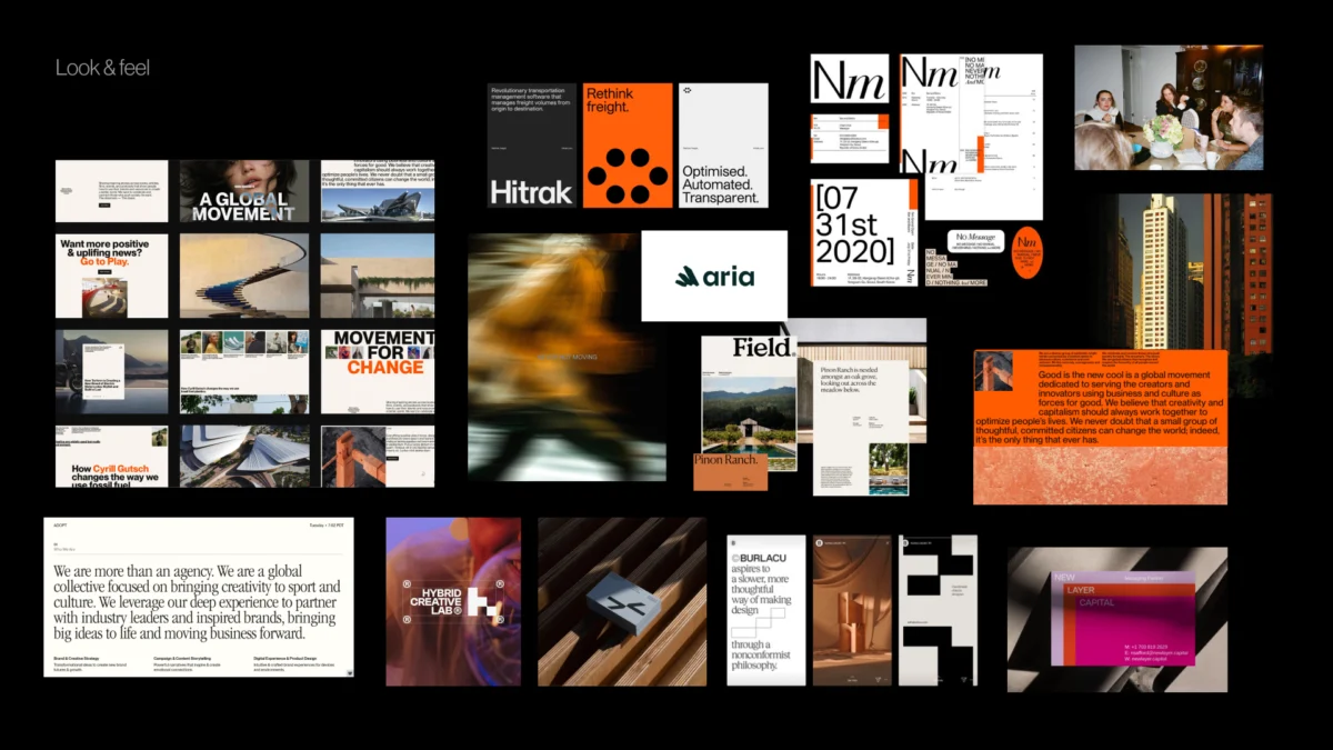
These are not "moodboards" in the traditional sense, but "perception boards." They consist of third-party references that test the boundaries of the brand’s character. If a brand aims to be "human," the board might explore different versions of humanity: warm and rustic versus clean and empathetic. This allows stakeholders to react to visual themes before they are applied to their specific logo or product.

2. Design Code
The design code translates strategic pillars into visual principles. For instance, a parenting application focusing on "research-backed support" might adopt a design code featuring editorial layouts, data snapshots, and infographics to signal authority. Conversely, if the pillar is "the messiness of real life," the code might include organic shapes and handwritten elements. This stage confirms whether the visual metaphors resonate with the brand’s core mission.
3. Brand Assets
The final layer of the pre-concept phase addresses the building blocks of the identity: typography, color, photography style, and logo direction. At this point, the team makes foundational decisions:
- Should the typography be an authoritative Serif or a modern Sans-Serif?
- Will the color palette rely on industry-standard blues (trust) or challenge the category with unexpected hues?
- Should photography be candid and documentary-style or highly polished and conceptual?
Economic and Operational Implications
The adoption of a rigorous pre-concept phase has significant implications for both design agencies and their clients. From an operational standpoint, it reduces "design churn"—the cycle of creating and rejecting concepts due to a lack of initial alignment. For agencies, this leads to higher profitability and improved client relationships. For clients, it ensures a faster time-to-market and a brand identity that is strategically insulated against shifting internal opinions.

Furthermore, the data-driven nature of this phase provides a "paper trail" for design decisions. If a stakeholder questions a visual direction three months into a project, the design team can refer back to the agreed-upon perception maps and design codes. This objective framework shifts the conversation from subjective preference ("I don’t like this color") to strategic alignment ("Does this color express the credibility we agreed upon?").
Conclusion: The First Concept as a Logical Progression
Ultimately, the goal of the pre-concept phase is to ensure that the "first concept" presented by a designer is never a surprise or a guess. Instead, it should feel like the inevitable next step in a journey the entire team has taken together.
Before moving into the final concept stage, successful teams utilize a pre-concept checklist to ensure:

- A shared understanding of the brand’s unique "version" of its core attributes.
- Agreement on where the brand sits within the competitive landscape.
- Validation of visual metaphors and design principles.
- Clear boundaries on what the brand is not allowed to be.
By investing in the pre-concept phase, organizations move away from the "reveal" culture of design and toward a collaborative, strategic process. This shift not only produces stronger visual identities but also ensures that those identities are deeply rooted in the brand’s authentic purpose and the audience’s evolving perceptions. In an era where brand equity is a primary driver of corporate value, the work that happens before the design begins is increasingly the most important work of all.

