
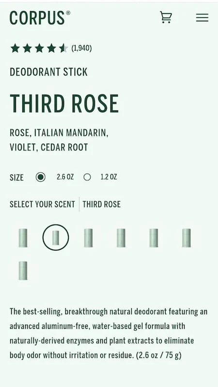
A burgeoning trend within the e-commerce design landscape, characterized by the complete thematic coloring of product pages to mirror the item on sale, is raising significant concerns regarding user experience (UX). While visually ambitious, this approach is proving to be detrimental to customer navigation and conversion, creating what industry experts are labeling a "bad, bad UX." The fundamental principle of effective user interface design, particularly in online retail, hinges on facilitating a seamless and intuitive journey for the consumer from discovery to purchase. This trend, however, introduces unnecessary friction, demanding excessive cognitive effort from shoppers and ultimately hindering their ability to make informed decisions.
The Illusion of Immersion: When Color Hinders Clarity
The core of the problem lies in the human psychological desire for efficiency and clarity. Users navigate digital spaces with the implicit expectation of reaching their desired destination with minimal effort. This is often described as the "point A to point B" principle, where any obstacle or "speed bump" forces a diversion of mental energy. In the context of online shopping, this translates to a frustrating experience that can lead to abandonment.
Consider a hypothetical scenario where a consumer, having heard positive reviews about a natural deodorant brand, seeks to explore its offerings online. Upon arriving at a product page designed with this monochromatic approach, the user is met with an overwhelming visual sameness. For instance, if the product is a green-scented deodorant, the entire page—including backgrounds, text elements, and calls to action—might be rendered in various shades of green. This creates an environment where distinguishing between different product variations, such as distinct scents, becomes a significant challenge.
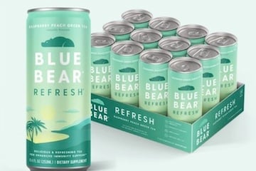
The provided example from a mobile view of a deodorant product page starkly illustrates this issue. The user is confronted with a sea of green, with minimal visual cues to differentiate between the available scent options. The immediate reaction for such a user might be one of confusion and doubt, questioning whether the issue is with their device or the website’s design. This uncertainty can prompt them to switch devices, seeking a clearer experience on a desktop computer, only to find the problem exacerbated.
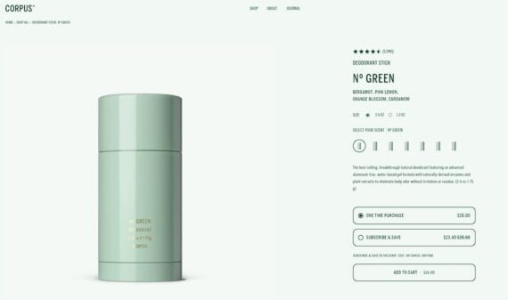
On a wider desktop screen, the monochromatic design often intensifies, making it even harder for users to discern critical information. In the case of the deodorant brand, the entire page’s visual theme, dominated by the product’s packaging color, overshadows crucial navigational elements. Scent variations, presented as small, undifferentiated blocks, require individual clicks to identify, a process that is both time-consuming and tedious. This lack of visual distinction extends to other important elements: link states are ambiguous, promotional tags like subscription discounts blend into the background, and even the "add to cart" button, a critical call to action, loses its prominence.
The "Greener" the Worse: A Case Study in Color Overload
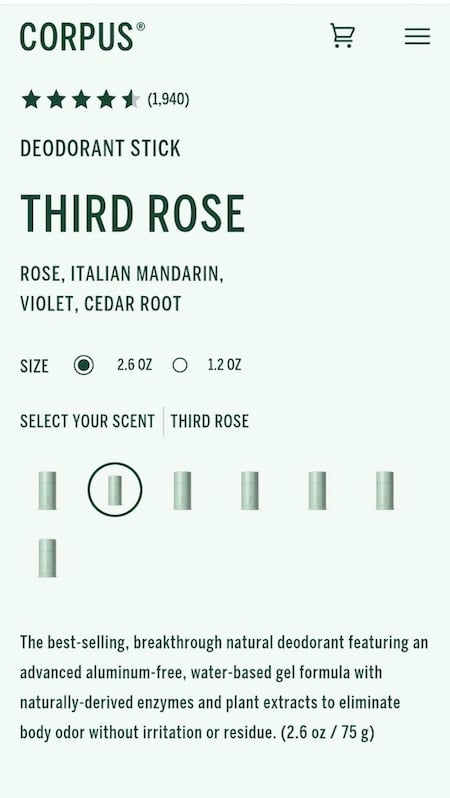
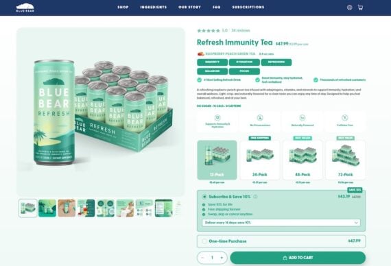
The issue is not isolated. Further examination reveals brands pushing this trend to even more extreme levels. A tea brand, for example, was observed to have a product page that was almost entirely green, from the product title and benefit tags to the subscription savings information and the "add to cart" button. This excessive use of a single color creates a visual cacophony where nothing truly stands out.
This phenomenon can be analogized to a student highlighting every sentence in a textbook. When everything is emphasized, nothing is truly highlighted. Similarly, when an entire webpage is saturated with a single color, the intended purpose of that color—to draw attention or convey meaning—is lost. By the time a shopper’s eye reaches the final call to action, such as the "add to cart" button, the lack of contrast and visual hierarchy means there is no clear signal guiding them towards the desired action.
The Science of Contrast: Why Visual Hierarchy Matters
The principle of visual hierarchy is fundamental to effective design. It dictates the order in which users perceive information on a page, guiding them through a logical flow from the most important elements to the least. Color plays a crucial role in establishing this hierarchy. It is through contrast—the deliberate use of differing colors, shapes, and sizes—that elements capture attention and convey priority.
When a webpage is uniformly colored, this essential contrast is eliminated. The brand’s signature color, intended to create recognition and appeal, becomes an impediment when applied indiscriminately. Instead of enhancing the product presentation, it obscures it. This design choice directly contradicts the objective of e-commerce, which is to make products accessible and desirable, ultimately leading to sales.
Expert Analysis and Industry Reactions
UX designers and e-commerce strategists are voicing strong disapproval of this trend. Lihi Lothan, a prominent figure in e-commerce design, has been a vocal critic, emphasizing the importance of user-centric design principles. "Human beings want to get from point A to point B as easily as possible," Lothan stated. "Speed bumps force us to spend brain energy, and that’s draining, even for online purchases." This sentiment is echoed by many professionals who believe that while aesthetic considerations are important, they should never come at the expense of usability.
Data from user behavior analytics often supports these concerns. Studies by Nielsen Norman Group consistently highlight the importance of clear visual cues and reduced cognitive load for optimal user experience. High bounce rates and low conversion rates on such monochromatic pages are often attributed to users’ inability to quickly find the information they need or complete desired actions. For instance, a 2023 report by Baymard Institute found that 17% of online shoppers have abandoned a purchase due to a website being too complicated to navigate. This monochromatic trend directly contributes to that complexity.
Historical Context and Evolving Design Philosophies
The evolution of web design has seen a pendulum swing between minimalist aesthetics and more immersive, brand-driven experiences. In the early days of the internet, functionality and basic information delivery were paramount. As design capabilities and user expectations grew, there was a move towards more visually rich and interactive websites. The current trend of monochromatic product pages can be seen as an extreme interpretation of brand immersion, where the desire to create a cohesive visual identity overrides fundamental usability principles.
However, leading design philosophies, such as Google’s Material Design and Apple’s Human Interface Guidelines, consistently advocate for clarity, contrast, and intuitive navigation. These principles are rooted in extensive user research and have been proven to enhance engagement and conversion rates. The monochromatic trend stands in stark contrast to these established best practices.
The Impact on Conversion and Brand Perception
The immediate implication of this design trend is a negative impact on conversion rates. When users struggle to navigate a product page, understand variations, or locate the "add to cart" button, they are less likely to complete a purchase. This can lead to lost revenue and missed opportunities for customer acquisition.
Beyond immediate sales, this design approach can also negatively affect brand perception. A website that is difficult to use can be perceived as unprofessional, frustrating, or even untrustworthy. While the intention might be to create a sophisticated and on-brand experience, the unintended consequence is a user experience that alienates potential customers.
Future Implications and Recommendations
The prevalence of this trend underscores a critical misunderstanding of how color and design function in user interfaces. While brand colors are vital for recognition, their application must be strategic and serve the user’s journey. The key lies in using color to create contrast, highlight important information, and guide the user’s eye through a clear visual hierarchy.
E-commerce businesses are strongly advised to prioritize usability over excessive thematic color application. This involves:
- Employing Strategic Contrast: Utilize contrasting colors for calls to action, important links, and differentiating product options.
- Establishing Clear Visual Hierarchy: Ensure that key information, such as product names, prices, and add-to-cart buttons, are visually prominent.
- Testing and Iteration: Regularly conduct user testing to identify pain points and areas for improvement in website design.
- Adhering to Accessibility Standards: Ensure sufficient color contrast for readability and to accommodate users with visual impairments.
By embracing these principles, e-commerce sites can create engaging and effective product pages that not only showcase their products attractively but also facilitate a seamless and enjoyable shopping experience, ultimately driving better business outcomes. The monochromatic product page, while visually striking in concept, ultimately proves to be a barrier rather than a bridge to customer satisfaction and sales.

