
In the fast-paced world of e-commerce, every moment a potential customer spends deciphering a website is a moment lost, potentially impacting sales and brand loyalty. Steve Krug, a leading authority in user-interface design, powerfully articulates this challenge in his seminal work, "Don’t Make Me Think." Krug’s core philosophy posits that any question a shopper encounters on a website, whether it’s "Where do I click?" or "What does this mean?", introduces friction. This friction distracts from the primary goals of finding a product or completing a purchase, transforming a shopping session into a puzzle-solving exercise. The cumulative effect of these moments of uncertainty erodes a customer’s "reservoir of goodwill," a vital, albeit finite, resource that, once depleted, can lead to shoppers abandoning their carts and seeking alternatives.
While overt issues like unclear pricing or exorbitant shipping costs are frequently cited as deterrents, subtler visual and written cues often play a more insidious role in fostering shopper doubt. These less-obvious elements, when poorly implemented, can create the very hesitation Krug warns against. Conversely, businesses that master these nuances can significantly enhance the user experience, fostering trust and encouraging conversions. This article explores how leading e-commerce brands are proactively addressing these subtle design challenges, transforming potential friction points into seamless pathways to purchase.
Deconstructing Shopper Hesitation: The "Don’t Make Me Think" Framework
Steve Krug’s "Don’t Make Me Think" has become an indispensable guide for anyone involved in website development and e-commerce strategy. First published in 2000 and updated through several editions, the book emphasizes the importance of usability, asserting that users should be able to navigate and interact with a website intuitively, without requiring significant mental effort. Krug’s central tenet is that users are goal-oriented; they visit a website with a specific purpose in mind, whether it’s to find information, purchase a product, or complete a task. Any element that impedes this goal, forcing the user to pause and think, detracts from their experience.

The book identifies several common sources of user confusion, including ambiguous navigation, inconsistent design patterns, and a lack of clear information hierarchy. In the context of e-commerce, this translates directly to questions like: "Is this the right product?", "How many do I need?", "What is the total cost?", and "How long will it take to arrive?". Each of these questions represents a potential breakdown in the user journey.
The cumulative impact of such hesitations is profound. Every second a shopper spends trying to understand an interface, they are not actively engaging with the products or the value proposition. This mental overhead can lead to frustration, a sense of distrust in the website’s professionalism, and ultimately, a reduced likelihood of completing a transaction. Krug likens this to a bank account of customer goodwill; each moment of confusion is a withdrawal, and when the account is empty, the customer leaves.
Addressing the "How Much Do I Need?" Conundrum
One of the most prevalent areas where shoppers encounter questions and require additional mental effort revolves around product quantities and associated costs, particularly shipping. While many businesses focus on optimizing the checkout process or offering attractive discounts, overlooking the fundamental clarity of product offerings can be a critical oversight. The following examples illustrate how innovative brands are tackling this challenge by simplifying quantity selection and clarifying value.
Gush: Contextualizing Quantities for Occasion-Based Purchasing
The beverage brand Gush demonstrates a sophisticated approach to quantity selection by framing it within relatable, occasion-based scenarios. Instead of solely relying on numerical pack sizes, Gush labels its offerings as "With a Friend," "With the Crew," and "For the Party." This strategy cleverly bypasses the need for shoppers to perform mental calculations regarding how many individual pouches are suitable for their specific needs.
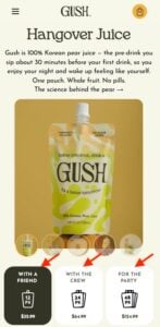
For instance, a shopper planning a small gathering might intuitively gravitate towards "With a Friend," knowing that the associated pack size (e.g., 12 pouches) is appropriate for their intended use. This eliminates the cognitive load of determining if 12, 24, or 48 pouches are the correct amount. The occasion-based labeling acts as a heuristic, guiding the customer’s decision based on their social context rather than a pure numerical assessment. This approach not only simplifies the purchasing decision but also creates a more engaging and personalized shopping experience, tapping into the customer’s social needs and plans. The visual presentation on their product pages further reinforces this, clearly displaying the number of pouches alongside the occasion-based label and corresponding price, providing both intuitive guidance and factual information.
Waju: Crystal Clear Quantity Definitions
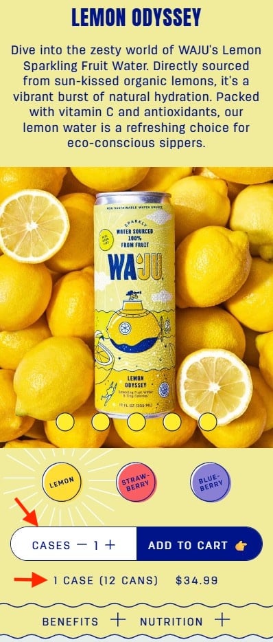
Beverage company Waju tackles the potential ambiguity of quantity selection with a direct and unambiguous approach. On their product pages, the term "Cases" is explicitly used in the quantity selector. This immediately clarifies that the customer is choosing the number of cases, not individual cans. Crucially, this is immediately followed by a clear explanation: "1 case (12 cans), $34.99." This concise statement leaves no room for misinterpretation.
The visual design of Waju’s product page further enhances this clarity. The quantity field, often a point of confusion, features a distinct white background that draws the user’s eye, ensuring that the explanatory text below it is not missed. By proactively defining units of sale and providing a direct conversion to individual items and their cost, Waju removes the cognitive burden of figuring out how many cans are in a case or what the price per can amounts to. This directness fosters trust and reduces the likelihood of shoppers abandoning their purchase due to a misunderstanding of the product quantity and its associated price.
Blueland: Focusing on Outcome, Not Just Contents
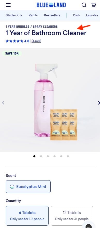
Blueland, a brand specializing in eco-friendly cleaning products, offers a prime example of intuitive product naming that prioritizes customer benefit and outcome. Instead of simply listing the number of cleaning tablets, their product names articulate the duration of use. For example, "1 Year of Bathroom Cleaner" immediately communicates the value proposition and the long-term benefit to the consumer.
This approach shifts the customer’s focus from the sheer quantity of individual tablets to the tangible result they can expect. For a household, this translates into understanding how long a purchase will last, simplifying the decision-making process and aligning the product with their consumption needs. The product page then elaborates on this by indicating how many tablets are included and how they translate to daily use for different household sizes (e.g., 6 tablets for 1-2 people, 12 tablets for 3 or more). By framing the product in terms of its ultimate utility and longevity, Blueland eliminates the need for customers to perform complex calculations based on tablet count and household size, thereby streamlining the path to purchase.
The Farmer’s Dog: Visualizing Portions for Pet Food
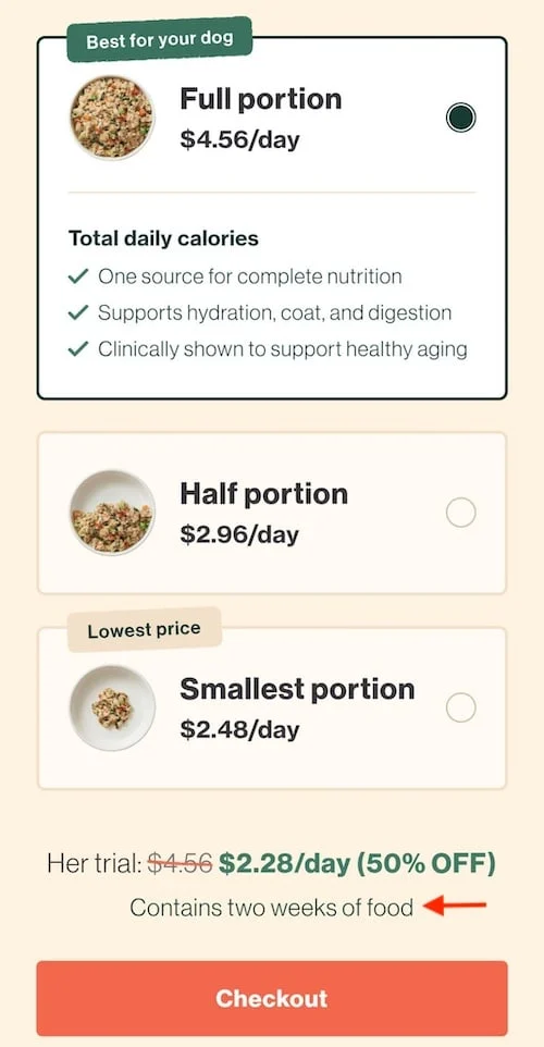
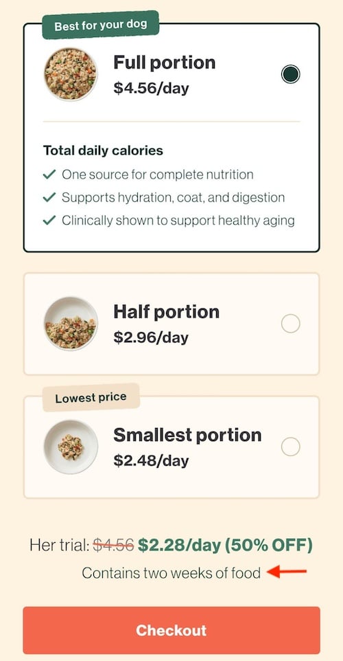
The Farmer’s Dog, a direct-to-consumer fresh dog food service, excels at simplifying complex portioning and pricing through visual aids. Their approach directly addresses the challenge of determining the appropriate amount of food for a pet. Instead of presenting quantities in abstract units like grams or ounces, they use three distinct bowl illustrations to visually represent the portion sizes.
This visual representation allows pet owners to intuitively grasp the quantity of food being offered, correlating it to how much their dog would typically eat. Furthermore, The Farmer’s Dog prices their offerings per day, a metric that aligns with how most pet owners budget and think about their pet’s dietary needs. A clarifying sentence below the visual options, such as "Contains two weeks of food," provides essential context, assuring customers that the chosen daily portion will fulfill their needs for a specified period. This multi-faceted approach—visual representation, per-day pricing, and duration clarification—eliminates the need for customers to convert units, perform complex calculations, or guess at appropriate quantities, thus creating a highly user-friendly experience.
The Broader Implications for E-commerce Success
The strategies employed by Gush, Waju, Blueland, and The Farmer’s Dog highlight a critical, often underappreciated, aspect of e-commerce: the power of anticipatory design. By anticipating potential questions and providing clear, intuitive answers before the customer even needs to ask, these brands not only reduce friction but also build trust and credibility. This proactive approach to user experience design has significant implications for a business’s bottom line.
Reduced Cart Abandonment: Studies consistently show a strong correlation between website usability and conversion rates. A complex or confusing interface is a primary driver of cart abandonment. By eliminating guesswork, these brands can significantly reduce the percentage of shoppers who leave without completing a purchase. For instance, a report by the Baymard Institute found that in 2023, the average documented online shopping cart abandonment rate was 70.28%. A significant portion of this can be attributed to poor user experience, including unclear product information.
Increased Customer Loyalty: A positive and frictionless shopping experience fosters customer satisfaction, which in turn drives repeat business and brand loyalty. When customers can easily find what they need and understand their purchase, they are more likely to return. This creates a virtuous cycle of positive customer interactions and increased lifetime value.
Enhanced Brand Perception: Websites that are intuitive and easy to navigate are perceived as more professional and trustworthy. This positive perception extends to the brand itself, influencing customer confidence and willingness to engage. Conversely, a poorly designed website can convey an impression of carelessness or unprofessionalism, deterring potential customers.
Competitive Advantage: In an increasingly crowded e-commerce landscape, user experience is becoming a key differentiator. Brands that invest in intuitive design and proactively address shopper hesitation are positioning themselves to outperform competitors who rely on more traditional, less user-centric approaches. As consumers become more discerning, the ease of doing business online will be a significant factor in their purchasing decisions.
Future Directions and Ongoing Evolution
The principles of "Don’t Make Me Think" are not static; they evolve with user behavior and technological advancements. As e-commerce platforms become more sophisticated, the expectations of consumers also rise. Future innovations in this space will likely involve:
- AI-Powered Personalization: Leveraging artificial intelligence to dynamically adjust product presentations and quantity recommendations based on individual user behavior and preferences.
- Interactive Visualizations: Developing more advanced interactive tools that allow customers to virtually "try on" products or visualize quantities in real-world scenarios.
- Voice Commerce Optimization: Ensuring that product information and selection processes are seamlessly integrated with voice-activated shopping assistants, where clarity and conciseness are paramount.
- Predictive Analytics for Support: Using data analytics to identify potential points of confusion in real-time and proactively offer assistance or clarify information before a customer even expresses a need.
In conclusion, the foundational principles laid out by Steve Krug remain remarkably relevant for today’s e-commerce businesses. By meticulously examining their user interfaces and proactively eliminating sources of shopper hesitation, companies can transform their websites from potential roadblocks into smooth, inviting pathways to purchase. The examples of Gush, Waju, Blueland, and The Farmer’s Dog serve as compelling testaments to the power of intuitive design in fostering customer satisfaction, driving conversions, and building enduring brand loyalty in the digital marketplace. The ongoing commitment to simplifying the customer journey, one clear interaction at a time, will undoubtedly be a hallmark of successful e-commerce enterprises in the years to come.

