
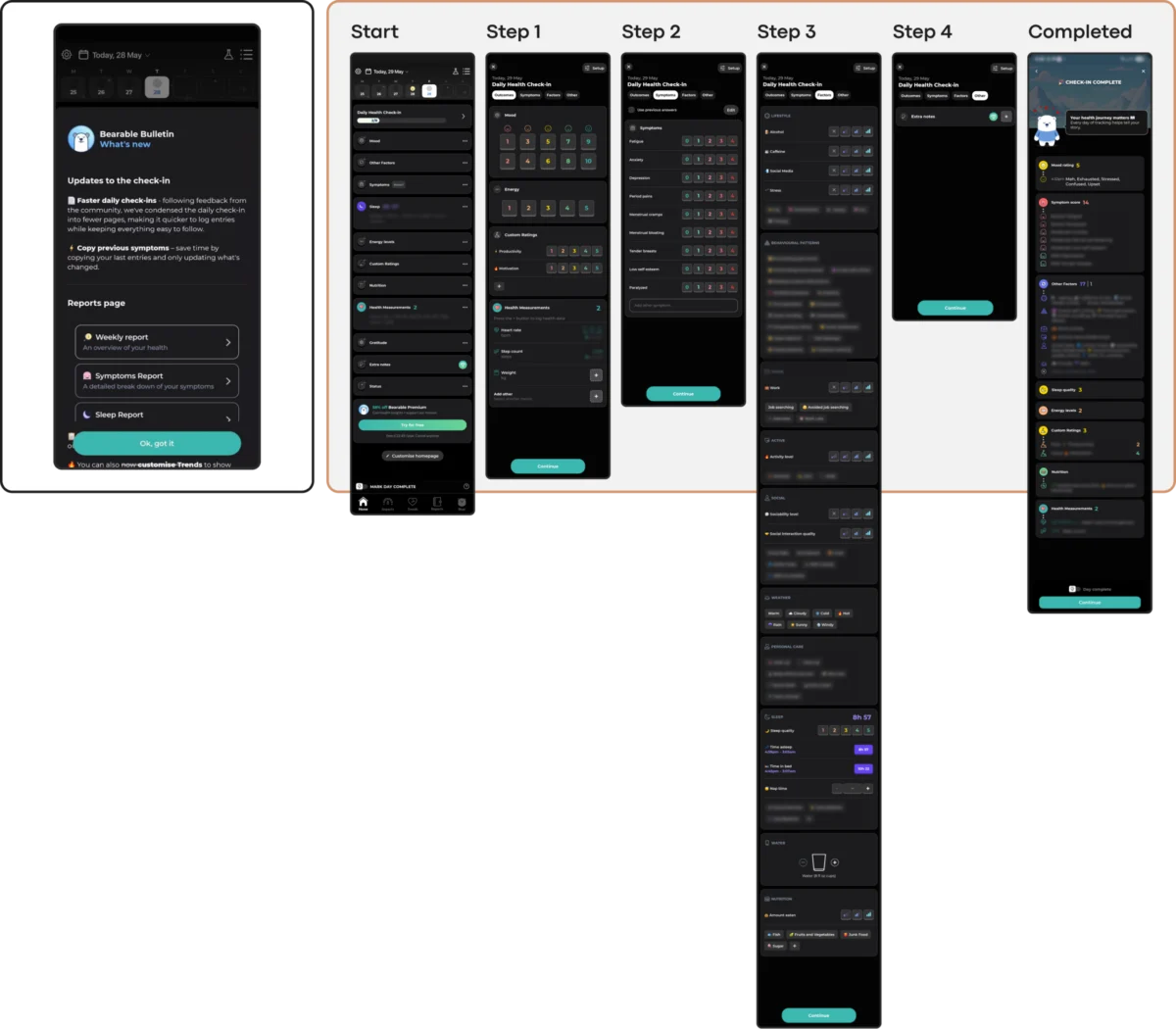
The global mental health application market is currently grappling with a profound paradox: while the demand for digital therapeutic tools has reached an all-time high, the ability of these platforms to retain users remains at a critical low. Recent industry data reveals a staggering abandonment rate, where approximately 95% of users who download a mental health app cease usage within the first 30 days. Even market leaders, often referred to as "mHealth giants," experience a 50% attrition rate within the first 10 days of installation. This retention collapse suggests a fundamental misalignment between modern user interface (UI) trends and the psychological needs of individuals in distress. As design expert Kat Homan posits, the industry is currently prioritizing visual innovation at the expense of clinical utility, creating a "cognitive overload" that drives vulnerable users away precisely when they require support.

The Retention Crisis in Digital Therapeutics
The digital health landscape has expanded rapidly over the last decade, with over 10,000 mental health-related applications now available across major app stores. However, the median 30-day retention rate for these apps stands at a mere 3.3%. This statistical reality indicates that the vast majority of digital interventions fail to transition from a novelty to a routine.

Research suggests that the primary driver of this abandonment is not a lack of interest, but rather the "cost of entry" in terms of mental energy. Users typically engage with mental health apps during periods of acute stress, anxiety, or exhaustion—states characterized by diminished executive function. When an app presents an unconventional navigation system, flashy animations, or complex onboarding flows, it imposes a cognitive tax that a distressed user is often unable to pay. In this context, effective interface design is no longer a matter of aesthetics; it is a clinical and operational priority that directly impacts the efficacy of the therapeutic intervention.

A Chronology of mHealth Design Evolution
To understand the current friction, it is necessary to examine how digital health design has evolved over the past fifteen years:

- The Clinical Era (2010–2015): Early mental health apps were often digitized versions of paper-based cognitive behavioral therapy (CBT) worksheets. They were functionally robust but visually sterile, often resembling medical records rather than consumer products.
- The Consumerization Wave (2015–2020): Platforms like Calm and Headspace revolutionized the sector by adopting high-end consumer UI. This era introduced vibrant colors, gamification, and celebrity partnerships, successfully destigmatizing mental health tools.
- The Trend-Driven Era (2021–Present): Contemporary apps have begun adopting broader digital design trends, such as Neo-brutalism, glassmorphism, and gesture-heavy navigation. While these trends signal innovation in social media or fintech, their application in mental health has created a "conflict of purpose."
Today, designers are increasingly challenged to move toward a "Refuge-Based Design" model, which prioritizes the reduction of strain over the capture of attention.

The Five Fronts of Design Conflict
The tension between trendy UI and therapeutic usability manifests across five specific domains. Each represents a point where adopting a popular visual pattern can actively undermine user trust and engagement.

1. Cognitive Friction and the Burden of Choice
Many modern UI trends, such as Neo-brutalism, utilize high-contrast layouts and stark typography that require significant visual parsing. Similarly, "hidden navigation" patterns—which remove visible menus in favor of complex swipes—turn simple tasks into puzzles. For a user experiencing "brain fog" or depression, these design choices create a barrier to entry.

Data from mHealth usability studies indicate that apps with linear, guided flows outperform those with open-ended dashboards. Tools like Nonori demonstrate the value of this approach by leading users through a single, small action at a time, thereby lowering the executive capacity required to begin a session.

2. Emotional Mismatch and Aesthetic Sensitivity
There is a growing body of research regarding how color and aesthetics influence mood in digital environments. Users in distress frequently report a preference for subtle, grounded palettes—neutral greens, taupes, and muted earthy tones. Conversely, the "cheerful" and bright aesthetics common in many wellness apps can feel jarring or dismissive to someone experiencing deep depression.

This mismatch extends to "celebration mechanics." For example, if an app triggers a burst of digital confetti after a user logs a "low mood" or a traumatic event, the resulting emotional dissonance can erode trust in the platform’s empathy.

3. The Inconsistency Penalty
Routine is a cornerstone of mental health recovery. Therefore, predictability in an app’s information architecture (IA) is essential. When apps frequently update their UI to follow the latest design fads, they force users to relearn the tool.

A positive example of stability is found in the PTSD Coach app, which maintains a rigid and predictable structure. By keeping the "Learn," "Track," and "Manage" sections consistent, the app ensures that users can find support during a crisis without having to navigate a redesigned interface.

4. Silent Exclusion: The Accessibility Gap
The World Health Organization (WHO) estimates that over one billion people globally live with a mental disorder. This population disproportionately includes individuals with visual, motor, or cognitive impairments. Popular trends like low-contrast text (minimalism) or gesture-only navigation (fluid UX) often fail to meet Web Content Accessibility Guidelines (WCAG 2.2).

Designers must recognize that accessibility is not an "add-on" but a foundational constraint. A failure to provide 4.5:1 contrast ratios or 24×24 px touch targets is an active decision to exclude the very users who may need the app most.

5. The Coercion Paradox and "Shame-Driven" UX
Engagement mechanics such as "streaks," aggressive push notifications, and "commitment contracts" are designed to maximize screen time. In a mental health context, however, these can become sources of performance pressure. If a user misses a day due to a relapse or low energy, a "broken streak" notification can exacerbate feelings of failure and guilt.

Ethical mHealth design suggests moving toward "forgiving" mechanics. For instance, the app Bear Room utilizes short, three-day streaks that do not reset upon a single missed day, framing the experience as a gentle support system rather than a productivity tracker.

Practitioner Responses and the "Bear Room" Case Study
In response to these challenges, several developers have begun implementing "state-aware" interactions. The development of Teeni, a parenting support app, and Bear Room, a stress-reduction tool, provides a template for this new approach.

In Bear Room, designers integrated voice-to-AI input as a primary interaction method. Recognizing that typing can be burdensome during high anxiety, the app allows users to speak their thoughts. The AI then analyzes the input to provide tailored coping practices. Similarly, Teeni introduced a "Quick Relief" button that initiates a "Hot Flow"—a dedicated space for emotional venting—before transitioning the user into a more reflective "Cold Flow." This sequential design acknowledges the user’s current capacity and provides a direct path to regulation.

A Framework for Future Evaluation
To bridge the gap between innovation and utility, Kat Homan proposes a five-point evaluation framework for designers. Before adopting any UI trend, developers should ask:

- Capacity: Does this design lower the effort for a user in a low-energy state?
- Tone: Does the visual language match the user’s likely emotional reality?
- Reliability: Is the navigation predictable enough for someone in a crisis?
- Inclusion: Does this choice meet or exceed accessibility standards?
- Agency: Does the interaction empower the user or pressure them?
Broader Impact and Global Implications
The stakes for improving mental health app design are high. The WHO reports that cases of depression and anxiety have increased by 25% in the last decade. As traditional healthcare systems become overwhelmed, digital tools are expected to fill the gap. However, if these tools continue to prioritize "Dribbble-ready" aesthetics over user-centric utility, they risk becoming part of the problem rather than the solution.

The future of the mHealth industry lies in its ability to earn "sustainable retention." This is achieved not by capturing attention through flashy trends, but by becoming a consistently respectful and helpful presence in a user’s life. As the digital therapeutics market continues to mature, the "quiet helper" model—one that focuses on felt support rather than visible interface—will likely emerge as the gold standard for design excellence. In the end, the ultimate measure of a mental health app’s success is not its visual innovation, but its ability to remain a refuge for the user in their most vulnerable moments.

