
The landscape of modern web development is currently navigating a significant technical paradox: while browser support for CSS Container Queries has reached a critical mass of 94%, actual implementation within production environments remains disproportionately low. Industry data and expert analysis suggest that a fundamental misunderstanding of the technology—specifically the tendency to treat container queries as mere extensions of media queries—is stalling the evolution of truly modular design systems. As the industry moves toward a component-driven architecture, the distinction between "macro" and "micro" layouts has become the new frontier for front-end engineering.
The Current State of Responsive Adoption
Recent findings from the 2025 State of CSS survey highlight a stark disconnect between developer awareness and practical application. While approximately 86% of surveyed developers expressed awareness of the @container rule, only 41.4% reported using the feature in their projects. This gap persists despite the fact that container queries were once the most requested feature in the history of the CSS specification, topping "wishlists" for over a decade.
During the SmashingConf Amsterdam 2024 conference, prominent CSS educator Kevin Powell addressed this stagnation, characterizing the adoption of container queries as "terrible" relative to their potential utility. The primary hurdle identified is a cognitive one: developers often view container queries through the lens of the viewport-centric model established by media queries in 2010. This reliance on the viewport as a proxy for layout logic has become a legacy habit that modern CSS seeks to disrupt.
A Chronology of Layout Logic
To understand the current friction, one must look at the evolution of responsive web design (RWD). In 2010, Ethan Marcotte’s seminal work introduced the concept of fluid grids, flexible images, and media queries. For twelve years, media queries were the sole mechanism for responsiveness, creating a mental model where the browser window’s width dictated the appearance of every element on the page.
The timeline of container queries is marked by years of technical hurdles regarding "layout loops"—the risk that an element’s size changing could trigger a change in its container, which would in turn change the element’s size again, creating an infinite cycle. It was not until 2021 that the W3C and the CSS Working Group, led by contributors like Miriam Suzanne, developed a containment model that effectively quarantined these layout calculations. By early 2023, all major evergreen browsers (Chrome, Firefox, Safari, and Edge) had shipped support for container size queries, officially ending the "viewport-only" era.
The Technical Divide: Viewport Proxy vs. Contextual Reality
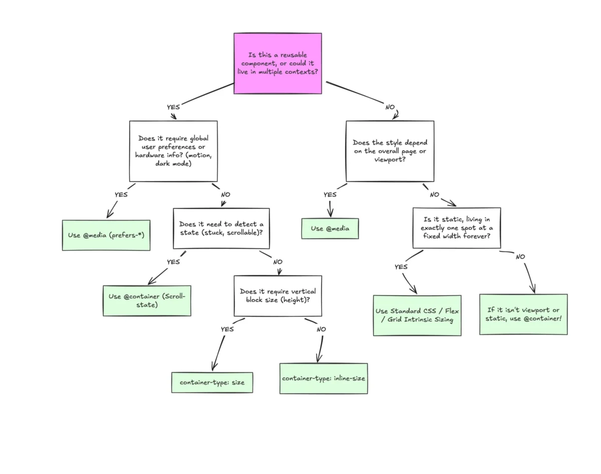
The fundamental difference between @media and @container lies in the reference point. Media queries are "dumb" in a structural sense; they only know the dimensions of the browser window. When a developer writes a media query for a card component to become horizontal at 1024px, the browser applies that style regardless of where the card sits. If that same card is placed in a narrow sidebar on a 1920px screen, the media query triggers the "desktop" layout, resulting in a broken, overflowing, or cramped component.
Container queries shift the logic from the global viewport to the local parent. By using container-type: inline-size, a developer allows a component to ask: "How much space is available to me in my immediate environment?" This enables a single component to exist simultaneously in multiple states on the same page—appearing as a list item in a sidebar and a hero banner in the main content area—without a single line of viewport-dependent code.

Macro vs. Micro Layout Strategies
Modern architectural theory now divides CSS into two distinct categories:
- Macro Layouts (Media Queries): These are the high-level structures of the application. Media queries remain the optimal tool for page-level concerns, such as adjusting the main grid columns, global headers, footers, and responding to system-level user preferences like
prefers-color-schemeorprefers-reduced-motion. - Micro Layouts (Container Queries): These govern the internal logic of reusable components. Cards, navigation bars, form groups, and media objects should ideally be governed by container queries. This ensures that the component remains "agnostic" of the page layout, making it truly portable across different regions of a design system.
Advanced Applications and Industry Impact
The implications of container queries extend beyond simple layout shifts. One of the most impactful applications is in the realm of fluid typography. Traditionally, developers used viewport units (vw) to scale text, which often failed when components were moved into different contexts. By using container query units—such as cqi (1% of a container’s inline size)—developers can create typography that scales perfectly relative to its parent box. Coupling this with the CSS clamp() function allows for "self-contained" responsiveness that functions independently of the screen size.
Furthermore, container queries have provided a CSS-native solution for "flex-wrap detection." Historically, CSS had no way to know if a flex item had wrapped to a new line without using JavaScript’s ResizeObserver. By nesting a container query inside a flex item that is set to flex-grow: 1, developers can now detect when an item has expanded to fill a new row and adjust its internal styling accordingly. This reduces the reliance on heavy JavaScript observers and improves runtime performance.
Analysis of Implementation Side Effects
Despite their benefits, the transition to container queries introduces new technical constraints that developers must navigate. A factual analysis of the specification reveals three primary "gotchas":

- The Wrapper Requirement: A container cannot query itself. This necessitates an additional layer of markup—a "container wrapper"—to house the component being queried. This has led to some criticism regarding "div soup," though design system advocates argue that the trade-off for component encapsulation is worthwhile.
- Size Collapse: When using
container-type: size(as opposed toinline-size), the browser ignores the content of the container when calculating its initial dimensions. Without an explicit height or aspect ratio, the container will collapse to 0px, a behavior that frequently confuses developers transitioning from media queries. - Custom Property Limitations: Currently, container queries cannot use CSS variables (custom properties) within their declarations. This is due to the complexities of the CSS cascade; if a container query changed a variable that it was also querying, it could trigger a circular dependency.
Broader Industry Implications and Future Outlook
The shift toward container queries represents a maturation of the "Design System" movement. Large-scale organizations with complex UI libraries, such as those using Shopify’s Polaris or Google’s Material Design, are increasingly looking to container queries to solve the problem of component "context-awareness."
Looking ahead, the next phase of this technology—Container Style Queries—is already in experimental stages. While size queries look at dimensions, style queries will allow components to adapt based on the computed styles of their parents, such as background colors or custom property values. This will allow for even more granular control, such as a component automatically switching to a "dark mode" variant if placed inside a dark-themed container.
Conclusion: A Strategic Shift
The data suggests that the "terrible" adoption rate of container queries is not a failure of the technology, but a lag in industry best practices. As web applications become more fragmented across an estimated 2,300 unique viewport sizes, the viewport-centric model is becoming increasingly unsustainable.
The professional consensus among CSS architects is that the future of the web is context-driven rather than screen-driven. Moving forward, the mark of a mature front-end architecture will be its ability to delegate macro-layout concerns to media queries while empowering components with the self-governance provided by container queries. This separation of concerns is no longer a luxury but a requirement for building scalable, resilient user interfaces in a multi-device world.

