
The global mental health technology sector is currently grappling with a systemic engagement crisis, characterized by a stark disparity between application downloads and sustained therapeutic use. Recent longitudinal data reveals a sobering reality for digital health developers: nearly 95% of users who engage with a mental health application on the first day will abandon the platform within 30 days. The median 30-day retention rate for the industry sits at a marginal 3.3%, and even established market leaders lose approximately 50% of their active user base within the first ten days of interaction. This collapse in retention suggests that while the digital health market is expanding, the current interface design paradigms may be fundamentally misaligned with the cognitive and emotional needs of users in distress.

The Evolution of the mHealth Crisis
To understand the current state of mental health applications (mHealth), it is necessary to examine the trajectory of the industry over the last decade. The "Mental Health Tech Boom" began in earnest around 2010, following the widespread adoption of smartphones.

- 2010–2014: The Utility Phase. Early apps focused on basic digitizations of clinical tools, such as Mood Diaries and Cognitive Behavioral Therapy (CBT) worksheets. These were functional but lacked aesthetic appeal.
- 2015–2019: The Engagement Phase. As the market became saturated, developers began borrowing "sticky" features from social media and gaming—such as streaks, badges, and push notifications—to drive daily active use.
- 2020–Present: The Saturation and AI Phase. The COVID-19 pandemic accelerated the demand for digital interventions. However, as the World Health Organization (WHO) notes, cases of anxiety and depression rose by 25% globally during this period, putting unprecedented strain on these digital tools.
The current crisis emerges from a foundational conflict of purpose. While modern UI trends are optimized to capture attention and signal innovation, mental health design requires a focus on offering refuge, reducing cognitive strain, and building long-term trust. When these two philosophies collide, the result is often "trend-driven friction" that alienates the very users the apps are designed to help.

The Cognitive Cost of Visual Innovation
For a user experiencing acute anxiety, depression, or burnout, cognitive resources are a scarce commodity. Research into human-computer interaction (HCI) within clinical contexts suggests that "distressed users" operate in a state of reduced executive capacity. In this state, tasks that would typically feel intuitive—such as navigating a hidden menu or interpreting an abstract icon—become significant barriers to care.

Industry analysts have identified "Neo-brutalism" as a particularly problematic trend in the mHealth space. Characterized by high-contrast borders, stark color palettes, and unconventional layouts, this aesthetic is designed to stand out in a crowded digital marketplace. However, for a user seeking calm, these visual choices can be overstimulating and demanding. Similarly, the trend toward "minimalist navigation," which hides essential functions behind non-standard gestures or unlabeled icons, forces users into a process of "guess-and-check" navigation. For an exhausted user, each second of hesitation is a prompt to disengage.

A Five-Point Framework for Therapeutic Usability
To address these challenges, design experts have proposed an evaluation framework intended to pressure-test UI trends against the needs of distressed users. This framework moves beyond simple A/B testing to ask whether a design reduces effort and preserves user agency.

1. Mitigation of Cognitive Friction
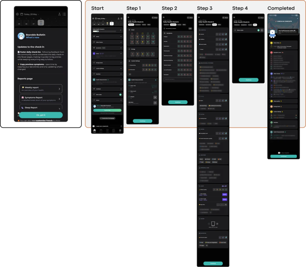
The primary objective of any therapeutic tool is to lower the barrier to entry. Successful applications like "Nonori" utilize linear, sequential flows rather than complex dashboards. By guiding the user through a single path, the app eliminates the "paradox of choice." Conversely, comprehensive tracking apps like "Bearable," while powerful for data collection, can inadvertently create "executive overload" by presenting users with dense grids of symptoms and habits to track during moments of low energy.

2. Emotional and Aesthetic Alignment
There is a growing body of research suggesting that users in distress prefer "subtle" and "grounded" aesthetics. A study investigating color influence in mHealth found that while bright, "cheerful" colors are often chosen by designers to "lift" the user’s mood, they often create a jarring emotional mismatch. Users reported that dark palettes and muted, earthy tones (such as soft greens and taupes) felt more respectful of their current state. Trust is built when an interface mirrors the user’s reality rather than imposing a "toxic positivity" through saturated colors and forced celebratory animations.

3. The Predictability Requirement
Mental health recovery is often built on the foundation of routine. UI trends that prioritize "delightful surprises" or "novel interactions" can disrupt this sense of stability. The "PTSD Coach" application serves as a benchmark for stable information architecture. By maintaining a rigid, predictable structure—Learn, Track, Manage, Support—it ensures that a user returning in a state of panic does not have to relearn the interface. When novelty undermines routine, the "inconsistency penalty" often results in the user closing the app permanently.

4. The Mandate of Universal Accessibility
In the mental health sector, accessibility is not a feature; it is a clinical requirement. Trends such as "glassmorphism" (which uses blurred, semi-transparent backgrounds) or ultra-light typography often fail to meet Web Content Accessibility Guidelines (WCAG) 2.2. For individuals with visual impairments or cognitive conditions like ADHD, these trends create "silent exclusion." Standards require a minimum contrast ratio of 4.5:1 for body text and interactive targets of at least 24×24 pixels. Designs that prioritize "the look" over these constraints actively limit the efficacy of the intervention.

5. Ethical Engagement vs. Coercive Pressure
The adoption of "gamification" in mHealth has led to the "Coercion Paradox." While streaks and daily goals can motivate some, they can also trigger feelings of guilt and failure in those struggling with depression or relapse. Professional analysis suggests that retention should be earned through helpfulness, not through the pressure of a "broken streak." Some developers are now pivoting toward "forgiving mechanics." For example, the "Bear Room" app utilizes short, three-day streaks that do not reset upon a single missed day, framing the experience as a supportive presence rather than a system to be satisfied.

Industry Implications and the "Quiet Helper" Philosophy
The scale of the stakes is immense. With over one billion people globally living with mental health conditions, the digital health industry is no longer a niche market; it is a critical component of the global healthcare infrastructure. The transition from "attention-grabbing" design to "quietly helpful" design represents a maturing of the sector.

A brief analysis of successful integrations reveals a shift toward state-aware interactions:

- Voice Integration: Apps like "Bear Room" have introduced voice-first pathways, recognizing that typing can be burdensome for users in distress.
- State-Sensitive Flows: "Teeni," an app for parents, utilizes a "Quick Relief" button that triggers a "Hot Flow" for immediate emotional venting, only transitioning to reflective content (the "Cold Flow") once the user’s immediate distress has been regulated.
These innovations suggest that the future of mHealth lies in "Contextual UI"—interfaces that adapt to the user’s current capacity rather than demanding that the user adapt to the interface.

Conclusion: The Shift Toward Sustainable Retention
The high abandonment rates in the mental health app market are a clear indicator that the industry can no longer rely on standard tech-sector engagement metrics. For a mental health tool, success is not defined by "time spent on screen," but by the user’s ability to achieve regulation and return to their life.

Designers and stakeholders must recognize that a UI trend, no matter how popular on design showcase platforms, is a liability if it adds a single millisecond of unnecessary cognitive load. The ultimate goal of therapeutic design is to become a "quiet helper"—a reliable, non-judgmental, and accessible tool that users trust enough to reach for in their most vulnerable moments. In this specialized field, the most sophisticated design is often the one that disappears, allowing the support to be felt rather than the interface to be seen.

