
The digital design industry is currently undergoing a period of intense self-reflection regarding the fundamental structures of user navigation, specifically the choice between utilizing modal windows and navigating users to separate pages. As web applications become increasingly complex, the Smashing Editorial team and prominent user experience (UX) researchers have identified this decision as a critical factor in determining task completion rates, error frequency, and overall user satisfaction. The choice is no longer viewed merely as an aesthetic preference but as a technical decision that carries significant implications for cognitive load and workflow efficiency.
The Evolution of the Interface Interruption
The tension between modals—often referred to as dialog boxes, overlays, or lightboxes—and standalone pages has existed since the early days of graphical user interfaces. Historically, the modal window was designed to force user attention toward a specific, high-priority action or piece of information, effectively "locking" the rest of the interface until the user interacted with the window. However, as the web transitioned from static documents to dynamic applications, the over-reliance on these interruptive components has led to what many experts describe as "modal fatigue."
Industry data suggests that the average user encounters dozens of overlays daily, ranging from cookie consent banners to marketing pop-ups and complex data-entry forms. Research conducted by the Nielsen Norman Group (NN/g) highlights that most overlays appear at suboptimal times, interrupting critical tasks and breaking the user’s mental model of the application. The primary challenge for modern designers lies in balancing the need for focus with the necessity of maintaining a fluid, non-disruptive user flow.
Categorizing the UI Component Landscape
To understand the decision-making process, designers must first distinguish between the various types of overlays. While the terms are often used interchangeably, they represent distinct functional behaviors:
- Modals: These components disable the background content, requiring the user to interact with the dialog before returning to the parent page. They are intended for high-stakes interactions.
- Non-Modals: These allow users to continue interacting with the background content while the dialog remains open. They are often used for utility tasks like find-and-replace or floating toolbars.
- Lightboxes: A specific type of modal used primarily for viewing media, such as images or videos, where the background is dimmed to enhance focus.
- Drawers and Side Panels: These slide in from the edge of the screen, often used in enterprise software to provide additional details without completely obscuring the main workspace.
The classification of these components is vital because each serves a different level of "interruption severity." Choosing the wrong component can lead to user disorientation, especially when the user needs to reference information on the underlying page to complete a task within the overlay.

The Case for Modals: Preserving Context and Preventing Errors
Despite their reputation for being disruptive, modals serve a vital purpose in specific scenarios. The primary advantage of a modal is context retention. By keeping the user on the same screen, the application preserves the current state of the UI—including scroll position, active filters, and unsaved input. This is particularly beneficial for short, self-contained tasks.
UX analysts point to three primary use cases where modals are preferred:
- Confirmation of Destructive Actions: When a user attempts to delete a record or exit without saving, a modal provides a necessary "speed bump" to prevent irreversible errors.
- Quick Data Entry: For tasks that require minimal input (e.g., naming a folder), navigating to a separate page would be unnecessarily disruptive and time-consuming.
- Contextual Drills: When a user needs to see a brief summary of details related to a specific item in a list, a modal can provide that information without forcing the user to lose their place in the list.
However, the "cost" of a modal is the loss of the ability to compare data. If a user needs to look at information on the main page to fill out a form in the modal, the modal becomes a barrier rather than a tool.

The Case for Pages: Handling Complexity and Multi-Step Workflows
For complex workflows, the industry consensus is shifting back toward the use of standalone pages. Multi-step processes—often referred to as "wizards"—frequently fail when implemented within a modal. This is due to several technical and psychological factors.
First, pages allow for more robust navigation. Users can utilize the browser’s "back" button, bookmark specific steps, and benefit from a more spacious layout that accommodates complex data visualization. Second, pages provide a sense of "place" in the application’s hierarchy. When a task is significant enough to require the user’s full attention, a dedicated page signals that the user has entered a new mode of work.
Timeline analysis of user behavior shows that when tasks exceed three steps or require significant cognitive processing, users are more likely to successfully complete them on a dedicated page. Furthermore, pages are inherently more accessible and mobile-friendly. Modals often struggle with "scroll-chaining" issues on mobile devices, where the background scrolls instead of the modal content, leading to significant frustration.

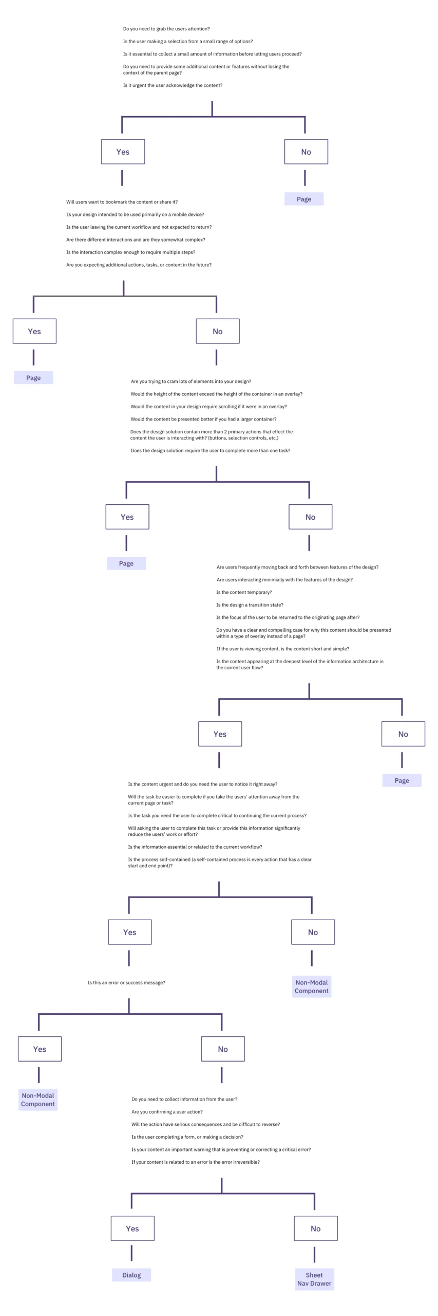
A Decision-Making Framework: The Four-Step Process
To standardize this decision-making process, design leaders like Ryan Neufeld have developed comprehensive frameworks. This structured approach moves away from subjective "gut feelings" toward a logical progression of questions:
Step 1: Identify the Task Type
Is the task a core part of the workflow or a secondary utility? Core tasks often deserve their own page, while secondary tasks (like settings or quick edits) are candidates for modals or drawers.
Step 2: Assess Task Complexity
Does the task involve multiple steps? Does it require extensive data entry? If the answer is yes, a page is the safer default. If the task is a "one-and-done" interaction, a modal may suffice.

Step 3: Determine Contextual Requirements
Does the user need to see the information on the current screen to complete the task? If they need to reference, copy, or compare data, a modal should be avoided in favor of a side drawer or an in-place expansion.
Step 4: Evaluate Interruption Value
Is the task important enough to stop the user in their tracks? If the goal is to prevent an error, the interruption is valuable. If the goal is to show a feature announcement or a newsletter sign-up, the interruption is often perceived as "noise."
The "Third Way": Side Drawers and In-Place Editing
As the limitations of both modals and pages become clearer, many organizations are adopting "in-place" editing and expandable sections. Saulius Stebulis and other UX practitioners suggest that for repeated tasks, the best interface is one that doesn’t move the user at all.

By using accordions or inline expansion, designers allow users to perform tasks without losing sight of the broader context. This "anchored" approach is becoming the standard in data-heavy enterprise applications (ERPs and CRMs), where efficiency is measured by the reduction of unnecessary clicks and page loads. Side drawers, in particular, have emerged as a powerful middle ground, offering the focus of a modal with the ability to still see a portion of the background content.
Industry Implications and the Path Forward
The broader impact of these design choices extends into the realm of accessibility and technical performance. The World Wide Web Consortium (W3C) and its Web Content Accessibility Guidelines (WCAG) emphasize that modals must be correctly "trapped"—meaning a keyboard user should not be able to tab out of the modal into the background. Implementing this correctly is technically challenging and often overlooked, leading to significant barriers for users with disabilities.
Furthermore, the "Single Page Application" (SPA) revolution has made it easier than ever to trigger modals, leading to their over-use. However, developers are now realizing that just because a modal can be used doesn’t mean it should be. The trend for 2025 and beyond appears to be a return to "purposeful navigation."

In conclusion, the decision between a modal and a page is a fundamental architectural choice. The emerging industry standard suggests that pages should be the default for most interactions, with modals reserved for high-stakes interruptions and drawers used for contextual sub-tasks. By applying a rigorous decision-making framework, designers can reduce user frustration, lower error rates, and create interfaces that respect the user’s flow and cognitive resources. As Vitaly Friedman and other industry experts suggest, we must ensure that every interruption is "absolutely worth the cost."
