
In the rapidly evolving landscape of user interface (UI) design, the efficiency of data entry and selection determines the overall success of a digital product. While components like the combobox, multiselect, listbox, and dual listbox may appear interchangeable to the untrained eye, they represent distinct architectural choices that influence cognitive load, accessibility, and task completion rates. As software grows more complex—moving from simple web forms to data-heavy enterprise dashboards—the necessity of selecting the correct list-based interaction pattern has become a critical focal point for UX researchers and front-end engineers alike.
The selection of a UI component is rarely an aesthetic choice; rather, it is a functional response to the volume of data and the specific intent of the user. Understanding the nuanced differences between these elements is essential for avoiding user frustration and ensuring that digital interfaces remain intuitive. This guide examines the technical definitions, historical evolution, and strategic implementation of these core UI patterns.

The Taxonomy of Selection Components
To implement an effective interface, one must first establish a clear vocabulary for the components in question. Each of these elements serves a specific role in the user’s journey.
The Combobox: Merging Input and Selection
A combobox is a hybrid component that integrates a single-line text input with a hidden dropdown list. Its primary function is to allow users to either type a value directly or select one from a predefined list. This pattern is particularly effective for large datasets where scrolling is impractical. By implementing "type-to-filter" functionality, the combobox reduces the user’s effort from a manual search to a targeted query. Modern design systems, such as IBM’s Carbon or Google’s Material Design, often utilize the combobox for country selection or font pickers, where the list might contain hundreds of entries.
The Multiselect: Managing Multiple Variables
The multiselect component is an extension of the dropdown or combobox that permits the selection of more than one item. In contemporary web design, selected items are frequently displayed as "pills" or "chips" within the input field. This provides immediate visual feedback regarding the current state of the selection. However, the multiselect carries a higher cognitive load than single-selection components, as users must manage the addition and removal of multiple variables within a confined space.

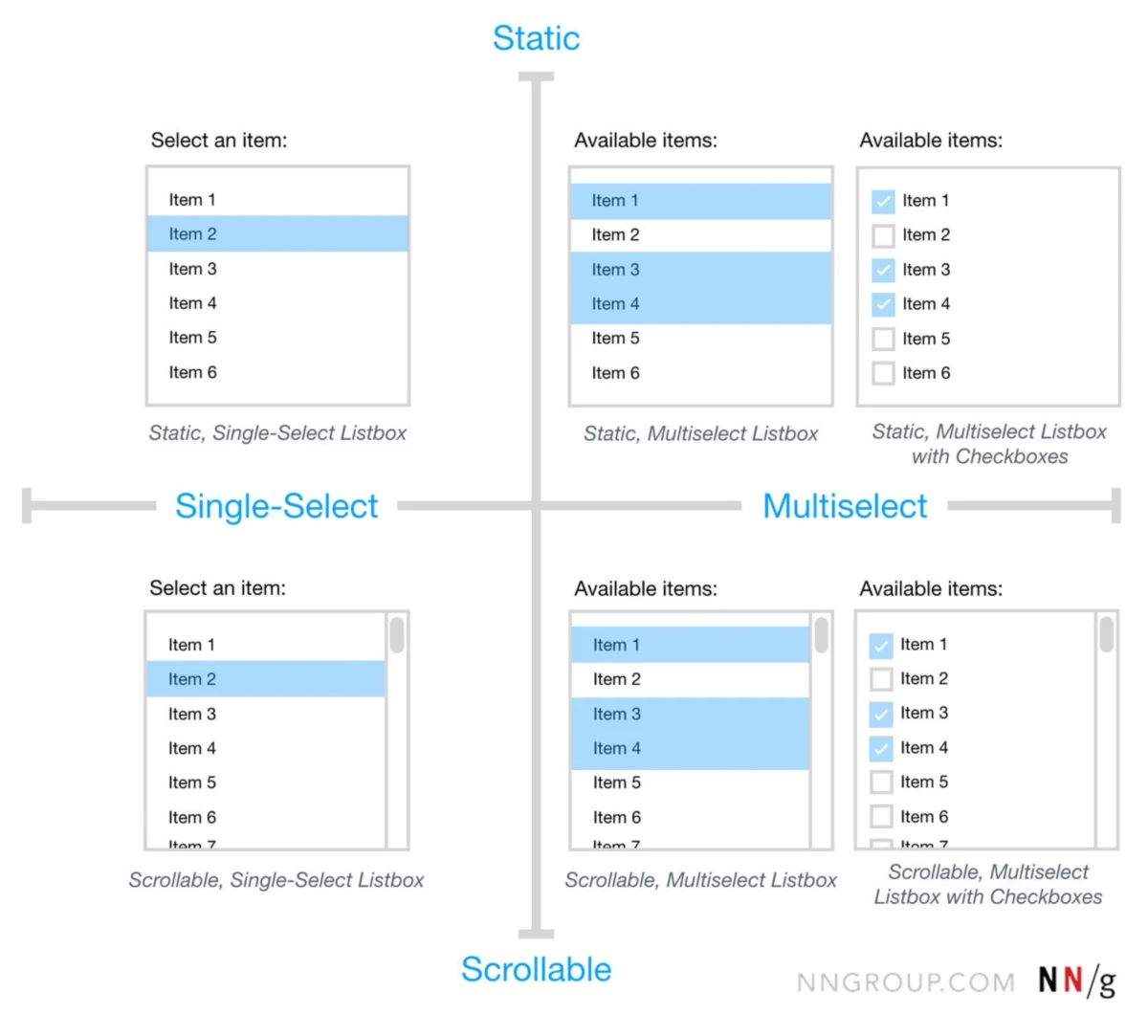
The Listbox: Prioritizing Visibility
Unlike the dropdown-based components, a listbox displays its options in a static, visible container, often with a vertical scrollbar. Because the options are visible by default, the listbox eliminates the need for an extra click to reveal the choices. This is highly beneficial when the available options are few and require immediate comparison. Listboxes are the standard for settings where users need to see the context of all available choices before making a commitment.
The Dual Listbox: The Power of the Transfer List
Often referred to as a "transfer list," the dual listbox consists of two distinct listboxes positioned side-by-side. Users move items from the "available" list (typically on the left) to the "selected" list (on the right) using directional arrows. This pattern is the gold standard for complex administrative tasks, such as assigning user permissions or managing bulk data transfers. It is the only component that allows a user to review a comprehensive list of selections alongside the source list before final submission.
A Chronology of UI Selection Evolution
The history of these components mirrors the broader transition from command-line interfaces to the sophisticated Graphical User Interfaces (GUIs) of today.

- 1980s – The Birth of the Listbox: Early desktop operating systems, such as the original Macintosh System Software and Windows 1.0, introduced the listbox as a fundamental way to navigate directories and file systems.
- 1990s – The Rise of the HTML Select: With the advent of the World Wide Web, the
<select>tag became the universal standard for dropdowns. However, these were limited in styling and functionality, leading to the development of custom-coded "comboboxes" in the early 2000s using JavaScript. - 2010s – The Era of Mobile-First and Chips: As mobile browsing overtook desktop, the need for touch-friendly selection grew. This led to the popularization of "chips" and "tags" within multiselect components to make selections easier to tap and dismiss on smaller screens.
- Present Day – AI and Predictive Filtering: Modern interfaces now incorporate AI-driven "smart suggestions" within comboboxes, where the list is dynamically reordered based on user behavior and predictive analytics.
Strategic Decision-Making: Choosing the Right Pattern
Data from usability studies, including those conducted by the Nielsen Norman Group, suggest that the "wrong" selection component can increase task time by as much as 40%. The choice between these components should be dictated by two primary variables: the number of options and the visibility requirements.
The Rule of Five
For lists containing fewer than five items, industry standards recommend avoiding hidden menus entirely. Instead, designers should use radio buttons (for single selection) or checkboxes (for multiple selections). Hiding three or four options behind a dropdown creates unnecessary friction, forcing the user to click just to see the available choices.
The Threshold for Filtering
Once a list exceeds 15 to 20 items, the combobox becomes the preferred choice. At this volume, manual scrolling becomes a usability bottleneck. By providing a text input for filtering, the interface respects the user’s time and reduces the "scanning" effort required to find a specific entry.

Managing High-Complexity Tasks
In enterprise environments where users may need to select 50 items out of a pool of 500, the dual listbox is objectively superior to the standard multiselect. The dual listbox provides a dedicated "staging area" for selections, reducing the risk of accidental clicks and allowing for easy auditing of the final list before the user clicks "Save" or "Submit."
The Principle of Visibility and Frequent Options
A recurring failure in modern UI design is the tendency to hide frequently used options within a generic dropdown. Expert consensus in the field of human-computer interaction (HCI) suggests a "Visibility First" approach. If a dataset contains 100 items but three of them are selected 80% of the time, those three options should be extracted and displayed as prominent buttons or chips outside the main list.
By surfacing popular choices, designers reduce the interaction cost for the majority of users while still providing the full list for edge cases via a combobox or listbox. This "hybrid" approach balances the cleanliness of the UI with the practical needs of the power user.

Technical Standards and Accessibility (WCAG)
The implementation of these components must adhere to the Web Content Accessibility Guidelines (WCAG) to ensure they are usable by individuals relying on assistive technologies.
- Keyboard Navigation: Every list-based component must be fully navigable via the keyboard. This includes using the
Tabkey to focus,Arrowkeys to navigate the list, andEnterorSpaceto select an item. - ARIA Roles: Developers must use appropriate ARIA (Accessible Rich Internet Applications) labels. A combobox, for instance, requires
role="combobox",aria-autocomplete, andaria-expandedattributes to inform screen readers of its state. - Focus Management: When a dropdown or listbox is opened, the focus must be managed correctly so that screen reader users are not "lost" in the background DOM.
- Contrast and Scaling: Selection states (e.g., the blue highlight on a selected item) must meet minimum color contrast ratios to be legible for users with visual impairments.
Broader Impact and Implications for Digital Productivity
The implications of these design choices extend beyond simple "user friendliness." In sectors such as healthcare, aviation, and financial services, the speed and accuracy of selection components can have high-stakes consequences. A dual listbox that allows a pharmacist to clearly see which medications are being added to a patient’s profile is not just a UI preference; it is a safety mechanism.
Furthermore, as the "No-Code" and "Low-Code" movements continue to gain momentum, these UI patterns are being standardized into drag-and-drop builders. This democratization of design makes it even more vital for builders to understand the underlying logic of these components. A poorly implemented multiselect in a corporate CRM can lead to data entry errors that cost companies thousands of dollars in lost productivity and inaccurate reporting.

Conclusion: Beyond the Dropdown
The term "dropdown" is often used as a catch-all phrase that obscures the specific functionality required for high-performance interfaces. By distinguishing between the combobox, multiselect, listbox, and dual listbox, designers and engineers can create more intentional, accessible, and efficient digital environments.
The ultimate goal of UI selection is to make the interface "invisible"—to allow the user to achieve their objective without having to think about the mechanics of the selection process. Whether it is through the type-to-filter speed of a combobox or the organizational clarity of a dual listbox, the right component is the one that aligns most closely with the user’s mental model and the complexity of the data at hand. As AI continues to integrate into these patterns, the future of selection will likely move toward even more proactive and predictive models, further reducing the friction between human intent and digital execution.
