
The global digital mental health market has seen an unprecedented surge in development over the last decade, yet the industry faces a persistent and measurable crisis: the vast majority of users abandon these tools almost as quickly as they download them. Research indicates a stark reality for developers and clinicians alike, as data from the Journal of Medical Internet Research (JMIR) reveals that approximately 95% of users who engage with a mental health application on day one will abandon the service within 30 days. The median 30-day retention rate for the sector sits at a dismal 3.3%, and even established industry giants lose roughly 50% of their user base within the first ten days of installation. This collapse in engagement suggests that while the demand for digital support is at an all-time high, the current interface design strategies are fundamentally misaligned with the needs of the people they serve.

Effective interface design in the mental health space is no longer a matter of mere aesthetics; it has become a critical clinical and operational priority. When a user opens a mental health app, they are rarely doing so out of casual curiosity. Instead, they are often in a state of acute need—stressed, anxious, or cognitively overwhelmed. In these moments of vulnerability, the "delightful" animations and unconventional navigation patterns that win design awards become significant barriers to care. Kat Homan, a prominent voice in UX design for digital therapeutics, argues that many current UI trends are optimized for capturing attention and signaling innovation, goals that directly conflict with the fundamental requirements of mental health apps: reducing cognitive strain, fostering deep-seated trust, and providing a sense of refuge.

A Chronology of the Digital Mental Health Revolution
To understand the current friction between design and utility, it is necessary to trace the evolution of the mHealth (mobile health) landscape. The timeline of this sector reflects a shift from clinical utility to consumer-driven "wellness" aesthetics.

- 2010–2014: The Clinical Emergence. Early mental health apps were largely digitized versions of Cognitive Behavioral Therapy (CBT) worksheets. They were functional but visually utilitarian, often developed by academic institutions or healthcare providers with limited focus on user experience.
- 2015–2018: The Rise of the Giants. Apps like Calm and Headspace began to mainstream the concept of digital wellness. This era introduced high-production-value illustrations and gamification, proving that design could drive massive user acquisition.
- 2019–2021: The Pandemic Surge. COVID-19 acted as a catalyst, driving a 25% increase in global anxiety and depression cases. Venture capital flooded the space, and the focus shifted toward aggressive retention mechanics and "trend-forward" UI to compete in a crowded marketplace.
- 2022–Present: The Retention Reckoning. As the initial novelty of wellness apps faded, the industry began to grapple with the "abandonment" data. Designers are now being forced to reconsider whether the "attention economy" model of UI is appropriate for users in psychological distress.
The Cognitive Science of the Distressed User
The primary failure of trend-driven design in this sector lies in a misunderstanding of the user’s cognitive state. In psychology, "distress" refers to a state of reduced capacity where executive functions—such as decision-making, memory, and focus—are compromised. When the brain’s amygdala is hyper-active due to stress, the prefrontal cortex, responsible for complex processing, becomes less efficient.

In this state, a user facing a "neo-brutalist" layout with high-contrast borders or a "minimalist" interface with hidden, gesture-only navigation is forced to expend "cognitive load" just to figure out how to use the tool. For a healthy user, this is a minor annoyance; for a user in the midst of a panic attack or a depressive episode, it is an insurmountable wall. Research suggests that apps with simple, linear interfaces significantly reduce the time and effort required to engage, which directly correlates with improved long-term retention.

Analysis of the Five Fronts of Design Conflict
The tension between modern design trends and therapeutic usability manifests across five critical areas, as identified in recent product audits and clinical research.

1. Cognitive Friction vs. Immediate Support
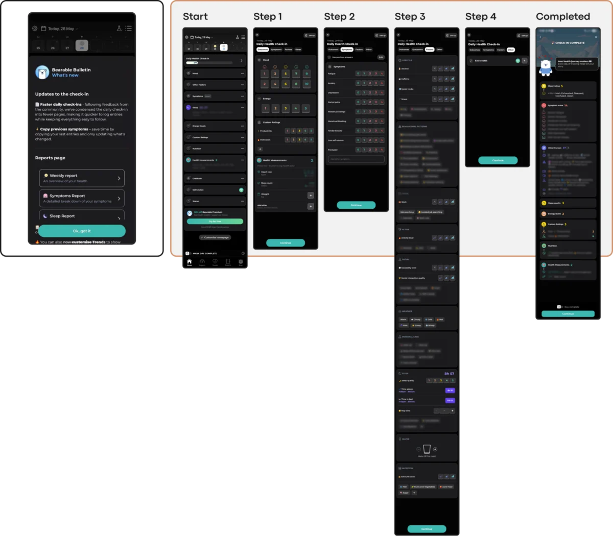
Trendy UI often utilizes abstract, unlabeled icons to maintain a "clean" look. However, for a user with brain fog or high anxiety, recognition is always faster than recall. Every second spent deciphering a symbol is a second the user is not receiving support. Case studies of apps like Nonori show that linear, guided flows—where the user is presented with one clear action at a time—outperform complex dashboards in high-stress scenarios.

2. Emotional Mismatch and Trust Erosion
There is a growing body of evidence suggesting that users in distress prefer "subtlety" over "vibrancy." While bright, cheerful colors are often associated with "happiness," they can feel jarring and dismissive to someone in a dark emotional state. A study investigating color influence in mHealth apps noted that users often long for muted, earthy tones and dark palettes that feel like a "safe space" rather than a digital billboard. Apps like Bear Room have successfully implemented this by using soft greens and taupes, creating a "grounded" atmosphere that respects the user’s current mood.

3. The Inconsistency Penalty
Routine and predictability are cornerstones of mental health recovery. UI trends that prioritize novelty—such as non-standard scrolling or experimental navigation—disrupt the user’s mental model. The app PTSD Coach serves as a benchmark for stability; its information architecture remains unwavering, allowing returning users to find symptom-tracking or support tools without relearning the interface. When an app changes its layout to follow a new design trend, it effectively "evicts" the user from their familiar digital home.

4. The Silent Exclusion of Accessibility
Accessibility is often treated as a secondary feature, yet in the mental health space, it is a core requirement. Minimalist trends often rely on low-contrast text (e.g., light gray on white), which fails Web Content Accessibility Guidelines (WCAG) 2.2 standards. Furthermore, gesture-only navigation marginalizes users with motor tremors or those whose focus is fractured by medication side effects. Choosing a trending aesthetic over an accessible one is a deliberate decision to exclude the most vulnerable segment of the target audience.

5. The Coercion Paradox
The "Duolingo-fication" of apps—using streaks, aggressive notifications, and "shame-based" rewards—can be toxic in a mental health context. While these mechanics increase daily active users (DAU) in educational apps, they often create "performance pressure" for mental health users. A missed day in a "wellness streak" can exacerbate feelings of failure and guilt, leading the user to delete the app to avoid the negative reinforcement.

Supporting Data and Global Implications
The stakes for improving these interfaces are immense. The World Health Organization (WHO) estimates that over one billion people globally live with a mental disorder. With a 25% increase in cases over the last decade, the demand for scalable digital solutions is urgent. However, if 95% of users abandon these tools within a month, the "scale" of digital health remains a theoretical benefit rather than a practical one.

Industry analysts suggest that the next wave of successful mental health technology will not be defined by visual flair, but by "Ethical UX." This involves moving away from the attention-based metrics of Silicon Valley and toward "clinical engagement" metrics—measuring how effectively the app supports the user during their moment of greatest need.

Official Responses and Industry Standards
While there is no single global regulator for app design, organizations like the American Psychological Association (APA) and the WHO have begun to release frameworks for the evaluation of digital health tools. The APA’s "App Evaluation Model" specifically highlights "Usability" as a core pillar, urging developers to prioritize ease of use and navigation for those with cognitive impairments.

Furthermore, healthcare advocates argue that "dark patterns"—design choices that trick or coerce users into staying on the app—are particularly unethical in mental health. The emerging consensus among digital clinicians is that a "successful" session might actually be a short one, where the user gets what they need and then puts the phone down to engage with the real world.

A Framework for Future Development
For designers and developers, the path forward requires a radically contextual approach. Before adopting a UI trend, teams should apply a five-point evaluation:

- Load Test: Does this pattern increase the time it takes for a distressed user to reach a core feature?
- Tone Check: Does the visual language feel empathetic to a user in a low-capacity state?
- Predictability Audit: Is the navigation consistent with the user’s existing mental models?
- Accessibility Floor: Does the design meet WCAG 2.2 AA standards at a minimum?
- Pressure Assessment: Do the engagement mechanics allow for a "non-linear" recovery without guilt?
The ultimate goal of design in this space is not for the interface to be seen, but for the support to be felt. In an era of "noisy" design, the most innovative mental health apps may be those that choose to be a "quiet helper"—a reliable, respectful, and invisible presence that prioritizes the user’s healing over the designer’s portfolio. As the global mental health crisis continues to escalate, the industry must decide whether it will continue to chase trends or start building digital refuges that truly stand the test of time.

