
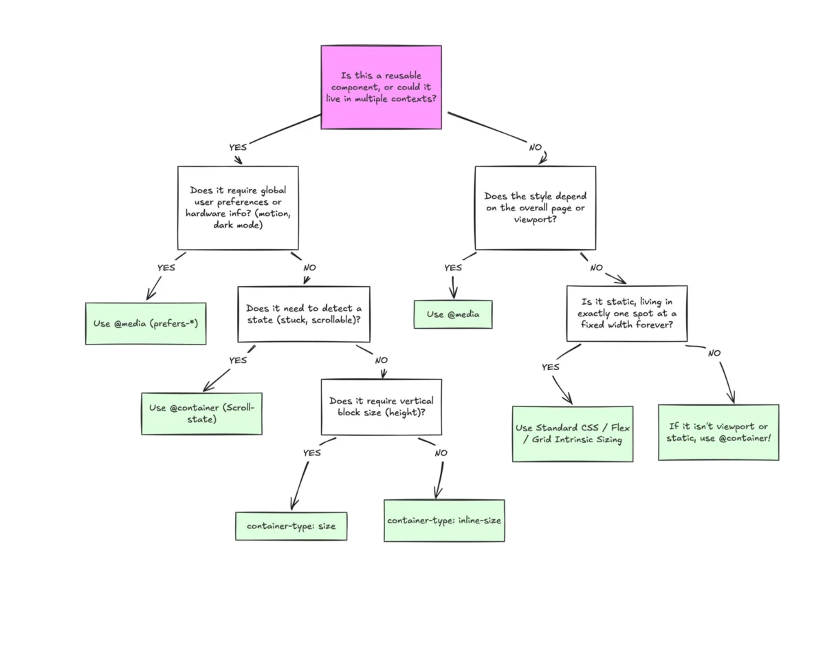
The landscape of front-end web development is currently navigating a significant transition as the industry attempts to move beyond the limitations of viewport-based responsive design. Despite achieving a robust 94% browser support rating, CSS Container Queries remain one of the most underutilized features in the modern web stack. Recent industry data reveals a stark disconnect between developer awareness and actual implementation, raising questions about the future of component-driven architecture. According to the 2025 State of CSS survey, while 86% of developers are aware of the existence of container queries, only 41.4% have integrated them into their production workflows. This discrepancy highlights a fundamental misunderstanding of how the technology differs from the traditional media queries that have defined responsive design for over a decade.
The Shift from Macro to Micro Layouts
For years, the viewport has served as a proxy for the user’s environment. When Ethan Marcotte introduced the concept of Responsive Web Design in 2010, media queries were the primary tool used to adapt layouts to different screen sizes. However, as web applications have become increasingly modular, the reliance on the browser window’s width has become a technical debt. Media queries, by definition, are "macro" tools; they look outward at the global environment. They ask the browser for the total width of the screen but remain "blind" to the internal constraints of the components themselves.
This limitation becomes evident in modern grid and flexbox layouts. A standard card component might be placed in a wide main content area or a narrow sidebar. Under a traditional media query system, if the viewport is 1920 pixels wide, the card will receive styles intended for a large screen, even if it is physically constrained to a 300-pixel sidebar. This often results in distorted layouts, overlapping text, and broken UI elements. Container queries address this by shifting the focus inward. Instead of asking how wide the screen is, a container query asks how much space is available within its immediate parent. This allows a component to adapt its internal layout—switching from a vertical to a horizontal orientation or adjusting font sizes—based solely on its own physical dimensions within the DOM.
A Chronology of Responsive Evolution
The journey toward container queries was driven by a long-standing demand within the developer community. For nearly a decade, the ability for elements to respond to their own size was the most requested feature in CSS.

- 2010–2012: The rise of Responsive Web Design (RWD) via media queries. Developers began using
@mediato create "breakpoints" based on device widths (mobile, tablet, desktop). - 2015–2018: The emergence of "Element Queries" as a community-driven concept. Various JavaScript polyfills were created to mimic the behavior, but they suffered from performance issues and circular dependency loops.
- 2019: The "CSS Wishlist" era. Major industry publications and surveys consistently ranked container-based responsiveness as the "missing piece" of the web platform.
- 2021: The W3C Editor’s Draft for CSS Containment Module Level 3 officially introduced
@container. Chrome became the first major browser to implement experimental support. - 2022–2023: Rapid cross-browser adoption. Safari and Firefox joined Chromium-based browsers in supporting container size queries, bringing the feature to the vast majority of global users.
- 2024–2025: The "Adoption Gap" period. Despite universal support in evergreen browsers, industry leaders like Kevin Powell have noted that adoption remains sluggish, largely due to the "muscle memory" developers have developed with media queries.
Comparative Analysis: Why Media Queries Fail Modern Components
The core of the adoption struggle lies in the visual similarity between @media and @container syntax. At first glance, they appear interchangeable, but their logic is diametrically opposed. To understand the necessity of this shift, one must look at the data regarding device fragmentation. Research into modern web usage has identified over 2,300 unique viewport sizes. Attempting to account for this fragmentation using only global breakpoints is mathematically unsustainable.
When a developer writes a media query such as @media (min-width: 1024px), they are making an assumption that a certain screen width equates to a certain amount of layout space. Container queries remove this guesswork. By using container-type: inline-size, a developer designates an element as a "query container." Any child of that container can then use @container to check its parent’s width. This creates a self-contained logic where the component carries its responsiveness with it, regardless of where it is placed in the application.
Industry Reactions and Expert Sentiment
The slow adoption rate was a central theme at SmashingConf Amsterdam 2026, where industry experts analyzed why such a highly-anticipated feature is being ignored. Kevin Powell, a prominent CSS educator, described the current state of adoption as "terrible," noting that many developers are still using container queries as if they were media queries. The consensus among design system engineers is that the industry is currently in a "re-learning" phase.
"Media queries are essentially ‘dumb’ in the context of modern component architecture," Powell noted during his keynote. "They don’t know anything about the component’s internal state. Most developers assume media queries know more than they actually do, leading to brittle layouts that break when a component is moved."
Furthermore, official responses from design system teams at major tech firms suggest that the transition is being slowed by legacy browser support requirements in corporate environments. While 94% support is high, the remaining 6% often represents critical enterprise users on older systems, necessitating the continued use of media query fallbacks.

Technical Enrichment: Advanced Use Cases
The power of container queries extends beyond simple layout shifts. They introduce new CSS units and capabilities that were previously impossible without JavaScript.
1. Fluid Typography with Container Units
Traditional fluid typography uses viewport units (e.g., vw). This causes text to scale based on the screen width. Container queries introduce container query units: cqi (inline size), cqw (width), cqh (height), cqb (block size), cqmin, and cqmax. By using font-size: clamp(1rem, 0.5rem + 3cqi, 2rem), a heading will grow and shrink based on the size of its container. This ensures that a card title remains legible whether it is in a wide hero section or a narrow grid cell.
2. State Detection and Flexbox Wrapping
A persistent challenge in CSS has been detecting when flex items wrap to a new line. Since media queries only see the viewport, they cannot tell when a flex container has run out of horizontal space. By nesting a container query inside a flex item, developers can now trigger style changes—such as changing colors or alignment—exactly at the moment a layout "wraps." This effectively provides a CSS-only alternative to the ResizeObserver API in JavaScript.
Critical Limitations and Implementation Caveats
Despite their advantages, container queries introduce specific technical constraints that developers must navigate to avoid layout "loops" or performance degradation.
- The Container-Descendant Rule: A container cannot query itself. This is a fundamental rule designed to prevent infinite loops where an element changes its size based on a query, which then invalidates the query, changing the size back. This necessitates a "wrapper" strategy where an outer element is defined as the container, and an inner element is styled.
- Size Collapsing: When using
container-type: size, the browser ignores the intrinsic size of the children to calculate the container’s dimensions. Without an explicit height or aspect ratio, the container will collapse to 0 pixels. This is whyinline-size(which only tracks width) is the preferred method for most responsive layouts. - Custom Property Restrictions: Currently, container queries cannot utilize CSS custom properties (variables) within the query declaration (e.g.,
@container (min-width: var(--breakpoint))). This is due to the complexities of the CSS cascade and the potential for circular dependencies.
Broader Implications for the Future of Web Design
The shift toward container queries signals the end of the "page-based" design era and the total dominance of "component-based" design. As design systems like Polaris, Carbon, and Material Design continue to evolve, the integration of container queries will become mandatory for creating truly portable UI kits.

The broader impact also includes the development of "Style Queries," which are currently in experimental stages. Style queries will allow elements to respond to the computed styles of their parents—such as background colors or custom property values—rather than just physical dimensions. This will allow for "context-aware" components that can automatically change their theme or contrast levels based on the section of the page they inhabit.
In conclusion, while the adoption of CSS Container Queries has been slower than expected, the technology represents the most significant advancement in responsive design since 2010. By separating "macro" layout concerns (handled by media queries) from "micro" component concerns (handled by container queries), developers can build more resilient, maintainable, and truly responsive web applications. The transition requires a departure from viewport-centric thinking, but for an industry facing 2,300+ unique screen sizes, it is a transition that is no longer optional.

