
In the contemporary landscape of digital product development and corporate positioning, the failure of a branding project is rarely a result of poor aesthetic execution. Instead, industry analysis indicates that systemic failures typically occur during the transition from abstract strategy to visual manifestation. This critical juncture, often characterized by a reliance on nebulous adjectives such as "modern," "trustworthy," or "disruptive," frequently leads to a disconnect between a brand’s strategic intent and its final visual identity. To mitigate these risks, design experts are increasingly advocating for a formalized "pre-concept" phase—a structured period of research and alignment that precedes the creation of logos or color palettes.
The pre-concept phase serves as a practical bridge, transforming verbal strategy into a visual foundation. While traditional design workflows often move directly from a creative brief to Figma-based prototyping, the pre-concept methodology emphasizes the deconstruction of stakeholder assumptions. By uncovering the specific meanings behind shared terminology, design teams can establish a "shared direction" that prevents costly revisions and ensures that the final product resonates with the intended audience.
The Evolution of Branding Methodologies: Context and Background
Historically, brand identity was often viewed as a purely artistic endeavor, centered on the creation of a mark or symbol. However, as digital ecosystems have become more complex, the role of brand identity has shifted toward a systemic function. In the current market, a brand must function across diverse touchpoints, from mobile interfaces and social media assets to traditional print media.
According to industry data, projects that lack a rigorous discovery and alignment phase are 50% more likely to undergo significant "pivot" revisions in the late stages of development. These revisions not only inflate budgets but also delay time-to-market in highly competitive sectors like Fintech and HealthTech. The emergence of the pre-concept phase is a direct response to this inefficiency. It integrates elements of user experience (UX) research and cognitive psychology into the branding process, ensuring that the visual "gut feeling"—as defined by brand strategist Marty Neumeier—is engineered with precision.
Stage 1: Deconstructing Perception and Brand Context
The foundation of the pre-concept phase is the research of brand context. This stage goes beyond the standard collection of business goals and competitor lists. It focuses on the clarity of perception. Because a brand ultimately lives in the mind of the consumer, the design team must define exactly what perception they aim to create.

In professional practice, this involves a series of targeted inquiries designed to reveal hidden assumptions. For example, a stakeholder’s request for a "premium" feel could imply anything from "refined and editorial" to "exclusive and expensive." Without clarification, a designer may produce a system that, while visually competent, fails to meet the stakeholder’s internal criteria for success.
Case Analysis: The "Disruption" Paradox in HealthTech
A notable example of this misalignment occurred during a project for a HealthTech firm. The leadership team expressed a desire for a "disruptive" brand identity. In a typical design vacuum, "disruptive" might lead to bold typography and high-contrast, unconventional color schemes. However, through the pre-concept phase, it was revealed that the firm’s primary clients were large, conservative government medical institutions.
In this specific context, "disruption" had to be communicated through extreme clarity, efficiency, and institutional confidence. A rebellious or visually loud brand would have eroded the trust necessary to operate within the healthcare sector. Consequently, the "disruptive" visual direction was actually more traditional than the word initially suggested. This highlights the necessity of context in defining design problems.

Chronology of the Pre-Concept Workflow
The implementation of a pre-concept phase typically follows a specific chronological sequence designed to move from broad ideas to specific design boundaries.
- Stakeholder Kickoff and Discovery: Initial gathering of business objectives and audience data.
- Perception Mapping (Exercise 1): Mapping competitors to identify visual "white space" and category expectations.
- Metaphorical Association (Exercise 2): Utilizing visual drivers to separate personal aesthetic preferences from brand requirements.
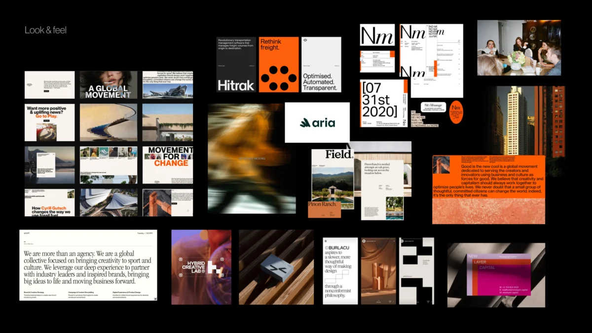
- Foundation Development: Creating Look and Feel boards, Design Codes, and early Brand Asset directions.
- Alignment Review: Securing stakeholder approval on the visual boundaries before any original concept work begins.
Exercise Analysis: Competitor Perception Mapping
One of the most effective tools in the pre-concept arsenal is Competitor Perception Mapping. This exercise requires stakeholders to place competitor brands on a two-axis map based on perceived attributes, such as "Understated vs. Bold" or "Traditional vs. Progressive."
The value of this exercise lies in the disagreements it fosters. When two stakeholders disagree on where a competitor sits, it reveals a fundamental difference in how they define key brand attributes. Resolving these disagreements during a workshop is significantly more efficient than resolving them during a final concept presentation. The map identifies where the brand can move to achieve differentiation without losing category credibility.

The Visual Brand Driver: Using Metaphor to Define Identity
To further refine the brand’s character, designers often employ the "Visual Brand Driver" exercise. Stakeholders are asked to select images from unrelated categories—such as architecture, transportation, or furniture—that represent the company.
The objective is to move the conversation away from "what we like" toward "what we are." If a company is represented by a high-speed train, the adjectives associated with that choice—speed, structure, reliability—become the building blocks of the design principles. If another stakeholder chooses a bicycle, representing agility and accessibility, the resulting tension provides a clear design problem for the creative team to solve: How can the brand feel both structured and agile?
Building the Visual Foundation: The Three-Layer Approach
Once the research and alignment exercises are complete, the designer synthesizes the findings into a three-layer visual foundation. This is not the final identity, but rather a set of guardrails for the creative process.

1. Look and Feel (Perception Boards)
Unlike traditional moodboards, these are "perception boards." They collect references specifically to test whether the team agrees on the tone of the brand. For a Fintech brand, this might involve comparing "institutional trust" (heavy serif fonts, deep blues) with "modern accessibility" (clean sans-serifs, vibrant accents).
2. Design Code (Visual Principles)
The Design Code translates abstract strategy into specific visual metaphors. For a parenting app, a strategy of "research-backed support" might translate into a design code of "editorial layouts and data snapshots," while "empathy for the journey" might translate into "organic shapes and handwritten elements."
3. Brand Assets (Building Blocks)
The final layer addresses the tactical components of the identity: typography styles, color theory, photography direction, and logo archetypes. By discussing these elements in the pre-concept phase, the designer establishes boundaries that prevent the final concepts from feeling like a "surprise reveal" or a "guess."

Industry Implications and Analysis
The shift toward a formalized pre-concept phase reflects a broader trend toward "Design Maturity" within organizations. As companies recognize that brand identity is a business asset rather than a decorative layer, the demand for predictable, strategy-led outcomes has increased.
Data from recent design industry surveys suggests that agencies utilizing a pre-concept or "Discovery and Strategy" phase report a 30% increase in client satisfaction and a 25% reduction in the number of design rounds required to reach a final version. Furthermore, this approach fosters a more collaborative relationship between designers and stakeholders. By involving clients in the "Visual Brand Driver" and "Perception Mapping" stages, they become active participants in the creative logic, making them more likely to support the final visual directions.
Broader Impact on Digital Product Branding
For digital products, where the brand is often experienced through a user interface (UI), the pre-concept phase is essential for maintaining consistency. A well-defined "Design Code" provides the logic for a design system, ensuring that buttons, icons, and typography all reinforce the same brand message.

In conclusion, the strongest visual concepts do not originate in design software; they are the result of rigorous inquiry and stakeholder alignment. The pre-concept phase serves as the critical connective tissue between what a brand means and how it looks. By researching context, uncovering hidden assumptions, and establishing a shared visual foundation, design teams can ensure that their first concept is not merely a creative experiment, but a strategic solution to a well-defined problem. As the branding landscape continues to evolve, this methodological bridge will likely become a standard requirement for any successful identity project.

