
The emergence of complex, data-heavy web applications has brought a recurring technical challenge to the forefront of front-end engineering: the failure of dropdown menus when nested within scrollable containers. This phenomenon, often characterized by "clipped" menus or "drifting" UI elements, represents a fundamental collision between three distinct browser systems: overflow management, stacking contexts, and containing blocks. As software-as-a-service (SaaS) platforms increasingly rely on dense data tables and nested dashboard components, understanding and resolving these layout failures has become a critical requirement for maintaining professional-grade user interfaces and ensuring digital accessibility.
The Anatomy of a Persistent UI Bug
In the context of modern web architecture, the scenario is frequently observed within administrative dashboards or enterprise-level data grids. A typical implementation involves a scrollable container—often a div with a fixed height and overflow: auto—housing a table where each row includes an "Actions" menu. While these components may function perfectly in isolation, their integration often leads to a specific set of failures. The dropdown menu may disappear behind the edge of its parent container, render beneath subsequent rows, or fail to track with its trigger element during a scroll event.
Technical analysis reveals that this is not a singular bug but a systemic conflict. Developers frequently attempt to resolve these issues by escalating the z-index value, sometimes reaching the maximum allowable integer of 2147483647. However, this approach often yields inconsistent results, signaling that the underlying problem resides deeper within the browser’s rendering engine.
The Evolution of CSS Layout Systems: A Historical Chronology
To understand why these issues persist, it is necessary to examine the evolution of CSS positioning and clipping.
In the early era of web development (pre-2010), layouts were largely static. The introduction of the CSS2 specification brought position: absolute and position: fixed, which were designed to remove elements from the normal document flow. However, these tools were conceptualized before the rise of deeply nested component architectures.
By 2015, the widespread adoption of JavaScript frameworks like React, Vue, and Angular encouraged the encapsulation of UI elements into reusable components. This shift led to the "nesting problem," where a component’s visual style is governed by the constraints of every ancestor in the Document Object Model (DOM). In 2021, the CSS Working Group began addressing these limitations more aggressively, leading to the development of the Popover API and CSS Anchor Positioning—modern standards designed to bypass the traditional constraints of the DOM hierarchy.
The Three Pillars of Layout Failure
The failure of a dropdown menu is typically rooted in one of three browser mechanisms.

1. The Overflow Constraint
When an ancestor element is assigned overflow: hidden, scroll, or auto, the browser establishes a box that clips any content extending beyond its boundaries. Contrary to common developer assumptions, position: absolute does not grant an element immunity from this clipping. If a dropdown’s height exceeds the remaining space within a scrollable panel, the browser will truncate the menu, rendering the lower options invisible.
2. The Stacking Context Trap
A stacking context is an isolated layer in the browser’s rendering process. Certain CSS properties—including opacity less than one, transform, filter, and will-change—automatically trigger the creation of a new stacking context. Within this isolated layer, z-index values are only relative to other elements in the same context. Consequently, a dropdown with a z-index of 9,999 trapped inside a low-priority stacking context will always appear behind a modal or header in a higher stacking context, regardless of how high the dropdown’s index is set.
3. Containing Block Miscalculations
Absolute positioning relies on the "nearest positioned ancestor" to determine coordinates. In a complex application, a dropdown’s reference frame is often a table row or a card component. When the user scrolls the parent container, the browser calculates the dropdown’s position relative to that ancestor. If the implementation does not account for the scroll offset of the parent, the dropdown will appear to "drift" away from its trigger button, breaking the visual association for the user.
Data-Driven Analysis of Accessibility and Performance
The implications of these layout failures extend beyond aesthetics. According to the Web Content Accessibility Guidelines (WCAG), interface components must be operable and robust. When a dropdown is clipped by an overflow: hidden container, it remains present in the DOM. This creates a critical disconnect: a screen reader may announce the menu items to a visually impaired user, but a sighted user or a keyboard-only user may find the items visually inaccessible or impossible to navigate via focus.

Furthermore, manual JavaScript solutions for positioning can incur significant performance costs. Using getBoundingClientRect() inside a scroll event listener can trigger "layout thrashing," where the browser is forced to recalculate the positions of all elements on the page multiple times per second. This leads to dropped frames and a "janky" user experience, particularly on mobile devices or lower-end hardware.
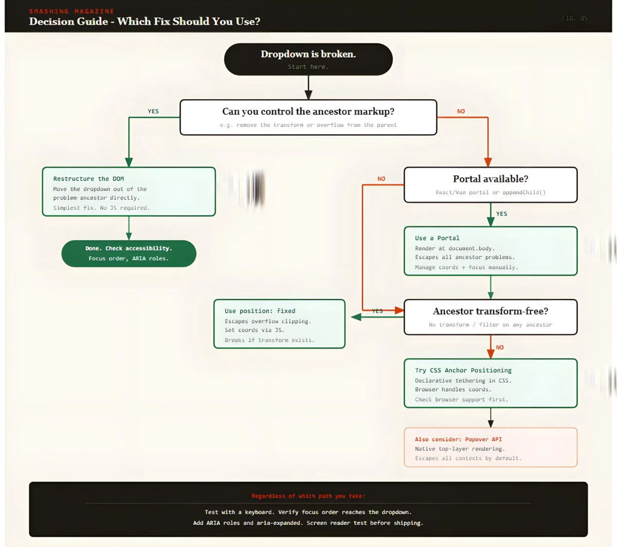
Strategic Solutions for Modern Interfaces
Industry experts and browser vendors have identified several robust strategies for resolving these conflicts, ranging from architectural changes to the adoption of new web standards.
The Portal Pattern
The most widely adopted solution in modern framework development is the "Portal." This technique involves rendering the dropdown menu as a direct child of the document.body, effectively moving it to the top level of the DOM. By bypassing the ancestor tree, the dropdown is no longer subject to the overflow clipping or stacking contexts of its original parent.
While effective, portals require additional logic to synchronize the menu’s position with its trigger. Developers must use the ResizeObserver and IntersectionObserver APIs to ensure the menu remains aligned as the page layout shifts. Additionally, developers must manually manage "focus traps" to ensure that keyboard users can move seamlessly between the trigger and the portaled menu.

The Popover API: A Native Resolution
The introduction of the HTML Popover API represents a significant milestone in browser-native solutions. Elements designated with the popover attribute are automatically promoted to the "top layer"—a special rendering layer managed by the browser that sits above all other content. This eliminates the need for complex z-index management and ensures the element is never clipped by an ancestor’s overflow property.
As of 2024, the Popover API has achieved broad support across Chromium, Firefox, and Safari. It provides built-in "light dismiss" functionality (closing the menu when clicking outside) and manages accessibility semantics automatically, making it the preferred choice for new projects.
CSS Anchor Positioning
The emerging CSS Anchor Positioning specification aims to solve the "synchronization" problem without JavaScript. It allows a developer to declare a relationship between two elements in CSS, such as:
top: anchor(--my-trigger bottom);
This ensures the browser handles the alignment natively, reducing the computational overhead of JavaScript-based positioning. While currently most robust in Chromium-based browsers, polyfills are available to extend support to other engines.
Industry Reactions and Implementation Standards
The shift toward native browser solutions has been met with approval from the web development community. Leading UI libraries, including Radix UI, Headless UI, and Adobe’s React Spectrum, have begun integrating these native APIs to improve reliability and reduce package sizes.

Senior software architects emphasize that the choice of solution should be dictated by the specific constraints of the environment. In a "Decision Guide" format, the industry consensus suggests:
- Use the Popover API for simple overlays and tooltips where native behavior is desired.
- Implement Portals for complex enterprise applications requiring deep integration with state management.
- Utilize Anchor Positioning as a progressive enhancement to improve performance on supported browsers.
Broader Implications for Web Architecture
The ongoing effort to fix dropdown behavior reflects a broader trend in web development: moving away from "hacks" and toward semantic, browser-managed interfaces. As the web platform matures, the responsibility for complex layout calculations is shifting from the developer to the browser engine.
This transition reduces the "UI debt" that often accumulates in large-scale projects, where thousands of lines of code may be dedicated solely to managing z-index conflicts and scroll listeners. By adopting standardized solutions like the Popover API and Anchor Positioning, organizations can ensure their applications are more resilient, accessible, and performant.
Conclusion
The "broken dropdown" is a symptom of a legacy layout system struggling to meet the demands of modern application design. By recognizing the interplay between overflow, stacking, and containing blocks, developers can move beyond trial-and-error fixes. Whether through the surgical application of portals or the adoption of the latest browser-native APIs, the path forward involves a deeper alignment with the underlying mechanics of the web. As these technologies continue to stabilize, the era of the clipped menu is likely coming to an end, replaced by a more robust and accessible digital landscape.
