
The landscape of front-end development is currently witnessing a significant shift in how geometric aesthetics are handled within the browser environment. For nearly two decades, web developers have relied on a narrow set of tools to define the boundaries of user interface elements, primarily the border-radius property. While revolutionary at its inception, border-radius has long been criticized for its singular focus on circular arcs. However, the introduction of the corner-shape property, currently integrated into the CSS Borders and Box Decorations Module Level 4, marks a definitive transition toward more complex, mathematically diverse UI designs. This new property allows for the native implementation of beveled, scooped, and squircle corners, effectively eliminating the need for the fragile "hacks" that have characterized modern web styling for years.
Technical Foundations and Property Specifications
The corner-shape property functions as a modifier to the existing border-radius specification. It does not replace the radius but rather defines the mathematical logic of the curve or line connecting the two points defined by that radius. Under the current W3C Working Draft, the property introduces several key values that provide designers with unprecedented control over element geometry.
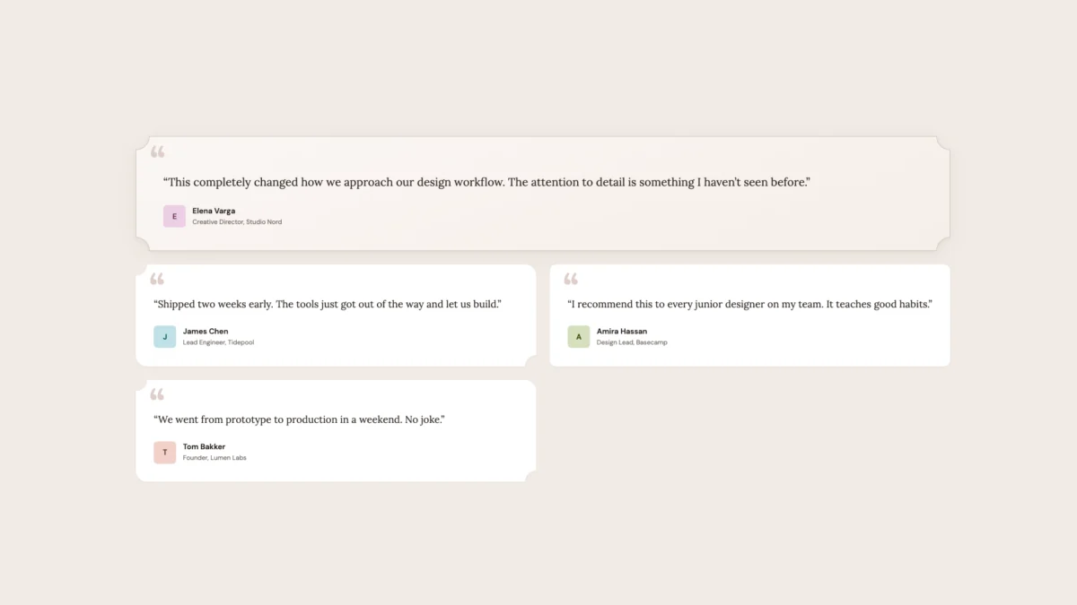
The round value remains the initial default, maintaining the standard circular arc. The bevel value creates a straight line between the curve’s start and end points, resulting in a faceted, gem-like appearance. The scoop value produces a concave circular arc, often used in editorial designs or to mimic the physical aesthetic of punched tickets. The notch value creates a sharp, inward-facing rectangular cut. Perhaps most significant for high-end UI design is the squircle value, which implements a superellipse—a mathematical curve that provides a smoother transition from straight lines to curves than a standard circle.

Furthermore, the property introduces the superellipse() function. This allows developers to pass a numeric parameter to fine-tune the curvature. In mathematical terms, a superellipse with an exponent of 2 is a perfect circle, while an exponent of 4 typically represents the "squircle" popularized by mobile operating system icons. By providing native access to these exponents, CSS now allows for the exact replication of premium hardware aesthetics directly within the code.
A Chronology of Web Corner Styling
The journey to corner-shape reflects the broader evolution of the Open Web Stack. To understand the impact of this property, one must look at the timeline of box decoration in CSS:

- The Pre-Standardization Era (1996–2005): In the early days of the web, rounded corners were achieved through "sliding doors" techniques. This involved using up to nine different background images for a single container—one for each corner, one for each side, and one for the center. This method was notoriously brittle, breaking whenever content exceeded the fixed dimensions of the images.
- The Border-Radius Revolution (2005–2010): Browser vendors began introducing experimental support for rounded corners via prefixes like
-moz-border-radiusand-webkit-border-radius. When the property was officially standardized in CSS3, it significantly reduced code complexity and HTTP requests, leading to a "rounded" aesthetic that dominated the web for a decade. - The Era of Geometric Workarounds (2010–2024): As design trends moved toward "Neo-Brutalism" and sophisticated "App-like" interfaces, the limitations of circular arcs became apparent. Developers turned to
clip-path, SVG masks, and complexradial-gradientbackgrounds to create non-circular corners. While visually effective, these methods often caused issues with border rendering, box-shadow clipping, and performance. - The Introduction of Corner-Shape (2025–Present): With the arrival of Chromium 139 and subsequent updates, the
corner-shapeproperty has begun to stabilize. It represents the first time since 2005 that the W3C has fundamentally expanded the geometric capabilities of the standard CSS box model.
Addressing the Limitations of Legacy Workarounds
The transition to native corner-shape support is driven by the technical shortcomings of previous methods. The most common alternative, clip-path, operates by literally cutting the element’s rendered box. While this allows for any shape, it also cuts off any CSS box-shadow or outline applied to the element, as these exist outside the clipping path. To compensate, developers often had to wrap elements in multiple containers or use filter-based shadows, which are less performant and harder to maintain.
SVG masks offered another alternative but introduced significant overhead. Animating an SVG mask requires complex path manipulation via JavaScript or CSS, often resulting in "jank" or jagged edges on lower-powered devices. Native corner-shape implementation resolves these issues by ensuring that borders, outlines, backgrounds, and shadows all adhere to the declared shape automatically. This integration into the standard rendering pipeline ensures that hardware acceleration is utilized effectively, providing smooth animations even on complex geometric transitions.

Industry Implementation and Progressive Enhancement
As of mid-2026, browser support for corner-shape is largely concentrated within Chromium-based browsers, including Google Chrome, Microsoft Edge, and Brave. Market data suggests that while this covers approximately 65-70% of the global user base, a significant portion of users on Safari (WebKit) and Firefox (Gecko) still lack native support.
In response, the development community has championed a "two-tier" design philosophy. This approach uses CSS Cascade Layers (@layer) and the @supports rule to deliver a robust baseline experience while "upgrading" the UI for compatible browsers.

Technical analysts recommend a structure where a standard border-radius is defined in a base layer, providing a polished, circular-cornered interface for all users. The corner-shape enhancements are then applied within an @supports (corner-shape: ...) block. This ensures that the layout remains functional and visually professional across all platforms, while users on modern browsers receive a "premium" experience characterized by smoother squircle curves or stylized beveled edges.
Broader Impact on UI/UX Design Trends
The implications of corner-shape extend beyond simple aesthetics; they influence visual hierarchy and brand identity. Design experts note that different corner shapes evoke different psychological responses:

- Squircle and Superellipse: These shapes are heavily associated with high-end consumer electronics and mobile OS interfaces (notably Apple’s iOS). Their use in web applications suggests a premium, "app-native" feel that standard circular corners cannot replicate.
- Bevel and Notch: These shapes are increasingly popular in "FinTech" and "Gaming" UIs, where a sense of precision, mechanical engineering, or futuristic aesthetics is desired.
- Scoop: This shape is seeing a resurgence in editorial and e-commerce design, particularly for "ticket" or "coupon" components, providing a tactile, physical-world quality to digital elements.
By moving these shapes into the CSS core, the W3C is effectively democratizing high-end design. Small-scale developers who previously lacked the resources to manage complex SVG masking systems can now implement sophisticated geometric systems with a single line of code.
Future Outlook and Standardization
The ongoing development of the CSS Borders and Box Decorations Module Level 4 suggests that corner-shape is only the beginning. Related properties, such as border-shape, are currently under discussion, which may eventually allow for even more granular control over the path of borders independently of the element’s corner shape.

The World Wide Web Consortium (W3C) continues to solicit feedback from major browser vendors. While Apple and Mozilla have historically been more cautious in implementing experimental CSS properties, the rapid adoption of Chromium support often acts as a catalyst for universal standardization. If the current trajectory continues, industry analysts expect corner-shape to reach "Baseline" status—meaning it is supported across all major evergreen browsers—within the next 18 to 24 months.
In conclusion, the corner-shape property represents a maturation of the web as a design medium. By providing native, performant, and accessible tools for geometric expression, the CSS specification is finally catching up to the ambitions of modern UI designers. The shift from "hacking" shapes to declaring them marks a new era where the browser’s box model is no longer a constraint, but a flexible canvas for digital craftsmanship. As developers adopt progressive enhancement strategies, the web will become a more diverse and visually rich environment, characterized by a level of geometric sophistication that was once the exclusive domain of native applications and high-budget design agencies.
