
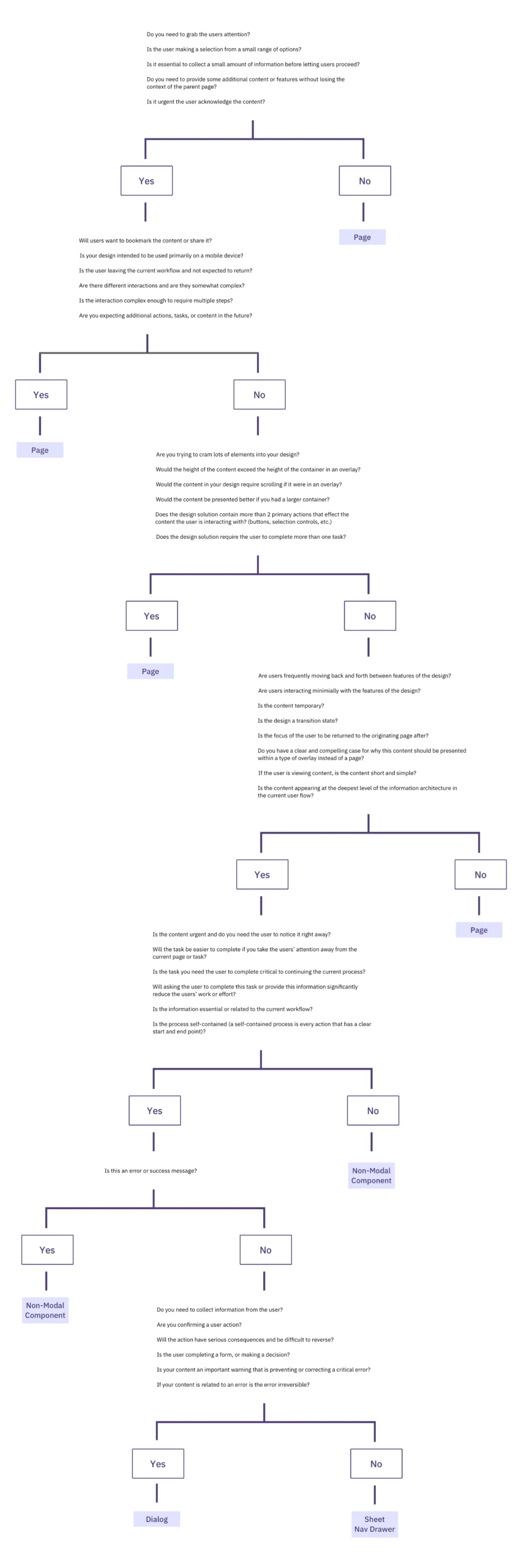
The fundamental architecture of a user interface often hinges on a single, recurring question: should a specific task occur within a modal overlay or on a dedicated standalone page? While this decision might appear cosmetic to the casual observer, user experience (UX) professionals and interface architects recognize it as a critical juncture that dictates the cognitive load, task completion rate, and overall satisfaction of the user. Modern digital product design has reached a level of maturity where the "standard" use of popups is no longer sufficient; instead, a nuanced understanding of interruption levels, context preservation, and workflow complexity is required to build efficient software.
The Technical Taxonomy of Overlays and Dialogs
To understand the strategic choice between modals and pages, one must first establish a rigorous taxonomy of the components in question. Industry experts, including those from the Nielsen Norman Group (NN/g), emphasize that not all overlays are created equal. The term "modal" specifically refers to a child window that requires user interaction before they can return to the parent application. This creates a state where the main workflow is temporarily suspended.
In contrast, "non-modal" dialogs allow users to interact with the background content while the dialog remains visible. Further distinctions exist between lightboxes—which dim the background to focus attention—and standard dialog boxes. According to Anna Kaley, a prominent UX researcher at NN/g, the misuse of these components is a primary driver of user frustration. Overlays frequently appear at inopportune moments, interrupting critical workflows and forcing users to re-orient themselves within the application. The severity of this interruption is often disproportionate to the value of the information being presented, leading to a phenomenon known as "popup fatigue."
The Psychology of Context Preservation
The primary argument for the use of modals is the preservation of context. When a user is deep within a complex task—such as filtering a massive dataset in a financial application like Yahoo! Finance—navigating to a completely new page to adjust a single parameter can be jarring. In this scenario, a modal or a non-modal overlay allows the user to maintain their visual and mental "anchor" on the primary data.
Context preservation involves more than just keeping the background visible; it includes maintaining the state of scroll positions, active form inputs, and selected filters. When a user is directed to a new page, the browser must often re-fetch data, and the user must mentally "reset" to the new environment. For short, self-contained tasks—such as confirming a deletion, choosing a date from a picker, or performing a quick edit—the modal serves as a surgical tool that performs a necessary function without breaking the user’s flow.

Complex Workflows and the Case for Standalone Pages
While modals excel at brevity, they falter under the weight of complexity. Design patterns that attempt to cram multi-step "wizards" or tabbed navigation into a modal window often result in a degraded experience. Standalone pages remain the gold standard for complex, multi-step workflows for several data-backed reasons.
First, standalone pages provide a unique URL, allowing users to bookmark their progress or share specific states with colleagues. Modals, which are typically triggered by JavaScript and do not change the browser’s location bar, are notoriously difficult to link to. Second, standalone pages offer more "real estate" for information-heavy tasks. When a user needs to compare data points from different sections of an application, a modal acts as a physical barrier, blocking the very information the user might need to reference.
In enterprise environments, where users often have multiple tabs open to cross-reference data, the modal becomes a hindrance. If a task requires the user to look up a value on a different screen to complete a form, a modal prevents them from doing so within the same tab, often forcing them to cancel their progress or open a duplicate tab—a workaround that increases the likelihood of data entry errors.

A Chronology of Interface Evolution: From Popups to Side Drawers
The history of this design conflict can be traced back to the early web, where "popup windows" were used primarily for intrusive advertising. As web standards evolved, the industry moved toward the "modal" as a more controlled, aesthetically pleasing alternative. However, the rise of the Single Page Application (SPA) in the 2010s led to an over-reliance on modals, as developers found it easier to trigger a div overlay than to manage complex routing between different views.
By 2020, a "modal fatigue" had set in, prompting the rise of alternative patterns like the side drawer (or "slide-out panel"). Side drawers offer a middle ground: they provide more space than a centered modal and often allow for better background visibility, yet they still maintain the primary page context. Experts like Saulius Stebulis have noted that for repeated tasks in task-heavy products, even side drawers can be too intrusive. The current trend is shifting toward "in-place editing" and "expandable sections," which keep the task anchored directly within the UI elements the user is already interacting with.
The Strategic Decision Framework
To assist designers in navigating these choices, UI strategist Ryan Neufeld developed a comprehensive decision-making framework. This framework moves away from subjective "gut feelings" and toward a logic-based 4-step process:

- Identify the Primary Goal: Is the goal to focus the user’s attention on a critical, high-consequence action, or is it to facilitate a secondary sub-task?
- Evaluate Task Complexity: Does the task require multiple steps, or can it be completed in a single interaction? If the task involves more than two steps, it almost always belongs on a standalone page.
- Assess Context Requirements: Does the user need to see or copy data from the background to complete the task? If so, a centered modal is a poor choice; a side drawer or a non-modal component is superior.
- Determine the Level of Interruption: Is the interruption "worth it"? Forcing a user to stop their workflow to read a "feature announcement" is generally considered poor UX, whereas forcing them to stop to prevent the accidental deletion of an account is a necessary safeguard.
Broader Implications for Accessibility and Mobile Design
The choice between modals and pages also carries significant implications for digital accessibility (A11y). Modals are notoriously difficult to implement correctly for screen reader users. Developers must ensure that "keyboard focus" is trapped within the modal, that the background content is hidden from assistive technologies, and that the "Escape" key correctly closes the dialog. Standalone pages, being the default behavior of the web, are inherently more accessible and require less custom engineering to meet Web Content Accessibility Guidelines (WCAG).
Furthermore, the mobile experience complicates the modal-page dichotomy. On a small smartphone screen, a modal often takes up 100% of the viewport, effectively becoming a page but without the benefits of standard browser navigation (like the "Back" button). In mobile-first design, the industry is increasingly favoring "full-screen dialogs" that behave like pages or "bottom sheets" that can be swiped away, providing a more tactile and intuitive experience than the traditional centered box.
Industry Analysis: The Cost of Improper Implementation
When organizations fail to choose the correct navigation pattern, the costs manifest in the balance sheet. High error rates in data entry, increased support tickets from "lost" users, and lower conversion rates on e-commerce platforms are direct results of "broken" user flows. Therese Fessenden, a Senior User Experience Specialist, notes that while no user enjoys being interrupted, the "cost" of the interruption must be balanced by the "value" of the focus it provides.

In complex enterprise software, where users spend eight hours a day, the cumulative friction of unnecessary modals can lead to significant productivity losses. Conversely, the absence of a modal during a destructive action can lead to catastrophic data loss. The objective of the modern designer is not to eliminate modals or to avoid pages, but to apply each with surgical precision.
Conclusion: The Future of Subtle UI
As we look toward the future of interface design, the industry is moving toward "Subtle UI"—interfaces that anticipate user needs without requiring loud, interruptive components. Artificial intelligence and predictive modeling are beginning to play a role in this, potentially allowing interfaces to dynamically choose between a modal, a drawer, or a page based on the user’s historical behavior and current task urgency.
Until such automated systems become standard, the responsibility remains with human designers and developers. By adhering to established frameworks, prioritizing context preservation, and respecting the user’s flow, creators can build digital environments that are not only functional but also harmonious. The decision between a modal and a page is, ultimately, a decision about how much of a user’s attention an application has the right to claim at any given moment.
