
In the hyper-competitive landscape of e-commerce, where consumer attention spans are fleeting and the competition is just a click away, the user interface (UI) has emerged as a critical battleground. Steve Krug, a renowned expert in user-interface design and author of the seminal book "Don’t Make Me Think," posits that any element of friction—questions like "Where do I click?" or "What does this mean?"—introduces hesitation in shoppers. This hesitation, he argues, directly detracts from the primary goals of product discovery and purchase completion, transforming a browsing session into a cognitive exercise in deciphering the website’s logic.
Krug’s central thesis is that this accumulation of small uncertainties erodes a shopper’s "reservoir of goodwill." Each moment spent grappling with an unintuitive interface depletes this goodwill, diminishing the inherent desire to buy. When this reservoir runs dry, the inevitable outcome is shopper abandonment. While pricing and shipping costs are often cited as common pain points, subtler visual and textual cues can significantly alleviate shopper doubts and foster a smoother, more intuitive purchasing experience. This article explores practical strategies, exemplified by leading e-commerce brands, that effectively address these user hesitations, thereby enhancing conversion rates and customer satisfaction.
The Silent Toll of Hesitation: Quantifying User Friction
The economic impact of poor user interface design is substantial. Studies have consistently shown a direct correlation between website usability and conversion rates. For instance, a report by the Nielsen Norman Group indicated that even a slight improvement in website usability could yield a significant increase in revenue. Conversely, a poorly designed checkout process alone can lead to billions of dollars in lost sales annually for e-commerce businesses.
The "Don’t Make Me Think" philosophy emphasizes that users visit e-commerce sites with a clear objective: to find and purchase a product. Any deviation from this objective, forced by an opaque or confusing interface, represents a missed opportunity and a potential loss of revenue. The average user, when faced with a website they find difficult to navigate or understand, will typically abandon it within seconds. This underscores the critical importance of clarity, intuitiveness, and immediate comprehension in every aspect of the user journey.

Strategies for Seamless Shopper Experiences: Case Studies in Clarity
Several forward-thinking e-commerce brands have successfully implemented strategies to preempt and eliminate shopper doubts, particularly concerning product quantities, pricing, and overall value. These approaches move beyond simply presenting information and instead focus on translating complex product details into easily digestible and actionable insights for the consumer.
1. Reframing Quantities: From Numbers to Needs
One of the most effective ways to reduce cognitive load is to reframe product quantities from abstract numerical values to relatable consumption scenarios. This approach allows shoppers to make purchasing decisions based on their anticipated needs rather than performing mental calculations.
Gush: Packaging for Occasions, Not Just Pouches
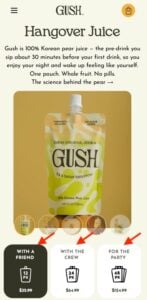
Beverage brand Gush excels in this regard by labeling its multi-packs not just by the number of pouches but also by the social context in which they might be consumed. Options like "With a Friend," "With the Crew," and "For the Party" immediately communicate the intended use and quantity without requiring the shopper to do any mental arithmetic. For example, a consumer planning a small gathering can instinctively select "For the Party" without needing to ascertain whether a 24-pack or a 48-pack is more appropriate. This "doing the math for them" approach streamlines the decision-making process, making it more intuitive and less prone to errors or indecision. The visual representation of these options, often accompanied by clear imagery of the product and its packaging, further reinforces the intended value proposition.
Analysis: This strategy taps into a fundamental human tendency to make decisions based on context and perceived value rather than pure numerical data. By aligning product offerings with lifestyle scenarios, Gush not only simplifies the purchasing process but also creates an emotional connection with the consumer, suggesting that the product is designed to enhance their social experiences.
2. Unambiguous Clarity: Eliminating "What Does This Mean?"
Ambiguity in product descriptions and quantity indicators can lead to significant confusion and frustration. Brands that proactively address these potential misunderstandings build trust and ensure customers receive what they expect.
Waju: Precision in Every Detail
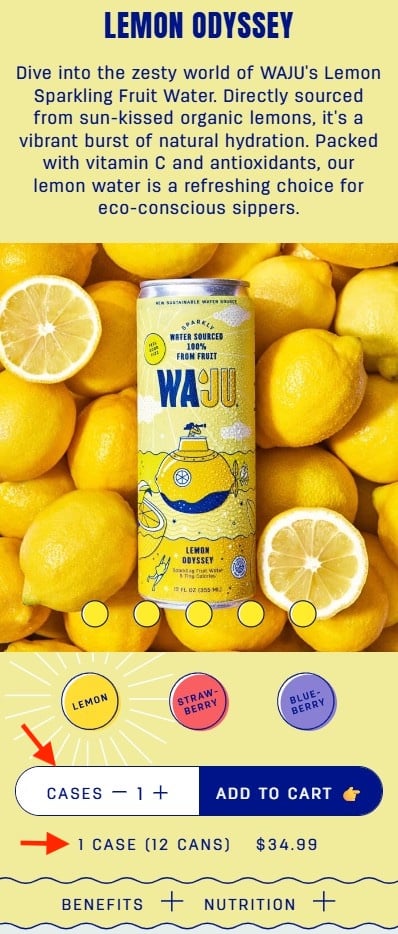
Waju, a beverage company, demonstrates exemplary clarity on its product pages. When presenting quantity options, the interface explicitly states that the quantity refers to "Cases" and provides a clear, concise explanation of how many individual cans are contained within each case. The prominent placement and contrasting white background of the quantity selector draw immediate attention, ensuring that this crucial information is not overlooked. This meticulous attention to detail prevents misunderstandings about whether a purchase includes individual units or bulk packaging, thereby mitigating post-purchase dissatisfaction and returns.
Analysis: Waju’s approach highlights the importance of explicit communication. In e-commerce, where the physical product cannot be examined before purchase, textual clarity becomes paramount. By leaving no room for interpretation regarding unit versus bulk quantities, Waju fosters a sense of reliability and transparency, crucial for building a loyal customer base.
3. Outcome-Oriented Naming: Focusing on Benefits, Not Components
Product names often fall into the trap of describing what a product is rather than what it does for the consumer. By shifting the focus to the tangible benefits or outcomes, brands can create more compelling and easily understood product offerings.
Blueland: The Promise of a Year’s Supply
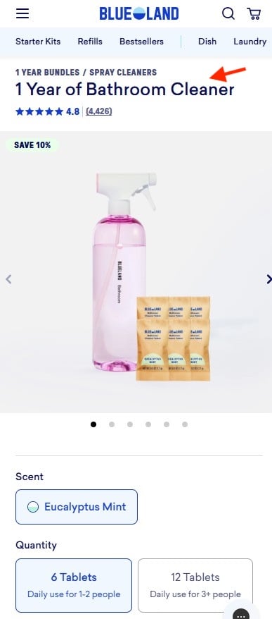
Blueland, a sustainable home cleaning product company, masterfully employs outcome-oriented product naming. Instead of simply listing the number of cleaning tablets or the type of cleaner, their product is named "1 Year of Bathroom Cleaner." This nomenclature instantly communicates the value proposition and the longevity of the product. It translates the abstract concept of refillable tablets into a concrete, long-term solution for the consumer’s cleaning needs. Shoppers don’t need to calculate how many tablets equate to a certain usage period for their household size; the product name itself provides this insight, directly addressing the question of "how long will this last me?"
Analysis: Blueland’s naming convention is a prime example of user-centric marketing. It speaks directly to the consumer’s desire for convenience, value, and sustainability, framing the purchase not as a transaction for cleaning supplies but as an investment in a cleaner home for an extended period. This resonates deeply with consumers looking for practical and efficient solutions.
4. Visualizing Portions: Making Quantities Tangible
For products where portion size or daily consumption is a key factor, visual aids can be incredibly powerful in conveying quantity and value. This is particularly relevant for consumable goods, such as pet food or subscription-based items.
The Farmer’s Dog: Illustrating Daily Portions for Pets
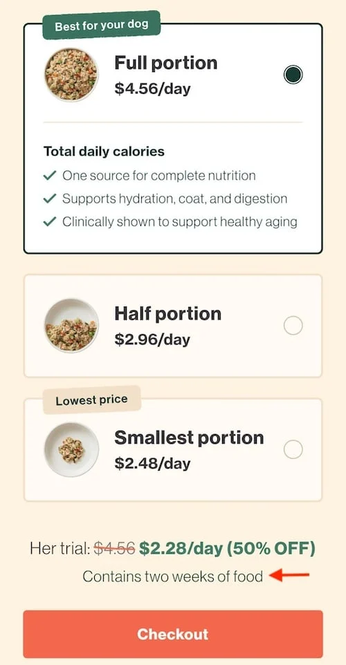
The Farmer’s Dog, a personalized dog food delivery service, effectively addresses the "how much should I order?" question through a visually intuitive portion selector. The interface presents three distinct bowl sizes, visually representing different quantities of food. This imagery makes it immediately clear to pet owners how much food their dog will receive. Furthermore, pricing is presented on a "per day" basis, aligning with how most dog owners budget for their pet’s meals. A clarifying sentence, such as "Contains two weeks of food," below the selection options provides an additional layer of confirmation, eliminating the need for shoppers to perform complex calculations involving grams, boxes, or total servings.
Analysis: The Farmer’s Dog’s strategy is a brilliant fusion of visual communication and value-based pricing. By making the concept of portion size tangible and aligning pricing with daily expenditure, they remove significant barriers to purchase. This approach caters to the emotional aspect of pet ownership, where owners want to ensure their pets are well-fed without overspending or underestimating their needs.
The Broader Impact: Building Trust and Driving Loyalty
The principles exemplified by Gush, Waju, Blueland, and The Farmer’s Dog are not merely design quirks; they represent a fundamental shift in how e-commerce businesses should approach customer interaction. By prioritizing clarity, intuitiveness, and user-centric design, these brands are:
- Reducing Cart Abandonment: Eliminating points of confusion directly leads to fewer shoppers leaving their carts before completing a purchase. Data from the Baymard Institute consistently highlights that complex or unclear checkout processes are major drivers of abandonment.
- Increasing Conversion Rates: A smoother, more understandable journey naturally translates into higher conversion rates. When users can easily find what they want and understand the value proposition, they are more likely to complete a transaction.
- Enhancing Customer Satisfaction: Positive user experiences foster a sense of trust and satisfaction. Shoppers who feel understood and well-served are more likely to return and recommend the brand to others.
- Building Brand Loyalty: In an era of abundant choice, brands that consistently provide exceptional user experiences differentiate themselves and cultivate long-term customer loyalty. This loyalty is built on a foundation of trust, reliability, and a deep understanding of customer needs.
The Path Forward: A Continuous Commitment to User Experience
The insights from Steve Krug’s "Don’t Make Me Think" remain profoundly relevant in today’s digital marketplace. The examples of Gush, Waju, Blueland, and The Farmer’s Dog illustrate that even seemingly minor design choices can have a significant impact on a user’s perception and purchasing behavior.
E-commerce businesses must continually invest in understanding their users’ mental models and anticipate their questions. This involves rigorous user testing, iterative design processes, and a steadfast commitment to clarity and simplicity. The ultimate goal is to create an online environment where the act of shopping feels effortless and intuitive, allowing customers to focus on the joy of discovery and the satisfaction of a well-made purchase, rather than on the frustration of deciphering a complex interface. The brands that successfully navigate this path will not only achieve higher sales but also build enduring relationships with their customers, securing their position in the ever-evolving e-commerce landscape.

