
The Adoption Paradox in Modern Web Development
The current state of CSS Container Queries presents a unique paradox in the front-end ecosystem. According to the 2024 State of CSS survey, awareness of the feature is remarkably high, with approximately 86% of developers reporting knowledge of the specification. However, the conversion from awareness to implementation is stalled; only 41.4% of developers indicate that they actually use container queries in their production workflows.
This discrepancy was a focal point of discussion at the SmashingConf Amsterdam 2026, where industry experts noted that the adoption rate has been unexpectedly sluggish. Kevin Powell, a prominent CSS educator and speaker, characterized the adoption as "terrible" relative to the feature’s potential. This slow uptake is particularly surprising given that container-based styling has topped developer "wishlists" for over a decade, often cited as the missing piece of the responsive design puzzle.
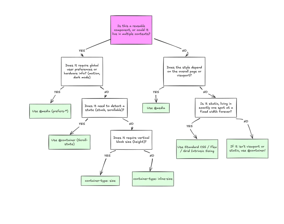
The stagnation is largely attributed to a fundamental misunderstanding of the technology’s purpose. Because the syntax of @container closely mirrors that of @media, many developers treat them as interchangeable tools. This tactical error ignores the architectural shift from "macro" layouts—which focus on the entire browser window—to "micro" layouts, which focus on the modular independence of individual components.
A Chronology of Responsive Evolution
To understand the necessity of container queries, one must look at the evolution of responsive web design (RWD).
- 2010: The Marcotte Era. Ethan Marcotte coined the term "Responsive Web Design," introducing a trio of ingredients: fluid grids, flexible images, and media queries. At this time, the viewport (the browser window) was the only available metric for change.
- 2011–2020: The Viewport Proxy. Media queries became the industry standard. However, as web applications grew more complex and component-based (driven by frameworks like React, Vue, and Angular), the viewport became a "proxy" for layout. Developers were forced to guess the size of a component based on the width of the screen, leading to fragile CSS that broke if a component was moved from a main content area to a sidebar.
- 2021: The Specification Breakthrough. The W3C’s CSS Working Group accelerated work on the CSS Containment Module Level 3. This introduced the concept of "size container features," allowing elements to query the dimensions of their nearest ancestor defined as a container.
- 2022–2023: Universal Support. Google Chrome 105, Safari 16, and Firefox 110 shipped support for container queries, effectively making the technology safe for production use across all major evergreen browsers.
Technical Distinction: Viewport vs. Container
The fundamental technical limitation of a media query is its "blindness" to internal layout logic. When a developer writes @media (min-width: 1024px), they are asking the browser about the dimensions of the hardware or the window. This works for page-level shifts, such as collapsing a multi-column grid into a single column.

However, modern design systems rely on reusable components. A "Card" component might appear in a wide hero section, a medium-sized three-column grid, or a narrow sidebar. Using media queries for this card is inherently flawed; a desktop screen (1920px) might trigger a "large" style for a card that is actually squeezed into a 300px sidebar. The result is content overflow, cramped typography, and broken aesthetics.
Container queries solve this by shifting the perspective inward. By defining a wrapper with container-type: inline-size, the browser creates a new containment context. The component then asks: "How much space is available to me in this specific location?" This allows the card to automatically switch from a horizontal layout to a vertical layout based on its immediate surroundings, regardless of whether the user is on an iPhone or a 4K monitor.
Supporting Data: The Reality of Device Fragmentation
The necessity for component-level responsiveness is underscored by the sheer scale of device fragmentation. Recent data from viewport analysis tools indicates there are now over 2,300 unique viewport sizes actively browsing the web. Attempting to manage this fragmentation using only macro-level media queries requires an unsustainable volume of breakpoints.
Furthermore, the rise of foldable devices and multi-window multitasking on platforms like iPadOS and Android has rendered the concept of a "standard screen size" obsolete. In these environments, the app window might change size dynamically without a change in device orientation. Container queries provide a resilient solution by ensuring that components remain visually coherent even as their parent containers are resized by the OS or user interaction.
Advanced Implementation: Beyond Basic Width
The enrichment of the CSS specification has introduced several specialized units and functions that enhance the power of container queries:
1. Container Query Units
Similar to viewport units (vw, vh), the specification introduced container units:

cqi: 1% of a query container’s inline size.cqw: 1% of a query container’s width.cqh: 1% of a query container’s height.
These units allow for "Fluid Typography" that is context-aware. A heading can be programmed using font-size: clamp(1rem, 0.5rem + 3cqi, 2rem). In this scenario, the text scales perfectly relative to the component’s size, ensuring it never looks awkwardly large in a sidebar or too small in a main feed.
2. Flexbox Wrap Detection Workarounds
While CSS cannot natively detect when a Flexbox item wraps to a new line (a long-standing "holy grail" of CSS), container queries offer a sophisticated workaround. By making the flex item itself a container, developers can trigger style changes when the item expands to fill a new row. This effectively mimics "wrap detection," allowing for a level of layout reactivity that was previously impossible without heavy JavaScript ResizeObservers.
Operational Challenges and Constraints
Despite the advantages, the transition to container-centric design involves navigating several technical constraints that differ from traditional CSS methodologies.
- The Infinite Loop Problem: A container cannot query itself. Attempting to change the width of an element based on its own width would create a circular dependency. Developers must implement a "wrapper" strategy, where a parent element is designated as the container and its immediate child is the element being styled.
- Size Collapse: When an element is set to
container-type: size, the browser ignores the dimensions of its children to calculate the container’s size. Without an explicit height or aspect ratio, the container will collapse to 0px. This behavior often confuses developers transitioning from media queries, where height is usually determined by content. - Variable Limitations: Currently, container queries do not support CSS Custom Properties (variables) within the query declaration (e.g.,
@container (min-width: var(--breakpoint))). This is a known limitation that requires developers to use hard-coded values or pre-processor variables, though future iterations of the spec may address this.
Broader Industry Impact and Implications
The shift toward container queries represents more than just a new syntax; it is a fundamental change in how design systems are built and maintained. For organizations with large-scale digital products, the implications are significant.
Design System Efficiency
Container queries allow design teams to build "smart components" that carry their own layout logic. This reduces the CSS payload, as developers no longer need to write hundreds of lines of contextual overrides (e.g., .sidebar .card ... or .hero .card ... ). The component becomes truly portable.
Performance Optimization
By moving layout logic from JavaScript (ResizeObserver) to native CSS, applications can achieve smoother performance, particularly on low-powered mobile devices. CSS-native queries are handled by the browser’s rendering engine more efficiently than script-based layout calculations, reducing "jank" during window resizing or orientation changes.

Future-Proofing with Style Queries
The industry is also looking toward "Style Queries," an experimental extension of the container query specification. Style queries allow elements to adapt based on the computed styles of a parent—such as its background color or a specific custom property value. This would allow a component to automatically switch to a "dark mode" variant if it is placed inside a dark-colored container, further automating the design process.
Conclusion: A Strategic Reassessment
The transition from viewport-driven design to container-driven design is an essential step in the maturation of the web. While media queries will continue to serve a purpose for "macro" layout concerns—such as global navigation, page-level grids, and user preferences like prefers-reduced-motion—the "micro" layout of components belongs to container queries.
For the 58.6% of developers who have yet to integrate this technology into their stack, the risk of technical debt is increasing. As the web moves toward more modular, resilient, and component-heavy architectures, the ability to decouple an element’s appearance from the browser’s viewport is no longer a luxury—it is a requirement for modern, professional web development. The industry must stop viewing container queries as a secondary alternative to media queries and start recognizing them as the primary tool for component architecture.

