
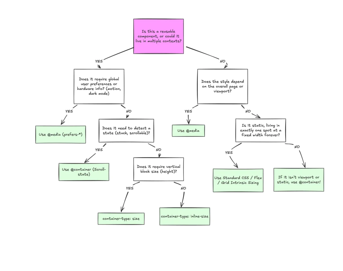
The landscape of front-end development is currently navigating a significant transition as industry standards move from viewport-centric layouts toward component-based responsiveness. Despite achieving nearly 94% browser support, CSS Container Queries—a feature long considered the "holy grail" of web design—face a unique paradox of high awareness but disproportionately low implementation. Recent industry data and expert analyses suggest that while the developer community has historically clamored for the ability to style elements based on their parent container’s size, the actual adoption of this technology remains sluggish, often hindered by a persistent reliance on traditional media queries.
The Current State of Adoption and Industry Awareness
According to the most recent State of CSS survey, a comprehensive annual report tracking developer trends, approximately 86% of web developers are aware of the existence of container queries. However, only 41.4% of respondents report using them in professional projects. This gap highlights a significant friction point in the modern workflow. During the SmashingConf Amsterdam 2024, industry educator Kevin Powell noted that adoption has been uncharacteristically slow for a feature that appeared at the top of developer "wishlists" for nearly a decade.
The stagnation is attributed to several factors, primarily the deep-seated mental model that equates "responsiveness" with "viewport width." For over fifteen years, the industry has viewed the browser window as the sole arbiter of layout changes. Shifting this perspective to a localized, container-first approach requires not just a change in syntax, but a fundamental reorganization of how CSS architectures are built.
A Chronology of Responsive Design Evolution
To understand the current friction, it is necessary to examine the timeline of responsive web design. In 2010, Ethan Marcotte introduced the concept of Responsive Web Design (RWD), which relied on fluid grids, flexible images, and media queries. At the time, media queries were revolutionary, allowing developers to adapt layouts to specific device categories—mobile, tablet, and desktop.

As the web moved toward component-driven architectures (popularized by frameworks like React, Vue, and Svelte), the limitations of media queries became apparent. By 2019, the demand for container queries reached a fever pitch, with developers noting that components intended for reuse across different parts of a site often broke when moved from a wide main column to a narrow sidebar.
The technical specification for Container Queries (CSS Containment Module Level 3) gained significant momentum in 2021. By early 2023, all major evergreen browsers—Chrome, Firefox, Safari, and Edge—had implemented stable support. This rapid cross-browser alignment is rare in web standards, yet the industry continues to treat the viewport as a proxy for layout logic.
The Viewport Proxy Problem: Why Media Queries Fall Short
The primary technical critique of media queries in modern development is that they are "structurally blind." When a developer writes a media query, they are asking the browser about the dimensions of the entire screen. While this is effective for page-level changes—such as hiding a navigation menu or changing a grid from three columns to one—it fails to account for the internal environment of a component.
Consider a standard "card" component. In a traditional media query setup, the card might be styled to display an image next to text when the viewport exceeds 1024 pixels. However, if that same card is placed inside a narrow sidebar on a large desktop screen, the media query still triggers the "wide" layout. This results in visual errors, including text overflow, cramped imagery, and broken alignment. The viewport, in this instance, acts as an inaccurate proxy for the actual space available to the component.
Container queries resolve this by shifting the inquiry. Instead of asking how wide the screen is, the component asks how much space its immediate parent provides. This allows a component to be truly "context-aware," adapting its layout whether it is placed in a hero section, a footer, or a multi-column grid.

Macro vs. Micro Layouts: A New Structural Framework
The emerging consensus among CSS architects is a clear division of labor between media queries and container queries, often categorized as "Macro" versus "Micro" layouts.
Macro Layouts (Media Queries): These are reserved for global page structures. Media queries remain the optimal tool for handling system-level preferences, such as prefers-color-scheme or prefers-reduced-motion, and for defining the primary layout grid of a website. The header, footer, and main content regions are generally governed by the viewport.
Micro Layouts (Container Queries): These are applied to the modular units that inhabit the macro layout. Elements such as buttons, cards, form fields, and navigation widgets benefit from container queries. By defining these at the micro level, developers ensure that the component remains robust and reusable across any design system without requiring additional "override" classes for different page locations.
Technical Implementation and Noteworthy Limitations
Implementing container queries requires the registration of a "containment context." A parent element must be defined as a container using the container-type property, typically set to inline-size. This allows the browser to track the width of the element without being forced to track the height, which prevents the performance-heavy "infinite loop" scenarios where an element’s content changes its size, which in turn changes its styles.
One of the most significant advantages of this technology is the introduction of container-relative units, such as cqi (container query inline-size) and cqw (container query width). These units enable "fluid typography" that scales based on the component’s size rather than the screen’s size. For example, a heading can be programmed to grow as its container expands, ensuring optimal legibility regardless of whether it is viewed on a mobile device or a high-resolution monitor.

However, the technology is not without constraints. Current specifications do not allow container queries to utilize CSS custom properties (variables) within the query declaration itself. Additionally, a container cannot query its own dimensions; it can only affect its descendants. This necessitates a "wrapper" strategy in HTML markup, which some developers argue adds unnecessary bloat to the DOM (Document Object Model).
Industry Implications and the Future of Design Systems
The shift toward container queries has profound implications for design systems and UI libraries. Historically, design systems had to provide "variants" for components—such as Card--horizontal or Card--stacked. With container queries, these variants become obsolete. The component itself contains the logic to switch between horizontal and vertical layouts based on its environment, significantly reducing the amount of CSS a library must ship.
Furthermore, the rise of "Flexbox wrap detection" through container queries represents a major leap in CSS capability. While Flexbox can wrap items to a new line, CSS has traditionally lacked a way to "detect" that wrap and change styles accordingly. By nesting a container query within a flex item, developers can now trigger style changes the moment an item wraps, a feat previously only possible through complex JavaScript ResizeObserver implementations.
Strategic Outlook
The transition from media queries to container queries is a maturation of the web as a platform. As the web moves further away from the "page" metaphor and closer to an "app" and "component" architecture, the tools used to build it must evolve. While the 41.4% usage rate suggests a slow start, the logic of container-driven design is becoming undeniable for large-scale, professional web applications.
Experts predict that as the "mental debt" of old responsive techniques is paid off, container queries will become the default method for styling UI components. The focus for the 2025-2026 development cycle will likely be on education and the refinement of best practices to help developers distinguish when to look outward at the viewport and when to look inward at the container. The end result will be a more resilient, modular, and truly responsive web.

