
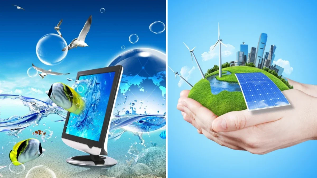
The design landscape of the mid-2000s to the early 2010s was dominated by a specific visual language that combined high-gloss textures, naturalistic imagery, and skeuomorphic digital interfaces, a style now retrospectively identified as Frutiger Aero. Characterized by its use of tropical fish, water droplets, sprawling green meadows, and vibrant "aurora" light effects, Frutiger Aero represented a period of profound technological optimism. While the aesthetic was ubiquitous during its peak years, it remained unnamed by the public until 2017, when Sofi Lee of the Consumer Aesthetics Research Institute (CARI) coined the term to categorize the era’s unique convergence of corporate technology and organic environmentalism. Today, the aesthetic is undergoing a massive cultural revival, driven by a combination of generational nostalgia and a reaction against the perceived sterility of modern minimalist design.
The Visual DNA of Frutiger Aero
Frutiger Aero, also frequently referred to as "Web 2.0 Gloss," served as the primary successor to the "Y2K Futurism" aesthetic that defined the turn of the millennium. Whereas Y2K design was characterized by low-poly 3D graphics, silver metallic finishes, and a certain "edgy" or science-fiction-inspired grit, Frutiger Aero moved toward a more approachable, bright, and "clean" presentation.
The aesthetic is anchored by several core visual pillars. Primarily, it utilizes skeuomorphism—the design principle of making digital interface elements resemble their real-world counterparts. This was most visible in the "glossy" buttons of early smartphones and the "glass-like" windows of desktop operating systems. The color palette typically emphasizes whites, vibrant greens, and various shades of blue, intended to evoke feelings of freshness and clarity.
Specific motifs recurring throughout Frutiger Aero include:
- Glossy Textures: Icons and interfaces designed to look like polished plastic or glass.
- Nature Imagery: High-definition photography of cloudy skies, tropical fish, bubbles, and grassy plains.
- Abstract Elements: Lens flares, bokeh effects, and "aurora" ribbons of light.
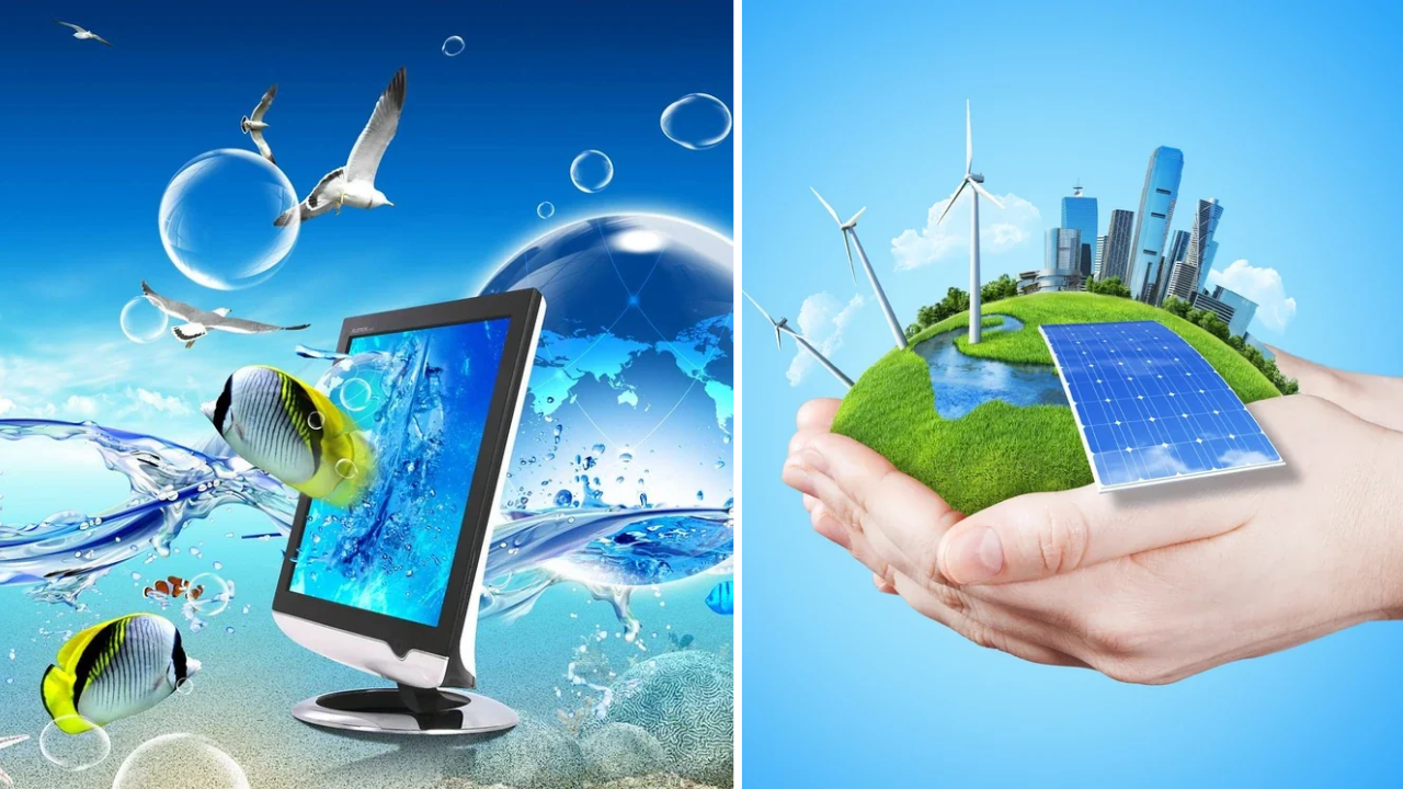
- Optimistic Futurism: Imagery depicting a harmonious coexistence between advanced technology and a pristine natural environment.
Etymology and the Role of the Consumer Aesthetics Research Institute
The name "Frutiger Aero" is a portmanteau of two major influences from the era. The first half, "Frutiger," refers to the Frutiger family of sans-serif typefaces designed by Swiss typographer Adrian Frutiger. These fonts, known for their high legibility, were widely adopted in public infrastructure, such as airports and train stations, and influenced many of the digital fonts used in the mid-2000s.
The second half, "Aero," is a direct reference to "Windows Aero," the design language introduced by Microsoft with Windows Vista in 2006 and continued through Windows 7. Windows Aero introduced the "Aero Glass" effect, which used translucent window borders and reflections to create a sense of depth and sophistication.
According to researchers at CARI, the categorization of such aesthetics is essential for understanding consumer behavior and the evolution of corporate identity. By naming the aesthetic retrospectively, researchers have been able to map how corporations across different sectors—from telecommunications to home appliances—coordinated their visual messaging to suggest that the digital revolution was "safe," "natural," and "bright."
The Technological Catalysts: From Dial-Up to Broadband
The emergence of Frutiger Aero was not merely a stylistic choice but was heavily dictated by the technological advancements of the era. The period between 2004 and 2013 saw the transition from the post-dot-com bubble recovery to the explosion of Web 2.0. The widespread adoption of broadband, DSL, and cable internet allowed web designers to move away from static, text-heavy pages toward media-rich environments.
Furthermore, the rise of High-Definition (HD) display technology played a critical role. As plasma and LCD televisions entered the mainstream, manufacturers used vibrant nature photography—specifically high-contrast images of coral reefs and rainforests—to demonstrate the superior color reproduction and clarity of their screens. This "HD aesthetic" bled into computer software and advertising, reinforcing the link between high technology and high-fidelity natural imagery.
Industry Adoption: Hardware and Software Implementation
The peak of Frutiger Aero coincides with some of the most influential hardware releases in modern history. The seventh generation of video game consoles served as a major vehicle for the aesthetic. The Nintendo Wii, released in 2006, featured a user interface (the Wii Menu) that epitomized the style with its clean white backgrounds, blue accents, and soft, rounded "channels." Similarly, the PlayStation 3’s "XrossMediaBar" (XMB) utilized flowing ribbons of light and bokeh effects, while the Xbox 360’s "NXE" dashboard update leaned heavily into glossy tiles and vibrant colors.
In the mobile sector, the original iPhone (2007) and early Android devices were built entirely on the principles of skeuomorphism. Icons for "Notes" looked like yellow legal pads, while the "Newsstand" app featured a wooden bookshelf texture. These design choices were intentional; they helped users who were transitioning from feature phones to smartphones understand how to interact with a touch-based interface by providing familiar visual cues.
The Shift to Flat Design and the Decline of the Glossy Era
By 2012, the industry began to move away from the complexity of Frutiger Aero. As digital literacy increased, the need for skeuomorphic "hand-holding" diminished. Users no longer needed a button to look like a 3D piece of glass to know it was clickable.
The definitive end of the Frutiger Aero era is often cited as September 18, 2013, the day Apple released iOS 7. Under the direction of Jony Ive, Apple stripped away all textures, shadows, and gloss in favor of "Flat Design." This new philosophy emphasized thin typography, neon gradients, and a lack of depth. Microsoft made a similar move with the "Metro" design language in Windows 8. By the mid-2010s, the "Corporate Memphis" style—characterized by flat, disproportionate human figures and pastel colors—had become the new standard for tech companies, leaving Frutiger Aero to be viewed as a relic of the past.
The Resurgence: Nostalgia and the "Neo-Aero" Movement
In late 2022 and throughout 2024, Frutiger Aero experienced a massive resurgence in popular culture, particularly among Generation Z. This revival is partly explained by the "20-year nostalgia cycle," where trends from two decades prior are rediscovered and romanticized by a younger generation. For many Gen Z individuals, Frutiger Aero represents the "visual background" of their childhood—a time before the perceived cynicism of the modern internet.
On platforms like TikTok and YouTube, the aesthetic has been rebranded as "Neo-Aero." This movement often involves creating "dreamcore" or "weirdcore" videos that use Frutiger Aero imagery to evoke a sense of "anemoia"—nostalgia for a time one never actually lived through, or a yearning for the "future they promised us." This phrase has become a rallying cry for the movement, reflecting a collective desire for the technological optimism of the 2000s in contrast to the data-privacy concerns and algorithmic fatigue of the 2020s.
Data and Social Media Impact
The statistical footprint of the Frutiger Aero revival is significant. On TikTok, videos tagged with #FrutigerAero have garnered hundreds of millions of views. For instance, in late 2026, a series of viral posts demonstrated the aesthetic’s enduring grip on the digital imagination:
- On October 20, 2026, a video likening a natural flood to the Frutiger Aero aesthetic received over 10.5 million views.
- On October 26, 2026, a compilation of nature-tech imagery reached 8.5 million views within days.
- A historical summary of the aesthetic posted by the YouTube channel @nationsquid accumulated over 610,000 views, indicating a deep interest in the academic and historical roots of the style.
The "Brainrot" Phenomenon: Frutiger Aero Yams
As with any aesthetic that reaches a critical mass of popularity, Frutiger Aero has eventually been absorbed into the "brainrot" subculture of the late 2020s. This is best exemplified by the "Frutiger Aero Yams" meme, which surfaced in mid-October 2026. The term, which combines the aesthetic with surreal internet slang for buttocks or vegetables, serves as a form of ironic commentary.
These memes often use the phrase "Frutiger Aero yams to your right" to mock the intense, almost obsessive love some users have for the aesthetic. Despite its seemingly nonsensical nature, the "yams" phenomenon highlights how Frutiger Aero has transitioned from a serious design movement to a flexible cultural shorthand used in ironic and surrealist humor.
Broader Impact and Implications for Future Design
The enduring appeal of Frutiger Aero suggests a growing dissatisfaction with the current state of digital design. Industry analysts suggest that the "clean," minimalist "Flat Design" that has dominated the last decade may be reaching its expiration date. The resurgence of Aero-inspired elements—such as the "Glassmorphism" seen in recent updates to macOS and Windows 11—indicates that designers are once again looking for ways to add depth, transparency, and organic warmth to digital spaces.
Furthermore, the Frutiger Aero movement reflects a broader societal yearning for environmental harmony. In an era of climate anxiety, the aesthetic’s depiction of a world where solar panels, sleek skyscrapers, and pristine oceans exist in perfect balance offers a form of visual escapism. While Frutiger Aero began as a corporate branding strategy to sell software and televisions, it has evolved into a symbol of a lost era of optimism, proving that even the most commercial of aesthetics can take on profound emotional meaning for a generation looking backward to find a way forward.

