
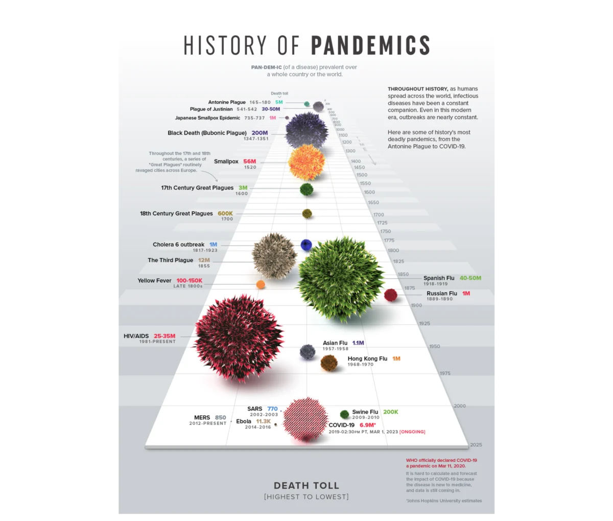
In the modern corporate landscape, organizations are experiencing a paradox of plenty: data has never been more accessible, yet its ability to drive meaningful decision-making remains remarkably low. Despite the proliferation of sophisticated business intelligence (BI) tools and real-time performance dashboards across sales, product, marketing, and operations functions, a significant gap persists between technical accuracy and communicative efficacy. Industry analysis suggests that while the global data visualization market is projected to reach approximately $19 billion by 2030, a staggering percentage of corporate dashboards fail to produce a tangible change in thinking or a clear strategic direction during critical reviews.
The core of this failure rarely lies in the integrity of the datasets. Instead, the breakdown occurs at the intersection of data science and design. Meriem Benhabiles, a specialist in the field, posits that the "technically correct but communicatively inert" dashboard is a byproduct of a lack of structured User Experience (UX) thinking. By treating data visualization as a passive reporting exercise rather than a functional design problem, organizations often obscure the very insights they seek to uncover.

The Evolution of Visual Literacy: From Anscombe to Tufte
To understand the current crisis in data communication, it is necessary to examine the historical foundations of the discipline. In 1973, statistician Francis Anscombe published a seminal paper featuring what is now known as Anscombe’s Quartet. He constructed four datasets with nearly identical statistical properties—including mean, variance, and correlation coefficients—that, when plotted, revealed radically different patterns. Anscombe’s objective was to demonstrate that visualization is not merely a secondary representation of data but a primary diagnostic tool capable of revealing operational truths that raw numbers conceal.
This diagnostic necessity was further codified in 1983 by Edward Tufte in his foundational work, The Visual Display of Quantitative Information. Tufte introduced the "data-ink ratio," a principle stating that every mark on a chart should serve a specific data-driven purpose rather than acting as decoration. While Tufte’s focus on visual hygiene remains a gold standard for clarity, modern UX practitioners argue that simplicity is not an absolute virtue. In a corporate context, a chart is never read in a vacuum; it is processed by specific individuals under specific pressures. Consequently, the goal of modern data visualization has shifted from "minimalism" to "appropriate complexity"—providing the exact layer of context a decision-maker requires to act.
A Chronology of the Data Visualization Shift
The transition from static reporting to "Data UX" has followed a clear chronological progression over the last several decades:

- The Era of Raw Calculation (Pre-1970s): Data was largely confined to ledgers and mainframe printouts, accessible only to specialists.
- The Diagnostic Breakthrough (1970s-1980s): Pioneers like Anscombe and Tufte established that visual forms are essential for identifying outliers and trends that summary statistics miss.
- The Tooling Explosion (2000s-2010s): The rise of SaaS platforms and BI tools like Tableau and PowerBI democratized chart creation, leading to an era of "dashboard bloat" where the ease of creation often outpaced the quality of insight.
- The UX Integration (2020s-Present): Current industry standards are moving toward "Data UX," where approximately 80% of the work occurs upstream—before a single chart is drawn—focusing on context, audience intent, and actionable insight.
The Three Pillars of Data UX Framework
Effective data design requires moving beyond the "data-first" approach, where teams simply visualize whatever metrics are currently being tracked. Instead, a "question-first" methodology is required, built upon three primary pillars.
Defining Context and Operational Goals
Most data projects fail because they start with available metrics rather than the problem to be solved. For instance, a directive to "show product performance" is functionally useless because it lacks a specific population and an implied action. In contrast, a goal such as "identify which features drive retention among users who signed up in Q1" provides a clear design constraint. This specificity allows designers to filter out the "noise" of irrelevant data, ensuring every element on the screen serves a specific answer.
Audience Calibration: Familiarity and Accountability
Designing for an audience requires balancing two variables: data literacy (familiarity) and the consequences of the data (accountability). An analyst requires high-density environments—such as granular session-level user journey flows—to perform diagnostic discovery. Conversely, an executive requires a highly synthesized translation of that data to make immediate commercial or budgetary decisions. Tailoring the "density dial" of a dashboard ensures that the information matches the cognitive load capacity of the viewer.

Driving Insight Over Information
Information describes what the data shows; insight describes what should change as a result. A dashboard built for information might alert a team to a 15% drop in booking rates, often triggering a misplaced "fire drill" in the engineering or UX departments. A dashboard built for insight, however, would map that drop against traffic sources and marketing campaigns. This would reveal if the drop was caused by a technical failure or merely diluted by an influx of low-intent traffic from a new advertisement, allowing for a precise, informed response rather than a reactive panic.
Case Study: Transforming Talent Management through Comparative Analysis
The practical application of Data UX was recently demonstrated in a project for a B2B SaaS platform focused on enterprise talent management and competency tracking. The platform possessed an immense archive of user activity telemetry but lacked a method to present it effectively to enterprise teams.
Initially, the client sought to chart all available user activity. However, the design team pivoted to architecting a tool based on "performance mechanics." They identified that "time spent on the platform" was merely a proxy for engagement and did not necessarily correlate with competency. By integrating competency scores, certification rates, and historical performance trajectories, the dashboard began to tell an "honest story" about employee growth.

A key innovation in this project was the implementation of the radar chart (or spider chart) for multi-dimensional analysis. While a standard bar chart would require a manager to scan eight individual bars and mentally calculate variances, the radial layout allowed for the instant recognition of a "balanced" vs. "skewed" profile. This visual mental model enabled managers to identify critical vulnerabilities in a team member’s skill set at a single glance.
Reported Outcomes and Impact
Following the deployment of these UX-centered dashboards, the organization reported several key performance indicators:
- Engagement: Weekly active engagement with the platform’s analytics features increased as managers shifted from monthly reporting to weekly planning.
- Retention: Qualitative feedback indicated that the ability to spot slipping performance early allowed for proactive coaching, contributing to a significant reduction in platform churn.
- Operational Efficiency: The introduction of a "side-by-side" comparison tool—a feature not in the original brief but identified through UX research—became the most utilized function for talent allocation.
The Broader Implications for Corporate Governance
The shift toward structured Data UX has profound implications for how organizations are governed. When data is presented as a passive log of the past, meetings often devolve into debates over the validity of the numbers. When data is presented through a UX lens, the focus shifts to the future.

Industry experts suggest that as Artificial Intelligence (AI) and Machine Learning (ML) continue to automate data collection, the role of the human "data translator" will become even more critical. The value of a data professional will no longer be measured by their ability to generate a chart, but by their ability to design a narrative that leads to a decision.
In conclusion, data visualization reaches its full potential only when it is treated as an upstream architectural choice rather than a downstream formatting step. By prioritizing the human decisions behind the screen, organizations can ensure that their data stops being a decorative byproduct of their operations and starts acting as a primary engine for strategic growth. The success of a dashboard is not measured by the beauty of its gradients or the complexity of its code, but by the clarity of the direction it provides to the person holding the mouse.

