
In the contemporary corporate landscape, the proliferation of data has reached an unprecedented scale, yet the ability of organizations to derive actionable insights from this information remains significantly hindered. While tools for generating dashboards and performance decks have become more accessible to departments ranging from sales to operations, a persistent disconnect remains between the presentation of numbers and the execution of strategic decisions. This phenomenon, characterized by meetings where data is shared but no direction is established, highlights a fundamental flaw in how information is visualized. Meriem Benhabiles, a specialist in the intersection of data and design, posits that the solution lies in the application of structured User Experience (UX) thinking to data presentation—a shift that prioritizes the operational question over the mere availability of datasets.
The Diagnostic Power of Visualization
The historical foundation of data visualization emphasizes its role as a diagnostic tool. In 1973, statistician Francis Anscombe published a seminal paper introducing what is now known as Anscombe’s Quartet. He constructed four datasets that were statistically identical in terms of mean, variance, correlation coefficient, and regression line. However, when plotted on a graph, the four datasets revealed vastly different patterns, ranging from linear relationships to extreme outliers and non-linear curves. Anscombe’s lesson was clear: visualization reveals the operational truths that raw numbers often conceal.
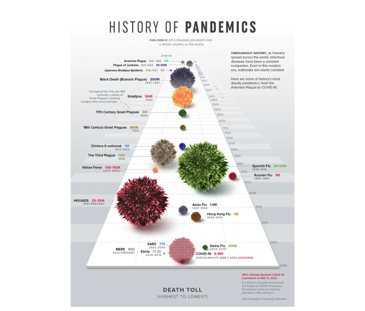
In a modern context, visualization has evolved from a diagnostic necessity to a communicative imperative. The choice of visual form determines whether an audience absorbs a series of disconnected figures or internalizes a narrative. A notable example of this is the "History of Pandemics" visualization by Visual Capitalist. Rather than utilizing a traditional data table, the designers employed a proportional bubble layout on a single timeline. This allowed the human visual system to grasp the catastrophic scale of the Black Death relative to other historical events before a single label was processed. Such examples underscore the principle that effective visualization makes the core story impossible to ignore.

The 80 Percent Rule: Strategy Before Execution
The success of a dashboard is rarely determined by the aesthetics of the final chart; instead, it is decided by the work performed before a single pixel is rendered. Approximately 80% of the effort required to create a functional dashboard involves addressing three critical pillars: context, audience, and insight.
1. Establishing Context Through Operational Questions
Most data-heavy projects suffer from a "data-first" bias, where teams aggregate whatever metrics are readily available in their analytics tools. This approach often results in dashboards that are technically correct but practically useless. To counteract this, designers must adopt a "context-first" strategy. For instance, a vague goal such as "monitor product performance" lacks the specificity needed for design. In contrast, a goal like "identify which features drive retention among users who signed up in Q1" provides a specific metric, a defined population, and an implied action. This level of constraint converts an open-ended exploration into a solvable design problem, ensuring every element on the screen serves a specific purpose.
2. Defining the Audience and the Density Dial
Designing for an audience requires an understanding of two variables: familiarity and accountability. Familiarity refers to the data literacy of the viewer—how instinctively they can interpret complex charts without friction. Accountability refers to the professional weight of the data; a 12% decline in revenue is viewed differently by an analyst than by the executive responsible for that budget.
These factors determine the "density dial" of the dashboard. An analyst requires a high-density environment to conduct diagnostic discovery, mapping raw user flows to uncover hidden friction points. Conversely, an executive requires a highly synthesized overview that facilitates rapid budget or strategic decisions. Simplicity, in this framework, is not a fixed virtue but a contingent one based on the user’s specific operational needs.

3. Transitioning from Information to Insight
The most significant gap in current data practices is the confusion between information and insight. Information is a report of what the data shows; insight is the decision or course correction that occurs as a result. A dashboard built for information might sound an alarm regarding a drop in booking rates, often leading to panic and misplaced "fire drills" in the engineering department. A dashboard built for insight, however, would map that drop against traffic sources, potentially revealing that the decline was caused by an influx of low-intent click traffic from a new marketing campaign rather than a technical failure in the app.
Case Study: Talent Management and Competency Tracking
The practical application of these principles was demonstrated in a recent project for a B2B SaaS platform specializing in enterprise talent management. The platform possessed an extensive archive of user activity telemetry but lacked a method to present it effectively to enterprise clients.
Chronology of Development
The project began by rejecting "time spent" as a primary metric. While easy to track, time spent is a proxy for engagement that does not necessarily equate to skill acquisition. The development team instead focused on competency scores, certification completion rates, and historical performance trajectories.
The design team identified two distinct user personas: the individual contributor and the team manager. For the individual contributor, the dashboard was designed as a self-directed mirror, allowing them to see their strengths and gaps in real-time. For the manager, the interface prioritized a macro pulse check on team vulnerabilities, enabling them to intervene before skill gaps led to project failures.

Technical Execution: The Radar Chart
A pivotal design choice was the implementation of radar charts (also known as spider charts) to visualize multi-dimensional competency. By organizing eight distinct skill areas across axes radiating from a central point, the interface created a unified shape. A balanced polygon indicated a well-rounded professional, while a skewed shape immediately highlighted outliers or deficiencies. This radial layout allowed users to process variance across multiple categories faster than a traditional linear bar chart, which would have required more cognitive load to compare individual bars.
Implementation of Visual Mental Models
To ensure immediate usability, a consistent color system was integrated into the data model from the outset. Each product or skill category was assigned a specific hue that remained constant across all charts, filters, and reports. This pre-established visual language meant that by the time a user reached the dashboard, they already understood the "grammar" of the data without requiring a manual.
Measured Impact and Market Implications
The transition from passive reporting to active insight led to quantifiable improvements in platform engagement. Following the deployment of these UX-centered dashboards, the client reported a significant rise in weekly active engagement with analytics features. Rather than viewing data as a retrospective post-mortem, managers began using the tools every Monday morning to plan their weekly interventions.
Furthermore, qualitative feedback indicated that the "comparison tool"—a feature allowing managers to view two team members side-by-side against identical metrics—became the most utilized function. This feature, which was not part of the initial client brief, was a direct result of UX designers anticipating the human need for comparative analysis.

Industry data from organizations like Gartner suggests that up to 80% of data analytics projects fail to deliver business value, often due to poor communication of insights rather than technical inaccuracies. The shift toward "Data UX" represents a maturing of the field, where the goal is no longer just to store or process data, but to ensure it can be consumed by the human brain under pressure.
The Future of Data UX in the Age of AI
As Artificial Intelligence and machine learning become more integrated into business intelligence tools, the role of structured UX thinking will only grow in importance. AI can generate thousands of charts in seconds, but it cannot inherently understand the specific organizational context or the emotional accountability of a human decision-maker.
The broader implication for designers and analysts is clear: visual presentation must be treated as an upstream architectural choice. When data design is relegated to a final formatting step, the potential for impact is lost. By focusing on the human decisions behind the screen, organizations can transform their data from a passive log of the past into a proactive engine for the future. Data visualization reaches its zenith when it stops being a collection of charts and starts being a functional tool for change.

