
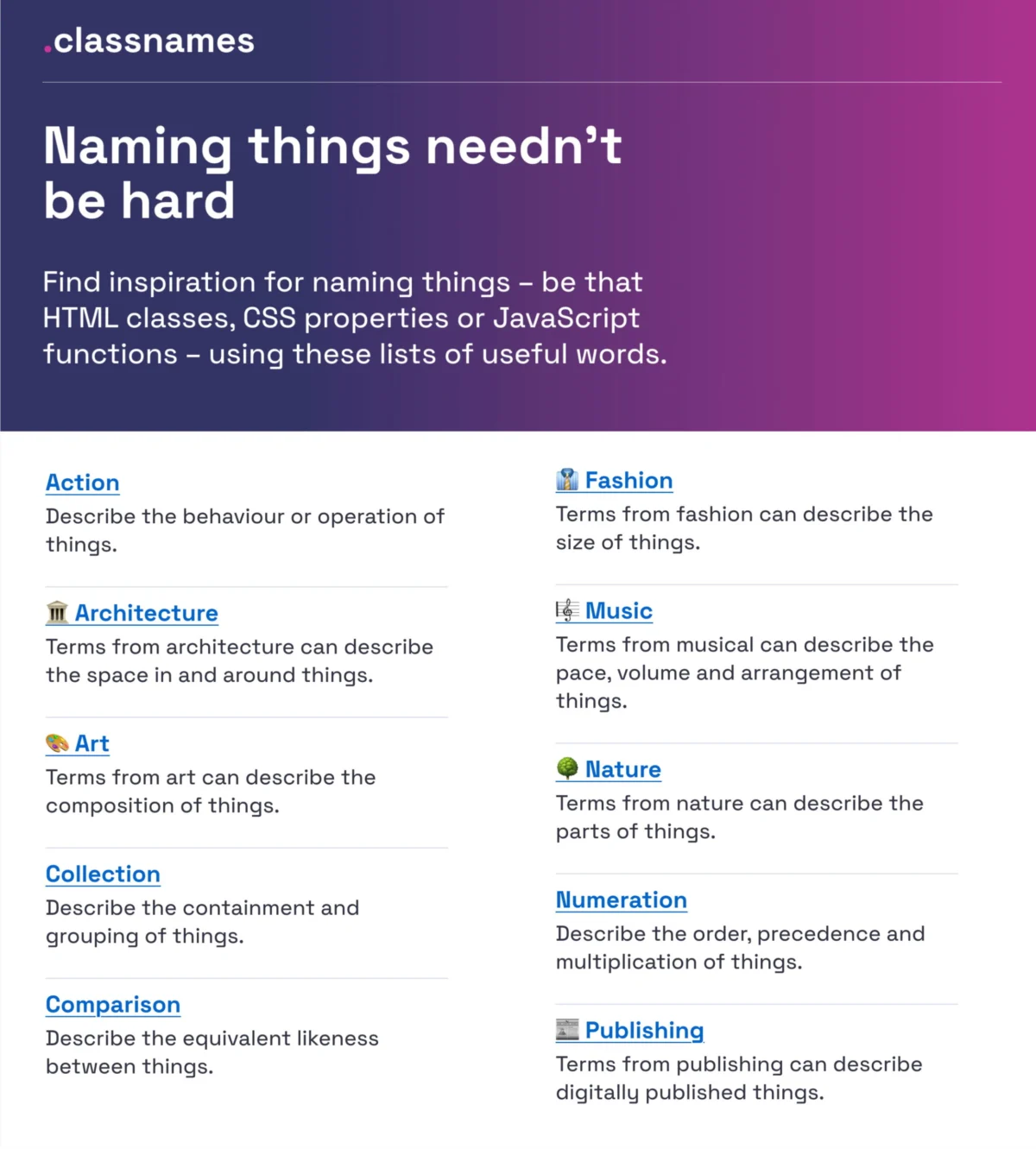
The discipline of digital product design has reached a critical inflection point where the semantic integrity of a system is as vital as its visual aesthetics. As software ecosystems grow in complexity, the act of naming—once considered a secondary concern for designers and engineers—has emerged as a primary bottleneck in development velocity and cross-functional collaboration. The challenges inherent in naming UI components, colors, design tokens, and features represent more than mere linguistic preferences; they reflect the underlying logic and scalability of a product’s architecture. Industry experts and design system practitioners are increasingly advocating for standardized taxonomies to mitigate the fragmentation that occurs when designers, developers, and product managers utilize disparate terminologies for identical assets.
The Evolution of Naming Methodologies in Software Engineering

The history of naming in digital environments is rooted in the fundamental principles of computer science. Phil Karlton, a renowned architect at Netscape, famously posited that naming is one of the two "hard things" in computer science, alongside cache invalidation. In the early stages of web development, naming was often arbitrary, dictated by individual developers and limited by the constraints of early CSS and HTML. However, the rise of modular design and the transition from static pages to dynamic, component-based frameworks like React, Vue, and Angular necessitated a more rigorous approach.
The chronology of this evolution moved from semantic HTML to the introduction of methodologies such as BEM (Block, Element, Modifier) in the late 2000s. BEM provided a structured way to name CSS classes, reducing specificity issues and making code more readable. As design systems became the industry standard in the mid-2010s, the focus shifted from code-level naming to a unified language that bridges the gap between design software like Figma and development environments. This led to the birth of design tokens—agnostic variables that store visual design attributes—which require a naming structure capable of supporting multiple themes, brands, and platforms.
Standardizing Visual Attributes and Color Repositories

One of the most persistent areas of confusion in UI design is color nomenclature. Historically, teams relied on generic names (e.g., "Light Blue") or technical hex codes (e.g., #F0F8FF), both of which fail to provide context or scalability. To address this, the industry has seen a move toward expansive, data-driven repositories. The "Color Names" project, maintained by David Aerne, serves as a benchmark in this space, housing over 30,355 unique color names sourced from various historical and technical references.
The data suggests that utilizing a vast, standardized repository allows teams to move away from subjective naming, which can vary wildly between team members. By using tools like Color Parrot or specialized color pickers, organizations can assign unique, memorable identifiers to brand palettes. This reduces the cognitive load on developers who must otherwise memorize hexadecimal strings and ensures that the "brand language" remains consistent across marketing materials and product interfaces.
Architectural Logic in Layer and Group Organization

Beyond the visual surface, the internal organization of design files—specifically layers and groups—dictates how efficiently a team can iterate on a product. Professional guidelines, such as those synthesized by designer Javier Cuello, emphasize that effective names must be short, meaningful, and independent of visual properties. For instance, naming a component "PrimaryButton" is more effective than "BlueButton," as the latter becomes obsolete if the brand’s primary color changes.
The logic of naming at the structural level follows a hierarchical approach:
- Category: The broad type of element (e.g., Button, Input).
- Type/Component: The specific manifestation (e.g., Radio, Toggle).
- State/Modifier: The condition of the element (e.g., Active, Hover, Disabled).
This structure ensures that as a design system scales from 50 components to 500, the searchability and discoverability of assets remain intact. Poorly named layers lead to "design debt," where new team members struggle to navigate legacy files, ultimately slowing down the production cycle.

The Design Token Taxonomy: A Case Study in Multi-Brand Scalability
The complexity of naming reaches its peak in multi-brand environments. A notable example is Intuit, the parent company of Mailchimp, QuickBooks, and TurboTax. Nate Baldwin, a lead architect at Intuit, documented the transition to a flexible design token taxonomy designed to serve a diverse array of products under a single foundational system.
The Intuit case study highlights a shift from "brand-centric" naming to "functional" naming. In a multi-brand setup, a token named "QuickBooks-Green" is useless for Mailchimp. Instead, the team developed a system of semantic tokens—names that describe the intent of the value rather than the value itself. For example, a token might be named "color.background.primary." This allows the underlying value to be green in QuickBooks and yellow in Mailchimp without requiring a change to the codebase.

Supporting data from industry surveys suggests that organizations utilizing semantic design tokens report a significant reduction in the time required to implement "dark mode" or rebrand initiatives. By abstracting the name from the value, the technical infrastructure becomes theme-agnostic.
Benchmarking Against Industry Standards: The Component Gallery
To assist teams in navigating the "naming rabbit hole," resources like the Component Gallery, curated by Iain Bean, provide a comprehensive index of how real-world design systems name their assets. Analyzing over 50 UI components—from "Accordions" to "Visually Hidden" elements—the gallery reveals that while there is some variance, a consensus is forming around "standard" names.
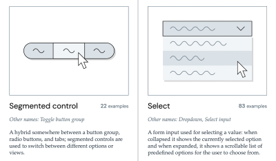
This benchmarking is vital for interoperability. If a company uses a third-party library or hires contract developers, adhering to industry-standard names (e.g., using "Breadcrumbs" instead of "NavigationPath") ensures that the external talent can contribute immediately without a lengthy onboarding process regarding internal jargon. Furthermore, visual dictionaries like "Name That UI" help bridge the gap for junior designers who may know what a component looks like but lack the technical term for it.
The Psychology of Feature Naming and User Discovery
Naming is not merely an internal technical requirement; it is a critical component of User Experience (UX). Erin Gannon’s research into feature naming suggests that low adoption rates for new software features are frequently linked to poor discoverability caused by confusing names.

A feature’s name serves as its first "instruction manual." If the name does not align with the user’s mental model, the feature may be ignored. Gannon proposes a "job-to-be-done" framework for naming, where the name signals the value or outcome. For example, a feature named "SyncPro" is less descriptive than "Auto-Save," which tells the user exactly what the feature does.
Data-driven approaches to feature naming often involve "cloze tests" or "preference testing," where users are asked to describe a feature’s function based solely on its name. If the user’s description deviates from the actual function, the name is deemed a failure. This user-centric approach ensures that the product’s language reflects the audience’s dialect rather than the internal company culture.
Broader Implications for the Future of Digital Workflows

The systemic adoption of naming conventions has profound implications for the future of the web. As Artificial Intelligence (AI) and Machine Learning (ML) begin to play a larger role in code generation and automated design, the need for clean, structured data becomes paramount. AI models trained on well-named components and tokens are significantly more accurate in generating usable code than those trained on fragmented, inconsistently labeled data.
Furthermore, standardized naming is a cornerstone of digital accessibility. Screen readers and assistive technologies rely on semantic HTML and correctly labeled components to describe the interface to users with visual impairments. A "Search" button labeled as "IconButton4" provides no context to an assistive device, whereas a button labeled with a clear, functional name ensures the web remains inclusive.
In conclusion, the practice of naming in UI/UX is an exercise in clarity, scalability, and empathy. By leveraging existing repositories, adopting semantic taxonomies like those used at Intuit and Vodafone UK, and grounding feature names in user research, organizations can eliminate the "dialect gap" that often exists between departments. The goal of a robust naming convention is to create a "frictionless" environment where the name of an object is so intuitive that it becomes invisible, allowing teams to focus on innovation rather than clarification. As digital products continue to integrate into every facet of human life, the language we use to build them will remain the most fundamental tool at our disposal.

