
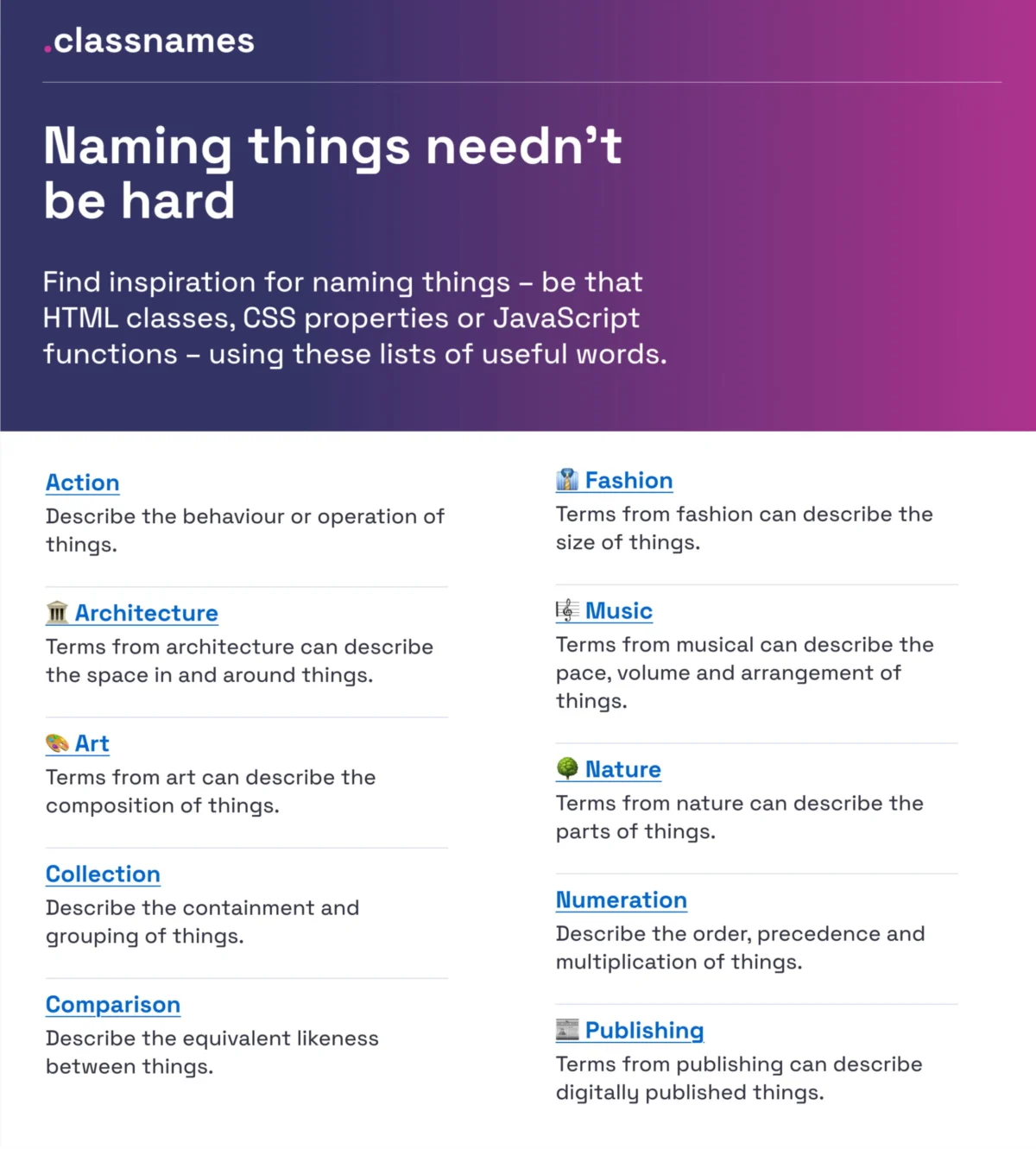
The linguistic framework utilized in software development and user interface design serves as more than a mere labeling system; it functions as the fundamental architecture for cross-functional communication. Industry experts have long identified naming as one of the most persistent challenges in computer science, famously encapsulated by Phil Karlton’s observation that naming things and cache invalidation represent the two primary hurdles in the field. Within the contemporary landscape of digital product design, the ambiguity surrounding the nomenclature of colors, icons, UI components, and design tokens has created significant friction between design and engineering teams. This friction often manifests as technical debt, where generic names obscure intent and overly specific names restrict the scalability of design systems. As organizations transition toward more robust, multi-brand design environments, the demand for standardized naming conventions has moved from a matter of preference to a critical operational necessity.

The Evolution of Naming Conventions in Digital Architecture
The history of naming in web development has evolved through several distinct phases, moving from the chaotic, inline styling of the early internet to highly structured methodologies. In the early 2010s, methodologies such as Block Element Modifier (BEM) and Scalable and Modular Architecture for CSS (SMACSS) attempted to bring order to HTML and CSS naming. However, as design shifted from static pages to component-based frameworks like React, Vue, and Figma-based design systems, the complexity of these names increased exponentially.
The current era is defined by the "design token," a concept popularized by Salesforce’s Lightning Design System. Design tokens are the visual atoms of a design system—abstracted values such as color hex codes, spacing units, or animation speeds—represented by a name. This shift has necessitated a new taxonomy that can survive the transition from a designer’s canvas to a developer’s codebase. The challenge lies in creating a "single source of truth" where a variable like color-primary-600 is understood identically by every stakeholder in the product lifecycle.

Semantic Integrity in Color and Visual Identity
One of the most immediate points of confusion in UI design is color nomenclature. Traditionally, teams relied on literal names (e.g., "sky-blue") or technical hex codes (e.g., "#87CEEB"). Neither approach scales effectively in a system supporting dark mode, high-contrast themes, or multi-brand deployments. David Aerne, a prominent figure in the design community, has addressed this by maintaining an extensive repository of over 30,355 unique color names. This database serves as a foundational resource for teams seeking to move beyond generic descriptors.
Tools such as "Color Parrot" and various color-naming APIs allow developers to input a hex code and receive a human-readable name. This process, while seemingly aesthetic, has functional implications for accessibility. Factual data suggests that consistent color naming improves the efficiency of screen readers and assists developers in maintaining visual consistency without needing to constantly reference a style guide. Professional analysis indicates that the transition from descriptive naming (what a color looks like) to semantic naming (what a color does) is the hallmark of a mature design system. For instance, naming a color action-primary-hover is more valuable to a developer than deep-blue-light, as the former describes the component’s state and intent.

Structural Methodologies for Layers and Components
In the realm of UI design, the organization of layers and groups within design software like Figma or Adobe XD often mirrors the eventual structure of the code. Javier Cuello, a specialist in design system documentation, has established a set of best practices that emphasize logic, brevity, and meaning. According to Cuello’s framework, a superior name must be independent of visual properties. If a button is named rounded-red-button, the name becomes obsolete the moment the brand guidelines change to square corners or a blue palette.
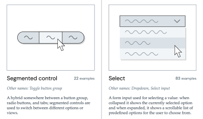
The industry is moving toward a hierarchical structure for component naming, typically following a [Category]-[Component]-[Type]-[State] format. For example, Form-Input-Password-Error provides an immediate, unambiguous understanding of the component’s location and condition. Data from design audits suggests that teams utilizing standardized component galleries, such as the one curated by Iain Bean, see a marked reduction in "component detachment" rates. Bean’s Component Gallery provides a cross-referenced index of how leading organizations—such as the UK Government Digital Service (GDS) and Shopify—name their UI elements. By observing that an "Accordion" is sometimes referred to as a "Disclosure" or a "Collapsible," teams can make informed decisions that align with broader industry standards, thereby easing the onboarding process for new hires.

Case Study Analysis: Intuit and the Flexible Token Taxonomy
The practical application of these naming theories is best observed in large-scale corporate environments. Intuit, the parent company of TurboTax, QuickBooks, and Mailchimp, recently underwent a massive overhaul of its design token taxonomy. The objective was to create a system that could accommodate multiple distinct brands under a single foundational architecture.
Nate Baldwin, who led the initiative, noted that the primary pain point in their legacy system was "rigidity." The old names were too closely tied to specific brand attributes, making it impossible to reuse tokens across different products. The new taxonomy implemented by Intuit utilizes a multi-layered approach:

- Global Tokens: Hard-coded values (e.g.,
color-blue-500). - Alias Tokens: Semantic names that point to global tokens (e.g.,
brand-primary). - Component Tokens: Highly specific names for individual UI elements (e.g.,
button-primary-background).
This three-tiered system allows Intuit to change the "Global" value once and have it propagate through the entire ecosystem, while the "Component" tokens ensure that developers know exactly which variable to apply to a specific piece of UI. This methodology has become a benchmark for enterprise-level design systems, demonstrating that effective naming is a prerequisite for technical scalability.
Feature Naming and the Psychology of User Discovery
While much of the naming discourse focuses on internal systems, the naming of customer-facing features is equally critical. Erin Gannon’s research into feature adoption suggests that "poor discoverability" is often a direct result of linguistic misalignment. If a user does not understand what a feature is called, they are unlikely to try it, regardless of its utility.
Gannon proposes that feature names should be driven by the "Job-to-be-Done" (JTBD) framework. This involves asking users to describe a feature’s function in their own words. If users consistently refer to a "Smart Filter" as a "Search Refiner," the latter name should be prioritized. Professional journalistic analysis of feature launches shows that descriptive, benefit-oriented names (e.g., "Focus Mode") generally outperform branded, abstract names (e.g., "Zenith View") in initial user testing. The goal is to minimize the cognitive distance between the user’s intent and the interface’s label.
The Role of Global Standards and Taxonomy Maps
The move toward standardization is further evidenced by the work of the Vodafone UK Design System team. Their "Variables Taxonomy Map" provides a visual representation of how tokens flow from brand primitives to page-level implementations. This map is built upon the foundational theories of Nathan Curtis, a leading voice in design system architecture. By documenting the "anatomy" of a token, Vodafone ensures that every stakeholder can decipher a variable’s purpose simply by reading its name.

This systematic approach is supported by emerging tools like Romina Kavcic’s Design Token Naming Guide and the "Onym" open-source repository. These resources provide a structured environment for teams to brainstorm and vet names, ensuring they are free of cultural insensitivity, easy to spell, and logically consistent. The use of spreadsheet inventories to track these names allows for "bird’s-eye view" auditing, which is essential for identifying naming conflicts before they are hard-coded into a production environment.
Broader Implications for the Future of Development
The implications of naming conventions extend far beyond organized files. As Artificial Intelligence (AI) and Machine Learning (ML) become more integrated into the design-to-code pipeline, the need for standardized nomenclature will only intensify. AI models require consistent, labeled data to function. A design system with a chaotic naming structure will produce "hallucinations" or errors when an AI attempts to generate code from a design mockup.

Furthermore, the W3C Design Tokens Community Group is currently working on a standard specification for design tokens. This international effort aims to create a universal format that allows design tokens to be shared seamlessly between different tools (e.g., from Figma to Style Dictionary to VS Code). Once these standards are finalized, the industry will likely see a significant shift toward automated naming validation, where "illegal" or non-compliant names are flagged in real-time, much like a spell-checker in a word processor.
Conclusion: Naming as a Collaborative Asset
The conclusion drawn from the collective research of industry leaders is clear: naming is not a task to be performed in isolation. It is a collaborative exercise that requires input from designers, developers, product managers, and end-users. When a team speaks in "different dialects," the result is frustration, redundancy, and a fragmented user experience.

By investing in robust naming conventions and utilizing the wealth of available resources—from color repositories to taxonomy maps—organizations can reduce the cognitive load on their teams and create more resilient digital products. The "right" name is ultimately the one that requires the least amount of explanation. As the web continues to grow in complexity, the ability to name things clearly and consistently will remain one of the most valuable skills in the digital professional’s repertoire. The editorial consensus in the design community is that while naming is indeed hard, the cost of poor naming is significantly higher than the effort required to get it right.

