
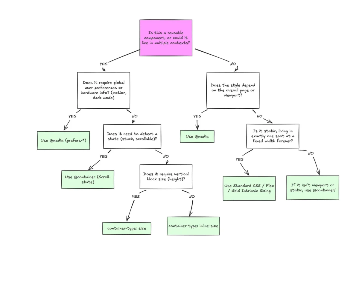
The current state of modern web development is defined by a curious paradox: while browser support for CSS Container Queries has reached a critical mass of 94%, actual implementation within professional workflows remains disproportionately low. This gap between technological availability and practical application was a central theme at the SmashingConf Amsterdam 2026, where industry experts highlighted a significant misunderstanding of how these queries function compared to their predecessor, the media query. For over a decade, media queries have served as the backbone of responsive web design, yet the shift toward component-based architectures in frameworks like React, Vue, and Svelte has exposed the inherent limitations of viewport-based logic.
The Evolution of Responsive Design Architecture
To understand the current friction in adoption, one must look at the chronology of responsive web design. The journey began in 2010 when Ethan Marcotte coined the term "Responsive Web Design," introducing a paradigm where fluid grids, flexible images, and media queries allowed a single codebase to span multiple screen sizes. For years, the viewport—the visible area of a web page—was the only proxy for environmental context. If a screen was wider than 1024 pixels, the browser assumed a desktop environment; if it was narrower than 480 pixels, it assumed a mobile device.
However, as design systems became more modular, this "macro" approach began to fail. A card component might need to look like a hero banner when placed in a wide main content area, but appear as a narrow list item when placed in a sidebar. Using traditional media queries, a developer would have to write complex, context-dependent CSS classes that accounted for every possible parent container. The industry’s desire for a solution was evident as early as 2019, when container-level styling topped the "CSS Wishlist" across multiple developer surveys. The W3C responded with the CSS Containment Module Level 3, which officially brought container queries to life.
Statistical Analysis of the Adoption Gap
Despite the long-standing demand, the "State of CSS" survey reveals a startling disconnect. While approximately 86% of developers are aware of container queries, only 41.4% report using them in production. This 45-point gap suggests that while the community recognizes the feature, there is a significant barrier to integration.
Data from "caniuse.com" confirms that container queries are supported in all major evergreen browsers, including Chrome (since version 105), Safari (since 16), and Firefox (since 110). This level of support typically triggers a wholesale shift in industry standards, yet many development teams continue to rely on media queries or JavaScript-based ResizeObservers to handle component-level responsiveness. Experts at SmashingConf 2026 noted that the primary hurdle is a mental model shift: developers are still treating the viewport as the primary source of truth, rather than the immediate parent container.
Macro Layouts vs. Micro Layouts: A Technical Distinction
The fundamental error in current development practices lies in the failure to distinguish between "macro" and "micro" layouts. Media queries are designed for macro layouts—the high-level structure of the page, such as the header, footer, and main grid columns. These elements are inherently tied to the browser window.
In contrast, container queries are designed for micro layouts—the individual components that live inside the macro structure. A component governed by a container query asks, "How much space is available to me in my specific location?" rather than "How wide is the user’s monitor?"
Consider the standard CSS syntax for a container query:
- The parent element must be defined as a container using
container-type: inline-size. - The child element is then styled using the
@containerrule.
This requirement for a parent-child relationship is one of the most frequently cited points of confusion. Unlike media queries, which can be applied globally, a container query requires the developer to explicitly designate which element’s dimensions are being monitored. This "look inward" approach ensures that a component remains truly portable, adapting its internal layout regardless of whether it is placed in a 1920px wide grid or a 300px wide sidebar.

Expanding the Toolset: Fluid Typography and Wrap Detection
The enrichment of the CSS specification has introduced new units specifically for container queries, such as cqi (container query inline-size) and cqw (container query width). These units allow for a level of fluid design that was previously impossible without heavy JavaScript intervention.
For instance, responsive typography has traditionally relied on viewport units (vw). However, vw-based text can become illegible if a component is placed in a small container on a large screen. By using container units in conjunction with the CSS clamp() function—such as font-size: clamp(1rem, 0.5rem + 3cqi, 2rem)—the text scales proportionally to the component’s actual width. This ensures visual harmony within the design system, regardless of the page-level layout.
Furthermore, container queries offer a workaround for a long-standing CSS limitation: flexbox wrap detection. While flexbox is excellent at wrapping items to new lines, CSS has historically lacked a pseudo-class or query to detect when a wrap has occurred. By nesting container queries within flex items, developers can now trigger style changes specifically when an item expands to fill a newly wrapped row. This capability bridges the gap between layout behavior and styling logic, allowing for more intelligent, self-aware components.
Implementation Challenges and Technical Constraints
While powerful, container queries are not a universal replacement for media queries and come with specific technical constraints. One significant side effect is "layout collapse." When a developer sets container-type: size, the browser ignores the children’s dimensions to calculate the container’s size, often resulting in a height of 0px unless an explicit height or aspect ratio is defined. Consequently, most developers find that inline-size is the more practical choice for standard web layouts.
Another limitation is the current inability to use CSS custom properties (variables) within the query declaration. A rule like @container (min-width: var(--breakpoint-lg)) will fail because custom properties are part of the computed style that cascades down the tree, creating a potential circular dependency where a query could change the very variable it is monitoring.

Industry Reactions and Future Implications
The web development community’s reaction to these constraints has been a mix of caution and advocacy. Kevin Powell, a prominent CSS educator, has argued that the "terrible" adoption rate is a result of developers not realizing that media queries are, in many ways, "dumb." They lack the context of the modern, component-driven web.
Miriam Suzanne, one of the primary authors of the container query specification, has emphasized that this feature represents a shift toward "intrinsic web design." In this model, the content and its container dictate the layout, moving away from the rigid, grid-first approach that dominated the early 2010s.
The implications for design systems are profound. Teams can now build truly atomic components that carry their own responsive logic. This reduces the "CSS bloat" associated with writing hundreds of lines of overrides for different page contexts. As viewport fragmentation continues to increase—with over 2,300 unique viewport sizes identified in recent data—the ability for a component to manage its own responsiveness is no longer a luxury but a necessity for scalable front-end architecture.
Conclusion: A Dual-Query Strategy
The consensus among architectural experts is that the future of CSS does not involve choosing between media queries and container queries, but rather implementing a dual-query strategy. Media queries should remain the tool for global concerns: page-level grids, dark mode preferences, and print styles. Container queries should become the standard for everything else.
As the industry moves toward 2027, the success of a design system will likely be measured by how little it relies on the viewport for component styling. By breaking the habit of treating container queries as "media queries for divs" and embracing them as a distinct logic for micro-layouts, developers can finally achieve the "write once, deploy anywhere" promise of component-based design. The transition requires more than just learning new syntax; it requires a fundamental reassessment of how we perceive space and context on the modern web.

