
The landscape of web development is undergoing a fundamental shift as the browser platform matures, absorbing functionalities that once required extensive third-party JavaScript libraries. Central to this evolution is the Popover API, a native HTML attribute-driven system designed to handle the complexities of transient user interface (UI) elements such as tooltips, menus, and teaching bubbles. For over a decade, developers have relied on external dependencies to manage the intricate logic of opening, closing, and positioning these elements. However, the standardization of the Popover API marks a pivotal moment where the browser itself assumes responsibility for the lifecycle and accessibility of floating UI components.
The Technical Challenges of Legacy Tooltip Implementation
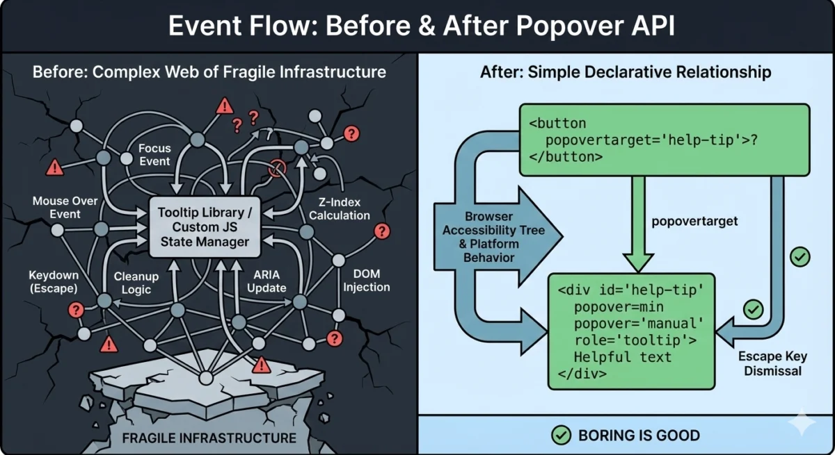
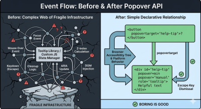
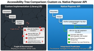
Historically, tooltips have been perceived as minor UI components, yet they represent a significant engineering challenge regarding accessibility and cross-browser consistency. A standard implementation required a delicate orchestration of HTML, CSS, and JavaScript. To ensure a tooltip functioned correctly, a developer had to manage mouse-over and mouse-out events, focus and blur states for keyboard users, and the "Esc" key logic for dismissal.
Beyond basic interaction, the "top layer" problem remained a persistent hurdle. Tooltips often became clipped or hidden when placed inside containers with overflow: hidden or specific z-index constraints. To solve this, developers were forced to use "portals"—a technique where the tooltip element is physically moved to the end of the document body via JavaScript to ensure it appears above all other content. This movement often broke the logical relationship between the trigger and the content, necessitating manual management of ARIA (Accessible Rich Internet Applications) attributes to maintain screen reader compatibility.
The complexity of these requirements led to the widespread adoption of libraries such as Popper.js and Floating UI. While effective, these libraries introduced significant overhead. A typical custom-built tooltip implementation could require upwards of 60 lines of JavaScript and five or more event listeners to handle various input methods and edge cases.
The Mechanics of the Popover API
The Popover API introduces a declarative approach to UI management. By utilizing the popover attribute, developers can designate any element as a popover. The browser then automatically handles its placement in the "top layer," a dedicated internal stack that exists above all other elements in the document, regardless of CSS z-index or overflow properties.
The API functions through two primary attributes: popover, which defines the element as a managed UI component, and popovertarget, which establishes a relationship between a trigger (such as a button) and the target element.
There are two distinct states for the popover attribute:
- Auto: This state enables "light dismiss" behavior. If a user clicks outside the popover or presses the "Esc" key, the browser automatically closes the element. Only one "auto" popover can typically be open at a time, preventing UI clutter.
- Manual: In this state, the developer retains control over the dismissal logic. The popover does not close when clicking outside, which is ideal for persistent tooltips or complex multi-step interfaces.
This declarative model removes the need for manual event listeners. When a button with a popovertarget is clicked, the browser internally toggles the visibility of the target element, updates the accessibility tree, and manages the focus ring without a single line of custom JavaScript.
Chronology of Standardization and Browser Support
The journey toward a native popover solution began in the early 2020s as part of a broader effort by the WHATWG (Web Hypertext Application Technology Working Group) and the W3C to address "gaps" in the web platform. The initiative was driven by the realization that many common UI patterns were being reinvented poorly across the web, leading to inconsistent accessibility experiences.
- 2022: The initial proposal for the Popover API (originally called the "Popup API") gained traction among browser vendors.
- May 2023: Google Chrome 114 became the first stable browser to ship full support for the Popover API, signaling a major milestone for the Chromium engine.
- September 2023: Apple followed suit with the release of Safari 17.0, bringing native popover support to iOS and macOS users.
- April 2024: Mozilla Firefox 125 introduced support, achieving "Baseline" status for the feature. This meant that the API was supported across all major evergreen browsers, making it a viable option for production-ready applications without requiring polyfills for most modern audiences.
The rapid adoption of the Popover API was bolstered by the "Interop 2024" initiative, a collaborative effort between Google, Apple, Mozilla, and Microsoft to improve the interoperability of web features. Popover was selected as a key focus area to ensure that developers could rely on consistent behavior regardless of the user’s browser choice.
Data-Driven Benefits: Performance and Accessibility
The transition from library-dependent tooltips to native popovers offers measurable improvements in performance and code maintainability. Industry benchmarks indicate that replacing a library like Popper.js with native Popover API attributes can reduce the interactive code footprint of a component by up to 85%.
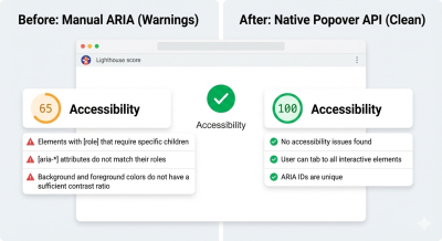
From an accessibility standpoint, the gains are even more significant. Standardized testing using tools like Lighthouse has shown that custom-built tooltips frequently fail accessibility audits due to "stale" ARIA states—where a tooltip is visually hidden but remains visible to screen readers, or vice versa. The Popover API solves this by automatically syncing the aria-expanded state of the trigger and ensuring the popover element is correctly exposed in the accessibility tree only when visible.
Furthermore, the native implementation handles "focus restoration" by default. When a user closes a popover, the browser automatically returns focus to the trigger element. In custom implementations, developers often forget this step, leaving keyboard users "lost" at the bottom of the document after closing a menu.
Industry Reactions and Expert Analysis
Technical leads at major tech firms have expressed a cautious but optimistic view of the API. The consensus among the developer community is that while the Popover API does not entirely replace libraries for every use case, it changes the "default" starting point.
Proponents of the API argue that it represents a return to "semantic HTML," where the markup itself describes the behavior of the interface. "We are moving away from a world where the browser is just a canvas for JavaScript to draw on," noted one senior web architect. "We are moving toward a world where the browser understands the intent of the UI."
However, some experts point out that for highly specialized requirements—such as tooltips that must dynamically flip across multiple axes in complex 3D layouts—libraries like Floating UI still offer superior geometric calculations. The Popover API manages the behavior (showing and hiding), but it does not yet natively solve all positioning problems.
The Broader Impact: CSS Anchor Positioning
The Popover API is only one half of a larger revolution in web layout. To fully eliminate the need for JavaScript positioning engines, the W3C is currently finalizing the "CSS Anchor Positioning" specification. This allows developers to tether a popover to its trigger using only CSS, defining offsets and "fallback" positions (e.g., "show above, but if there is no room, show below") without calculating pixel coordinates in JavaScript.
As of early 2025, Anchor Positioning has begun shipping in Chromium-based browsers. When paired with the Popover API, it creates a fully declarative pipeline for floating UI:
- HTML (Popover API): Handles the logic, state, and accessibility.
- CSS (Anchor Positioning): Handles the visual coordinates and responsive flipping.
- JavaScript: Used only for intentional refinements, such as custom entry/exit delays.
Implications for the Future of Web Development
The emergence of the Popover API signals a broader trend: the "un-libbing" of the web. As the platform absorbs common patterns, the barrier to entry for building accessible, high-performance web applications continues to drop. Small-to-medium-sized projects can now achieve "gold standard" accessibility for their UI components without importing thousands of lines of third-party code.
For large-scale design systems, the impact is structural. Organizations are beginning to refactor their component libraries to use native primitives as the foundation, layering custom branding and animations on top. This reduces the long-term maintenance burden, as the browser vendors—not the organization’s engineers—become responsible for fixing bugs related to new input methods or OS-level accessibility changes.
In conclusion, the Popover API is more than just a new attribute; it is a realignment of responsibilities between the developer and the platform. By providing a native model for transient UI, the web platform has moved one step closer to being a complete, self-contained environment for building sophisticated user interfaces. Developers are encouraged to adopt these native tools not just for the sake of modernity, but to ensure their applications are faster, more accessible, and more resilient to the changing landscape of the internet.
