
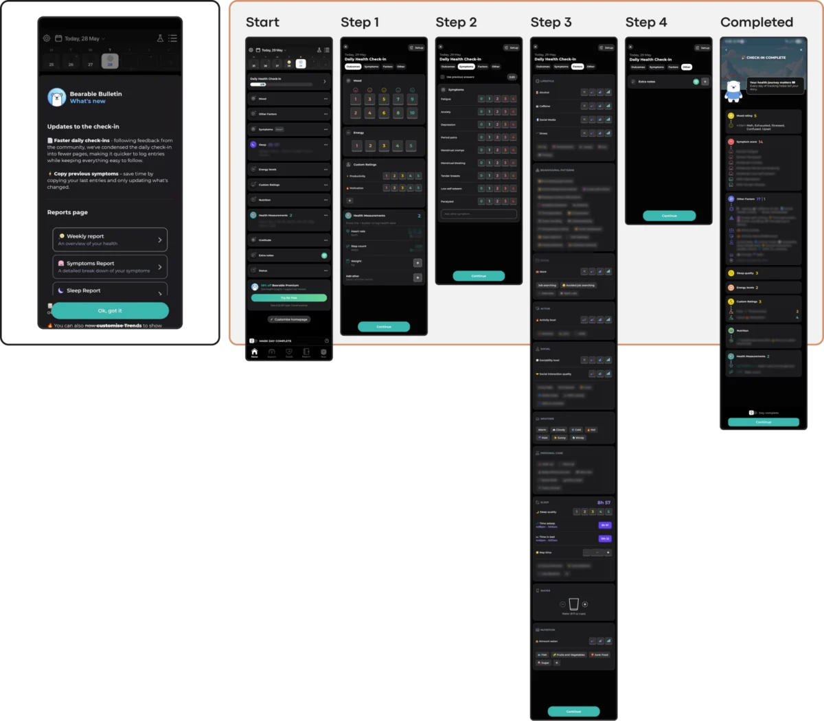
The global digital mental health market is currently grappling with a significant and measurable engagement crisis, characterized by a rapid collapse in user retention that threatens the efficacy of mobile health (mHealth) interventions. Recent industry data reveals a stark reality: approximately 95% of users who download and open a mental health application abandon the platform within the first 30 days. The median 30-day retention rate for these services sits at a mere 3.3%, a figure that underscores a fundamental disconnect between app design and the needs of individuals in psychological distress. Even market leaders and industry "giants" in the mindfulness and therapy space report losing roughly 50% of their user base within the first 10 days of interaction.

This retention collapse has prompted design experts and clinical researchers to re-evaluate the role of user interface (UI) trends in therapeutic contexts. Kat Homan, a prominent designer in the mental health space, has introduced an evaluation framework designed to help developers determine whether visual and interaction patterns support or undermine clinical goals. The central thesis of this shift in thinking is that traditional UI trends—often optimized for capturing attention and signaling innovation—frequently conflict with the primary needs of mental health app users: reducing cognitive strain, fostering long-term trust, and providing a digital sense of refuge.

The Evolution of the Digital Mental Health Landscape
To understand the current crisis, it is necessary to examine the chronology of the mHealth industry. The sector saw a massive surge in investment and adoption between 2018 and 2022, accelerated significantly by the COVID-19 pandemic. During this period, developers prioritized "visual fashion" and "feature density" to compete in a crowded marketplace. However, as the industry matured, a pattern emerged: users were not opening these apps out of curiosity or for entertainment, but out of acute need.

Research published in the Journal of Medical Internet Research (JMIR) suggests that many mental health tools have historically prioritized aesthetic appeal at the expense of sustainable utility. For a user experiencing high levels of anxiety, depression, or exhaustion, an unconventional icon, a complex gesture-based navigation system, or a flashy, high-speed animation acts as a cognitive barrier rather than a "delightful" feature. In these moments of vulnerability, what designers intended as innovation often manifests as friction, providing the user with a reason to disengage permanently.

The High Cost of Trend-Driven Design
The conflict between modern UI trends and therapeutic usability typically surfaces across five distinct "fronts." Each represents a point where adopting a trend for the sake of novelty can result in a net loss of user engagement.

1. Cognitive Friction and Executive Load
The primary goal of a mental health tool is to reduce cognitive load, yet trendy designs often do the opposite. Patterns such as "Neo-brutalism," which utilizes stark contrasts and heavy borders, or hidden "hamburger" menus that rely on non-standard swipes, require significant visual parsing. For individuals in a "reduced-capacity state"—where everyday tasks and choices require more effort than usual—these design choices become insurmountable hurdles.

Case studies of apps like Bear Room and Teeni illustrate an alternative approach. Bear Room, a stress reduction app, utilizes voice-based input as a primary, low-friction path for users who may find typing or navigating complex menus overwhelming. Similarly, Teeni, a platform for parents of teenagers, uses a "Quick Relief" button that initiates a "Hot Flow," allowing users to vent immediately before moving into more reflective, "Cold Flow" resources. This state-sensitive design acknowledges that a user in peak distress cannot navigate a complex dashboard.

2. Emotional Mismatch and Trust Erosion
The visual language of an app must be empathetic to the user’s current mood. Research into how color influences mood in mHealth apps suggests that users in distress show a strong preference for subtlety, dark palettes, and clean, uncluttered aesthetics. Cheerful, neon-bright colors can create a jarring emotional conflict for someone experiencing depression.

Trust erosion also occurs when engagement mechanics clash with the emotional context. For instance, the use of "confetti" animations or "discount wheels" after a user has logged a low mood can feel dismissive or predatory. Professional analysis suggests that trust is built when the interface respectfully aligns with the user’s emotional reality, offering "solace through subtlety" rather than "solution through saturation."

3. The Inconsistency Penalty
Mental health stability often relies on routine and predictability. However, contemporary UI design frequently thrives on disruption. When an app reimagines fundamental navigation, it forces the user to learn a new "language" before they can access help.

The gamified self-care app Finch serves as a notable example of this tension. While its playful identity supports routine building for many, its non-skippable celebration screens can become a burden for a user who simply wants to complete a single task during a difficult day. In contrast, the public-health-oriented PTSD Coach maintains a stable, predictable information architecture that allows users to learn, track, and manage symptoms without having to relearn the interface upon every return.

4. Silent Exclusion and Accessibility Risks
The population requiring mental health support disproportionately includes individuals with visual, motor, or cognitive impairments. Many UI trends, such as low-contrast text for a minimalist look or gesture-only navigation, actively exclude these users. Adhering to the Web Content Accessibility Guidelines (WCAG) 2.2 is not merely a legal or ethical requirement but a clinical necessity. Effective design must ensure body text has a 4.5:1 contrast ratio and that interactive targets are large enough for unsteady hands, ensuring the tool remains usable when the user is under physical or mental strain.

5. The Coercion Paradox
Engagement mechanics designed for productivity or entertainment—such as daily streaks and aggressive notifications—can transform into sources of performance pressure and guilt in a mental health context. For a user managing depression, a "broken streak" can exacerbate feelings of failure. Designers are now moving toward "forgiving" mechanics. For example, some newer applications utilize short, three-day streaks that do not reset immediately upon a missed day, reframing the interaction as a gentle support for return rather than a punishment for absence.

Supporting Data and Global Context
The stakes of this design crisis are significant. The World Health Organization (WHO) estimates that over one billion people globally live with a mental disorder. Depression and anxiety cases have increased by an estimated 25% in the last decade, yet the "treatment gap" remains wide. Digital tools are often seen as the only way to scale mental health services to meet this demand.

However, if these tools continue to suffer from a 95% abandonment rate, they cannot fulfill their promise as a scalable solution. The data from the JMIR study on 30-day retention highlights that the "innovation" sought by venture-backed startups often works against the "efficacy" required by clinical practitioners. The cost of user acquisition in the mHealth space is rising, making retention the single most important metric for both business sustainability and patient outcomes.

Industry Responses and Implications
In response to these findings, a movement toward "Quiet Design" or "Subtle UX" is gaining traction among digital therapeutics developers. This approach emphasizes that the ultimate goal of the interface is not to be "seen" or to "win awards," but for the support to be "felt."

Industry analysts suggest that the next generation of successful mental health apps will likely move away from the "all-in-one" comprehensive tracking model—which can overwhelm users with dense dashboards—toward more linear, guided flows. The focus is shifting from "capturing attention" to "becoming a consistently respectful and helpful presence."

Furthermore, the integration of Artificial Intelligence (AI) is being redirected. Rather than using AI to increase screen time, developers are using it to analyze voice inputs or text patterns to simplify the user’s journey, effectively acting as a "digital triage" that directs the user to the most relevant support with the least amount of clicking or searching.

Conclusion: A Contextual Approach to Innovation
The framework introduced by Kat Homan and supported by broader industry data suggests that UI trends are not inherently problematic; rather, their application must be "radically contextual." A style chosen for its aesthetic appeal—such as glassmorphism or ultra-minimalism—must be evaluated against the user’s capacity in their moment of greatest need.

As the digital health sector continues to evolve, the distinction between "apps that look good" and "apps that do good" will become the primary driver of market survival. For the billion people living with mental health conditions, the best design is often the one that functions as a "quiet helper," reducing the cost of use when the user can least afford it. In the high-stakes environment of mental health, sustainable retention is earned through trust and reliability, not through the pursuit of the latest visual trend.

