
The failure of a multi-million dollar branding project rarely occurs during the final presentation of a logo; rather, it typically collapses months earlier during the strategy phase. In the contemporary design landscape, a recurring systemic issue has emerged where high-level abstractions—words such as "modern," "trustworthy," "premium," and "disruptive"—are left undefined by stakeholders and designers alike. This lack of semantic precision creates a vacuum between strategic intent and visual execution, a space now identified by industry experts as the "pre-concept" phase. By focusing on this critical juncture, design teams can move beyond the limitations of digital tools like Figma to establish a visual foundation rooted in shared brand context and verified assumptions.
The Anatomy of Strategic Misalignment
In the traditional branding workflow, designers are often inundated with disparate inputs: a creative brief, a handful of stakeholder interviews, a list of competitors, and a collection of adjectives. The expectation is that the designer will synthesize these into a "right" visual concept. However, "rightness" is an impossible metric to hit when the team has not reached a consensus on the brand’s core communicative goals.
Industry data suggests that misalignment in the early stages of design can lead to project delays of up to 40% and significant budget overruns. When a client requests a "modern" look, they may be envisioning a minimalist, Swiss-style layout, while the designer interprets the request as a vibrant, neo-brutalist aesthetic. Without a pre-concept phase to bridge this gap, the first concept reveal becomes a high-stakes guessing game rather than a logical progression of strategy.
Case Study: The Paradox of Conservative Disruption
The necessity of the pre-concept phase is best illustrated by a recent engagement with a health-tech firm. The company’s leadership expressed a desire to appear "modern," "trustworthy," and "disruptive." Under a standard workflow, a designer might have leaned into "disruption" by utilizing bold, unconventional typography and a loud color palette to signal a break from the status quo.
However, during deeper pre-concept research, it was revealed that the firm’s primary clients were large, conservative government medical institutions. In this specific market context, "disruption" did not mean rebellion; it meant superior efficiency and clarity. For these stakeholders, a rebellious visual identity would actually undermine "trustworthiness." Consequently, the visual translation of "disruptive" had to be expressed through high-functioning, traditional design codes rather than experimental aesthetics. This realization saved the project from a first-round rejection by aligning the visual direction with the audience’s specific requirements for credibility.

Stage 1: Researching Brand Context and Perception
The pre-concept phase begins with a shift from collecting facts to clarifying perception. As brand theorist Marty Neumeier famously stated in The Brand Gap, "A brand is a person’s gut feeling about a product, service, or company." Because the brand ultimately lives in the mind of the consumer, the design team must first define what that "gut feeling" should be.
To achieve this, designers are moving away from standard discovery questions toward perception-based inquiries. Instead of asking "What are your goals?", designers are now asking:
- What does the audience need to believe about us to choose us?
- Where do we need to feel most credible?
- Which category conventions must we follow, and which can we challenge?
- If we move too far in a specific visual direction, at what point does it become "wrong" for our audience?
These questions are designed to uncover the hidden assumptions behind stakeholder opinions. When three different executives agree that a brand should be "premium," these targeted questions reveal whether they mean "exclusive and expensive," "refined and editorial," or "minimal and quiet."

Stage 2: Tactical Exercises for Visual Alignment
To move from verbal strategy to visual material, the pre-concept phase utilizes specific exercises that force stakeholders to engage with imagery and relative perception. This active participation prevents the "passive agreement" trap, where clients nod during strategy presentations only to realize they disagree once they see the final pixels.
Competitor Perception Mapping
This exercise involves placing competitor brand assets on a two-axis map. The axes are chosen based on the specific tensions the brand must resolve, such as "Traditional vs. Progressive" or "Understated vs. Bold." The value of this exercise lies not in the final map, but in the friction it generates. If one stakeholder views a competitor as "innovative" while another views them as "generic," the design team has identified a critical semantic gap that must be resolved before a single logo is sketched.
The Visual Brand Driver
This exercise employs metaphor to bypass personal aesthetic bias. Stakeholders are asked to select images representing the company across unrelated categories: transport, furniture, architecture, or even drinks. For instance, if a company were a type of transport, would it be a high-speed train (reliable, structured, mass-accessible) or a private jet (exclusive, fast, high-end)? By explaining the "why" behind these choices through adjectives, stakeholders provide the designer with a rich tapestry of associations that define the brand’s character more accurately than a list of buzzwords.

Stage 3: Establishing the Three-Layer Visual Foundation
Once the research and exercises are complete, the findings are distilled into a three-layer framework that serves as the bridge to the concept phase.
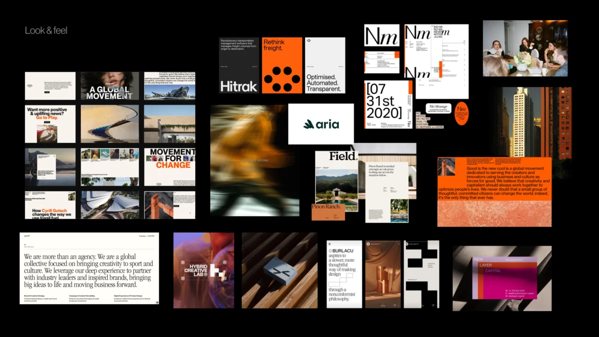
1. Look and Feel (Perception Boards)
Unlike traditional mood boards, these are "perception boards." They are curated to test specific visual directions—such as "institutional trust" versus "human warmth"—allowing the client to react to a mood before they are distracted by specific brand assets like a logo.
2. Design Code (Visual Principles)
This layer translates abstract ideas into concrete design principles. For a fintech company, the concept of "Security through Transparency" might be coded as "glass-morphism, clear grids, and open white space." For a parenting app, "Messy but Magical" might be translated into "organic shapes, soft gradients, and layered, candid photography."

3. Brand Asset Direction
The final layer defines the boundaries for the building blocks of the identity: typography, color, photography style, and graphic language. At this stage, the team discusses whether the brand should use a serif or sans-serif typeface, or whether the color palette should be high-contrast or monochromatic. This provides the designer with a "sandbox" to play in, ensuring that the eventual creative exploration is bounded by strategic reality.
The Chronology of a Pre-Concept Workflow
A typical high-level branding timeline incorporating the pre-concept phase generally follows this trajectory:
- Week 1: Project Kickoff and Discovery: Initial stakeholder interviews and goal setting.
- Week 2: Contextual Research: Competitive analysis and audience perception audits.
- Week 3: The Brand Workshop: Perception mapping and Visual Brand Driver exercises.
- Week 4: Synthesis: The design team analyzes workshop data to identify core tensions and shared directions.
- Week 5: Pre-Concept Presentation: Reviewing the three-layer foundation (Look and Feel, Design Code, Asset Direction).
- Week 6+: Concept Development: The designer begins original visual work within the agreed-upon boundaries.
Broader Impact and Industry Implications
The shift toward a formalized pre-concept phase reflects a broader maturation of the design industry. As digital products become increasingly commoditized, the "visual skin" of a brand is no longer enough to ensure market success. Brands must now demonstrate a deep understanding of their emotional and functional role in a consumer’s life.

By adopting this methodology, agencies and in-house teams report higher client satisfaction rates and a reduction in the number of required revision rounds. More importantly, it shifts the relationship between client and designer from one of "service provider and critic" to "collaborators solving a shared problem." When the first concept is eventually presented, it no longer feels like a "reveal" or a "guess"; it feels like the inevitable and logical next step in a journey the entire team has taken together.
In conclusion, the strongest visual concepts do not begin in design software; they begin in the rigorous interrogation of language and perception. The pre-concept phase ensures that when a designer finally opens Figma, they are not searching for an answer—they are executing a solution that has already been discovered through shared direction and strategic clarity. This disciplined approach is becoming the gold standard for creating brand identities that are not only visually striking but also commercially resilient and authentically aligned with their intended audience.

