
The digital mental health sector is currently grappling with a systemic engagement crisis that threatens the efficacy of mobile-based therapeutic interventions. Despite a surge in the availability of wellness applications, recent data from the Journal of Medical Internet Research (JMIR) reveals a stark reality: nearly 95% of users who download a mental health application abandon it within the first 30 days. The median 30-day retention rate for these platforms sits at a meager 3.3%. Even market leaders in the meditation and mindfulness space report losing approximately 50% of their user base within the first 10 days of installation. This collapse in retention suggests a fundamental misalignment between the visual language of modern software and the cognitive requirements of individuals in states of psychological distress.

As user interface (UI) trends prioritize innovation, high-contrast aesthetics, and aggressive engagement mechanics, they often inadvertently create barriers for the very populations they aim to serve. Design, in this context, is no longer a secondary aesthetic concern; it has become a critical operational priority and a clinical tool for user retention. When a user opens a mental health app, they are frequently operating under a "reduced-capacity state," characterized by heightened anxiety, exhaustion, or cognitive load. In these moments, the friction introduced by "trendy" design choices can transition from a mild annoyance to a definitive reason for disengagement.

The Evolution of the mHealth Interface: A Contextual Timeline
To understand the current friction in mental health design, one must examine the chronological shift in mobile interface standards over the last decade.

In the early 2010s, mental health applications were largely clinical, mirroring the utilitarian and often sterile environments of electronic health records (EHRs). While functional, these apps lacked the "delight" necessary to foster long-term habits. Between 2015 and 2020, the "consumerization of health" saw apps like Calm and Headspace revolutionize the sector by introducing soft gradients, whimsical illustrations, and high-production-value audio. This era successfully moved mental health tools into the mainstream.

However, since 2021, a new wave of UI trends—driven by social media and fintech—has begun to permeate the mHealth space. Trends such as Neo-brutalism, Bento-box layouts, and "Glassmorphism" prioritize visual signaling and "wow factor" over traditional usability. For a general-purpose productivity tool, these trends signal innovation; for a mental health tool, they often signal noise. The current challenge for designers, as highlighted by industry frameworks like those proposed by Kat Homan, is to evaluate whether these visual patterns support or undermine the unique goal of providing a digital refuge.

The Global Scale of Mental Health Needs
The stakes of this design conflict are significant. According to the World Health Organization (WHO), over one billion people globally live with a mental disorder. In the wake of the COVID-19 pandemic, cases of depression and anxiety alone increased by an estimated 25%. As traditional healthcare systems remain overstretched, mobile health (mHealth) has been positioned as a scalable solution to bridge the "treatment gap."

However, if 95% of users abandon these tools due to design-induced cognitive strain, the scalability of digital therapeutics is effectively neutralized. Clinical research suggests that individuals managing depression or burnout often suffer from "executive dysfunction," making simple tasks like navigating complex menus or interpreting abstract icons feel insurmountable. When an app adds to this burden, it fails its primary therapeutic mission.

The Five Fronts of Design Conflict
The tension between modern UI trends and therapeutic usability manifests across five primary categories. Each represents a point where "fashionable" design choices can lead to "silent exclusion."

1. Cognitive Friction and Executive Load
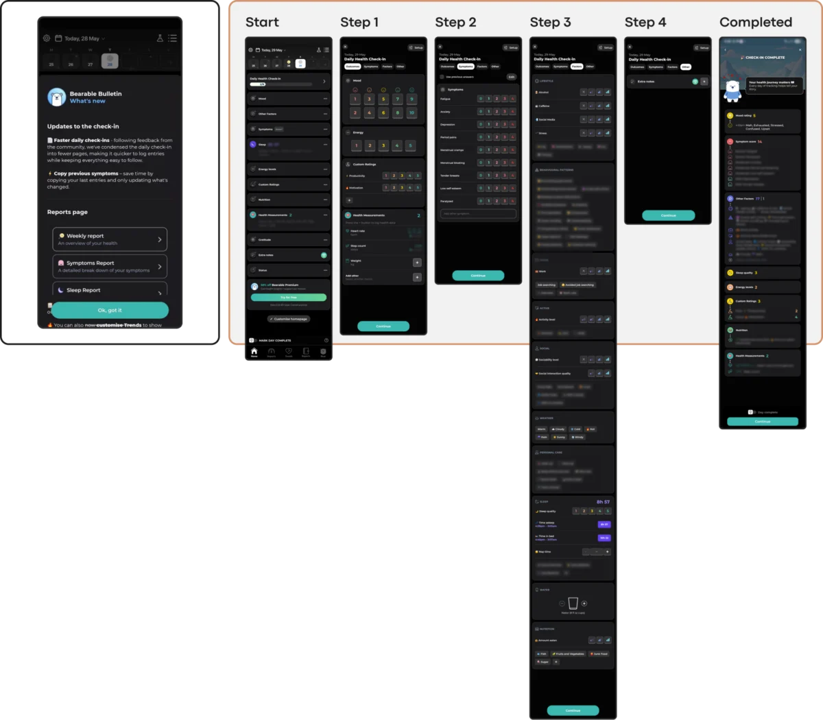
Many contemporary interfaces rely on "hidden navigation"—swipes and gestures that are not visually telegraphed—to maintain a minimalist aesthetic. While sleek, this forces the user to rely on memory and trial-and-error. For a user in the midst of a panic attack or a depressive episode, these "micro-challenges" accumulate. Neo-brutalist layouts, characterized by heavy borders and jarring contrasts, require significant "visual parsing" energy. Research indicates that simple, linear flows—such as those found in apps like Nonori—directly improve retention by reducing the number of decisions a user must make upon opening the app.

2. Emotional Mismatch and Visual Tone
There is a documented preference among users in distress for subtlety and grounded aesthetics. A study investigating color influence in mHealth apps found that users often find bright, "cheerful" palettes to be jarring or dismissive of their current emotional state. Emotional alignment requires a fit between the product’s promise and the user’s likely reality. For instance, an app providing grief support that uses "bouncy" animations and neon colors creates a "tone-deaf" experience that erodes trust. Conversely, apps like Bear Room utilize muted, earthy tones to create a "digital safe space" that acknowledges the user’s need for calm.

3. The Inconsistency Penalty
Routine is a cornerstone of mental health recovery. Therefore, predictability in an interface is a therapeutic feature. UI trends that prioritize novelty—such as non-standard button behaviors or "experimental" information architectures—punish returning users by forcing them to relearn the tool. Industry stalwarts like PTSD Coach emphasize a stable architecture: Learn, Track, Manage, and Support. This predictability ensures that even if a user has been away from the app for weeks, the path to help remains unchanged.

4. The Accessibility Imperative
The mental health population disproportionately includes individuals with visual, motor, or cognitive impairments. Many popular "minimalist" trends, such as low-contrast gray text on white backgrounds, fail the Web Content Accessibility Guidelines (WCAG) 2.2. When a designer chooses a "clean" look that lacks sufficient contrast or provides interactive targets smaller than 24×24 pixels, they are actively excluding users with unsteady hands or visual strain. Accessibility is not an optional "add-on"; in mHealth, it is a prerequisite for clinical efficacy.

5. The Coercion Paradox in Engagement
The "gamification" of wellness has led to the widespread adoption of streaks, aggressive notifications, and "commitment contracts." While effective for language learning or fitness, these mechanics can be counterproductive in mental health. For a user managing depression, a "broken streak" can be framed as a personal failure, exacerbating feelings of guilt and shame. This "performance pressure" often leads to "churn" rather than long-term habit formation. Ethical mHealth design is moving toward "forgiving" mechanics—shorter streaks, "streak freezes," and notifications that prioritize support over urgency.

Expert Perspectives and Regulatory Implications
The shift toward more "distress-aware" design is beginning to catch the attention of clinical researchers and regulatory bodies. In the United States, the Food and Drug Administration (FDA) has begun providing more rigorous oversight for "Prescription Digital Therapeutics" (PDTx). Experts in the field of human-computer interaction (HCI) argue that for an app to be considered "therapeutic," its UI must be validated through the lens of cognitive load theory.

Statements from UX researchers suggest that the "Dribbble-fication" of mental health—where designers create interfaces meant to look good in a portfolio rather than function in a crisis—is a significant hurdle. The emerging consensus is that the most effective design for a distressed user is often the "Quiet Helper": an interface that stays out of the way, avoids the spotlight, and focuses entirely on the delivery of support.

Conclusion: Toward a "Quiet Helper" Philosophy
As the mHealth market matures, the measure of success is shifting from "daily active users" (DAU) to "meaningful therapeutic outcomes." Achieving these outcomes requires a radical departure from trend-driven design. The most successful mental health tools of the next decade will likely be those that resist the urge to capture attention and instead focus on "offering refuge."

Designers are encouraged to adopt an evaluation framework that asks: Does this trend lower the cost of use when the user can least afford it? If a flashy animation or a novel navigation pattern adds even a second of confusion for a person in pain, it is a design failure. In the sensitive arena of mental health, the ultimate goal is not for the interface to be admired, but for the support to be felt. By prioritizing accessibility, emotional alignment, and cognitive ease, the industry can begin to address the 95% abandonment rate and fulfill the promise of digital mental health for all.

