
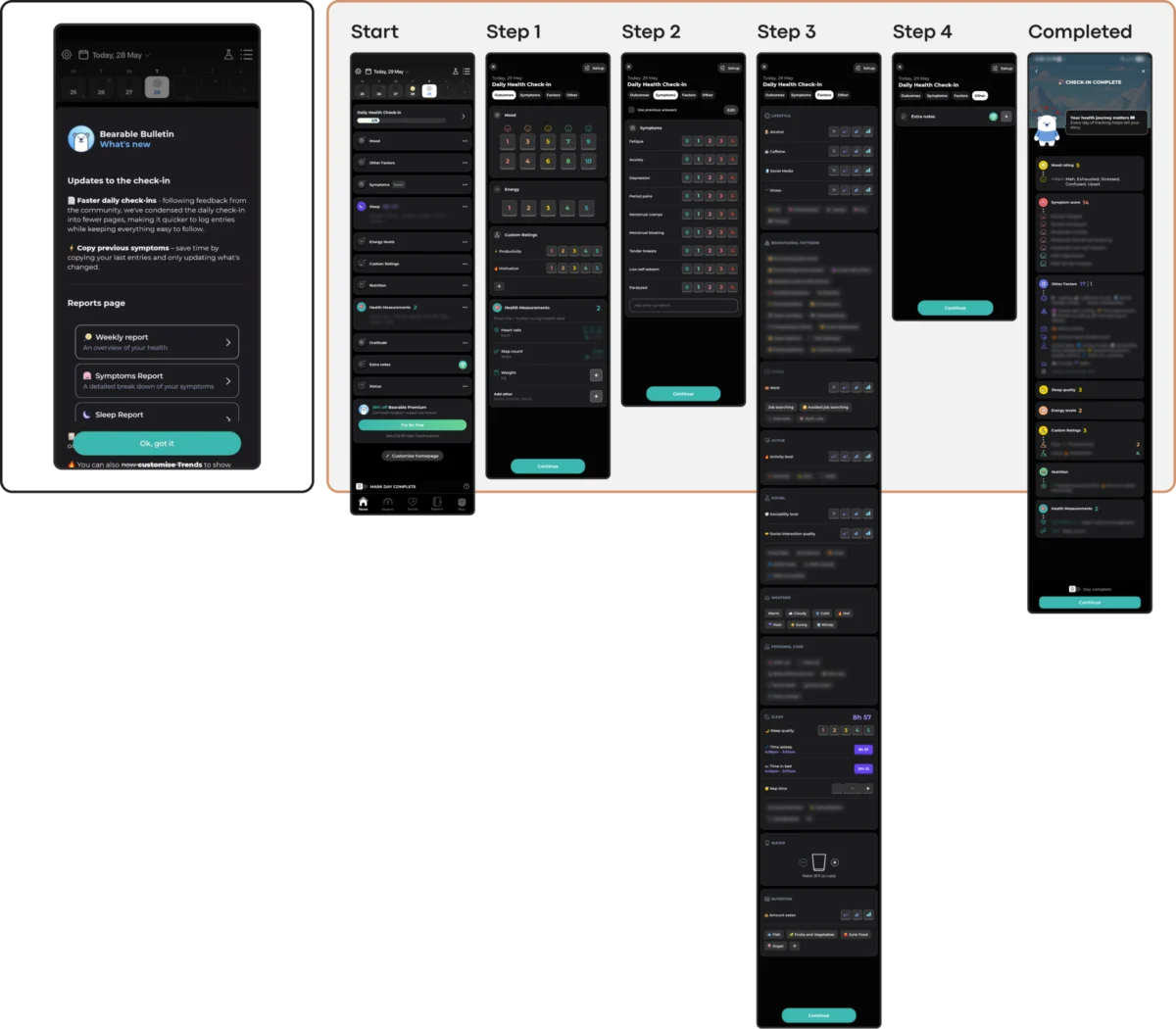
The global digital health industry is currently grappling with a severe engagement crisis, as recent data reveals that nearly 95% of users who download mental health applications abandon them within the first 30 days of use. While the "mHealth" sector has seen a surge in investment and innovation over the last decade, researchers and user experience (UX) designers are increasingly pointing to a fundamental disconnect between modern aesthetic trends and the cognitive needs of users in distress. This phenomenon, characterized by a median 30-day retention rate of just 3.3%, suggests that the very visual and interaction patterns intended to signal innovation are often the primary barriers to therapeutic utility.

The Retention Crisis: A Statistical Overview of mHealth Abandonment
The scale of user attrition in the mental health app space represents a significant challenge for both clinical efficacy and operational sustainability. According to a study published in the Journal of Medical Internet Research (JMIR), the drop-off is immediate and steep. Even established industry leaders, often referred to as "mental health giants," report losing approximately 50% of their user base within the first 10 days of installation.

This collapse in retention is particularly concerning given the rising global demand for digital mental health support. The World Health Organization (WHO) currently estimates that over one billion people worldwide live with a mental disorder, with cases of depression and anxiety increasing by 25% over the last ten years. For many, mobile applications represent the first, and sometimes only, point of access to care. When these tools fail to retain users, the impact is not merely a loss of revenue for developers, but a failure in the delivery of essential health services.

Chronology of the mHealth Design Evolution
To understand the current friction in mental health UI (User Interface), it is necessary to examine the evolution of the medium over the past fifteen years:

- 2008–2012: The Clinical Era. Early mental health apps were largely digitized versions of clinical forms and mood diaries. They were functional but lacked user-centric design, often feeling cold and institutional.
- 2013–2018: The Gamification and Wellness Boom. Following the success of apps like Calm and Headspace, the industry shifted toward "wellness" aesthetics. This era introduced bright palettes, illustrations, and gamification elements like streaks and badges to encourage daily use.
- 2019–Present: The Trend-Driven Conflict. As the market became saturated, designers began adopting high-visibility UI trends—such as neo-brutalism, glassmorphism, and gesture-heavy navigation—to stand out in crowded app stores. It is this current phase that Kat Homan and other design experts identify as being in direct conflict with the needs of distressed users.
The Psychology of the Distressed User
In a professional design context, a "distressed user" is defined not necessarily by a clinical diagnosis, but by a state of reduced cognitive capacity. Users seeking mental health support often do so while experiencing high levels of stress, anxiety, exhaustion, or "brain fog."

Neuropsychological research indicates that during these states, the prefrontal cortex—the area of the brain responsible for executive function and complex decision-making—operates with diminished efficiency. Consequently, tasks that seem simple to a healthy user, such as interpreting an unlabeled icon or navigating a hidden menu, become significant sources of cognitive overload. When an app requires more energy than a user has to spare, the instinctive response is to disengage.

Analysis of Five Critical Friction Points in Modern UI
Kat Homan’s evaluation framework identifies five specific areas where popular design trends actively undermine the goals of mental health applications:

1. Cognitive Friction and Interaction Complexity
Modern trends like neo-brutalism use stark contrasts and heavy borders that require significant visual parsing. Similarly, the trend toward "minimalist" navigation often hides essential tools behind non-standard gestures or unlabeled icons. For a user in the midst of a panic attack or a depressive episode, these "puzzles" act as barriers. Apps like Nonori have addressed this by utilizing linear, simplified flows that guide users through one small action at a time, reducing the need for executive decision-making.

2. Emotional Mismatch and Aesthetic Dissonance
There is a documented preference among users in distress for subtle, grounded, and "quiet" interfaces. Research investigating color influence in mHealth suggests that overly bright, cheerful, or "vibrant" palettes can feel jarring or dismissive to a user in a low mood. This "emotional mismatch" erodes trust. In contrast, the app Bear Room utilizes muted, earthy tones and soft greens to create a digital "refuge," aligning the visual tone with the user’s emotional reality.

3. The Inconsistency Penalty
Routine and predictability are foundational to mental health recovery. However, many contemporary UI designs prioritize novelty and disruption. When an app changes its navigation structure or introduces "unskippable" celebration screens for simple tasks, it disrupts the user’s routine. While gamification can delight an engaged user, it can feel like an unnecessary hurdle for someone who only has the energy to complete a single task.

4. Silent Exclusion: The Accessibility Gap
Trends such as low-contrast text and gesture-only navigation frequently violate Web Content Accessibility Guidelines (WCAG 2.2). The mental health community disproportionately includes individuals with cognitive, attentional, or motor difficulties. Choosing a "trendy" look that sacrifices a 4.5:1 contrast ratio or fails to provide large, stable touch targets (at least 24×24 px) effectively excludes the very population the app is designed to serve.

5. The Coercion Paradox and Performance Pressure
Engagement mechanics borrowed from productivity or social media apps—such as aggressive notifications and "streaks"—can backfire in a therapeutic context. For a user struggling with depression, a "broken streak" is often interpreted as a personal failure rather than a minor lapse in app usage. This adds a layer of "performance pressure" that can exacerbate feelings of guilt. Forward-thinking apps are now moving toward "forgiving" mechanics, such as three-day cycles that do not reset upon a single missed day.

Case Studies: State-Sensitive Design in Practice
Several emerging applications are providing a blueprint for how to balance modern technology with the needs of distressed users.

- Teeni: This app, designed for parents of teenagers, features a "Quick Relief" button that initiates a "Hot Flow." This acknowledges that a parent in a state of anger or frustration cannot navigate a complex library of resources. The app allows for immediate emotional venting via voice input before guiding the user into a more reflective "Cold Flow."
- PTSD Coach: Developed for trauma survivors, this app eschews fashion-forward trends in favor of a stable, predictable information architecture. Users always know exactly where to find symptom tracking versus immediate support, which provides a sense of agency and control.
- Bear Room: By integrating voice-to-text as a primary input method, the app removes the mechanical burden of typing for users with low energy. It also utilizes familiar household objects as navigation icons, leveraging existing mental models to reduce the learning curve.
Industry Implications and Future Outlook
The implications of this design shift are significant for the broader MedTech industry. As regulatory bodies like the FDA and various international health organizations begin to scrutinize the efficacy of digital therapeutics, the "usability" of an interface is no longer being viewed as a secondary concern. It is increasingly recognized as a clinical requirement.

Industry experts suggest that the next phase of mHealth will be defined by "Quiet Design"—interfaces that do not compete for attention but instead offer a consistent, respectful, and helpful presence. The goal is a transition from interfaces that are "seen" to support that is "felt."

Summary of the Evaluation Framework for Designers
To mitigate the 95% abandonment rate, Kat Homan proposes a five-point check for any new UI element in the mental health space:

- Capacity: Does this interaction require high cognitive or mechanical effort?
- Alignment: Does the visual tone respect the user’s likely emotional state?
- Reliability: Is the navigation predictable enough for a returning user in distress?
- Accessibility: Does the design follow WCAG 2.2 standards to avoid exclusion?
- Pressure: Does this engagement mechanic risk creating guilt or a sense of failure?
As the global mental health crisis continues to escalate, the responsibility of the UI designer has shifted. The success of a mental health application is no longer measured by the novelty of its "Dribbble-ready" aesthetics, but by its ability to remain a low-friction, high-trust tool during a user’s most vulnerable moments. In this sector, the most innovative design is often the one that has the courage to be invisible.

