
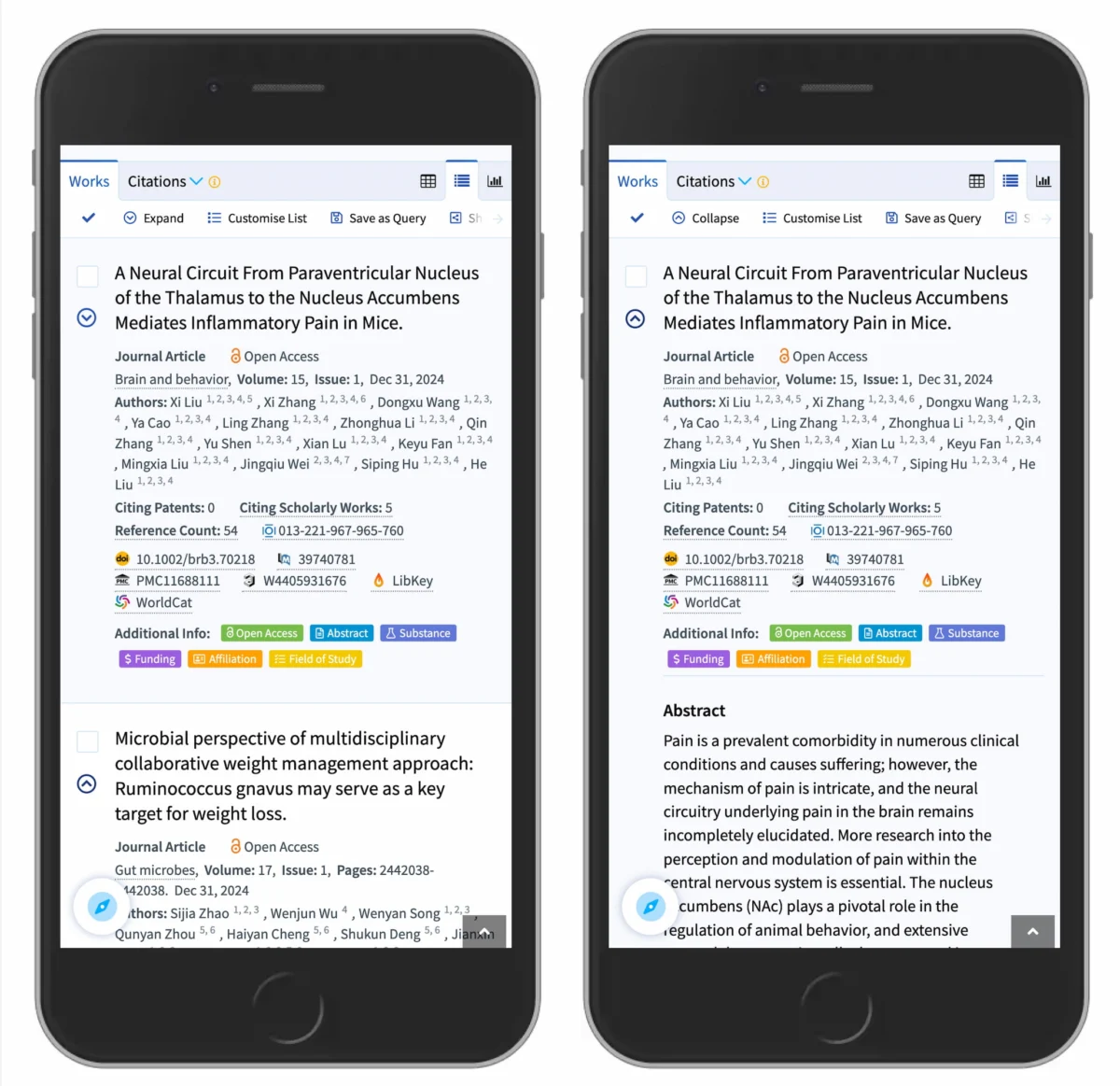
Accordion navigation has become a fundamental component of modern web design, serving as a vital tool for managing content density on mobile devices and complex data-heavy interfaces, yet recent usability research indicates that improper implementation of these components continues to be a primary source of cognitive friction for users. As digital environments shift toward minimalist aesthetics, the choice of iconography—specifically the use of carets, plus signs, and arrows—has moved from a purely stylistic decision to a critical factor in determining navigation success. Data from the Nielsen Norman Group (NN/g) and other leading UX research bodies suggest that while the accordion is a ubiquitous pattern, the lack of standardized visual cues often leads to "interaction cost" errors, where users are unable to predict the outcome of their clicks or taps.
The core of the issue lies in the distinction between page navigation and content expansion. In many contemporary UI frameworks, designers struggle to balance the need for "drill-down" navigation with the requirement to provide direct access to top-level category pages. This conflict often results in the implementation of "split menus," a pattern where a text label and its adjacent icon trigger different actions. Journalistic analysis of user behavior patterns reveals that these split interactions are among the most harmful design choices in modern web architecture, as they violate the principle of least astonishment and force users to make a conscious, often difficult, choice about where exactly to place their finger or cursor.
The Quantitative Case for the Caret Icon
Research into accordion iconography highlights a significant disparity in how different symbols are perceived by the general public. In controlled usability studies, participants were presented with several common variants: the caret (a simple v-shape), the chevron, the traditional arrow, and the plus/minus toggle. The findings suggest that the caret is the "safest" and most intuitive choice for signaling expansion. Unlike arrows, which are frequently associated with linear progression or navigating to an entirely new URL, the caret pointing downward is almost universally understood as a signifier that content will reveal itself vertically within the current view.
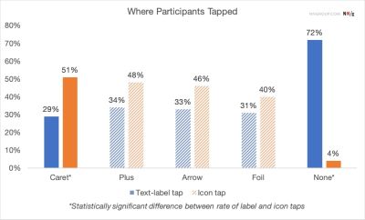
Data indicates that when no icon is present, nearly 100% of users expect a click to trigger a full page load. When a right-facing arrow is used, expectations are split; a significant portion of users still anticipate a page transition rather than an accordion expansion. However, the caret consistently signals a "reveal" behavior. Furthermore, tracking heatmaps from interaction studies show that the caret icon is the only signifier that actually changes user tapping behavior. While users tend to tap the text label and the icon with equal frequency for plus signs and arrows, they are statistically more likely to tap the icon itself when it is a caret, suggesting a stronger mental association between that specific shape and the mechanical action of opening a drawer.
The Chronology of Accordion Design and Navigation Patterns
To understand the current state of accordion design, one must look at the evolution of web navigation over the last three decades. In the early 1990s, web navigation was primarily composed of flat, blue-underlined text links. As websites grew in complexity during the early 2000s, the "mega-menu" became the standard for desktop browsing, allowing users to see dozens of options at once via hover-activated dropdowns.

The pivotal shift occurred around 2010 with the rise of "Mobile First" design philosophies. The limited screen real estate of the iPhone and subsequent Android devices made mega-menus impossible to implement effectively. This gave birth to the widespread adoption of the accordion, which allowed developers to stack categories and let users choose which sections to expand. However, early mobile accordions were often clunky, using large "+" symbols that were frequently confused with "Add to Cart" or "Zoom" functions.
By 2015, the industry began to see the emergence of the "split-button" accordion, an attempt to solve the problem of top-level categories that also needed their own landing pages. This period was marked by high user frustration, as the "hit targets" for the text (to go to the page) and the icon (to open the menu) were often too small or poorly defined. The current era of design, spanning from 2020 to the present, represents a "return to simplicity," where designers are increasingly favoring the "Overview" link strategy—where the entire top-level bar opens the accordion, and the first item inside the accordion is a link to the main category page.
The Hidden Dangers of Split Menus and Interaction Overloading
The "split menu" or "split button" remains one of the most contentious patterns in interface design. From a technical perspective, it requires two distinct HTML elements placed in close proximity, each with a different event listener. From a human perspective, it creates a "gamble" for the user. If a user wants to see the sub-categories of "Men’s Shoes," and they tap the word "Men’s," they may be unexpectedly whisked away to a new page, losing their place in the navigation hierarchy.
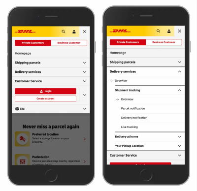
UX analysts argue that this pattern is inherently harmful because it ignores the reality of "fat-finger" syndrome on mobile devices. Even on desktop, the precision required to click a 16-pixel icon instead of the adjacent text label increases the "interaction cost"—the physical and mental effort required to achieve a goal. Leading logistics brands like DHL have moved away from this model, opting instead for a unified interaction. In the DHL mobile navigation, tapping any part of a category row expands the accordion. To reach the category’s landing page, the user simply clicks an "Overview" or "All [Category]" link that appears within the expanded section. This approach eliminates the need for split-second decision-making and reduces the error rate to near zero.
Accessibility Standards and Technical Implementation
Beyond visual aesthetics, the choice of accordion icons and behaviors has profound implications for digital accessibility (A11Y). Under the Web Content Accessibility Guidelines (WCAG), accordions must be navigable via keyboard and understandable by screen readers. A major failure in many custom icon implementations is the lack of proper ARIA (Accessible Rich Internet Applications) labeling.
When a designer uses a "+" icon that changes to a "-" icon, the code must reflect this state change using aria-expanded="true" or "false". Furthermore, the icon itself should be hidden from screen readers using aria-hidden="true" if it is purely decorative, with the state information handled by the parent button element. The preference for carets over arrows is also supported by accessibility experts, as carets are less likely to be misinterpreted by users with low vision who may rely on high-contrast settings that can distort more complex custom icons.

Professional Perspectives and Industry Reactions
The design community has reacted with varying degrees of enthusiasm to the push for stricter standardization. Some creative directors argue that "icon-only" navigation or custom animated symbols are necessary for brand differentiation. However, senior UX researchers at firms like Nielsen Norman Group maintain that navigation is a "utility" rather than a "feature," and should therefore prioritize clarity over novelty.
"Users spend most of their time on other websites," says a common industry maxim (Jakob’s Law). This means that if the majority of the web uses a downward-pointing caret to indicate an accordion, any site using a different symbol—such as a plus sign or a custom brand mark—is forcing the user to learn a new language just to navigate a menu. The consensus among top-tier UX architects is that the underline remains the most powerful tool for indicating a link, while the caret remains the most powerful tool for indicating a toggle.
Broader Impact and the Future of UI Simplicity
The implications of these findings extend beyond simple menus. As we move toward voice-controlled interfaces and augmented reality (AR) environments, the "mental models" we establish today will dictate how users interact with information in the future. The move away from "overloaded" icons—symbols that have multiple, conflicting meanings—is a step toward a more universal and accessible internet.
The data is clear: simplicity out-converts complexity. By removing unnecessary arrows, avoiding the trap of split menus, and utilizing the reliable caret icon, designers can create interfaces that feel "invisible" to the user. When navigation is intuitive, users can focus on the content and the task at hand, whether that is purchasing a product, reading a research paper on Lens.org, or tracking a package. The future of the web is not one of more icons, but of better-chosen ones. The transition back to basics—underlined text for links and carets for expansion—is not a regression, but a sophisticated refinement based on decades of human-computer interaction data.
In conclusion, the "accordion" is more than just a UI component; it is a test of a designer’s commitment to user-centric principles. By prioritizing the caret as the default expansion icon and ensuring that text and icons perform a single, unified action, developers can significantly reduce user frustration and improve the overall efficiency of the digital ecosystem. As the web continues to mature, the focus remains on making the complex feel simple, one click at a time.

