
The global mental health landscape is currently defined by a profound paradox: while digital health interventions are more accessible than ever, the vast majority of users fail to sustain engagement with the tools designed to help them. Data regarding mental health application (mHealth) usage reveals a stark reality for developers and designers alike. According to research published in the Journal of Medical Internet Research (JMIR), approximately 95% of users who download a mental health app abandon it within the first 30 days. The median 30-day retention rate across the industry sits at a meager 3.3%. Even market leaders and "unicorns" in the space lose roughly 50% of their user base within the first ten days of installation. This retention collapse suggests that while visual innovation and trend-driven design are often used to signal modernism, they frequently conflict with the fundamental psychological needs of a user in distress.

The Retention Crisis: Aesthetics Versus Clinical Utility
The failure of mHealth apps to retain users is not merely a marketing or technical hurdle; it is increasingly recognized as a design-led clinical crisis. Effective interface design in this sector is not an aesthetic luxury but a vital tool for user retention and, by extension, therapeutic success. Current research suggests that the primary driver of abandonment is a fundamental misalignment between UI trends and the cognitive state of the target demographic.

Users do not typically approach mental health applications out of casual curiosity. Instead, they engage with these platforms during moments of vulnerability—when they are stressed, anxious, overwhelmed, or cognitively exhausted. In such states, the executive function required to navigate unconventional layouts or decipher abstract icons is significantly diminished. When an app prioritizes "visual delight" or "innovation" through complex animations or non-standard gestures, it inadvertently increases the cognitive load on a user who has no mental energy to spare. Consequently, what the designer intended as a "delightful surprise" becomes a barrier to entry, providing a direct incentive for the user to disengage.

A Chronology of mHealth Design Evolution
To understand the current tension in mHealth UI, one must look at the evolution of digital health interfaces over the last decade.

- The Clinical Era (2010–2015): Early mental health apps were largely digitized versions of clinical worksheets. They were functional but lacked engagement, often feeling cold, sterile, and overly academic.
- The Consumerization Phase (2016–2020): Following the success of apps like Headspace and Calm, the industry shifted toward "lifestyle" branding. Interfaces became more colorful, using rounded typography and soft illustrations to destigmatize mental health.
- The Trend-Driven Era (2021–Present): As the market became saturated, apps began adopting high-concept UI trends such as neo-brutalism, glassmorphism, and aggressive gamification to stand out in the App Store.
This current era has introduced a conflict of purpose. Trend-driven design is optimized for capturing attention and signaling cutting-edge technology. Conversely, therapeutic design must focus on offering refuge, reducing strain, and building trust. Experts like Kat Homan have introduced evaluation frameworks to help designers determine if these visual patterns support or undermine the unique goals of mental health experiences.

The Five Fronts of Design Conflict
The tension between modern UI trends and therapeutic utility manifests across five critical areas, each of which can determine whether a user continues their treatment or abandons the platform.

1. Cognitive Friction and Executive Function
The primary goal of any mental health tool is the reduction of cognitive load. Trends such as neo-brutalism—characterized by high-contrast borders and stark layouts—demand significant visual parsing. Similarly, "hidden" navigation menus that rely on specific swipes rather than visible buttons turn simple navigation into a cognitive puzzle.

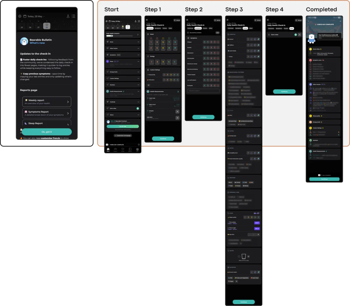
For users experiencing acute anxiety or depression, even minor decisions can feel paralyzing. Research indicates that apps with simplified, linear interfaces reduce the time and effort required to engage, which directly correlates with higher retention. Apps like Nonori have addressed this by utilizing a linear sequence of small actions rather than a complex dashboard, acknowledging that a user in a low-capacity state needs to be guided, not given a multitude of choices.

2. Emotional Mismatch and Trust Erosion
The visual language of an app must be empathetic to the user’s current mood. Studies investigating the influence of color and aesthetics on mood in mHealth apps suggest that users in distress often prefer subtle, grounded aesthetics. Bright, neon, or overly "cheerful" palettes can feel jarring and dismissive to someone in a dark emotional state.

A significant risk in modern design is "emotional mismatch." This occurs when the app’s mechanics—such as a discount wheel or celebratory confetti—trigger after a user has logged a low mood or a traumatic event. In the app Calmer, for instance, the transition from a quiet support interface to an "upsell" screen or a flashy animation can erode the trust necessary for a therapeutic relationship.

3. The Inconsistency Penalty
Mental health stability is often built upon routine and predictability. However, contemporary UI trends thrive on disruption. When an app reimagines fundamental navigation patterns, it forces the user to relearn the interface during every session.

While gamified apps like Finch use playfulness to build routines, they face the risk of the "non-skippable interruption." A user who opens an app simply to mark a task as "done" after a difficult day may find themselves blocked by mandatory celebration screens or character interactions. In contrast, apps like PTSD Coach prioritize a stable information architecture. By maintaining a predictable structure for learning, tracking, and managing symptoms, the app provides a sense of security that trendier, more "dynamic" interfaces lack.

4. The Silent Exclusion of Accessibility
Popular UI trends often compromise accessibility for the sake of minimalism. Low-contrast text, small hit targets, and gesture-only navigation marginalize users with visual impairments, motor difficulties, or cognitive conditions—groups that are disproportionately represented in the mental health community.

Designing within the Web Content Accessibility Guidelines (WCAG) 2.2 is not just a legal or ethical requirement but a functional one. For a mental health app to be effective, it must ensure that body text maintains a 4.5:1 contrast ratio and that interactive targets are at least 24×24 pixels. Choosing a "sleek" but low-contrast aesthetic is an active decision to exclude the very users who may need the support most.

5. The Coercion Paradox in Engagement
The adoption of "persuasion patterns"—such as streaks, aggressive push notifications, and commitment contracts—can be counterproductive in a mental health context. While these mechanics increase retention in language learning or fitness apps, they can induce guilt and "performance pressure" in mental health users.

For someone managing major depressive disorder, a notification warning them that they are about to "lose their streak" can be perceived as a record of failure rather than a motivational nudge. More effective designs, such as those found in Bear Room, utilize "forgiving streaks" that do not reset after a single missed day, framing the experience as a gentle support system rather than a demanding taskmaster.

Analysis of Broader Implications and Global Need
The stakes for improving mHealth design are high on a global scale. The World Health Organization (WHO) estimates that over one billion people live with a mental disorder, and the prevalence of anxiety and depression increased by an estimated 25% in the wake of the COVID-19 pandemic. As traditional healthcare systems struggle to meet this demand, digital tools are expected to fill the gap.

However, if these tools continue to suffer from a 95% abandonment rate, they cannot be considered a viable solution to the global mental health crisis. The transition from "designing to impress" to "designing to support" requires a shift in how success is measured. In the context of mental health, the most successful interface may be the one that is the least "visible"—a quiet, reliable helper that facilitates regulation and then encourages the user to put their phone down.

Implementation: The Evaluation Framework
To mitigate the risks associated with trend-driven design, designers are encouraged to apply a five-point evaluation framework before adopting any new visual or interaction pattern:

- Cognitive Load: Does this pattern require more effort to understand than the standard it replaces?
- Emotional Alignment: Does the tone of this design match the user’s likely state of mind during an acute episode?
- Predictability: Can a returning user navigate this feature instinctively without relearning it?
- Accessibility: Does this design choice exclude users with visual, motor, or cognitive impairments?
- Psychological Safety: Does this mechanic use shame or pressure to drive engagement?
By prioritizing these questions over visual novelty, developers can create "refuge-based" interfaces. As demonstrated by apps like Teeni, which uses a "Quick Relief" button to help parents regulate their emotions before asking them to reflect on their behavior, the future of mHealth lies in state-sensitive design. In this paradigm, sustainable retention is not earned by capturing attention with flashes of innovation, but by becoming a consistently respectful, low-friction, and helpful presence in a user’s life. In the end, the ultimate goal of mental health UI is not for the interface to be admired, but for the support to be felt.

