
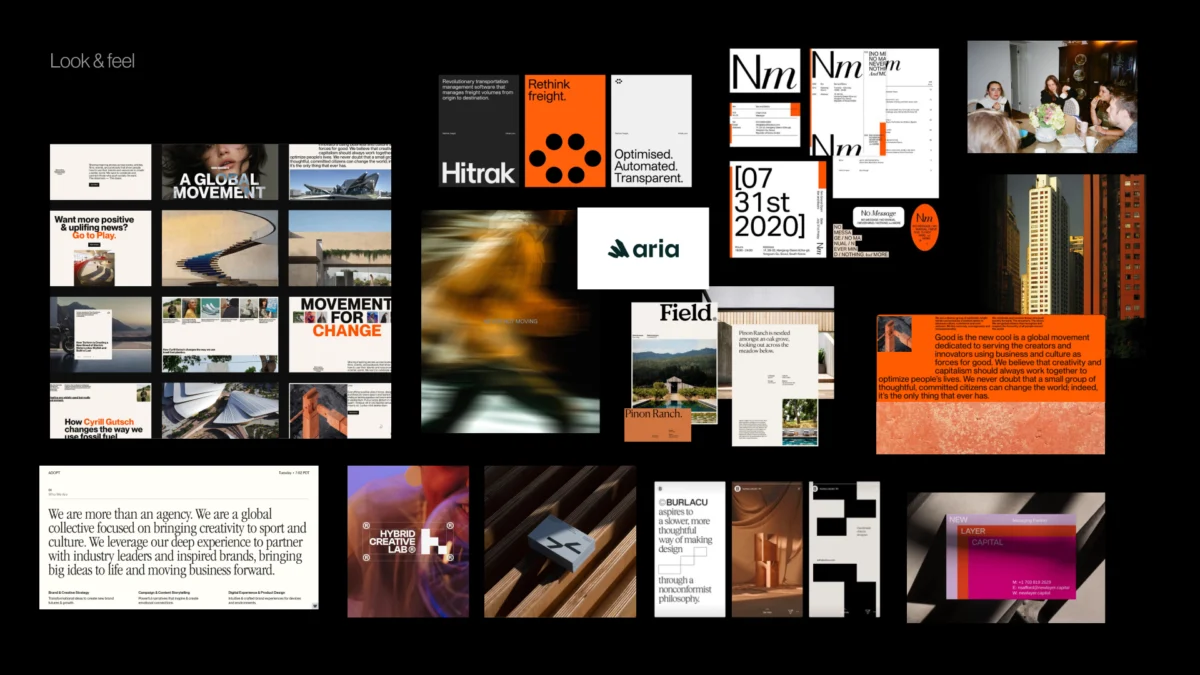
In the contemporary design landscape, the transition from verbal strategy to visual execution remains one of the most volatile stages of brand development. While modern design tools like Figma have streamlined the production of assets, the foundational logic behind those assets often remains underdeveloped. Industry data suggests that a significant percentage of branding projects fail not because of poor aesthetic execution, but due to a structural disconnect during the strategy phase. This gap occurs when high-level descriptors such as “modern,” “trustworthy,” “premium,” or “disruptive” are left undefined, leading to a misalignment between stakeholder expectations and creative output. To mitigate this risk, a specialized "pre-concept" phase has emerged as a critical bridge, transforming abstract brand values into a concrete visual foundation before a single logo is drafted.
The Structural Gap in Brand Identity Development
The traditional branding workflow often follows a linear path: a project kickoff, a brief containing a list of adjectives, and the eventual presentation of three distinct visual concepts. However, this process frequently encounters friction during the first review. Stakeholders often find that the concepts do not "feel right," even if they adhere strictly to the brief. The root cause is the subjective nature of language. In a professional design context, a term like “premium” can signify anything from minimalist editorial layouts to dark, opulent color palettes. Without a pre-concept phase to align these interpretations, the designer is essentially forced to guess the stakeholders’ internal visual definitions.
A recent case study involving a health-tech firm illustrates this phenomenon. The client requested a brand identity that was “modern, trustworthy, and disruptive.” While “disruptive” usually signals a departure from industry norms—often through bold typography or vibrant colors—the client’s actual context required a different approach. Their primary audience consisted of conservative government medical institutions. In this environment, true disruption was found in efficiency, clarity, and administrative confidence, rather than aesthetic rebellion. Consequently, their version of “disruptive” actually required a more traditional, credible visual language. By identifying this discrepancy during the pre-concept phase, the design team avoided a costly pivot that would have occurred had they presented a standard "disruptive" concept.
Chronology of the Pre-Concept Workflow
The implementation of a pre-concept phase alters the standard project timeline to prioritize alignment over immediate production. The revised chronology typically follows these four stages:
- Contextual Research: Moving beyond the brief to understand the competitive landscape and the specific nuances of the target audience’s perception.
- Stakeholder Alignment Workshops: Using interactive exercises to externalize hidden assumptions and resolve disagreements regarding brand character.
- Visual Foundation Development: Creating look-and-feel boards, design codes, and asset directions that serve as a "working layer" between strategy and design.
- Concept Exploration: Developing the final identity based on the boundaries and principles established in the previous stages.
This structured approach ensures that by the time the first concept is presented, it does not feel like a surprise reveal, but rather the logical evolution of a shared direction.

Methodological Framework: The Brand Workshop Toolkit
The pre-concept phase relies heavily on structured workshops designed to clarify perception. As Marty Neumeier, author of The Brand Gap, famously noted, a brand is not what a company says it is, but a person’s “gut feeling” about a product or service. Therefore, the goal of the workshop is to define exactly what gut feeling the team intends to evoke.
Exercise 1: Competitor Perception Mapping
To understand a brand’s potential positioning, designers utilize competitor perception maps. This involves collecting visual touchpoints from market rivals—websites, social media, and product interfaces—and asking stakeholders to plot them on a two-axis grid. The axes are determined by the specific tensions the brand must navigate, such as "Traditional vs. Progressive" or "Understated vs. Bold."
The value of this exercise lies in the resulting dialogue. When two stakeholders disagree on whether a competitor is “premium” or “cold,” it reveals a misalignment in their internal definitions. Resolving these discrepancies in the workshop prevents them from surfacing as criticisms during the concept review. This data-driven approach to perception allows the design team to identify "white space" in the market—visual territories that are currently unoccupied by competitors.

Exercise 2: The Visual Brand Driver
This exercise utilizes metaphorical association to bypass personal aesthetic preferences. Stakeholders are asked to select images representing the company across unrelated categories, such as transport, furniture, or animals. For instance, if a company were a mode of transport, would it be a high-speed train (signaling reliability and mass scale) or a quiet electric car (signaling innovation and sustainability)?
Participants must then provide adjectives explaining their choices. This layer is crucial because the same image can carry multiple meanings. A "lounge chair" might represent "comfort" to one executive and "lack of urgency" to another. By forcing stakeholders to think through metaphors, the design team can identify recurring patterns in how the company’s mission is perceived internally.
The Triple-Layer Visual Foundation
Once the workshop has clarified the brand’s verbal strategy, the designer creates a "visual foundation" composed of three distinct layers. This serves as a practical set of boundaries for the creative process.

Layer 1: Look and Feel
Rather than a traditional moodboard, these are "perception boards." They are curated to test specific directions identified in the workshop. If the team agreed on being “trustworthy,” the look-and-feel board explores different kinds of trust—institutional and calm versus warm and accessible. This allows the client to react to the general "mood" before any specific brand assets are created.
Layer 2: Design Code
The design code translates strategic pillars into visual principles. For example, a parenting app focusing on "research-backed support" might adopt a design code involving data snapshots, editorial layouts, and infographics to signal credibility. Conversely, a pillar like "the messiness of parenting" might be translated into organic shapes and handwritten elements. This stage tests whether the visual metaphors resonate with the brand’s core message.
Layer 3: Brand Asset Direction
The final layer addresses the building blocks of the identity: typography, color, logo style, and photography. Here, the team discusses functional requirements. For a digital-first product, the conversation might focus on the legibility of sans-serif typefaces or the accessibility of a specific color palette. By establishing these technical and aesthetic boundaries early, the designer can focus their creative energy on refining a direction that is already known to be viable.

Economic and Operational Implications
The adoption of a pre-concept phase carries significant implications for the business of design. According to industry analysis, the cost of "re-work" or mid-project pivots can account for up to 30% of a total branding budget. By investing time upfront to define the visual direction, agencies and in-house teams can significantly reduce the number of revision rounds required.
Furthermore, this methodology shifts the power dynamic of the creative review. In a traditional setup, feedback is often subjective, centered on whether a stakeholder "likes" a concept. With a pre-concept foundation, the evaluation criteria become objective. The question changes from "Do you like this logo?" to "Does this visual system express the ‘modern-yet-credible’ character we agreed upon in the workshop?" This objective framework fosters a more professional and efficient relationship between designers and stakeholders.
Broader Impact on Brand Consistency
In an era of multi-channel marketing, brand consistency is more than an aesthetic choice; it is a revenue driver. A 2023 report on brand consistency highlighted that businesses with a highly consistent brand are 20% more likely to experience growth than those with inconsistent identities. The pre-concept phase contributes to this consistency by ensuring that the "visual DNA" of the brand is rooted in a deep understanding of strategy rather than a fleeting trend.

When a brand’s visual foundation is clearly articulated, it becomes much easier to scale. Product teams, marketing departments, and external partners can all refer back to the established design codes to create new assets that feel part of a cohesive whole. This prevents the "brand drift" that often occurs as a company grows and more people are involved in the creative process.
Conclusion: Shifting the Paradigm of Creative Evaluation
The strongest visual concepts are rarely the result of a single "eureka" moment in a design tool. They are the product of rigorous questioning, strategic alignment, and the systematic removal of ambiguity. The pre-concept phase represents a shift in the design industry from a "guess-and-check" model to a collaborative, research-based methodology.
By researching brand context, uncovering hidden assumptions, and building a shared visual foundation, designers can approach the concept phase with unprecedented confidence. This process does not stifle creativity; rather, it provides the necessary constraints that allow creativity to solve real business problems. Ultimately, the pre-concept phase ensures that the final brand identity is not just a beautiful piece of design, but a precise reflection of the company’s strategic intent and its audience’s perceptions.

