
The digital mental health industry is currently grappling with a severe retention crisis, as data reveals that nearly 95% of users who download mental health applications abandon them within the first 30 days. Despite the rapid innovation in mobile user interface (UI) design, research suggests that the pursuit of visual trends is often diametrically opposed to the needs of users in states of distress. Kat Homan, a specialist in the field, has introduced an evaluation framework designed to help developers assess whether modern interaction patterns support or undermine the therapeutic goals of these platforms.

The Retention Crisis and the Data of Abandonment
The statistical reality of mental health technology (mHealth) is stark. According to a study published in the Journal of Medical Internet Research (JMIR), the median 30-day retention rate for mental health apps sits at a meager 3.3%. Even market leaders—the "giants" of the industry—report losing approximately 50% of their user base within the first ten days of installation. This collapse in engagement suggests a fundamental disconnect between the product and the person it intends to serve.

While many factors contribute to app abandonment, including clinical efficacy and cost, the visual and functional interface remains a primary barrier. Users typically turn to these apps during moments of high anxiety, depression, or cognitive exhaustion. In such states, the brain’s executive functions are compromised, making even simple navigation tasks feel insurmountable. When designers prioritize "innovative" UI trends over clarity, they inadvertently create an "extra cognitive overload," transforming a potential tool for relief into a source of further frustration.

The Evolution of mHealth Design: From Utility to Aesthetic Innovation
The trajectory of mental health app design has evolved significantly over the last decade. Early iterations focused on simple mood tracking and text-based resources. However, as the app economy grew, developers began adopting trends from the broader tech industry to signal innovation and capture attention in crowded app stores.

This evolution has led to a core tension: traditional trend-driven design aims to capture attention and disrupt patterns, whereas mental health design must prioritize offering refuge and reducing strain. Contemporary styles such as "neo-brutalism"—characterized by high-contrast borders and stark layouts—or minimalist interfaces that hide navigation menus behind non-standard gestures, are optimized for users with high cognitive capacity. For a user in a low-capacity state, these designs act as physical and mental barriers.

Five Critical Fronts Where UI Trends Conflict with Therapeutic Goals
The research into mHealth engagement identifies five specific areas where modern design trends frequently fail the user.

1. Cognitive Friction as a Barrier to Healing
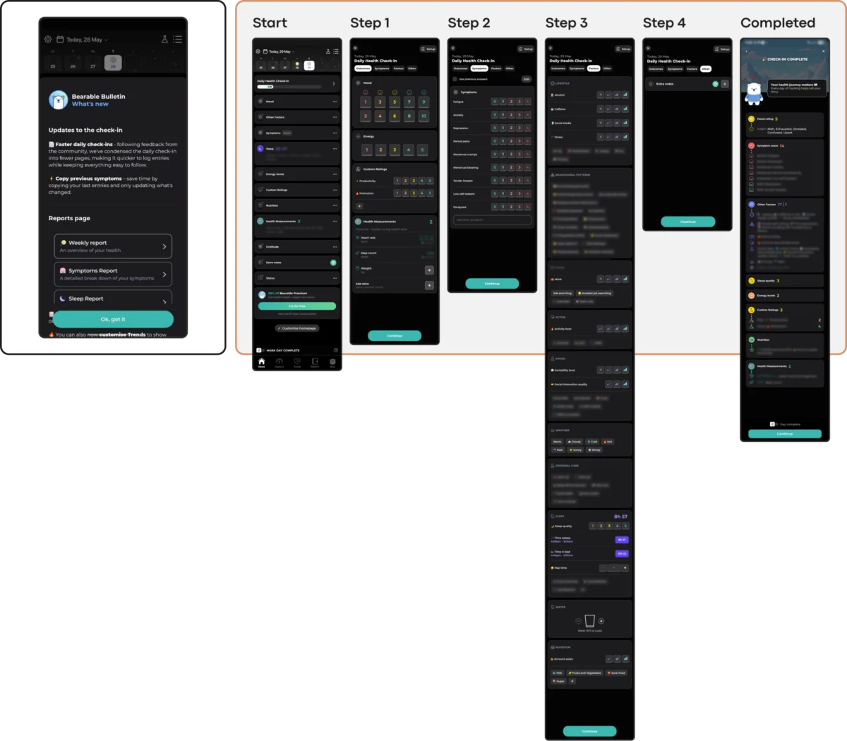
The primary objective of any therapeutic tool is to lower the barrier to entry. However, many trendy interfaces utilize unlabeled, abstract icons that force users to guess their meaning rather than recognizing them intuitively. Research indicates that for individuals experiencing high anxiety, the act of making a choice or interpreting an unconventional icon can trigger a decision-to-quit. Apps like Nonori have addressed this by utilizing linear sequences of small actions, reducing the "choice paralysis" often found in comprehensive dashboards like those in Bearable, which, while powerful, may overwhelm a user suffering from brain fog or burnout.

2. Emotional Mismatch and the Erosion of Trust
A product’s visual tone must align with the user’s emotional reality. A study on color and aesthetics in mHealth apps found that users in distress often find bright, "cheerful" palettes to be jarring or dismissive. There is a documented preference for subtle, earthy, or dark palettes that feel sophisticated and grounded.

Emotional mismatch can also manifest in mechanics. For instance, the app Calmer, despite a clean interface, has been noted for using "gamified" elements like discount wheels or celebratory confetti even when a user logs a low mood. This shift from support to upsell or inappropriate celebration can erode the trust necessary for a therapeutic relationship.

3. The Inconsistency Penalty
Mental health stability is often built on routine and predictability. UI trends that disrupt standard navigation patterns—such as replacing the "back" button with a unique swipe gesture—force users to relearn the app during every session. This "novelty" is perceived as an inconsistency penalty. Public-health-oriented tools like PTSD Coach serve as a positive counter-example; by maintaining a stable, almost clinical information architecture, they allow users to find support through predictable paths without the need for exploration.

4. The Silent Exclusion of Accessibility Needs
Minimalist trends often compromise accessibility. Low-contrast text (common in "ultra-minimalist" designs) and gesture-only navigation marginalize users with visual impairments or motor difficulties—populations that are disproportionately represented among those seeking mental health support. Adhering to Web Content Accessibility Guidelines (WCAG) 2.2 is not merely a legal requirement but a clinical necessity. Ensuring a 4.5:1 contrast ratio for body text and providing visible button fallbacks for all gestures are essential steps in preventing the "silent exclusion" of the most vulnerable users.

5. The Coercion Paradox in Engagement Mechanics
The tech industry’s reliance on "streaks," aggressive notifications, and reward systems is designed to maximize screen time. In a mental health context, these can become sources of "performance pressure." For a user with depression, a notification about a "broken streak" can exacerbate feelings of failure and guilt.

To combat this, newer applications like Bear Room have introduced "forgiving streaks." In these models, a streak does not reset after a single missed day, and the focus is shifted from punishing absence to gently rewarding return. This approach recognizes that recovery is non-linear and that an app should not feel like another system the user is failing to satisfy.

Global Context: The Rising Demand for Effective Digital Tools
The stakes of mHealth design are magnified by the scale of the global mental health crisis. The World Health Organization (WHO) estimates that over one billion people worldwide live with a mental disorder. In the last decade alone, cases of depression and anxiety have increased by 25%, a trend accelerated by the global pandemic and economic instability.

As traditional healthcare systems struggle to scale, digital tools are increasingly seen as a vital component of the "urgent scale-up" of services. However, if these tools continue to suffer from a 95% abandonment rate due to poor UI choices, they will fail to provide the public health impact required. The digital health market is projected to continue its rapid growth, but industry analysts suggest that long-term viability will belong to products that prioritize "therapeutic usability" over aesthetic trends.

A Practical Evaluation Framework for Designers
To bridge the gap between design and distress, the proposed framework suggests a five-point check before any new UI trend is adopted:

- Cognitive Load: Does this pattern require the user to learn something new or interpret abstract symbols?
- Emotional Alignment: Does the visual tone match the user’s likely state of mind (e.g., avoiding "toxic positivity" in high-stress tools)?
- Predictability: Does the navigation remain consistent with standard mobile patterns?
- Accessibility: Does the design meet or exceed WCAG 2.2 standards for contrast and target size?
- Pressure vs. Support: Do the engagement mechanics (like streaks) allow for non-linear recovery without guilt?
Implications for the Future of mHealth
The transition toward "empathy-friendly" design requires a shift in how designers view their success metrics. In traditional tech, success is often measured by time spent in-app. In mental health, success might be measured by how quickly a user can find a breathing exercise and put their phone down.

Case studies like the Teeni app, which features a "Quick Relief" button for parents in distress, illustrate this shift. By providing a "Hot Flow" for immediate venting via voice input before transitioning to a "Cold Flow" for reflection, the app acknowledges the user’s immediate state.

Ultimately, the goal of mHealth UI is to become a "quiet helper." While trends like glassmorphism or biomorphic shapes can be used to enhance a sense of calm, they must be applied with a "radically contextual approach." When the look of an app answers to the moment of the user’s need, it ceases to be a digital product and becomes a reliable extension of care. In the expanding landscape of digital therapeutics, the most successful designs will be those that are felt as support, rather than seen as innovation.

