
The landscape of front-end web development is currently undergoing a fundamental shift as the industry moves away from viewport-centric layouts toward a more modular, component-based architecture. Despite reaching a critical milestone of 94% browser support, CSS Container Queries remain one of the most significant yet underutilized advancements in the history of the language. While media queries have served as the backbone of responsive design since 2010, the emergence of container queries addresses a long-standing limitation: the inability of individual components to perceive and react to their immediate surroundings. Industry data and expert analysis suggest that while awareness of the technology is high, a significant gap remains in practical implementation and conceptual understanding.
The Paradigm Shift from Viewport to Container
For over a decade, the "viewport" has served as a proxy for user context. When developers write media queries, they are essentially asking the browser for the dimensions of the entire window. This approach was revolutionary when Ethan Marcotte first coined the term "Responsive Web Design," but it has become increasingly problematic in the era of design systems and reusable components. A component, such as a card or a navigation widget, may be placed in a wide main content area or a narrow sidebar. Using traditional media queries, that component has no way of knowing its allocated space; it only knows the width of the screen.
Container queries solve this by allowing an element to query the size of its parent container. This enables "micro-layouts" that adapt independently of the "macro-layout" of the page. According to the 2024 State of CSS survey, while approximately 86% of developers are aware of container queries, only 41.4% report using them in their daily workflow. This discrepancy highlights a period of transition where the industry is still unlearning the habits of viewport-only responsiveness.
A Chronology of Responsive Evolution
The journey toward container-level responsiveness has been one of the most requested features in the history of web standards. To understand the current state of the technology, it is necessary to examine the timeline of its development:
- 2010: Ethan Marcotte introduces Responsive Web Design, popularizing
@mediaqueries. - 2011–2015: As component-based frameworks like React and Vue gain traction, developers begin requesting "Element Queries." However, the concept faces significant technical hurdles, specifically the risk of "infinite loops" where an element’s style change alters its own size, triggering another style change.
- 2020: The CSS Working Group finds a path forward by introducing "containment," a way to isolate parts of the DOM so the browser can calculate styles without triggering layout loops.
- 2021: Miram Suzanne and other contributors refine the Container Queries specification. Browser vendors begin experimental implementations.
- 2022–2023: Major browsers, including Chrome, Firefox, and Safari, ship stable support for size queries.
- 2024: Browser support reaches approximately 94% globally, making the feature viable for the vast majority of production environments.
Statistical Analysis of Developer Adoption
The slow adoption rate noted by industry experts, including prominent CSS educator Kevin Powell, points to a psychological barrier. In presentations at major conferences like SmashingConf, Powell has observed that "Container Queries adoption has been terrible" relative to the high demand for the feature over the previous decade.
The data from the State of CSS survey suggests several reasons for this lag. First, the syntax of container queries closely mirrors media queries, leading many developers to assume they are a direct replacement rather than a complementary tool. Second, the requirement for a "container-type" declaration adds a layer of structural complexity that media queries do not require. Finally, the legacy of supporting older browsers—specifically Internet Explorer and older versions of Edge—has historically made developers hesitant to adopt new CSS features until they reach near-universal support. With that threshold now met, the industry is expected to see a surge in adoption over the next 24 months.
Technical Architecture Micro vs. Macro Layouts
The distinction between "macro" and "micro" layouts is essential for modern web architecture. Professional journalistic analysis of current design trends suggests that the most effective websites now use a hybrid approach.
Macro Layouts and Media Queries
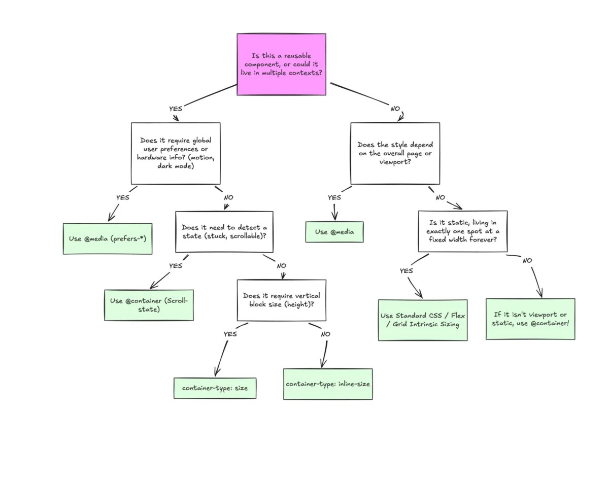
Media queries remain the ideal tool for the overall page structure. This includes the global grid, the positioning of the primary header and footer, and responding to system-level preferences such as prefers-color-scheme or prefers-reduced-motion. These are concerns that affect the entire document and are logically tied to the viewport or the device itself.
Micro Layouts and Container Queries
Container queries are designed for the internal logic of a component. A standard "card" component provides a perfect case study. In a traditional setup, a card might switch from a vertical layout to a horizontal layout at a 768px viewport breakpoint. However, if that card is placed in a narrow sidebar on a 1920px desktop screen, the media query will trigger the horizontal layout, causing the content to overflow or appear cramped. By using @container, the card only switches to a horizontal layout if its immediate parent provides enough space (e.g., 400px), regardless of the screen size.

Beyond Viewport Units The Rise of Container Relative Lengths
One of the most powerful but overlooked aspects of the container query specification is the introduction of new CSS units. Just as vw and vh represent percentages of the viewport, container query units—such as cqi (inline size) and cqw (width)—allow for fluid typography and spacing relative to the container.
This innovation solves the long-standing problem of "fluid typography" in components. Previously, using vw units for font sizes meant that text would scale based on the screen width. If a component was moved into a smaller section of the page, the text would remain too large. By utilizing clamp() in conjunction with cqi, developers can create components where the text scales perfectly according to the space available within the component’s own boundaries.
Structural Constraints and Implementation Challenges
Despite their utility, container queries introduce specific technical requirements that can lead to implementation errors if not properly understood.
- The Containment Requirement: A container cannot query itself. This is a fundamental rule designed to prevent infinite layout loops. Developers must wrap their components in a "container" element that is distinct from the element being styled. This often requires adding an extra layer of HTML, which some developers find counterintuitive to "clean code" practices.
- Size vs. Inline-Size: Setting
container-type: sizetells the browser to ignore the content of the container when calculating its dimensions. This frequently leads to "collapsed" layouts where a container’s height drops to 0px because the browser is no longer looking at the height of the children to determine the parent’s size. For most use cases,container-type: inline-sizeis the preferred choice, as it only monitors the horizontal axis. - The Custom Property Limitation: Currently, container queries cannot utilize CSS custom properties (variables) within the query declaration. This prevents developers from using shared breakpoint variables, a common practice in media query management. The limitation exists because of the complex "cascade" logic involved in how variables are inherited, which could theoretically create circular dependencies.
Broader Impact and Industry Implications
The shift toward container queries represents a maturation of the web as a platform for applications, not just documents. As design systems become the standard for enterprise-level development, the ability to create "context-aware" components is becoming a necessity.
Designers are also beginning to adapt their workflows. Tools like Figma have introduced features that mimic container query behavior, allowing designers to test how components behave in different frames. This alignment between design tools and CSS capabilities is expected to reduce the friction between the design and development phases of a project.

Furthermore, the emergence of "Style Queries"—an experimental subset of container queries—promises even more control. Style queries allow elements to react to the computed styles (such as background color or font weight) of their parents. While size queries are now stable, style queries represent the next frontier of CSS, potentially allowing for even more complex, theme-aware components that don’t rely on heavy JavaScript logic.
Conclusion
The adoption of CSS Container Queries is not merely a matter of learning a new syntax; it is an evolution in how developers perceive the relationship between content and space. While the "usage gap" persists, the technical foundation is now firmly in place. As developers move away from the "viewport proxy" and embrace component-level logic, the web will become more resilient, modular, and truly responsive. The industry consensus is clear: media queries are for the page, but container queries are for the components that live within it. This separation of concerns is the final piece of the puzzle in the decade-long journey toward a truly flexible web.

