
The evolution of user interface (UI) design has reached a critical juncture where the micro-interactions of navigation elements determine the overall success of digital accessibility and user retention. Recent research into the efficacy of accordion icons—specifically focusing on the distinctions between carets, arrows, plus signs, and triangles—has provided a definitive framework for designers seeking to minimize cognitive friction. The core findings, substantiated by the Nielsen Norman Group (NN/g), suggest that the caret remains the most reliable signifier for expanding and collapsing content, while the implementation of "split menus" poses a significant risk to user task completion. As digital interfaces become increasingly dense, particularly in mobile environments, the clarity of these navigational signifiers is no longer a matter of aesthetic preference but a fundamental requirement for functional usability.
The Foundational Mechanics of Accordion Navigation
In the context of web design, an accordion is a graphical control element used to expand and collapse sections of content. This pattern is essential for managing information density on smaller screens, allowing users to scan high-level categories before committing to a deeper dive into specific data. However, the visual signifier used to represent this functionality is frequently a point of confusion. The latest industry data indicates that the choice of icon directly influences a user’s mental model of what will happen upon interaction.
When an interface presents a text label without any accompanying icon, the overwhelming majority of users expect a traditional page navigation. In this scenario, tapping or clicking the label is perceived as a command to load a entirely new URL. The introduction of custom or non-standard icons often muddies this expectation. Research shows that users frequently struggle to interpret idiosyncratic symbols, leading to "interaction cost"—the mental and physical effort required to complete a task. To mitigate this, the industry standard has gravitated toward a small subset of symbols: the caret (v), the arrow (→), and the plus sign (+).
Comparative Analysis of Icon Performance and User Expectations
The NN/g study, which serves as a primary source for modern accordion standards, reveals that while several icons are "understood," they are not all equally effective. The caret, a simple V-shaped symbol, has emerged as the "safest" choice because its primary digital association is the toggling of visibility. Unlike the arrow, which is frequently associated with directional movement or page progression, the caret is almost exclusively used for opening and closing containers.
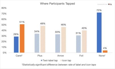
Supporting data from user testing sessions indicates a specific behavior regarding hit targets. For most icons, participants tend to tap fairly equally on the text label and the icon itself. However, the caret is unique in that it draws a higher percentage of taps directly to the icon, suggesting a stronger cognitive link between the symbol and the mechanical action of expansion.

In contrast, the plus sign (+), while widely recognized for its "add" or "expand" functionality, carries significant "semantic overload." In various contexts, a plus sign can mean "save to list," "add to cart," "zoom in," or "create new item." In multi-level navigation systems, where several layers of a menu may be open simultaneously, a screen filled with plus and minus signs can become visually cluttered and difficult to parse. Similarly, the right-facing arrow (→) is often misinterpreted. Users frequently associate arrows with "next" actions or external links. When an arrow points down (↓), it may imply a scroll-to-section command rather than an accordion expansion, leading to a disconnect between user intent and interface response.
The Hazard of Split Menus in Hierarchical Navigation
Perhaps the most critical finding in recent usability research is the inherent harm caused by split menus. A split menu occurs when a single navigation item is divided into two distinct hit areas: the text label, which links to a parent category page, and an adjacent icon, which opens an accordion to reveal sub-items.
This pattern is statistically prone to error. Users often have difficulty precisely targeting the small icon on mobile devices, leading to accidental page loads when they merely intended to see sub-categories. Furthermore, the dual-functionality creates a "split-attention effect," where the user must pause to decide which part of the button will yield the desired result.
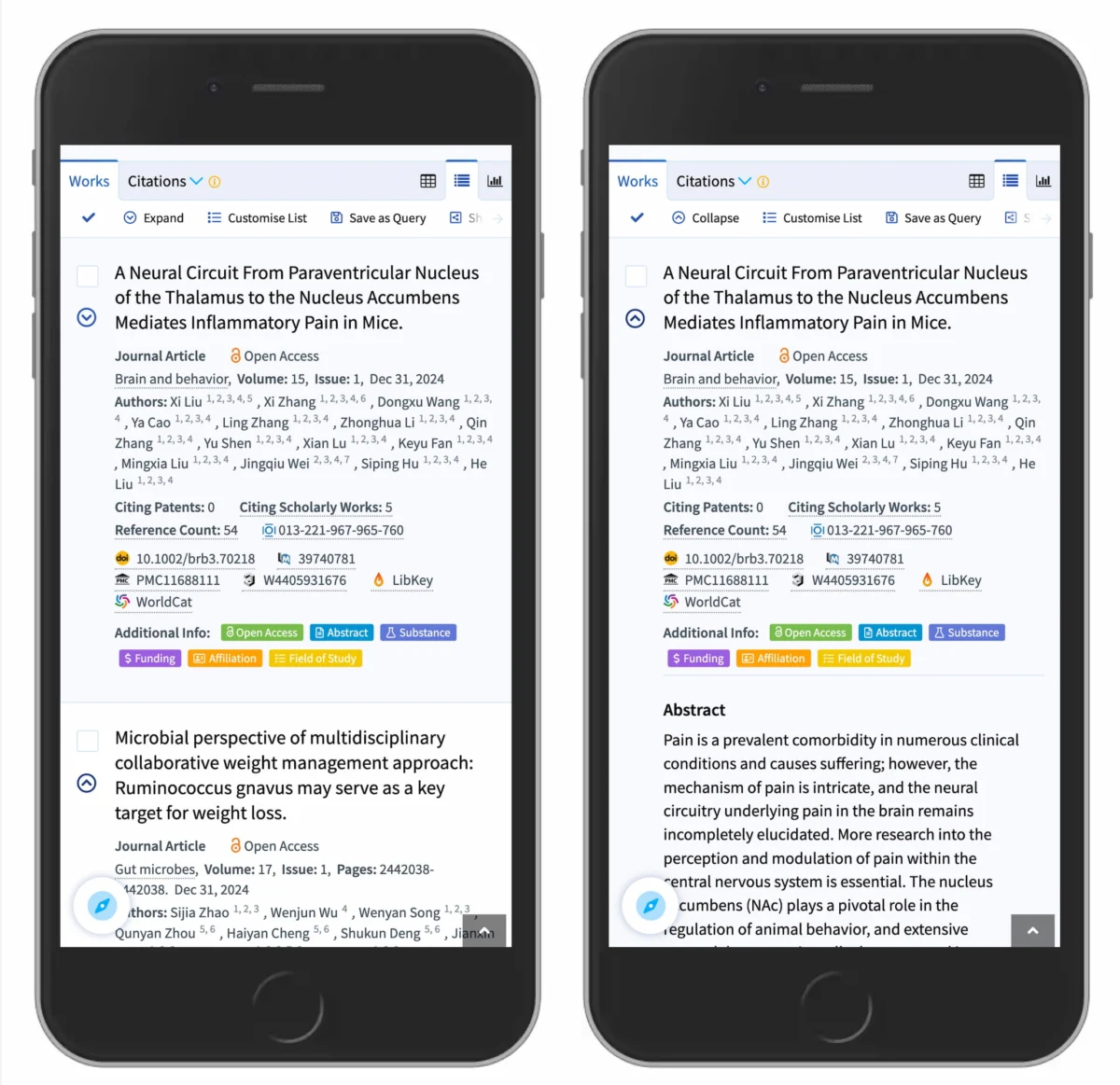
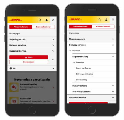
Top-tier logistics and search platforms, such as DHL and Lens.org, have moved away from this pattern in favor of a "unified" interaction model. In a unified model, the entire bar (text and icon) performs the same action—usually opening the accordion. To allow users to reach the parent category page, a dedicated "Overview" or "View All" link is placed inside the expanded menu. This approach respects the user’s physical constraints on touchscreens and aligns with the principle of "one-click, one-action," significantly reducing the error rate in navigation.
A Chronology of UI Navigational Standards
The transition toward the current "caret-default" standard is the result of a multi-decade evolution in web design:
- The Early Web (1990s – 2000s): Navigation was largely static. Blue, underlined text was the universal signifier for a link. Accordions were rare, as page-reloads were the standard method for information retrieval.
- The Rise of Web 2.0 (Mid-2000s): The introduction of AJAX allowed for dynamic content loading without page refreshes. This saw the birth of the "drawer" and "accordion" patterns, often using plus/minus icons borrowed from desktop file explorers like Windows Explorer.
- The Mobile Revolution (2010 – 2015): As the "hamburger menu" became ubiquitous, the need to nest links became urgent. Designers began experimenting with various icons (chevrons, triangles, arrows) to save space.
- The Minimalist/Flat Design Era (2015 – 2020): Icons became thinner and more abstract. However, this led to a "usability gap" where users could not distinguish between a link and a toggle.
- The Modern Usability Standard (2021 – Present): Data-driven design has brought a return to clarity. The caret has been identified as the superior toggle, and the underlining of links is seeing a resurgence as a way to differentiate navigation from interaction.
Official Responses and Expert Consensus
Design authorities and editorial boards at major publications like Smashing Magazine have advocated for a "simpler is better" philosophy. The consensus among UX researchers is that the visual signal should never be sacrificed for the sake of "clean" aesthetics.

According to experts in the field, the rule of thumb is now binary: If the element is a link that takes the user to a new page, it should be underlined or styled as a distinct button. If the element modifies the current view (such as opening an accordion), it should be accompanied by a caret. Industry leaders emphasize that avoiding "over-iconization"—the practice of adding arrows to every link—is essential for maintaining a clear visual hierarchy. When every item has an icon, no item stands out, and the icons lose their power as signifiers.
Broader Impact on Digital Accessibility and Inclusive Design
The implications of icon choice extend beyond mere convenience; they are central to digital accessibility. For users with motor impairments, split menus are a significant barrier, as the small hit area of a toggle icon requires a level of precision that may not be possible. By making the entire label a toggle and placing the category link inside the menu, designers create a much larger, more accessible hit target (complying with WCAG 2.1 Target Size requirements).
Furthermore, for users relying on screen readers, the clarity of these icons is vital. A caret or a plus sign must be backed by correct ARIA (Accessible Rich Internet Applications) attributes, such as aria-expanded="true" or "false". If the icon is poorly chosen or the interaction is a split menu, the screen reader’s announcement can become confusing, leaving the user unsure whether they are activating a link or expanding a list.
The research conducted by organizations like NN/g serves as a reminder that the web’s most successful components are often the most boring. The caret is not "exciting" from a graphic design perspective, but its performance in user testing is unrivaled. As the industry moves forward, the trend is leaning toward radical transparency: providing users with a clear, unambiguous path to their destination. By abandoning split menus and embracing the humble caret, designers can create interfaces that are not only more usable but more inclusive for a global audience.
In conclusion, the data suggests that the most effective way to "name things" in UI is to use the most established conventions. Underline your links, use carets for your accordions, and avoid the complexity of split-action buttons. These simple changes, supported by decades of user data, remain the most effective tools for building a more accessible and functional web.

