
The discipline of digital product design and software engineering is frequently haunted by a challenge that appears deceptively simple yet remains one of the most persistent bottlenecks in the development lifecycle: naming. As Phil Karlton, a renowned architect at Netscape, famously observed, there are only two hard things in computer science: cache invalidation and naming things. In the modern era of design systems and multi-platform applications, this observation has evolved from a witty aphorism into a critical operational hurdle. The language utilized by cross-functional teams—designers, developers, and product managers—shapes not only how they think about the product but also how they communicate its functions. Misalignment in terminology regarding colors, icons, UI components, and features frequently leads to "dialectal friction," where different departments use varying names for the same asset, resulting in confusion, technical debt, and decreased velocity.

The Cognitive Impact of Nomenclature in UI Design
Naming is not merely a cosmetic choice; it is a structural necessity. When names are too generic, they fail to convey intent, leading to ambiguity in the codebase. Conversely, when names are too specific, they restrict the flexibility and reusability of a component, undermining the very purpose of a design system. Industry experts argue that an effective name must bridge the gap between form and function. To address this, various resources have emerged to assist professionals in breaking away from repetitive or uninspired naming conventions.
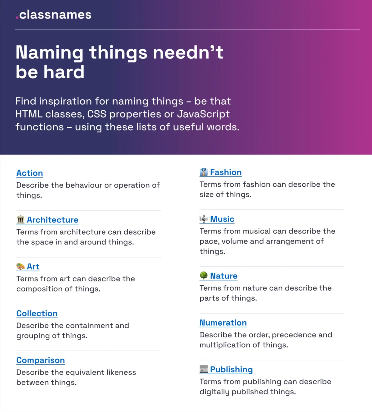
One such resource is Classnames, curated by Paul Robert Lloyd. This tool is designed to help developers and designers think beyond the standard "container" or "wrapper" labels. By providing thematically grouped lists of words—ranging from nature and architecture to music and theater—it encourages a more diverse vocabulary. For instance, instead of naming a grouping element a "Box," a team might look to architectural terms like "Atrium" or "Plinth" to better describe the hierarchy or spatial relationship of the element. This diversification of language helps in creating more distinct and memorable mental models for complex UI structures.

The Systematic Categorization of Color
In the realm of design tokens, color naming is often where systems first begin to break down. While hex codes and RGB values provide mathematical precision, they lack human-readable context. The transition from "Brand-Red" to a more scalable system requires a deep inventory of identifiers. David Aerne currently maintains a comprehensive repository of color names, which has grown to include over 30,355 unique identifiers sourced from historical references and user contributions.
The utility of such a repository, accessible via tools like Color Parrot, allows teams to move away from subjective descriptions. In a professional environment, naming a specific shade "Cerulean Frost" rather than "Light Blue 2" provides a unique identifier that can be tracked across Figma libraries, CSS variables, and documentation. This level of specificity is essential for maintaining brand integrity across global products where multiple shades of the same primary color may be in use simultaneously.

Best Practices for Layer and Group Organization
As design files grow in complexity, the internal organization of layers and groups becomes a primary factor in designer productivity. Javier Cuello, a leading voice in design systems, has established a framework for naming best practices that emphasizes consistency and scalability. According to Cuello’s guidelines, a high-quality name must possess a logical structure, remain concise, and be universally understood by all stakeholders.
Crucially, Cuello advocates for names that are independent of visual properties. For example, naming a component "Primary-Button-Large" is preferable to "Blue-Button-Big," as the latter becomes obsolete if the brand’s primary color changes to green. His research into naming conventions suggests a "Do and Don’t" methodology:

- Do: Use functional names (e.g.,
status-indicator). - Don’t: Use specific visual attributes (e.g.,
green-dot). - Do: Establish a clear hierarchy (e.g.,
Category/Component/State). - Don’t: Use idiosyncratic abbreviations that require a legend to decipher.
Case Study: Intuit’s Flexible Design Token Taxonomy
The practical application of these naming theories is best observed in large-scale enterprise environments. Intuit, the parent company of Mailchimp, QuickBooks, and TurboTax, faced the monumental task of creating a design token taxonomy that could span multiple disparate brands. Nate Baldwin, a key architect in this transition, documented the evolution of Intuit’s system, highlighting the shift from a rigid, brand-specific model to a flexible, multi-tiered taxonomy.
The Intuit team identified that their legacy system suffered from "token bloat" and ambiguity. By redefining their criteria, they moved toward a system that categorized tokens by their role (e.g., background, border, text) rather than their specific appearance. This allowed for "theming" at scale; a single token could represent a specific semantic value that changed its output depending on whether it was being used in the QuickBooks environment or the TurboTax environment. This approach significantly reduced the friction in developer handoffs and ensured that brand updates could be pushed across the entire ecosystem with minimal manual intervention.

Multi-Brand Architecture: The Vodafone UK Variables Map
Building on the foundations laid by industry pioneers like Nathan Curtis, the Vodafone UK Design System team developed a "Variables Taxonomy Map." This map serves as a visual guide to the anatomy of a design token, breaking it down into four distinct collections: brand, primitives, semantics, and pages.
This hierarchical structure allows for a "cascade" of meaning. Primitives (e.g., color-red-500) are mapped to semantic tokens (e.g., color-background-error), which are then applied to specific components. This methodology ensures that every stakeholder can determine the purpose and location of a token simply by reading its name. In a multi-brand context, this is vital for maintaining a single source of truth while allowing for the distinct visual identities required by different sub-brands or international markets.
Standardizing UI Components Through the Component Gallery
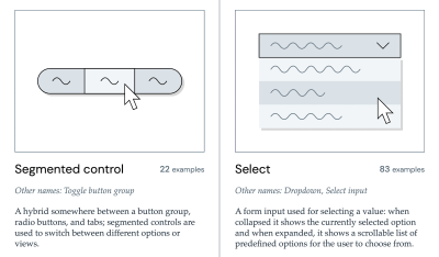
To avoid "reinventing the wheel," many teams now look to the Component Gallery, a project by Iain Bean. This resource aggregates interface components from real-world design systems, providing a comparative look at how different organizations name similar elements.
Analysis of the gallery reveals that while there is significant overlap in common components like "Accordions" or "Breadcrumbs," there is wide variance in more complex patterns. For instance, what one system calls a "Modal," another might call a "Dialog" or a "Lightboxed Overlay." By referencing a visual dictionary like "Name That UI," teams can reach a consensus on terminology during the early stages of a project, preventing the "naming conflicts" that typically arise during the development of version 2.0 or 3.0 of a product.

Feature Discovery and the Psychology of Adoption
The impact of naming extends beyond internal workflows and directly affects the end-user experience. Erin Gannon’s research into feature adoption suggests that poor discoverability is often a linguistic issue rather than a functional one. A feature must be discovered, understood, and learned before it can be integrated into a user’s workflow.
Gannon’s guide to naming features emphasizes the "Job-to-be-Done" (JTBD) framework. A successful feature name should signal the value or outcome the user desires. She suggests that teams should observe users describing a feature in their own words and adopt that vernacular. If a user refers to a "Data Export" tool as "The Report Maker," the latter may actually be the more effective name for driving adoption, as it aligns with the user’s mental model and expectations.

Broader Impact and Business Implications
The cumulative effect of precise naming is a reduction in "communication debt." When designers and developers speak the same language, the time required for QA and handoff is drastically reduced. According to industry surveys on design system ROI, organizations with standardized naming conventions report up to a 25% increase in speed-to-market for new features.
Furthermore, clear naming facilitates better accessibility. Semantic HTML and well-named ARIA labels are the backbone of a usable web for individuals relying on assistive technologies. When a component is named correctly at the design level, those names often carry through to the code, ensuring that the structural integrity of the application is maintained for all users.

In conclusion, naming is a strategic asset. While it requires an upfront investment of time and cross-departmental collaboration, the long-term benefits of a clear, scalable, and user-centric nomenclature are undeniable. By utilizing the tools and frameworks developed by the global design community, organizations can transform their naming process from a point of frustration into a foundational strength of their digital products. The right name is not just a label; it is a clear path to understanding, efficiency, and user success.

