
The landscape of web development is undergoing a fundamental shift as the browser’s native capabilities begin to absorb functionalities once reserved for complex third-party JavaScript libraries. Central to this evolution is the emergence of the Popover API, a standardized web platform feature that transforms tooltips and menus from simulated elements into native browser-understood components. This transition represents a significant milestone in the quest for a more accessible, performant, and standardized internet, effectively reducing the reliance on "ad-hoc" JavaScript logic that has dominated user interface (UI) design for over a decade.
For years, the development community viewed tooltips as a minor UI challenge, yet they frequently became a source of significant technical debt. While simple in concept—a small box of text appearing on hover or focus—the execution of a robust, accessible tooltip required managing complex event listeners, ARIA (Accessible Rich Internet Applications) attributes, and focus states. The Popover API aims to eliminate this complexity by providing a declarative HTML-first approach, allowing the browser to handle the heavy lifting of state management and accessibility.
The Historical Context of Simulated Tooltips
Before the standardization of the Popover API, the web platform lacked a native concept of a non-modal overlay that could work seamlessly across various input methods, including mouse, keyboard, and assistive technologies. Developers were forced to "simulate" tooltips using generic <div> elements and extensive JavaScript.
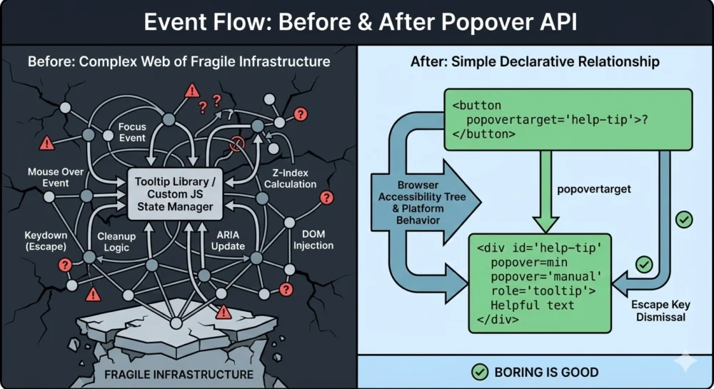
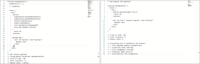
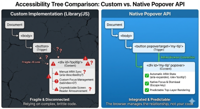
In a typical legacy implementation, a developer would need approximately 60 lines of JavaScript to manage a single tooltip. This code had to coordinate five or more event listeners to handle mouse entry, mouse exit, keyboard focus, blur, and the Escape key. Furthermore, developers had to manually sync ARIA attributes like aria-expanded and aria-describedby to ensure screen readers could interpret the UI correctly.
This reliance on simulation created several industry-wide pain points:
- Accessibility Fragmentation: Custom implementations often failed to meet WCAG (Web Content Accessibility Guidelines) standards. Keyboard users frequently found that tooltips were skipped entirely during tabbing, or that they could not be dismissed without moving the mouse.
- The "Z-Index" War: Tooltips often suffered from clipping issues when placed inside containers with
overflow: hiddenor were obscured by other elements due to complex stacking contexts. - Performance Overhead: The cumulative effect of multiple tooltip libraries across a large-scale application increased the "bundle size" and main-thread processing time, leading to slower page loads and degraded user experiences.
Chronology of the Popover API Development
The journey toward a native popover solution has been a multi-year effort involving the W3C (World Wide Web Consortium) and major browser vendors under the "Interop" initiative, which seeks to improve web compatibility.
- 2021-2022: Initial proposals for a "Popup" attribute were discussed within the WHATWG (Web Hypertext Application Technology Working Group). The focus was on creating a "top layer" for the browser—a dedicated rendering space above all other elements in the document.
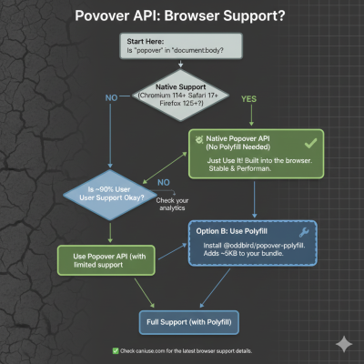
- May 2023: Google Chrome 114 became the first major browser to ship the Popover API, introducing the
popoverattribute and the associated JavaScript methods. - September 2023: Apple released Safari 17.0, bringing native popover support to the macOS and iOS ecosystems.
- April 2024: Mozilla Firefox 125 added support for the Popover API, marking the point of "Baseline" availability across all three major browser engines.
- 2025 and Beyond: The focus has shifted toward refining companion APIs, such as CSS Anchor Positioning and the Interest Invoker API, which are designed to further automate the placement and timing of these native elements.
Technical Analysis: Declarative vs. Imperative Models
The Popover API introduces a declarative model that shifts responsibility from the developer to the browser engine. By using the popover attribute, an element is automatically moved to the "top layer." This ensures that the tooltip will always appear above other content, regardless of the z-index of its parent containers.
The API utilizes two primary attributes:
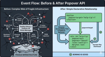
popover: Defines an element as a popover. It can be set toauto(which allows "light dismiss" behavior where clicking outside or pressingEsccloses the element) ormanual(where the developer retains control over closing logic).popovertarget: Placed on a button or input, this attribute creates a direct, native link to the popover’s ID, allowing the browser to toggle the element without a single line of JavaScript.
Data from early adopters suggests that migrating to the native API can reduce the code required for tooltip interactions by up to 80%. A standard implementation that previously required 60 lines of JavaScript can now be achieved with approximately 10 lines of declarative HTML.
Supporting Data: Accessibility and Performance Wins
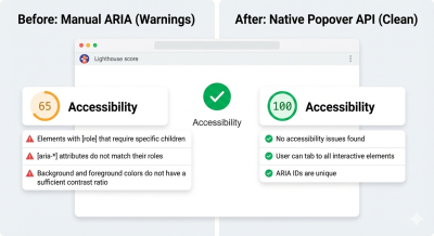
The impact of the Popover API extends beyond code cleanliness. Technical audits using tools like Lighthouse have shown immediate improvements in accessibility scores following the adoption of native popovers.
Automated ARIA Management
One of the most significant technical hurdles in tooltip development is the synchronization of ARIA states. In custom implementations, developers must manually update aria-expanded="true" when a tooltip opens. Failure to do so results in a "stale state" where assistive technology does not announce the change to the user. The Popover API automates this process; the browser’s accessibility tree is updated in real-time as the popover toggles, eliminating a common category of accessibility bugs.
Focus and Dismissal Logic
Native popovers provide "free" keyboard support. The Esc key is globally recognized as a dismissal command for popovers with the auto state. Furthermore, the API ensures that focus management is handled correctly—if a user tabs into a tooltip trigger, the tooltip is displayed, and if the popover is dismissed, focus is reliably returned to the trigger element. This prevents "focus traps," where a user becomes stuck inside a UI element with no clear way to navigate back.
Industry Reactions and the Role of Libraries
Despite the advantages of the native API, industry experts suggest that JavaScript libraries still hold a valuable, albeit changed, position in the ecosystem.
Statements from the Developer Community:
Technical architects at major design systems have noted that while the Popover API handles the behavior, it does not yet fully solve the geometry. "The Popover API is a massive win for semantics and accessibility," says one lead engineer at a prominent UI framework. "However, for complex applications that require tooltips to intelligently ‘flip’ when they hit the edge of a viewport, we still look to libraries like Floating UI to handle the mathematical positioning."
This has led to a "hybrid approach" in modern web development:
- Native for Logic: Using the Popover API to manage opening, closing, and accessibility.
- CSS for Positioning: Utilizing the emerging CSS Anchor Positioning API to define where the tooltip appears relative to its trigger.
- Libraries for Edge Cases: Reserving heavy libraries for enterprise-grade design systems that require highly specific, non-standard behaviors.
Broader Impact and Future Implications
The standardization of the Popover API is part of a broader trend known as "The Great Regression" to the platform—a movement where developers are returning to native HTML and CSS features as they become more powerful. This trend is expected to significantly reduce the complexity of web applications, leading to faster performance on low-powered devices and more reliable experiences for users with disabilities.
Furthermore, the introduction of "Invoker Commands" is set to expand the declarative power of HTML. Future updates to the spec may allow for interest invokers, which would enable developers to define hover-based delays (common in tooltips to prevent accidental flickering) directly in HTML or CSS, potentially removing the final need for JavaScript in basic tooltip implementations.
Conclusion
The transition from simulated JavaScript tooltips to the native Popover API represents a maturation of the web platform. By moving UI primitives into the browser’s core logic, the industry is moving away from fragile, "black box" dependencies and toward a more stable, standardized foundation.
For organizations and independent developers, the directive is clear: the default approach to overlays should now begin with the platform. While libraries remain a tool for specialized customization, the Popover API ensures that the simplest implementation of a tooltip can also be the most correct, accessible, and performant one. As browser support reaches near-ubiquity, the era of the 60-line JavaScript tooltip is effectively coming to an end, replaced by a more robust and native web.