
The global mental health landscape is currently navigating a profound paradox: while digital interventions are more accessible than ever, the vast majority of users fail to sustain engagement with the very tools designed to assist them. Recent clinical data reveals a stark reality for the mobile health (mHealth) industry, noting that approximately 95% of users who download a mental health application abandon it within the first 30 days. With a median 30-day retention rate of only 3.3%, even industry leaders and "mental health giants" report losing nearly half of their user base within the first ten days of installation. This collapse in retention has transformed interface design from a purely aesthetic concern into a critical operational and clinical priority. As practitioners like Kat Homan have observed, the current crisis suggests that many UI trends, while successful in capturing attention in the broader app economy, often directly undermine the unique psychological needs of users in distress.

The Evolution of the mHealth Retention Crisis
To understand the current state of mental health design, one must look at the chronology of the digital therapeutics market. Over the last decade, the industry has shifted from simple mood-tracking logs to complex, AI-driven platforms. Following the global surge in anxiety and depression cases—which the World Health Organization (WHO) reports increased by 25% in the wake of the COVID-19 pandemic—the market saw an influx of venture capital and a subsequent pressure to "gamify" and "trend-ify" health experiences to compete for user attention.

However, the "attention economy" model, which relies on high-contrast visuals, frequent notifications, and rapid-fire animations, is fundamentally at odds with the "refuge model" required for mental healthcare. For a user experiencing a panic attack, severe depression, or burnout, the cognitive load required to navigate a trendy, experimental interface can become an insurmountable barrier. Research indicates that users do not approach these apps out of curiosity but out of acute need. In these high-stakes moments, a confusing gesture or an unlabeled icon is not merely a design flaw; it is a point of cognitive overload that triggers disengagement.

Analyzing the Conflict Between UI Trends and Therapeutic Utility
The tension in modern mental health design surfaces across five primary fronts. Each represents a point where adopting a trend for the sake of novelty can actively damage the therapeutic alliance between the user and the software.

1. Cognitive Friction and the Executive Function Deficit
The primary objective of any mental health tool is the reduction of cognitive strain. However, contemporary trends such as "Neo-brutalism"—characterized by high-contrast borders and stark layouts—demand significant visual parsing. Similarly, the trend toward "minimalist" hidden navigation menus, which replace standard tabs with non-standard swipes, turns simple navigation into a cognitive puzzle.

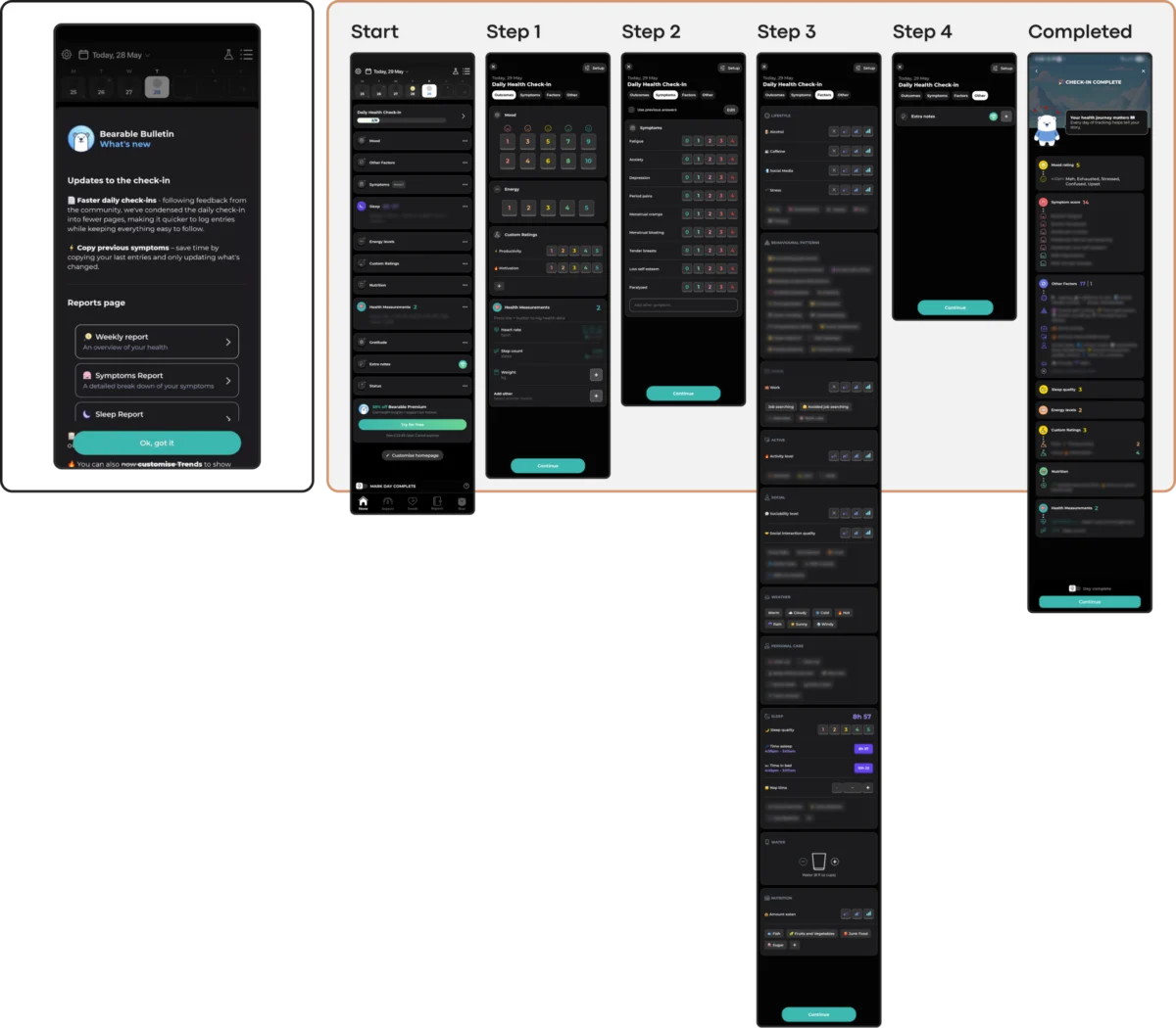
From a clinical perspective, individuals suffering from depression or high anxiety often experience a temporary deficit in executive function. This makes multi-step decision-making and the interpretation of abstract, unlabeled icons physically and mentally exhausting. Studies have shown that apps utilizing simple, linear interfaces significantly reduce the time-to-value for the user, thereby improving retention. When an app like "Nonori" guides a user through a single, sequential path, it acknowledges the user’s limited mental energy, whereas a dense dashboard like "Bearable," while powerful, can inadvertently overwhelm a user during a period of "brain fog" or exhaustion.

2. Emotional Mismatch and Visual Tone
A significant body of research into color theory and mHealth aesthetics suggests that users in distress prefer subtlety over saturation. While bright, cheerful palettes are often used to signal "wellness," users in the midst of a mental health crisis frequently report that these visuals feel jarring or dismissive of their current state.

Industry audits suggest a growing preference for dark palettes, earthy tones (such as soft greens and taupes), and uncluttered aesthetics. The concept of "emotional alignment" requires that the visual tone of the app matches the user’s internal state. For instance, the "Bear Room" application utilizes a "cosy room" metaphor with muted hues to create a digital safe space. When an app introduces "confetti" animations or high-energy celebratory sounds after a user logs a low mood, it creates an emotional mismatch that erodes trust.

3. The Inconsistency Penalty
Predictability is a cornerstone of psychological stability. UI trends that prioritize "disruption" or "novelty" in navigation often force users to relearn the interface with every update. In contrast, tools like "PTSD Coach" utilize a stable information architecture that remains unchanged over time. This reliability allows users to access support tools through muscle memory—a critical feature when a user is too distressed to think through a new navigation pattern.

While large platforms like "Headspace" or "Calm" offer vast content libraries, the sheer volume of choice can lead to "decision paralysis." For a user in a low-capacity state, the ability to find a specific tool immediately is more valuable than the ability to browse a thousand options.

4. Accessibility and Silent Exclusion
Accessibility is often treated as a secondary layer in design, yet in mental health, it is a foundational requirement. A significant portion of the population seeking mental health support also manages comorbid conditions, including visual impairments or motor difficulties.

The trend toward low-contrast text (often seen in ultra-minimalist designs) violates Web Content Accessibility Guidelines (WCAG) 2.2, which require a 4.5:1 contrast ratio for body text. Gesture-only navigation can marginalize users with unsteady hands or those using assistive devices. By choosing a "trending" aesthetic over an accessible one, designers are making an active decision to exclude the most vulnerable segments of their target audience.

5. The Coercion Paradox in Engagement Mechanics
The most controversial trend in mHealth is the adoption of "hard" engagement mechanics like daily streaks, aggressive push notifications, and "commitment contracts." While these tools are effective in education or fitness apps, they can be counterproductive in mental healthcare.

For a user managing depression, a "broken streak" can be perceived as a personal failure, exacerbating feelings of guilt and shame. This is known as the coercion paradox: the very mechanic meant to encourage the user becomes a source of performance pressure. Ethical design in this space requires "forgiving" mechanics. For example, "Bear Room" uses short, three-day streaks that do not reset upon a single missed day, framing the experience around support rather than punishment.

Supporting Data: The Rising Stakes of Digital Care
The urgency for better design is underscored by global health statistics. The WHO estimates that approximately one billion people worldwide live with a mental disorder. Depression alone is a leading cause of disability, affecting 5% of the world’s adults. In the United States, the National Institute of Mental Health (NIMH) notes that nearly one in five adults lives with a mental illness, yet access to traditional in-person therapy remains limited by cost and provider shortages.

This gap has made mHealth apps a primary "first line of defense." However, if 95% of users abandon these tools within a month, the digital divide in healthcare only widens. The financial implications are also significant; the mHealth market is projected to reach hundreds of billions of dollars by 2030, but sustainable growth is impossible without addressing the fundamental "leaky bucket" problem of user retention.

Industry Reactions and the Path Forward
In response to these challenges, a new framework for "Therapeutic Usability" is emerging among UX researchers. The consensus is moving away from "attention-grabbing" design toward "calm technology." Statements from leading digital psychologists suggest that the goal of a mental health app should not be to maximize screen time, but to facilitate "effective disengagement"—helping the user feel better so they can put the phone down and return to their lives.

Leading apps are now experimenting with "state-aware" interactions. "Teeni," an app for parents of teens, utilizes a "Quick Relief" button that initiates a "Hot Flow" for immediate venting via voice input, only transitioning to a "Cold Flow" of reflective resources once the user’s immediate emotional intensity has subsided. This acknowledges that a user’s capacity for complexity changes based on their emotional state.

Analysis of Implications: Design as a Clinical Intervention
The implications of this shift are profound for the future of software development. If UI design can be shown to directly affect clinical outcomes—by either facilitating or hindering a user’s ability to perform a therapeutic exercise—then design must be treated with the same rigor as pharmaceutical efficacy.

The move toward a "quiet helper" model of UI suggests that the most successful mental health apps of the next decade will likely be those that are the least "trendy." They will prioritize:

- Voice and Low-Friction Input: Reducing the mechanical burden of typing during distress.
- Predictable Architecture: Favoring stable, "boring" navigation over experimental layouts.
- Muted, Grounded Aesthetics: Using biomorphic shapes and earthy palettes to foster a sense of calm.
- Non-Coercive Retention: Building trust through respect for the user’s time and emotional boundaries.
In conclusion, the crisis of retention in mental health applications is a design-led problem that requires a design-led solution. By moving beyond the "Dribbble-ready" aesthetic and embracing a framework of therapeutic usability, designers can transform these apps from fleeting distractions into reliable digital refuges. The ultimate measure of success in this field is not whether the interface is seen or admired, but whether the support it provides is felt when the user needs it most.

