
In the competitive landscape of modern branding and digital product design, the most successful visual identities are no longer born from immediate creative intuition or rapid prototyping in tools like Figma. Instead, they emerge from a rigorous, often overlooked period known as the pre-concept phase. This stage serves as a critical bridge between abstract brand strategy—defined by high-level adjectives and corporate goals—and the tangible visual assets that define a company’s public face. Industry experts and design strategists are increasingly identifying the lack of a pre-concept phase as the primary cause of project failure, where a misalignment between stakeholder expectations and designer output leads to costly revision cycles and diluted brand messaging.
The Semantic Gap in Brand Strategy
The failure of a branding project rarely occurs during the final rendering of a logo; rather, the seeds of failure are sown in the earliest strategy sessions. When teams rely on broad descriptors such as "modern," "trustworthy," "premium," or "disruptive," they operate under the illusion of consensus. These terms are semantically ambiguous, carrying vastly different connotations depending on an individual’s professional background, cultural context, and personal aesthetic preferences.
For example, to a stakeholder in the fashion industry, "premium" might suggest an avant-garde, minimalist editorial style. To a stakeholder in the automotive sector, the same word might evoke images of heavy, leather-bound luxury and traditional craftsmanship. When these words are left undefined, a designer is tasked with hitting a moving target. The pre-concept phase is designed to close this gap by transforming vague language into specific, agreed-upon visual boundaries before a single original concept is developed.

Chronology of the Pre-Concept Workflow
The integration of a pre-concept phase alters the traditional design timeline, moving from a linear "strategy-then-design" model to a more iterative, collaborative discovery process. The chronology typically follows a structured path:
- Project Kickoff and Broad Discovery: Collection of the creative brief, competitor lists, and initial stakeholder interviews.
- The Perception Workshop: A deep dive into how the brand is currently perceived versus how it needs to be perceived by its specific audience.
- Competitor Perception Mapping: An analytical exercise placing market rivals on various axes to identify "white space" in the visual landscape.
- The Visual Brand Driver Exercise: Using metaphors and non-industry imagery to bypass personal biases and uncover the "gut feeling" of the brand.
- The Three-Layer Foundation Meeting: Presenting look-and-feel boards, design codes, and asset directions to establish project boundaries.
- Concept Development: The formal creation of original logos, palettes, and typography based on the established foundation.
Researching Brand Context and Category Tension
A central component of the pre-concept phase is researching the brand context. This involves more than just a cursory glance at competitors; it requires an analysis of category expectations and the tensions within them. In a recent analysis of a health-technology firm, designers encountered a common strategic paradox. The client requested a brand that felt "disruptive" yet "trustworthy."

In the vacuum of a creative brief, "disruptive" might lead a designer toward neon colors, experimental typography, and asymmetrical layouts. However, the pre-concept research revealed that the firm’s primary clients were large, conservative government medical institutions. In this specific context, "disruption" did not mean rebellion; it meant superior efficiency and clarity compared to legacy systems. Consequently, the visual direction needed to lean toward institutional credibility while using subtle, modern accents to signal innovation. This realization prevented the design team from presenting concepts that would have been rejected for being too visually "loud" for the target demographic.
Analytical Tools: Perception Mapping and Metaphor
To move from verbal strategy to visual direction, strategists employ specific exercises that force stakeholders to think concretely.

Competitor Perception Mapping
During this exercise, stakeholders are asked to place competitor brands on a two-axis map. The axes are chosen based on the specific tensions of the project, such as "Traditional vs. Progressive" or "Understated vs. Bold." This exercise is less about the competitors themselves and more about revealing how the client "reads" the category. Disagreements between stakeholders during this process are considered highly valuable, as they expose hidden assumptions. If one executive views a competitor as "premium" while another sees it as "generic," the design team knows they must define those terms more precisely for the current project.
The Visual Brand Driver
This psychological exercise asks stakeholders to select images from unrelated categories—such as transportation, furniture, or architecture—to represent the company. By removing the conversation from the immediate product, it bypasses personal aesthetic preferences. If a stakeholder chooses a high-speed train to represent the brand, they might associate it with "speed" and "reliability." If another chooses a bicycle, they might be thinking of "agility" and "sustainability." These metaphors provide a rich layer of brand character that adjectives alone cannot provide.

The Three-Layer Foundation: Establishing Design Boundaries
Once the research and workshops are complete, the findings are synthesized into a three-layer presentation. This is the final step of the pre-concept phase and serves as the "contract" for the upcoming design work.
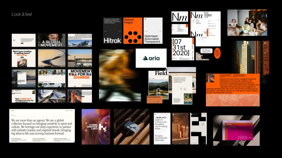
- Look and Feel: These are perception boards featuring third-party references. They are not intended to show what the final design will look like, but rather to confirm the "mood" and "energy" the brand should project.
- Design Code: This layer translates brand ideas into visual principles. For instance, a brand value of "precision" might be translated into a design code of "geometric grids" and "monospaced typography." A value of "humanity" might translate to "organic shapes" and "warm photography."
- Brand Assets: This is the most tactical layer, discussing the early directions for the building blocks of identity—typography styles (serif vs. sans-serif), color theory (high-contrast vs. tonal), and logo styles (abstract mark vs. wordmark).
Industry Implications and Project Efficiency
The adoption of a pre-concept phase has significant implications for the business of design. By investing more time upfront in alignment, agencies and in-house teams can drastically reduce the number of revision rounds required during the concept phase. Industry data suggests that projects with a clearly defined pre-concept phase see a higher rate of first-round concept approval.

Furthermore, this process shifts the nature of the feedback loop. Instead of stakeholders providing feedback based on subjective "likes" or "dislikes," the conversation becomes objective. Feedback is framed against the agreed-upon visual foundation: "Does this concept express the ‘precision’ and ‘trust’ we defined in the design code?" This objective framework protects the integrity of the design and ensures that the final brand identity is a tool for business growth rather than a reflection of individual taste.
Broader Impact on Digital Product Ecosystems
In the context of digital products—where brand identity must live across websites, mobile apps, and social media—the pre-concept phase is even more vital. Digital brands are not static; they are functional systems. The design code established in the pre-concept phase often forms the basis for a brand’s "Design System," influencing everything from button radius to animation easing.

By uncovering hidden assumptions and defining the brand’s visual "DNA" early, product teams can ensure consistency across multiple touchpoints. This level of coherence is essential for building user trust in a digital-first economy.
Conclusion: The First Concept Should Not Be a Surprise
The ultimate goal of the pre-concept phase is to ensure that the first formal design concept feels like the logical next step in a shared journey, rather than a "reveal" or a guess. It does not eliminate the need for creative intuition; rather, it provides that intuition with a sharper, more defined problem to solve.

As the branding industry continues to evolve toward more data-driven and strategy-led methodologies, the pre-concept phase stands as a vital safeguard. It ensures that when a designer finally opens Figma, they are not just making something that looks "modern" or "friendly"—they are building a visual system that is deeply rooted in the brand’s unique context, audience needs, and strategic goals. The strongest visual concepts, it seems, are those that are thoroughly understood before they are ever drawn.

