
The digital health landscape is currently navigating a profound paradox: while the demand for mental health support has reached historic highs, the tools designed to provide that support are struggling to keep users engaged. Recent industry data reveals a staggering retention crisis within the mental health application (mHealth) sector. Research published in the Journal of Medical Internet Research indicates that approximately 95% of users who download a mental health app abandon it within the first 30 days. The median 30-day retention rate for these platforms sits at a mere 3.3%. Even market leaders and industry "unicorns" are not immune to this trend, frequently losing up to 50% of their active user base within the first 10 days of installation. This collapse in user engagement suggests that while the clinical content of these apps may be sound, the delivery mechanism—the user interface (UI) and user experience (UX)—is fundamentally misaligned with the needs of the target audience.

The Retention Crisis: Aesthetics vs. Utility
Effective interface design in the mental health space is no longer a matter of simple aesthetics; it is a clinical and operational necessity. Kat Homan, a prominent voice in UX design, argues that many modern UI trends are optimized for goals that mental health apps do not share. In the broader tech industry, design trends are typically engineered to capture attention, signal innovation, and maximize "time on device." However, for a user experiencing a mental health crisis or chronic distress, these very same patterns can become barriers to healing.

Users do not typically engage with mental health apps out of casual curiosity. They arrive in states of vulnerability, often feeling overwhelmed, anxious, or cognitively exhausted. In these "low-capacity" states, unconventional icons, flashy animations, or complex navigation gestures do not provide "delight"—they provide cognitive overload. When a user is struggling to process basic information, a "trend-forward" interface that requires learning new interaction patterns becomes a reason to disengage entirely.

Chronology of the mHealth Explosion and the Design Shift
To understand the current friction, it is necessary to examine the timeline of the mHealth industry. Between 2015 and 2020, the market saw a massive influx of venture capital, leading to the creation of thousands of wellness and meditation apps. The COVID-19 pandemic accelerated this growth, as social distancing measures made digital intervention the only viable option for many. According to the World Health Organization (WHO), the global prevalence of anxiety and depression increased by a massive 25% in the first year of the pandemic alone.

During this period of rapid scaling, many developers adopted "standard" tech industry UI patterns to ensure their apps looked modern and competitive on the App Store and Google Play. This led to the widespread adoption of:

- Neo-Brutalism: High-contrast layouts and bold typography intended to stand out.
- Minimalism: Stripped-back interfaces that often hide essential navigation behind gestures.
- Gamification: Reward systems, streaks, and badges designed to foster habit formation.
While these trends were successful for social media and productivity tools, their application in mental health contexts has proven problematic. The stakes are higher here; a confusing interface in a banking app is an annoyance, but a confusing interface in a suicide prevention or panic-relief tool is a failure of care.

Five Fronts Where Modern UI Conflicts with Mental Health
The evaluation framework for mHealth design identifies five primary areas where popular trends often undermine therapeutic goals.

1. Cognitive Friction and Executive Dysfunction
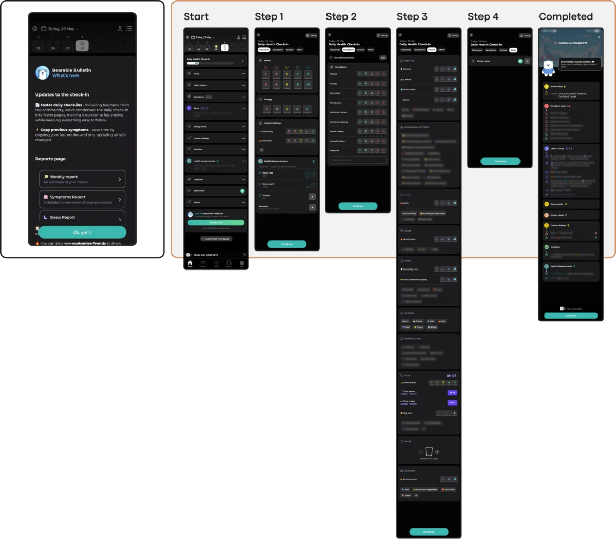
The primary objective of any mental health tool should be to reduce the user’s cognitive load. However, trends like neo-brutalist layouts or hidden navigation menus turn simple tasks into puzzles. Research suggests that during periods of high anxiety, even making simple choices can feel impossible. Apps like Bearable provide comprehensive tracking for chronic conditions, but their dense dashboards can sometimes overwhelm users who are already suffering from "brain fog." Conversely, apps like Nonori have found success by utilizing linear, step-by-step flows that guide the user through a single action at a time, minimizing the need for decision-making.

2. Emotional Mismatch and Visual Tone
A user’s emotional state is the context in which the app operates. Studies on color psychology in mHealth suggest that users in distress often prefer subtle, muted palettes—earthy tones like soft greens and taupes. Cheerful, bright, and neon colors, while popular in general UI design, can feel jarring or even physically uncomfortable for someone in a depressive or highly anxious state.

A notable example of emotional mismatch occurred in the app Calmer, where engagement mechanics like "discount wheels" or celebratory confetti appeared immediately after a user logged a low mood. This shift from support to gamified upsell creates a sense of distrust, making the user feel like a "customer" rather than a patient.

3. The Inconsistency Penalty
Mental health stability often relies on routine and predictability. When an app updates its UI to follow a new trend—such as moving the navigation bar or changing icon styles—it forces the user to relearn the interface. For a user with executive dysfunction, this "novelty" is a penalty. Public-health-oriented tools like PTSD Coach prioritize a stable information architecture over fashion. By keeping the "Learn," "Track," and "Manage" sections consistent for years, they build the "muscle memory" that users rely on during a crisis.

4. Silent Exclusion through Accessibility Failures
Many UI trends actively compromise accessibility. The minimalist trend of low-contrast text (e.g., light gray text on a white background) fails users with visual impairments or those experiencing the "visual blurring" sometimes associated with certain medications or severe fatigue. The Web Content Accessibility Guidelines (WCAG 2.2) mandate a 4.5:1 contrast ratio for body text, yet many "trendy" apps ignore this in favor of a specific aesthetic. Furthermore, gesture-only navigation marginalizes users with motor difficulties or those whose hands may be shaking during a panic attack.

5. The Coercion Paradox in Gamification
Engagement mechanics like "streaks" (popularized by apps like Duolingo) are often ported into mental health apps to encourage daily use. However, in a non-linear recovery context, a broken streak can be devastating. For a user managing depression, seeing a "0-day streak" after missing a day due to low energy can exacerbate feelings of guilt and failure. This transforms a "motivational tool" into a source of performance pressure.

Practical Solutions: The "Refuge" Model of Design
In response to these challenges, a new wave of "empathy-driven" design is emerging. Apps like Bear Room and Teeni demonstrate how to balance engagement with emotional safety.

- State-Aware Interaction: In Teeni, a parenting support app, designers implemented a "Quick Relief" button. This triggers a "Hot Flow" designed for immediate emotional venting via voice input. Only after the user has regulated their emotions does the app transition into the "Cold Flow" of reflective resources.
- Low-Friction Input: Recognizing that typing can be exhausting, Bear Room uses voice-to-text as a primary input method. This allows users to "dump" their thoughts without the mechanical burden of a keyboard.
- Forgiving Mechanics: Instead of indefinite streaks, Bear Room uses short, three-day cycles. If a day is missed, the streak does not reset to zero, acknowledging that recovery is non-linear and that absence should not be punished.
The Broader Impact: A Global Health Imperative
The importance of these design decisions cannot be overstated. The WHO estimates that approximately one billion people globally live with a mental disorder. Depression alone affects 5% of the adult population. As healthcare systems worldwide remain overstretched, digital tools are often the first—and sometimes only—line of defense for these individuals.

Industry analysts suggest that the next phase of mHealth will move away from "attention-grabbing" design and toward "invisible" support. The goal is for the interface to disappear so that the therapeutic benefit can be felt. This requires designers to treat "calm" as a core feature rather than an aesthetic choice.

Conclusion: A Framework for Ethical Evaluation
For designers and developers in the mental health space, the path forward involves a rigorous evaluation of every new feature or visual trend. A five-point check is recommended before any design change is implemented:

- Does this reduce cognitive load?
- Does the emotional tone match the user’s likely state?
- Does this maintain navigational predictability?
- Does this meet or exceed WCAG 2.2 accessibility standards?
- Does this mechanic motivate through support or through pressure?
By prioritizing these questions over industry trends, developers can create tools that users don’t just download, but actually keep. In the high-stakes world of mental health, the ultimate measure of design success is not how much an app is "seen," but how much the user feels "supported." Sustainable retention in this sector is not earned by capturing attention, but by becoming a consistently respectful, reliable, and quiet helper in a user’s life.

